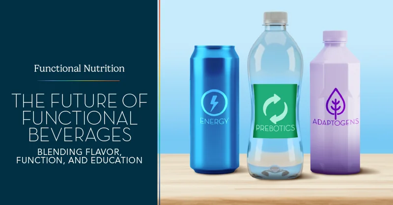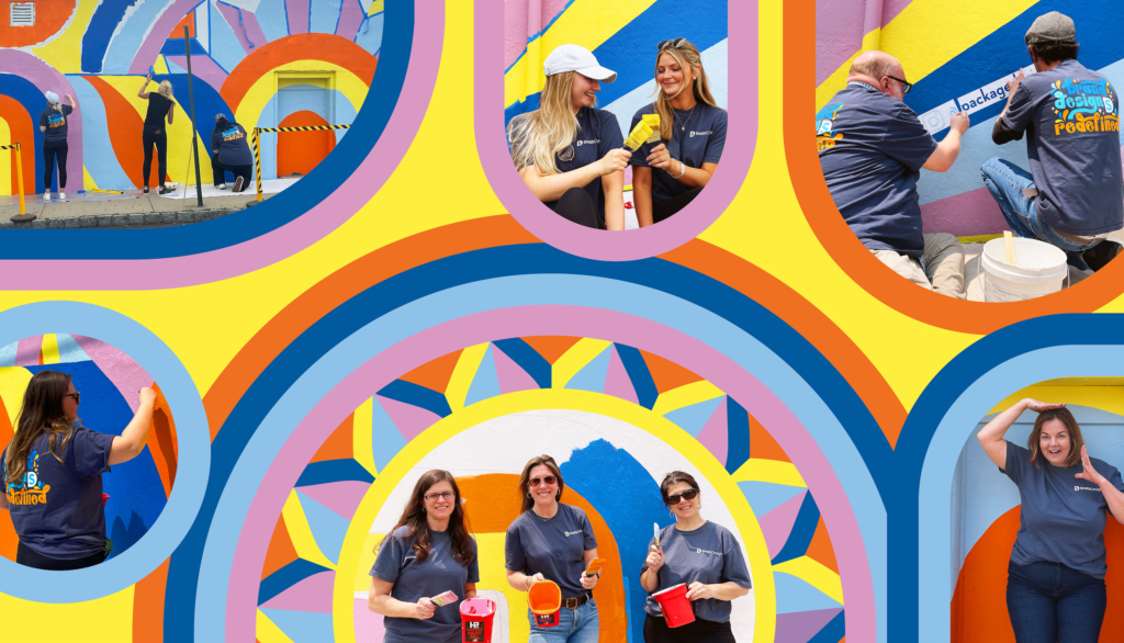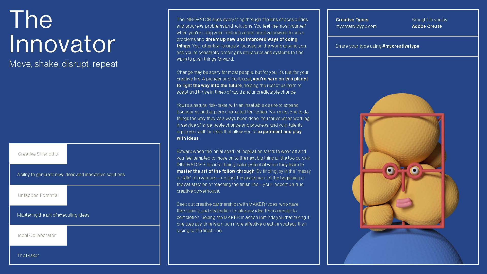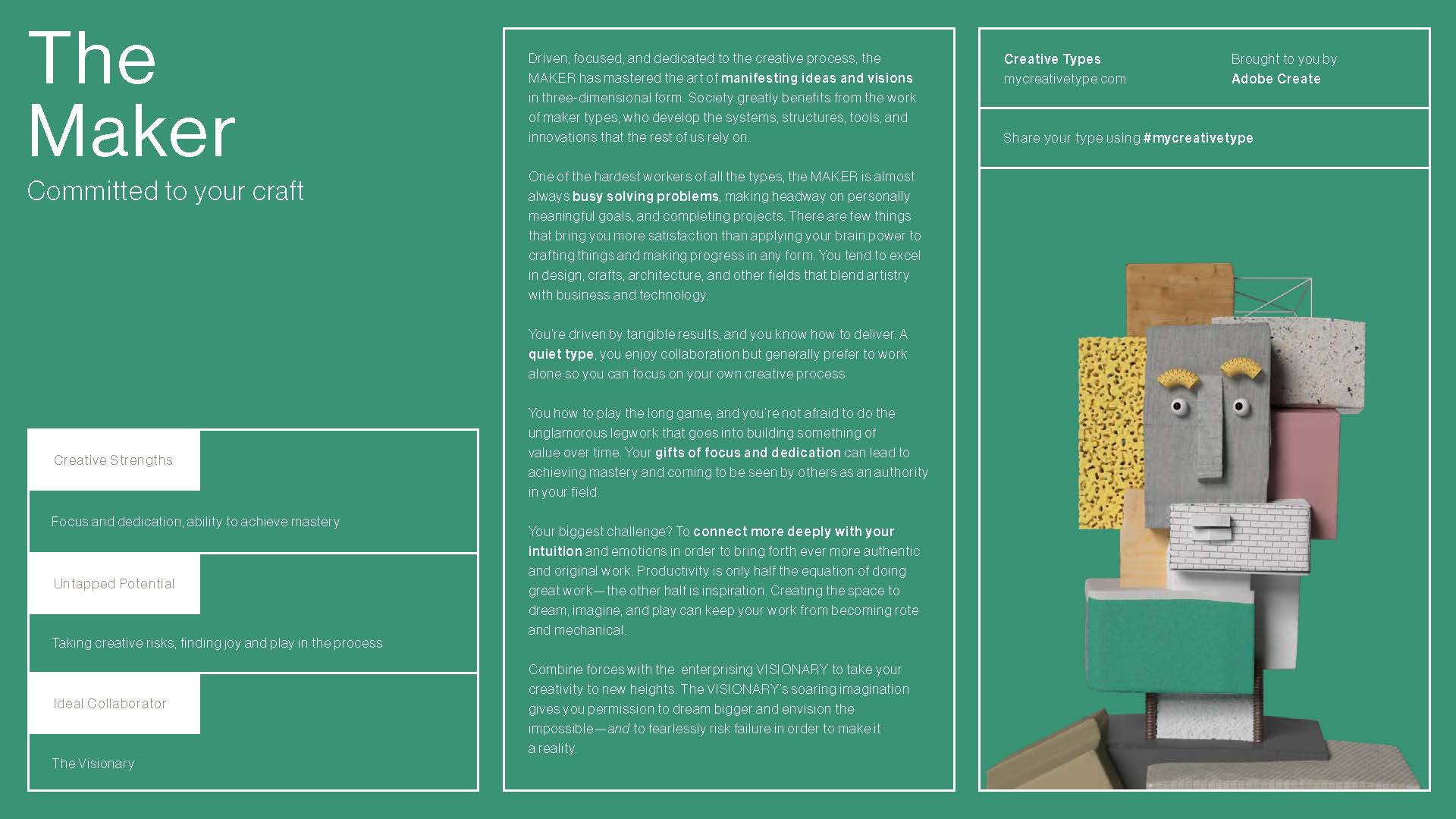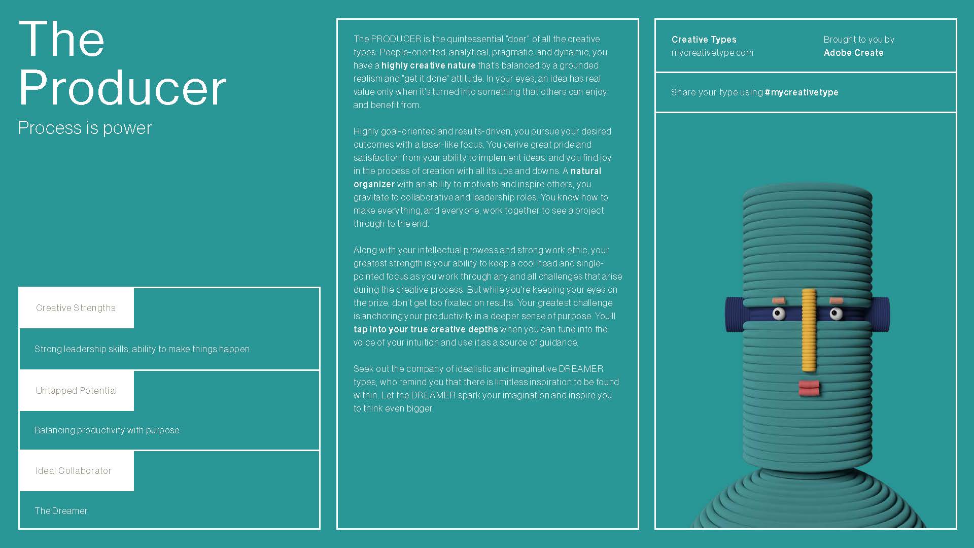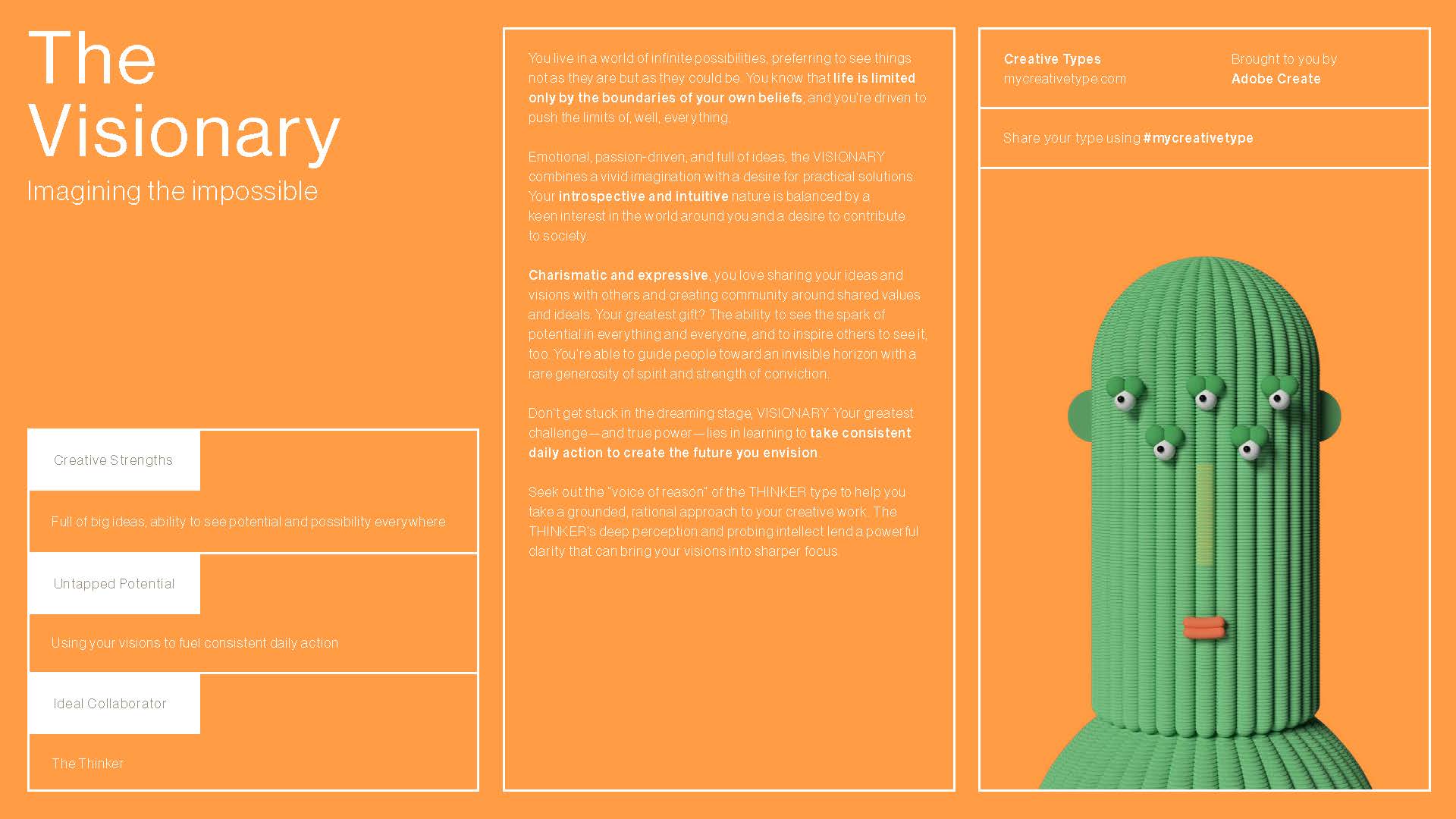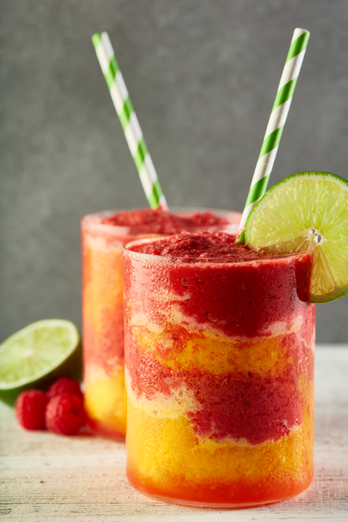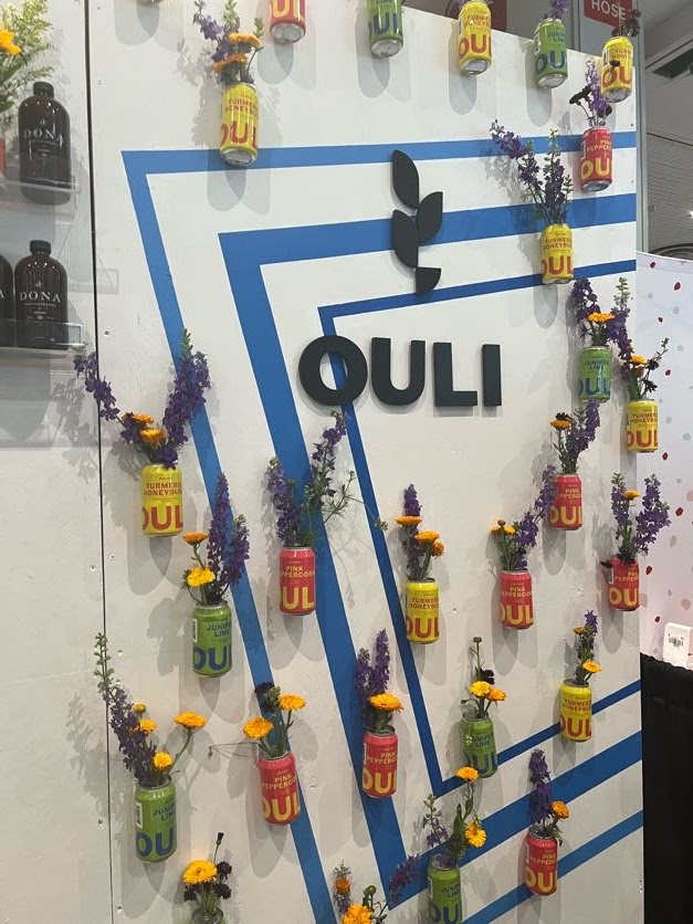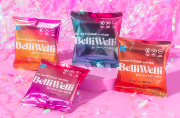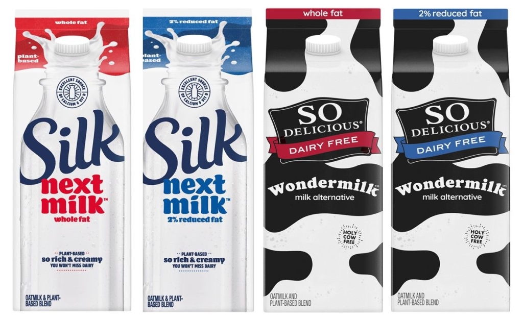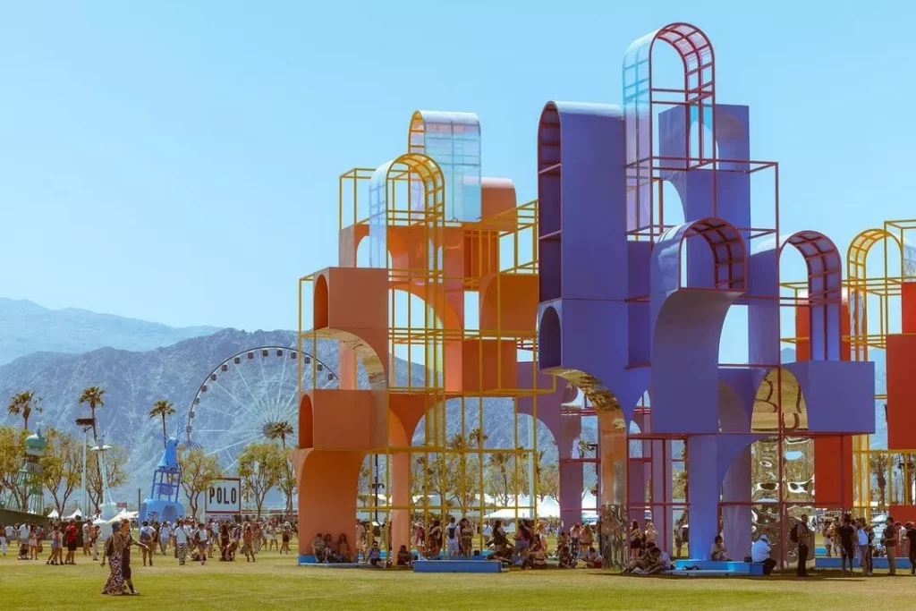
Functional beverages continue to evolve, and a new dual-focus trend has emerged, with drinks that support both cognitive wellness and visible beauty. Consumers are no longer satisfied with single-purpose beverages; they want products that enhance how they feel and how they show up in daily life. Expo West 2026 highlighted this shift, revealing brands that combine wellness benefits, flavor, and lifestyle-focused experiences to redefine what drinkable function can be.
From Single Benefit to Integrated Wellness
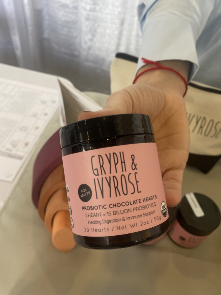
Five years ago, functional beverages were largely defined by a single promise: energy, hydration, immunity, or digestion. Bold ingredients like adaptogens, probiotics, and nootropics dominated.
Today, the category is moving toward integrated wellness. Hydration incorporates broader mineral profiles. Energy is expected to feel balanced and sustainable. Magnesium has emerged as a key ingredient, supporting stress response, recovery, and overall equilibrium.
Consumers also evaluate flavor, design, and experience alongside efficacy. The most successful brands integrate benefits seamlessly, providing a daily ritual that fits naturally into modern lifestyles.
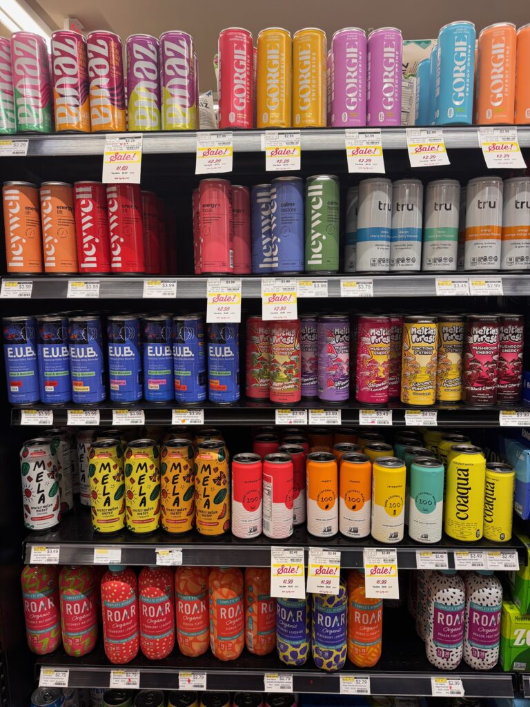
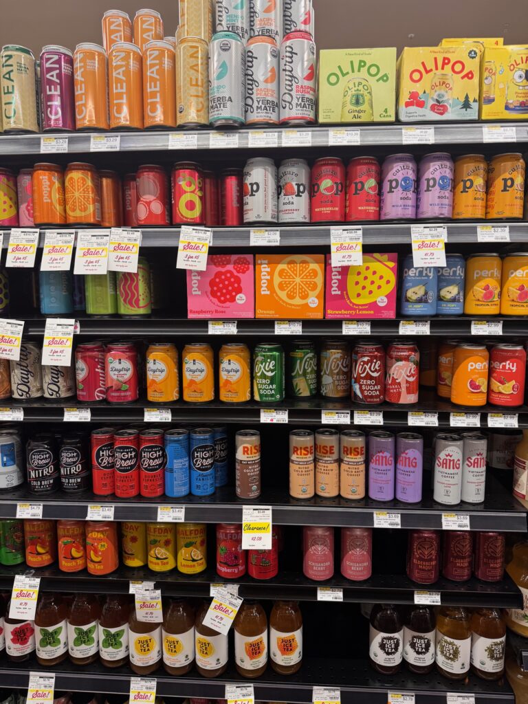
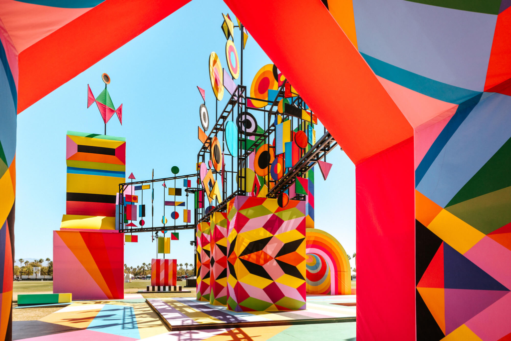
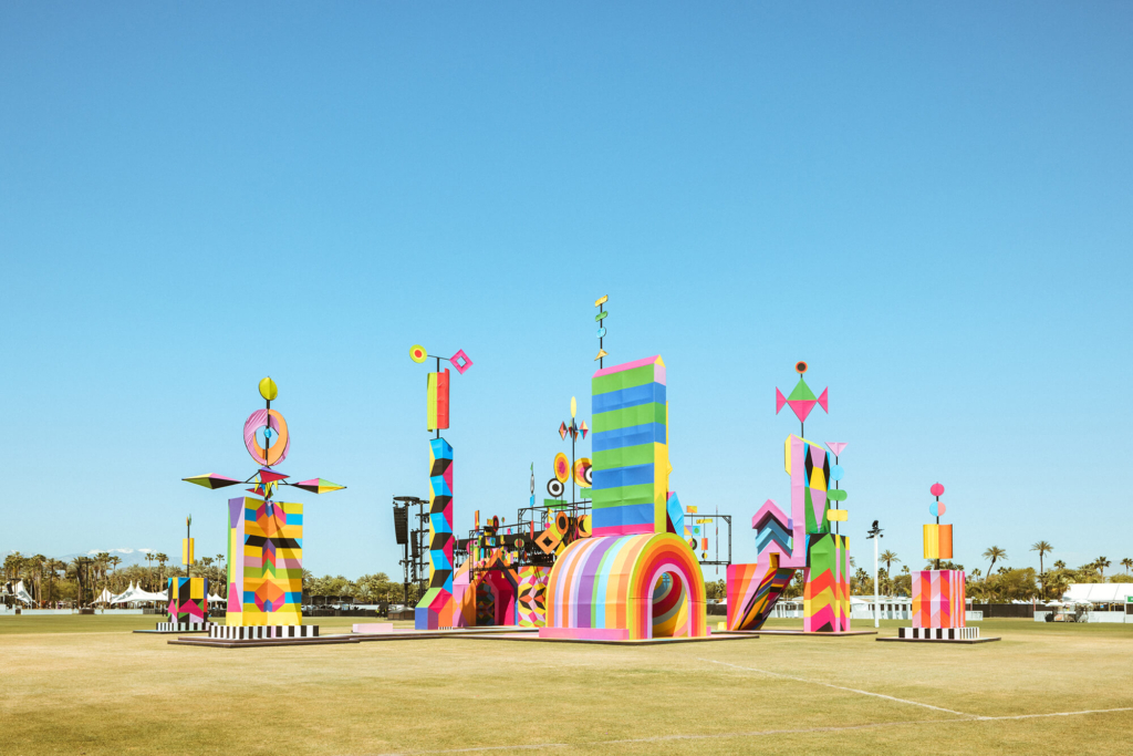
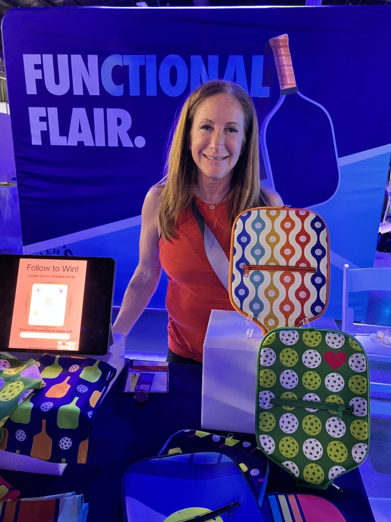
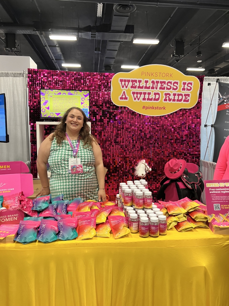
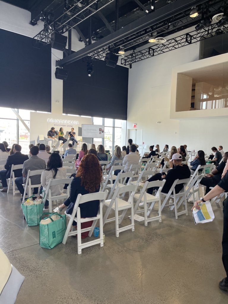
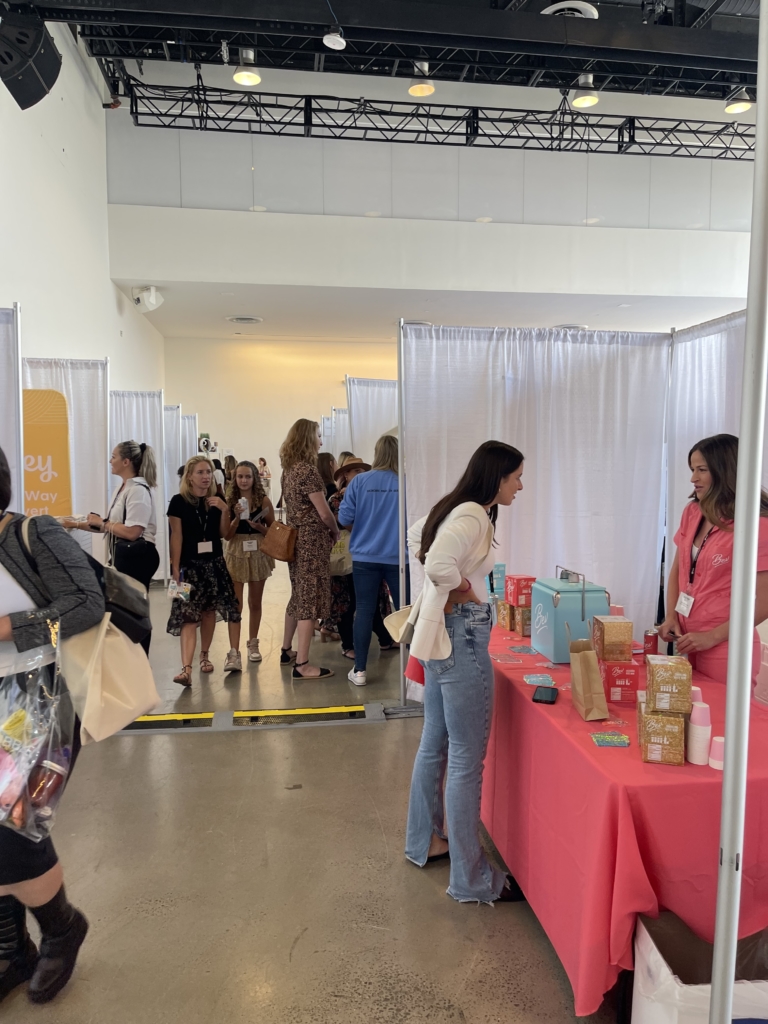
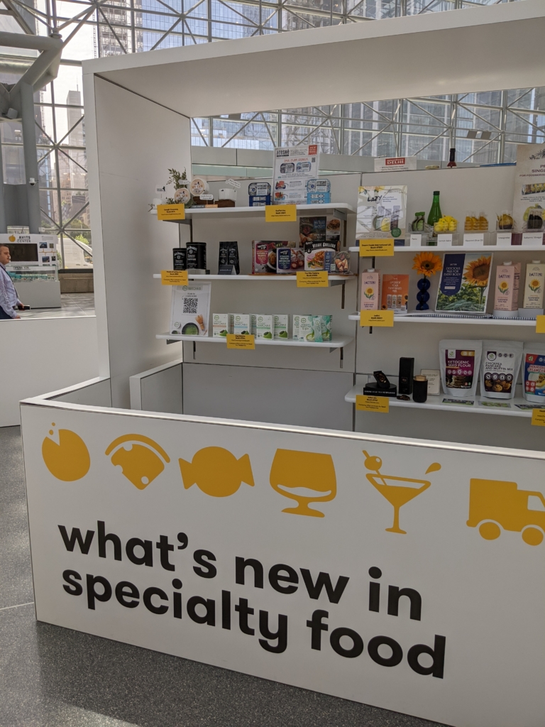
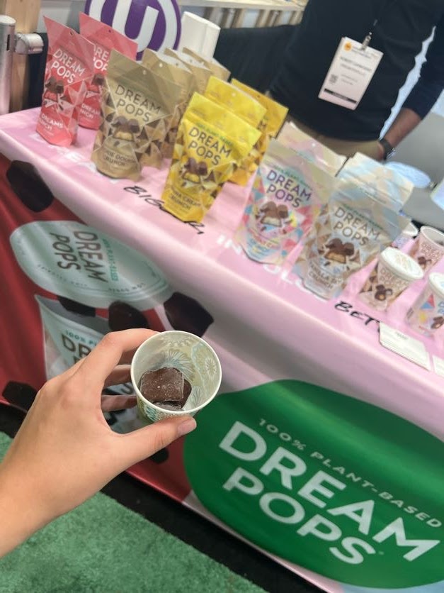
Trends in Action at Expo West
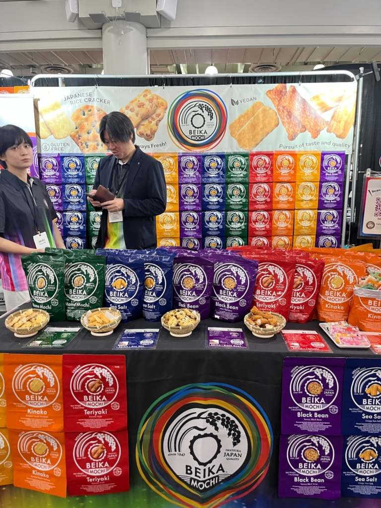
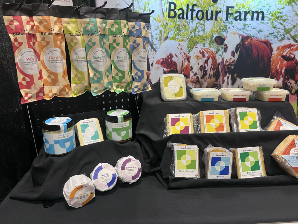
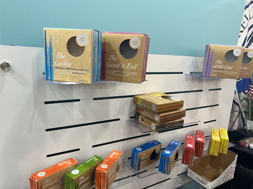
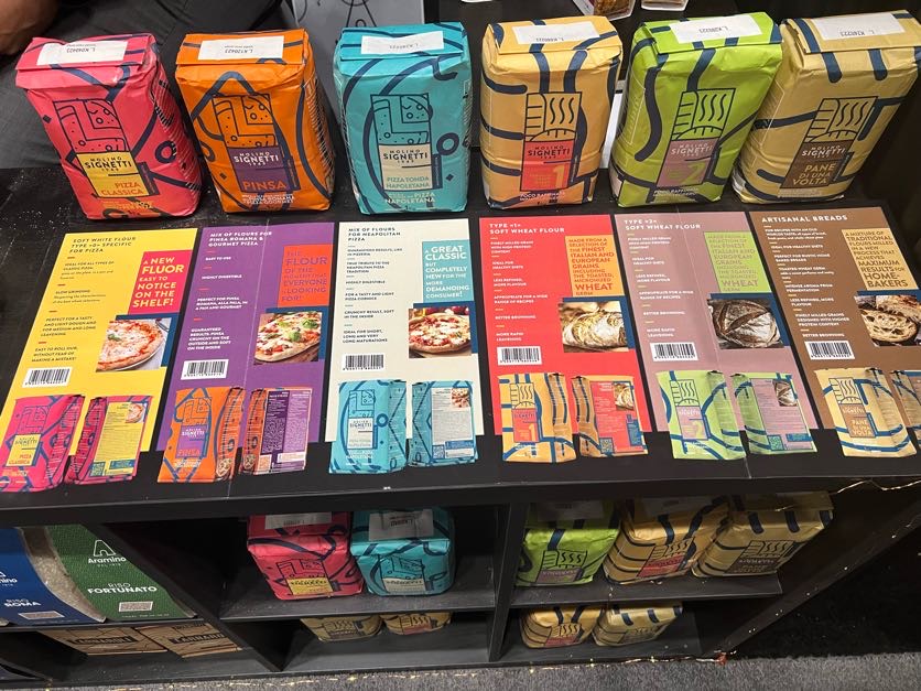
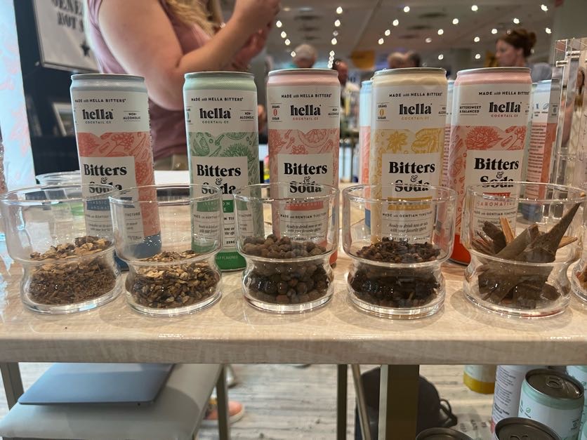
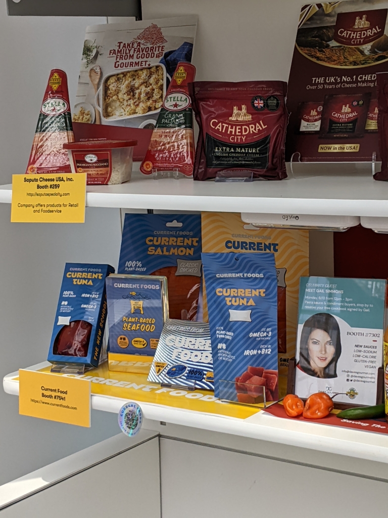
Expo West 2026 made these shifts tangible. Leading brands no longer focus on single ingredients. They combine multiple benefits into cohesive, everyday experiences.
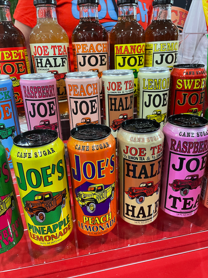
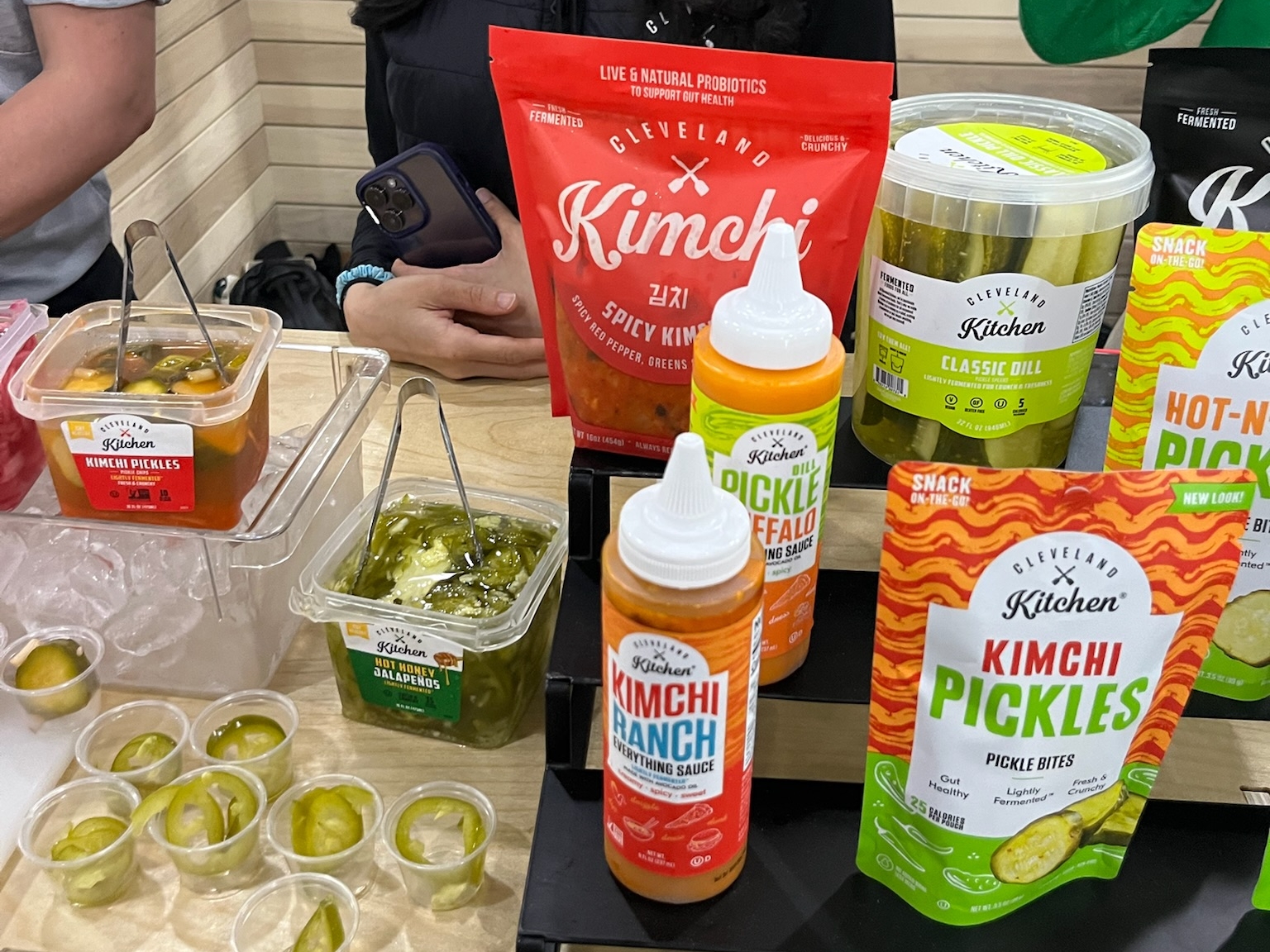
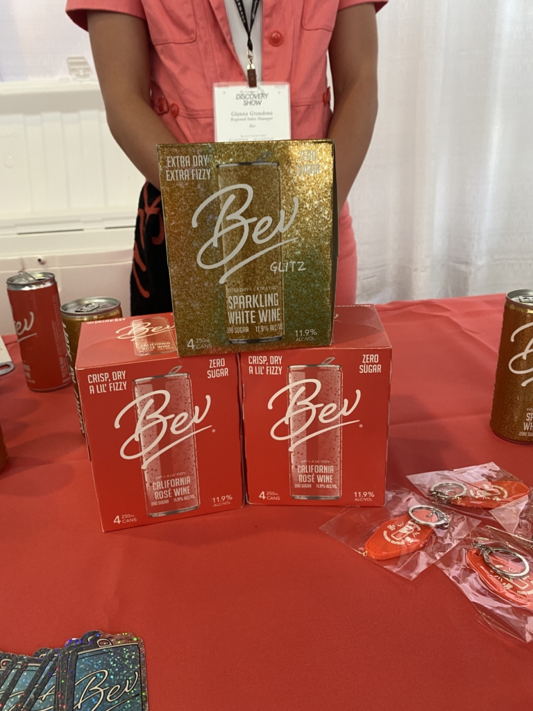
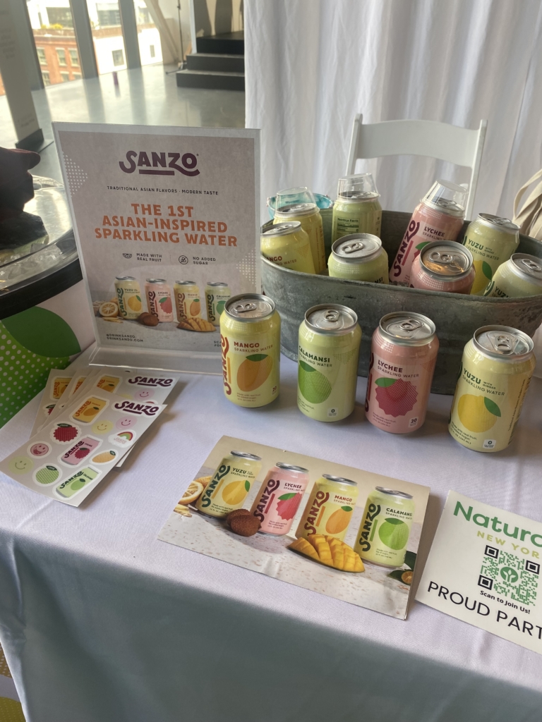
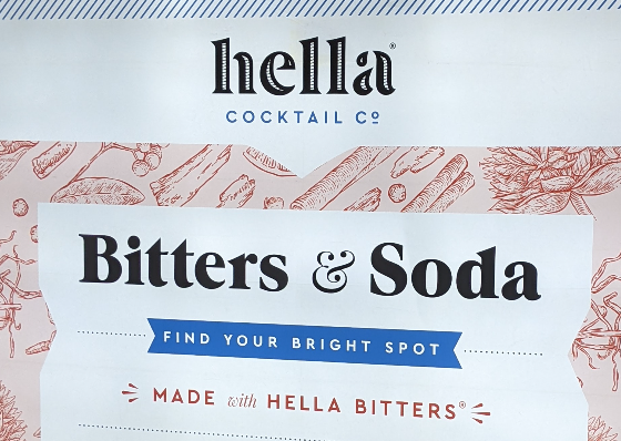
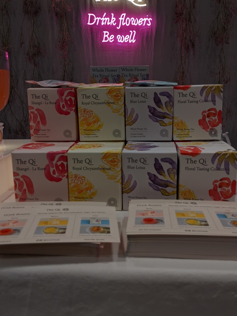
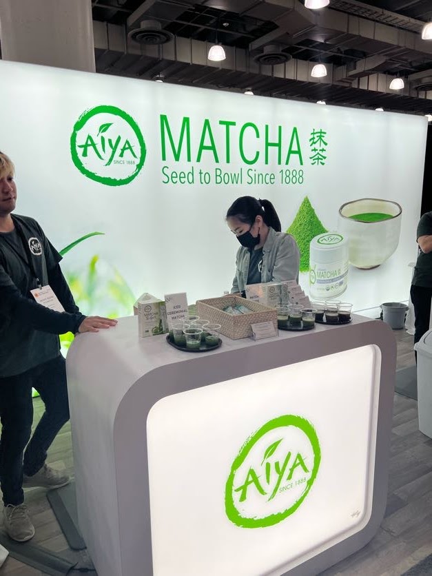
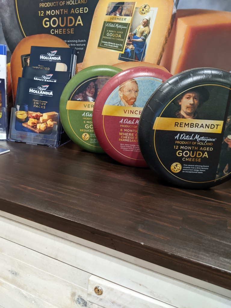
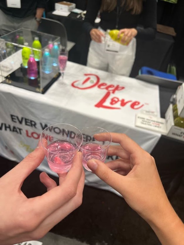
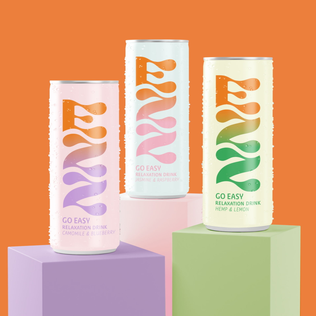
Everyday wellness is evolving. Drinks now blend adaptogens, nootropics, and hydration with lifestyle benefits. Classic formats are being reimagined. Soda-inspired beverages feature functional ingredients and bold, nostalgic flavors. Protein is increasingly incorporated to support satiety and sustained energy. Bright, fruit-forward flavor combinations make functional benefits approachable and enjoyable.
Together, these trends reinforce a key insight: success is no longer defined by one ingredient. It comes from how well benefits, flavor, and experience are integrated.

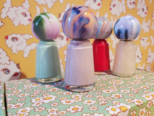
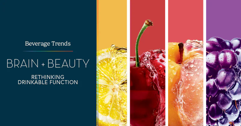
Brain + Beauty: A Defining Shift
A major emerging trend is the convergence of cognitive wellness and beauty. Consumers no longer see these areas separately. Stress affects skin. Hydration impacts both mental clarity and appearance. Recovery, sleep, and overall balance influence how people feel and present themselves.
Magnesium plays a central role in this shift. Traditionally associated with relaxation and muscle function, it now supports calm, recovery, and overall balance. These benefits influence both cognitive clarity and visible well-being. In this way, magnesium bridges brain and beauty, connecting internal wellness with external expression.
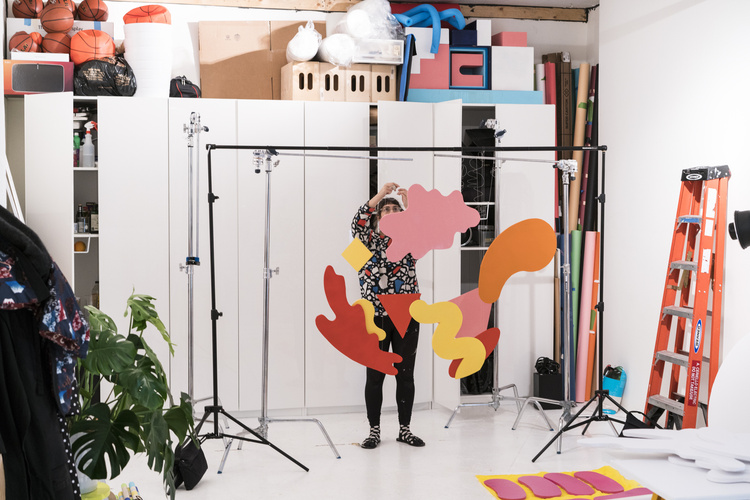
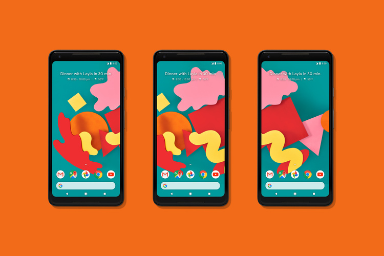
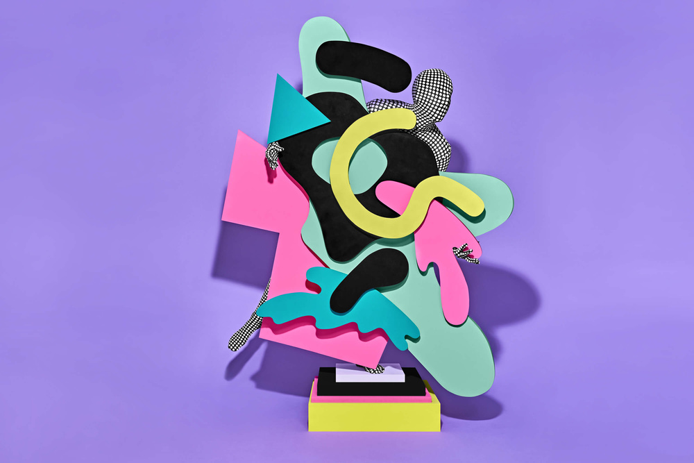
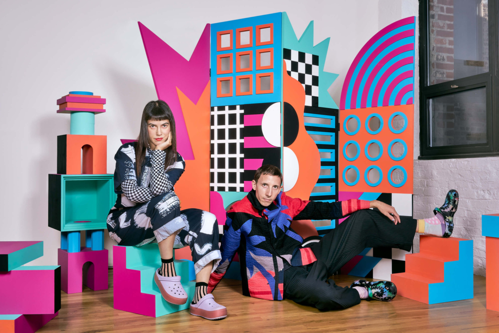
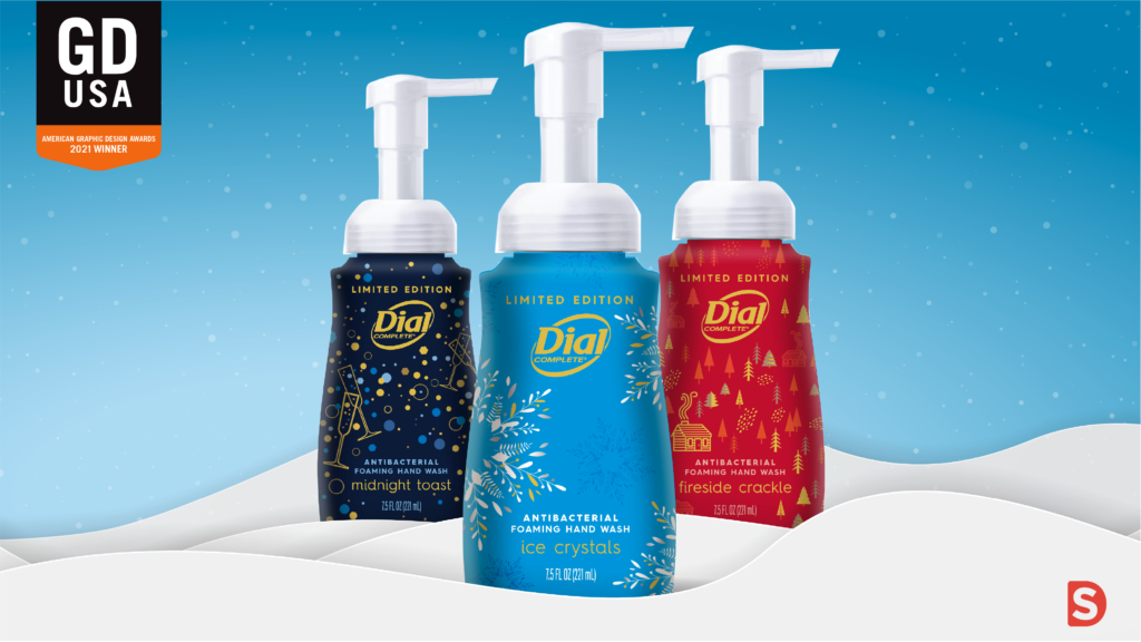
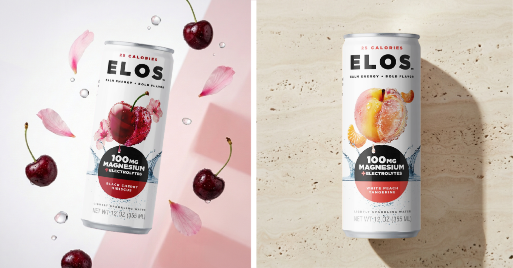
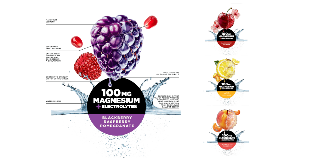
ELOS: Launching at Expo West
At Smith Design, we recently partnered with Accelerated Manufacturing Solutions (AMS) to launch ELOS, a functional sparkling water brand that officially debuted at Expo West 2026. From the beginning, we worked end to end: naming guidance, brand positioning, visual identity, packaging, and comprehensive brand guidelines.
Our process began with a deep dive into the beverage category and broader wellness landscape. We analyzed competitors, consumer motivations, and emerging cultural signals to identify strategic opportunities for differentiation.
Smith Design collaborated closely with AMS to shape every aspect of the brand:
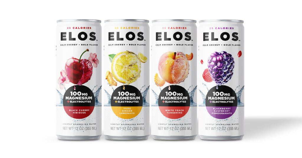
- Naming: We explored potential brand names and strategies, ultimately landing on ELOS, a modern, flexible identity designed to grow with the category
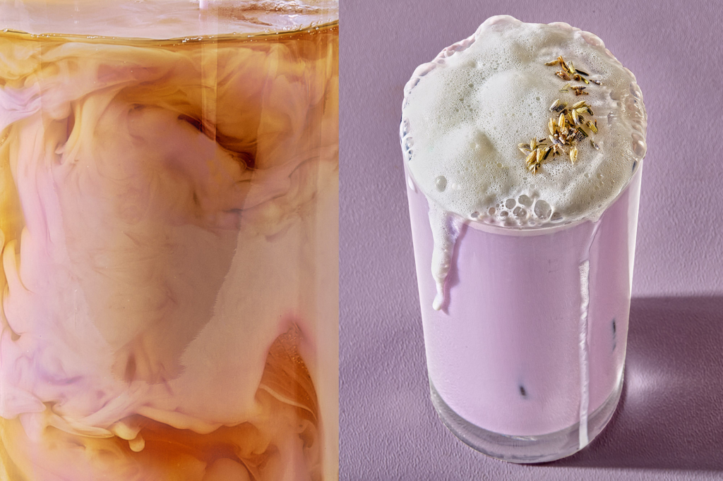
- Brand Positioning: We defined a promise of refreshment paired with everyday wellness benefits, expressed through a bold, rebellious personality. Large hyper-liquified fruit graphics signal energy, edge, and shelf presence
- Visual Identity and Packaging: Design systems communicate premium refreshment while reflecting the playful, bold spirit of ELOS
- Brand Guidelines: Comprehensive guidelines ensure consistency across packaging, marketing, and future product extensions
The initial product delivers a lightly sparkling beverage with magnesium, electrolytes, essential vitamins, and fruit-forward flavor. ELOS is designed as a flexible brand platform capable of evolving with trends, flavors, and consumer expectations.
By combining functionality with flavor, design, and experience, ELOS reflects the future of integrated wellness beverages and the Brain + Beauty movement.
Looking Ahead
Expo West 2026 confirms a clear trajectory for the category: integration is key. Consumers want products that deliver benefits, enjoyment, and balance, seamlessly woven into everyday rituals.
The brands that will lead combine credible wellness claims with strong identity, thoughtful design, memorable flavors, and compelling storytelling. ELOS demonstrates this evolution, pairing wellness, flavor, and personality in a way that feels current, forward-looking, and fully integrated.
For brands and partners, the takeaway is clear. Success comes from building platforms designed to evolve alongside consumers, where integrated wellness, enjoyment, and experience define the next chapter of functional beverages.