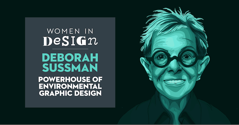
Deborah Sussman was an American designer best known for being the powerhouse of Environmental Graphic Design. She was born in Brooklyn in 1931 and years later began her studies in the arts. Her father was a newspaper artist who gave her some of her earliest lessons in drawing. Sussman took classes at the Art Students League in Manhattan and Bard College where she studied acting and painting. Later she attended Chicago’s Institute of Design where she graduated with a degree in graphic design. She got her first job for Charles and Ray Eames at the age of 22, where she worked on seminal exhibits for IBM. Shortly after, Sussman won a Fulbright Scholarship to study at the Hoschschule für Gestaltang, an art and design school in Ulm, Germany.
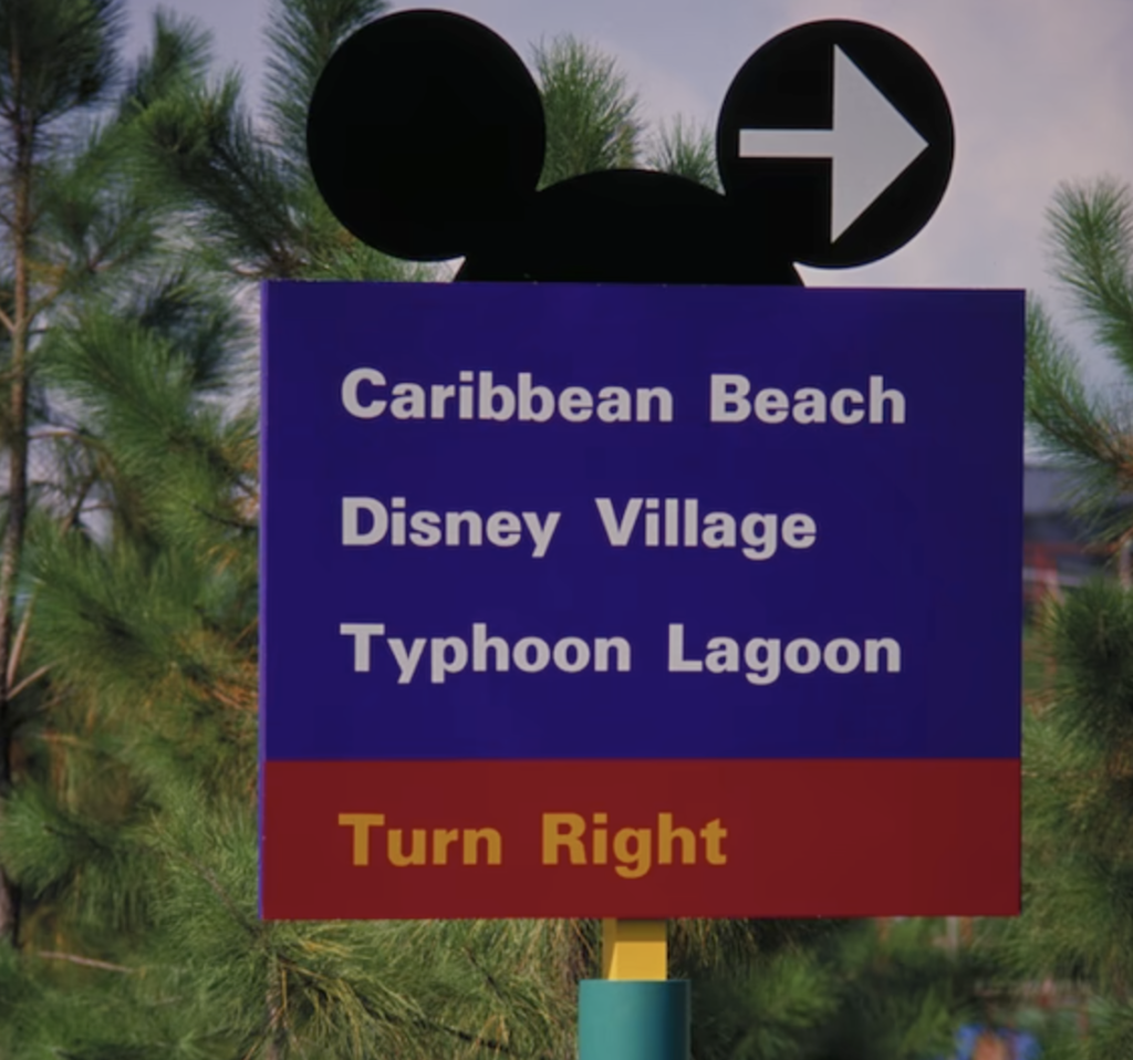
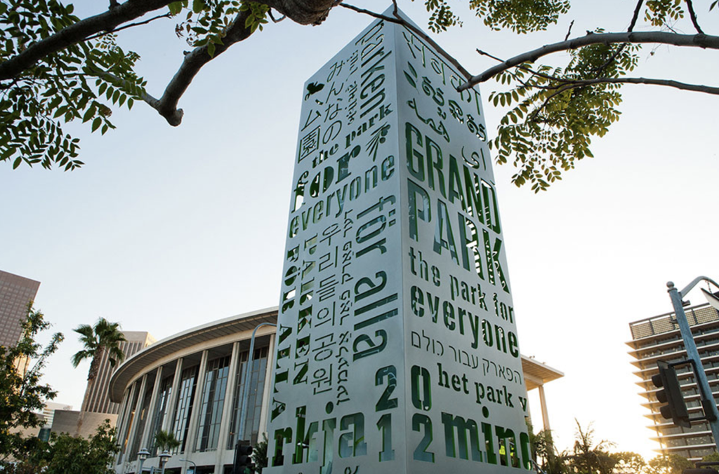
Eventually, Sussman opened her own design practice in 1968 and years later, her husband, Paul Prezja, an urban planner and architect, joined her. Some of their projects included designing wayfinding systems for Walt Disney Resorts and interiors for Hasbro, Inc. She was also the first woman to exhibit in New York’s School of Visual Arts “Master Series” and later won the American Institute of Graphic Arts Medal in 2004. One of the last projects she was involved in was signage for Grand Park, which opened in downtown Los Angeles in 2012. It included 16-foot-high entrance totems that read “the park for all” in 26 languages. Throughout the years, she gained clients and work that included branding and other projects for companies such as Apple, Disney, Samsung, Southern California Gas, as well as projects with numerous museums, entertainment and sports venues.
Sussman was known for creating the environmental graphics of the 1984 Summer Olympics in Los Angeles. Hot graphic colors, iconic geometries and ephemera materials were fused together to transform the city of Los Angeles. Additionally, she designed the wayfinding and identification system including vehicular and pedestrian wayfinding signs, transportation signs, facility identification signs and graphics to direct spectators from the highway to their designated seats. Rather than the typical red, white and blue color pallet that is normally used, she designed with inspiration “channeling the sun-drenched color palette of Los Angeles and the Pacific Rim”.
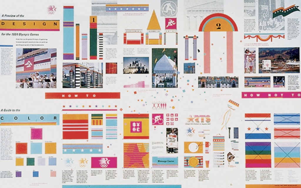
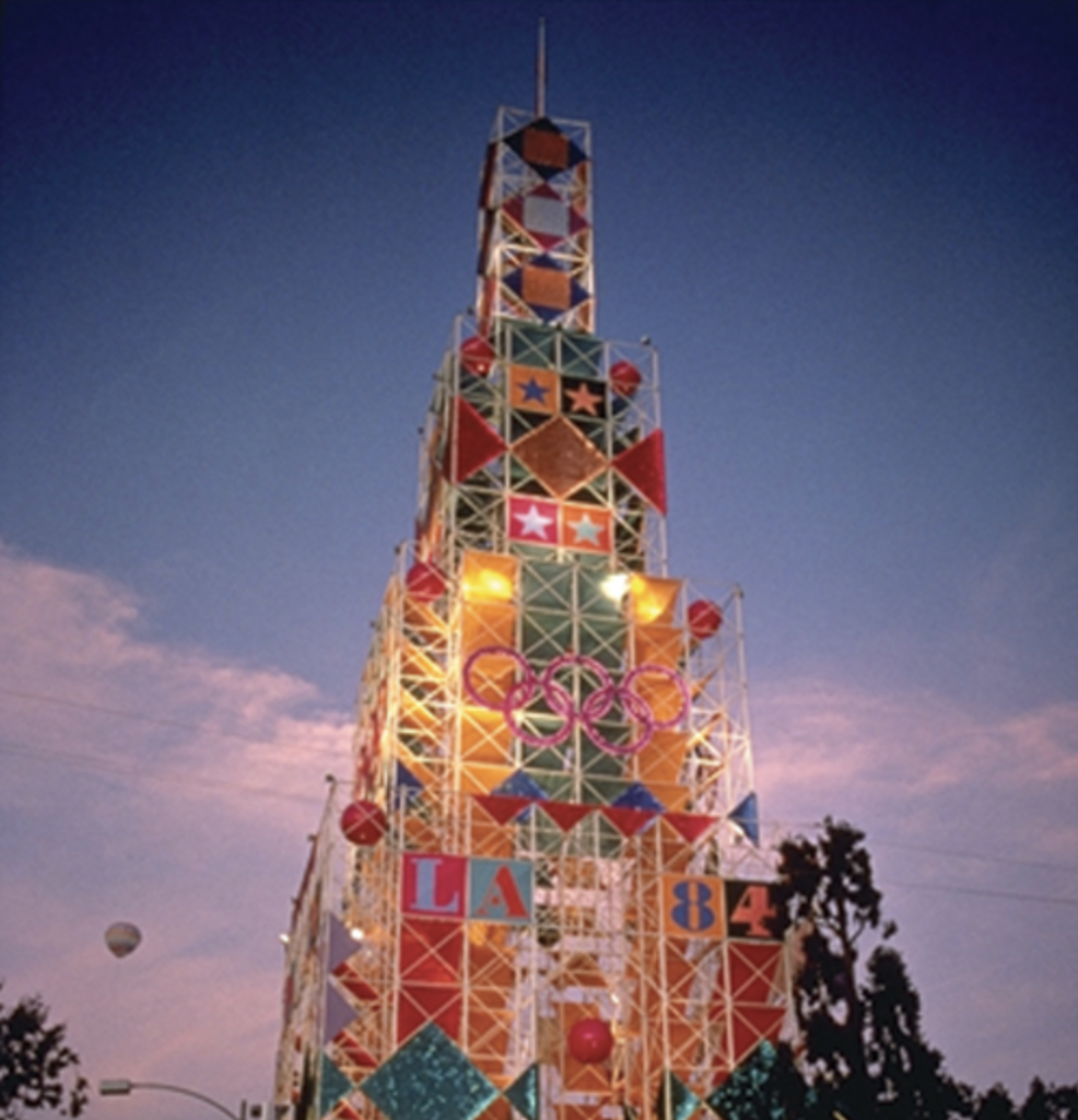
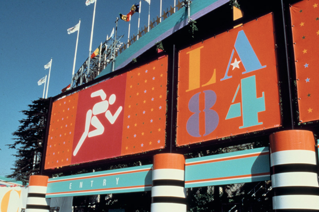
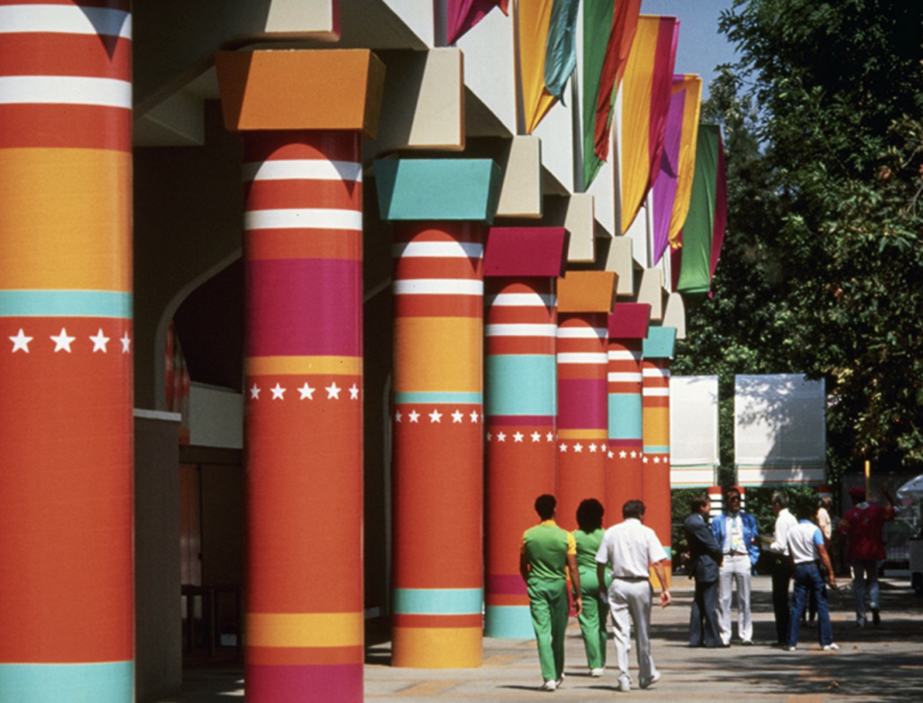
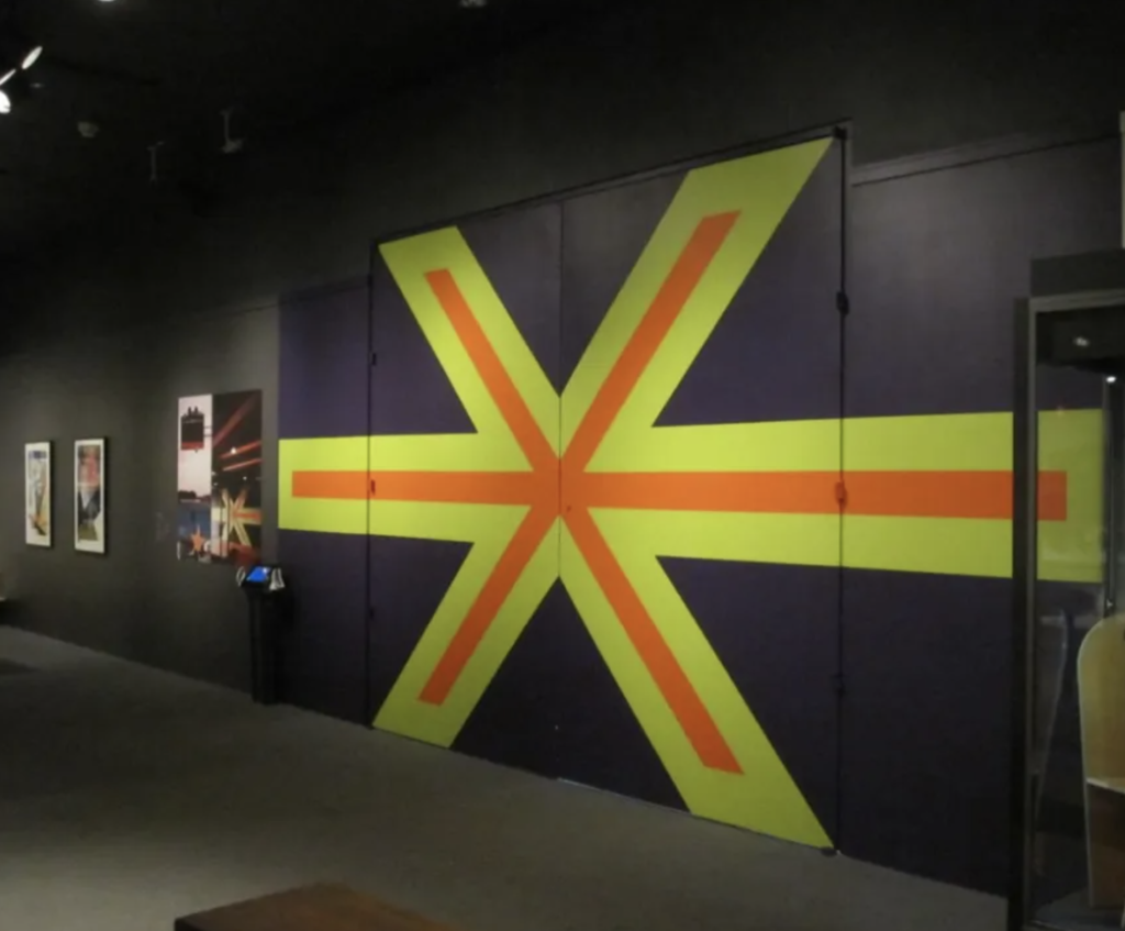
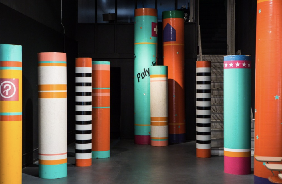
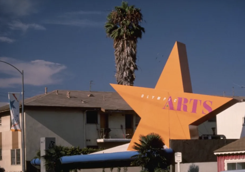
Sussman characterized her work as “supergraphics” being “large-scale, brightly colored designs that shaped the built environment and brought the urban landscape to life often more powerfully than architecture itself”. The idea of supergraphics was not that it was just ‘big’ but that it was ‘bigger’ than the architecture” (Fast Company). One of her supergraphic designs being a giant orange star for the 1984 Olympics Arts Festival in Los Angeles.
While the designer frequently worked in collaboration, she was known to be difficult to work with. She was said to be intense, not always willing to collaborate and could be arrogant in her passion. She explained in an interview with Designboom in 2013 that “Several people have told me over the years ‘just give them what they want’ with regards to clients, and I can’t bring myself to do it, I have to inspire them, and that can sometimes be a very dangerous attitude to have because you can lose yourself a lot of money”(Los Angeles Times). But fellow coworkers stated that she was always worth the trouble of working with because she brought incredible and distinguished designs to life.
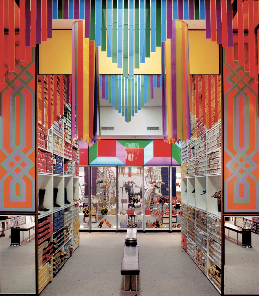
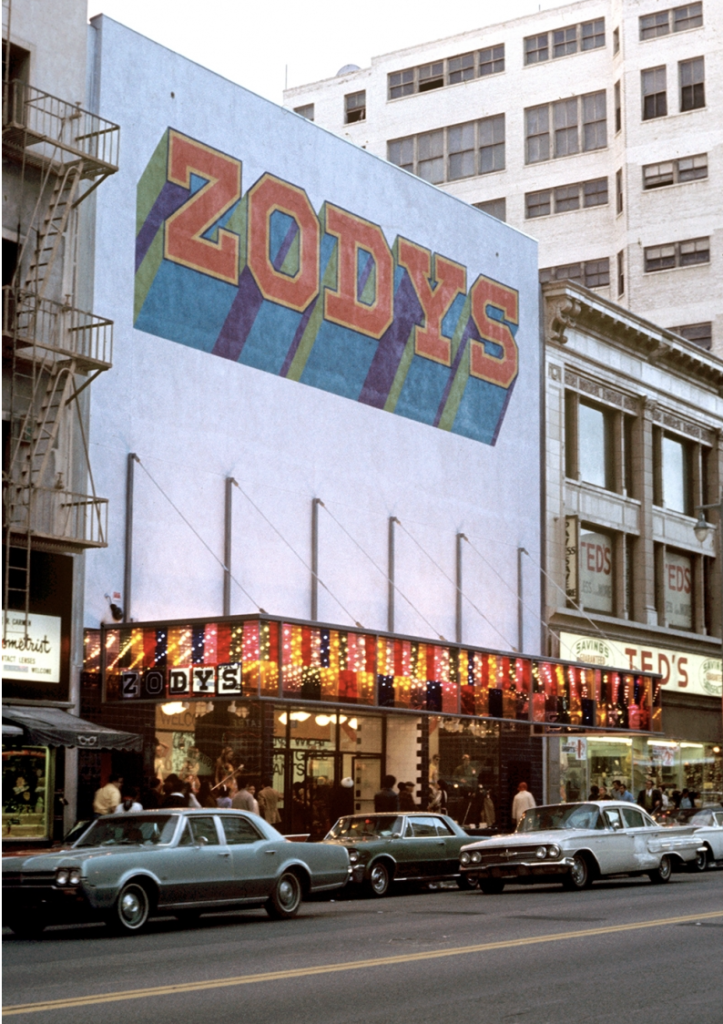
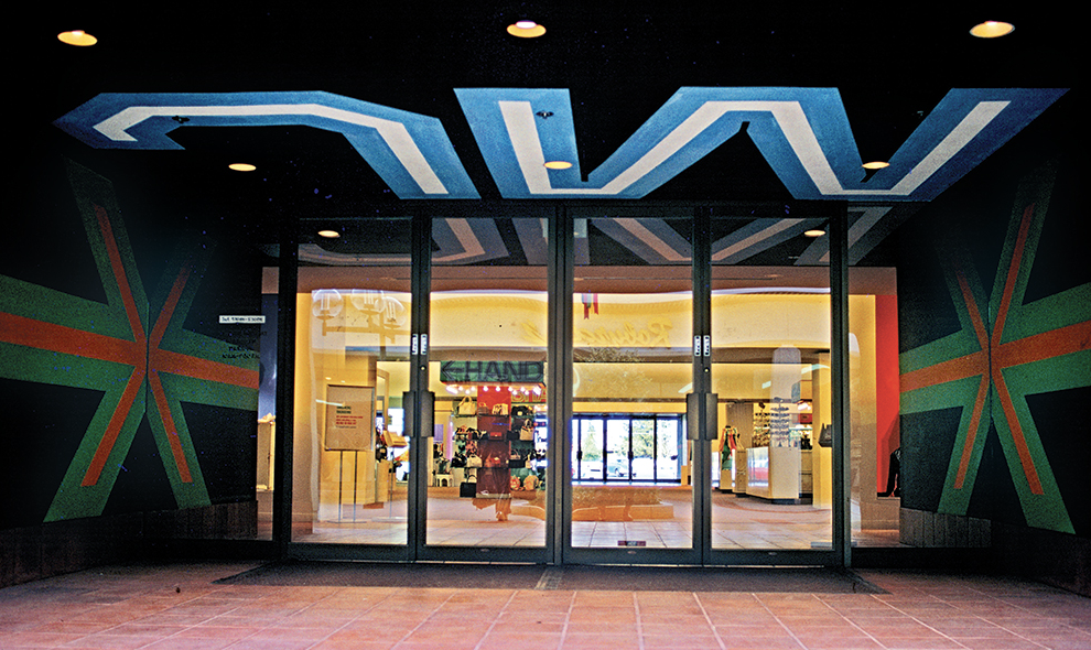
Deborah Sussman unfortunately passed away in 2014 due to Breast Cancer but her memory lives on through her very “large” artwork around the world. Check out some more of the designer’s memorable work below: