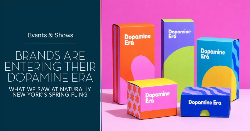
There’s a certain energy that happens when emerging CPG founders, marketers, creatives, and operators all gather in the same room. At the Naturally New York Spring Fling, that energy felt especially clear: the better-for-you space is growing up, and its branding is getting bolder.
The event itself was refreshingly informal. A bright, upbeat room full of founders sharing products, stories, and ideas. And while every brand had a different point of view, one visual trend kept popping up: Dopamine Packaging.
This mood-first branding is bringing joy to shelves (and directly to consumers). “Dopamine Packaging” seems to be one of the defining visual languages of emerging food and beverage brands.
Bright colors. Optimistic typography. High-energy palettes. Packaging designed not just to inform, but to spark emotion instantly. In a crowded category where consumers make split-second decisions, these brands understand something important: people don’t just buy products anymore. They buy brands that they connect with.
In the better-for-you space specifically, we’re seeing a move away from the sterile, overly clinical wellness aesthetic to brands embracing indulgence, personality, humor, nostalgia, and visual stimulation. A few brands that were showcased really embodied that shift.
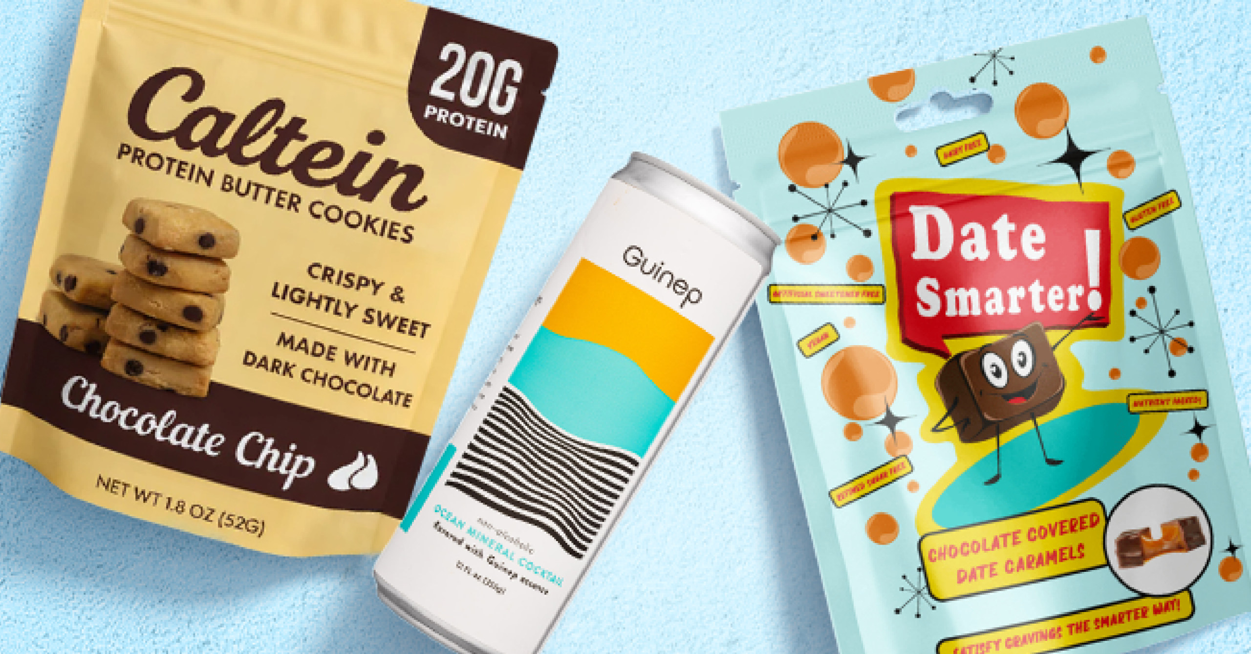
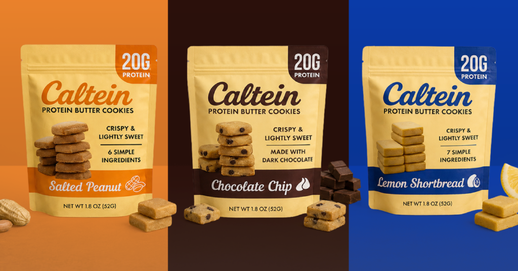
CALTEIN
The protein category has historically leaned heavily into performance-first branding: dark colors, aggressive typography, hyper-masculine visual systems. CALTEIN flips that entirely.
Their butter cookie pouches feel nostalgic, playful, and genuinely appetizing, while still communicating functional benefits like high protein and simple ingredients. The warm color palette and retro-inspired typography create a softer, more emotionally driven entry point into the category. This aligns with a broader shift we’re seeing across wellness brands: consumers increasingly want products that feel joyful, not restrictive.
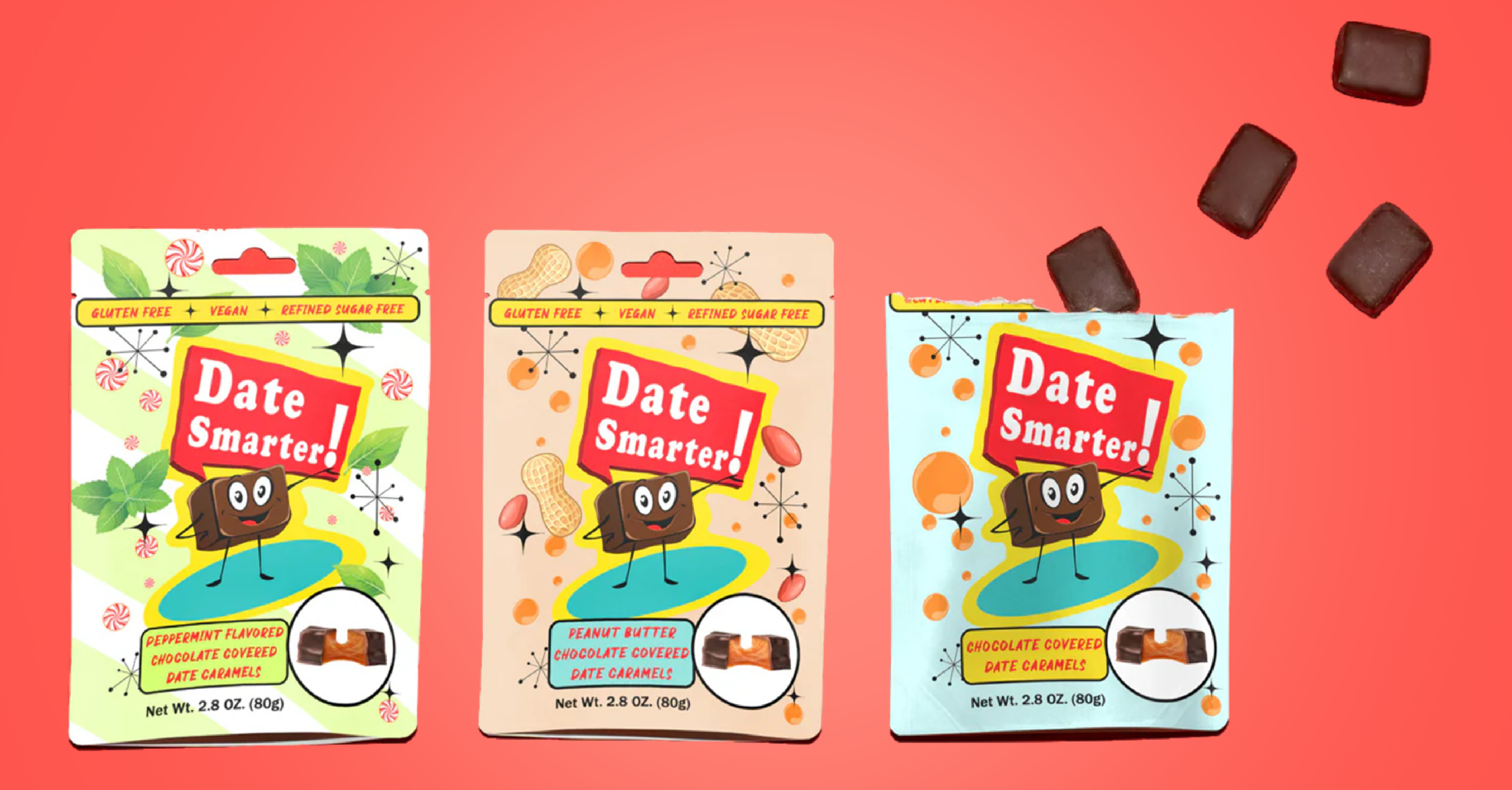
Date Smarter
Date Smarter’s packaging leans into vibrant color, kinda-retro inspired illustration, playful callouts, and personality-driven messaging, all while introducing consumers to a healthier snack built around dates. Packaging like this instantly reframes the experience as fun, craveable, and accessible.
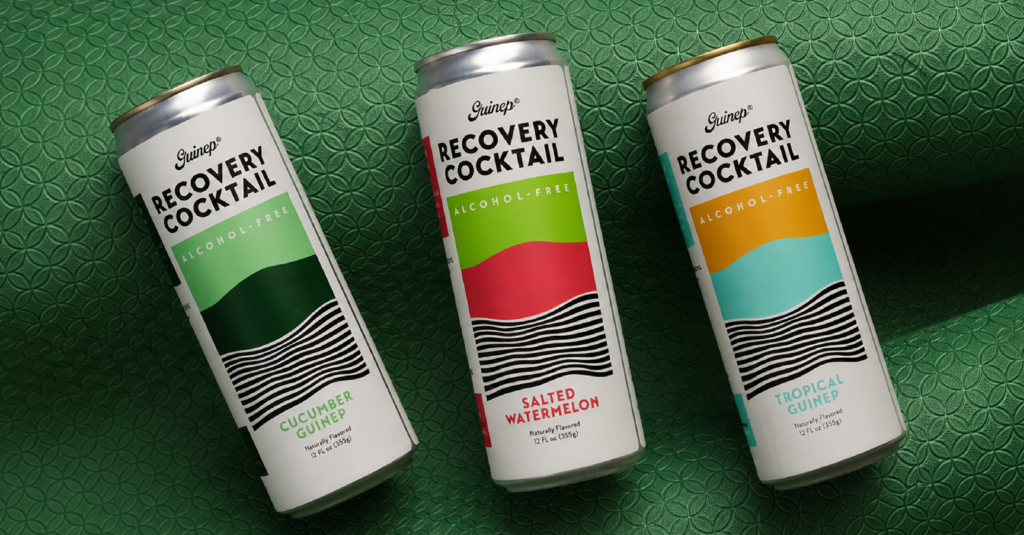
GUINEP
GUINEP took a slightly different approach but still tapped into the same emotional territory through color blocking and bold visual contrast. Their cans feel modern, energetic, and culturally expressive without becoming visually overwhelming.
The best emerging brands today understand that packaging no longer lives only in-store, it lives in TikToks, Instagram Stories, unboxings, and founder content.
Other Brands We’re Watching
The Bigger Takeaway
All these emerging brands recognize that branding is the product experience.
Packaging has become: a growth tool, a trial driver, a social asset, a positioning strategy, and a way to communicate emotion instantly. And especially in the better-for-you space, brands are finally realizing that wellness doesn’t have to look clinical to feel credible.