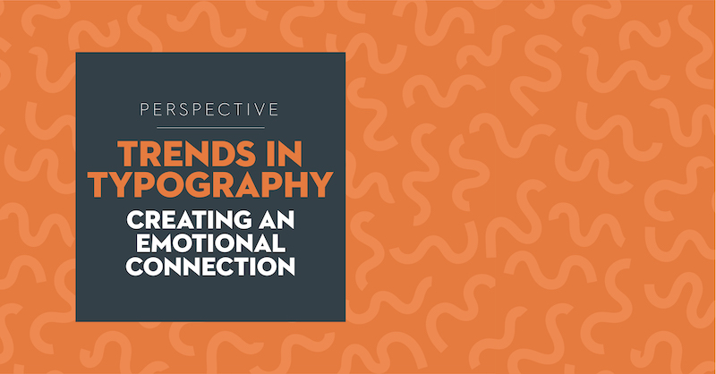
Written By: Melissa Sadowski – Senior Director of Creative
Typefaces are emotive and can create a positive emotional connection between a brand and a consumer. Choosing the right font to communicate your message is like picking out the perfect outfit for an important party. The fonts we are seeing utilized this year are dressed to impress. They are flowing and in motion, fun and cheeky, ownable and sophisticated, and some are also focused on inclusivity and legibility.
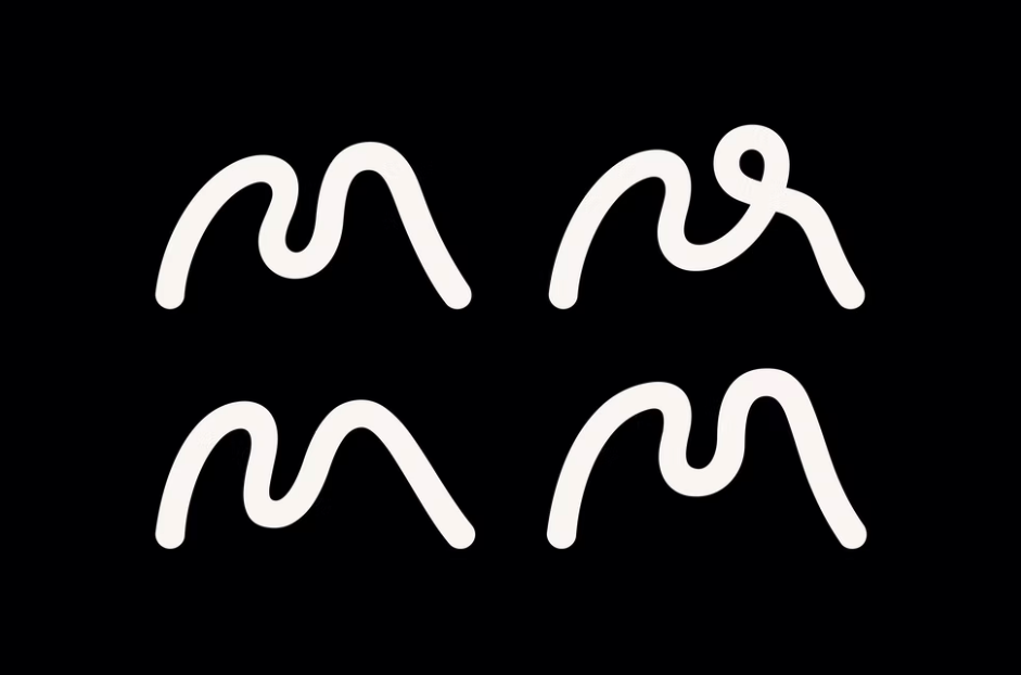
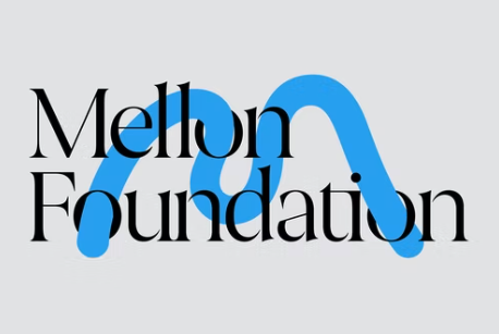
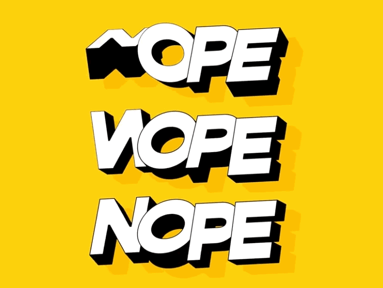
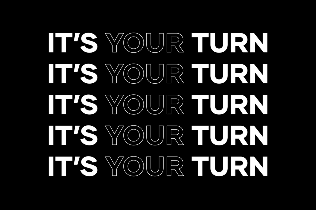
3D Morph Motion: This typography is developed for impact while in motion—where so many brands now play—but also to stand alone in an engaging way. Designers experiment with a key letterform or a whole word animated to create the desired effect. Some typestyles will flow and morph into different fonts entirely, allowing for limitless possibilities.
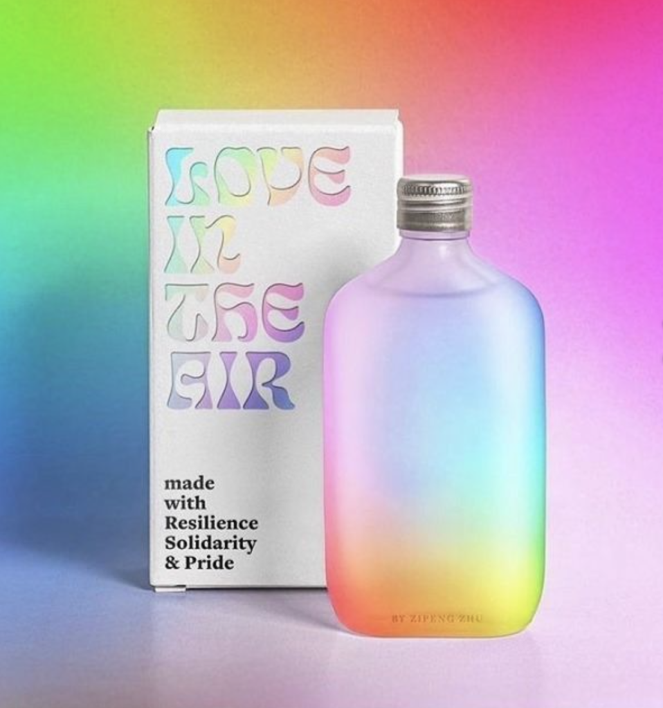
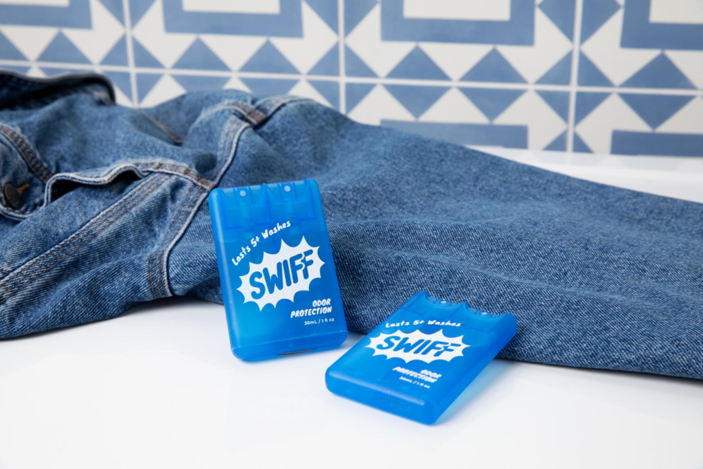
That 70s Font: These throwback fonts remind us of simpler, pre-pandemic times. They are nostalgic, comforting and guaranteed to put a smile on your face. Inspired by 70s typestyles, these designs have a stylish groove in their character.
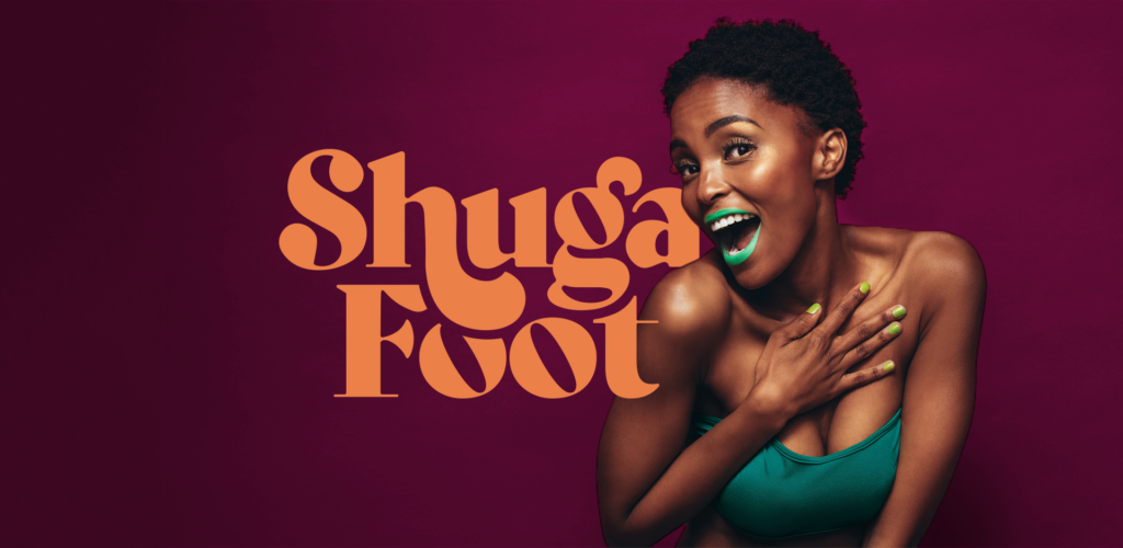
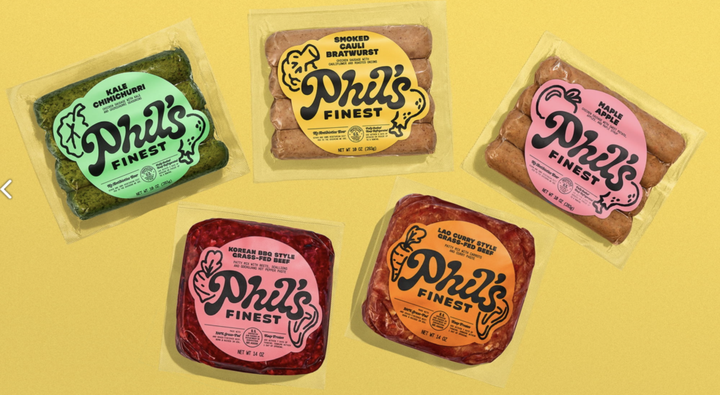
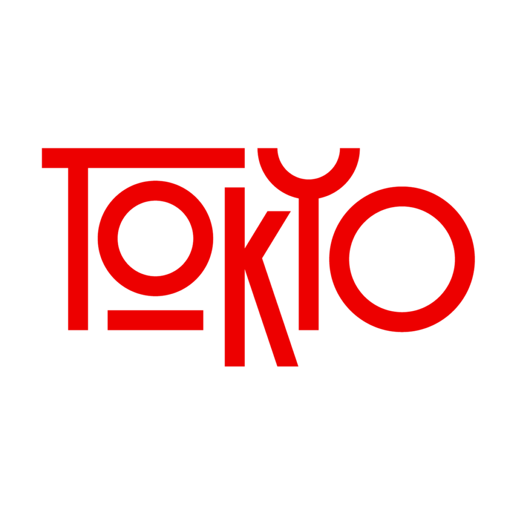
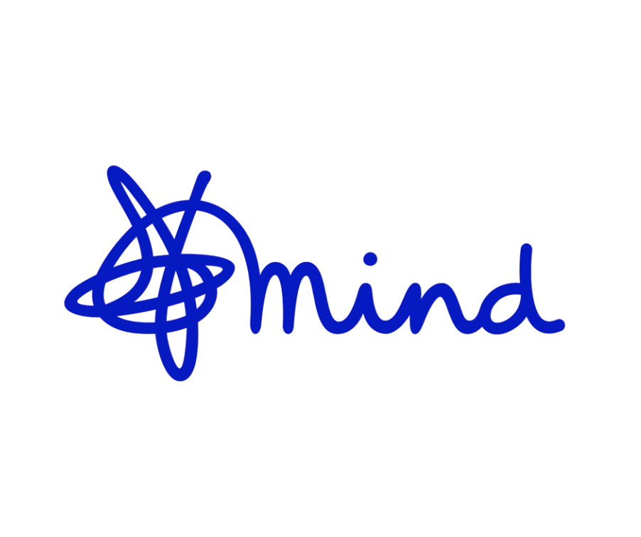
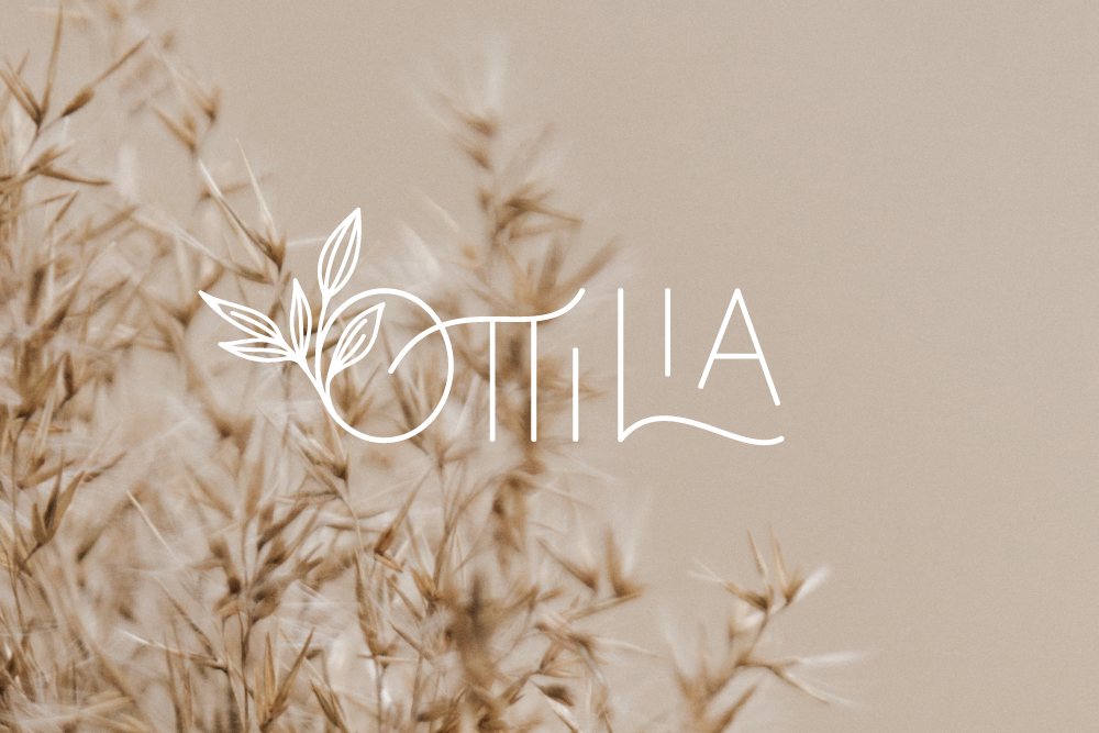
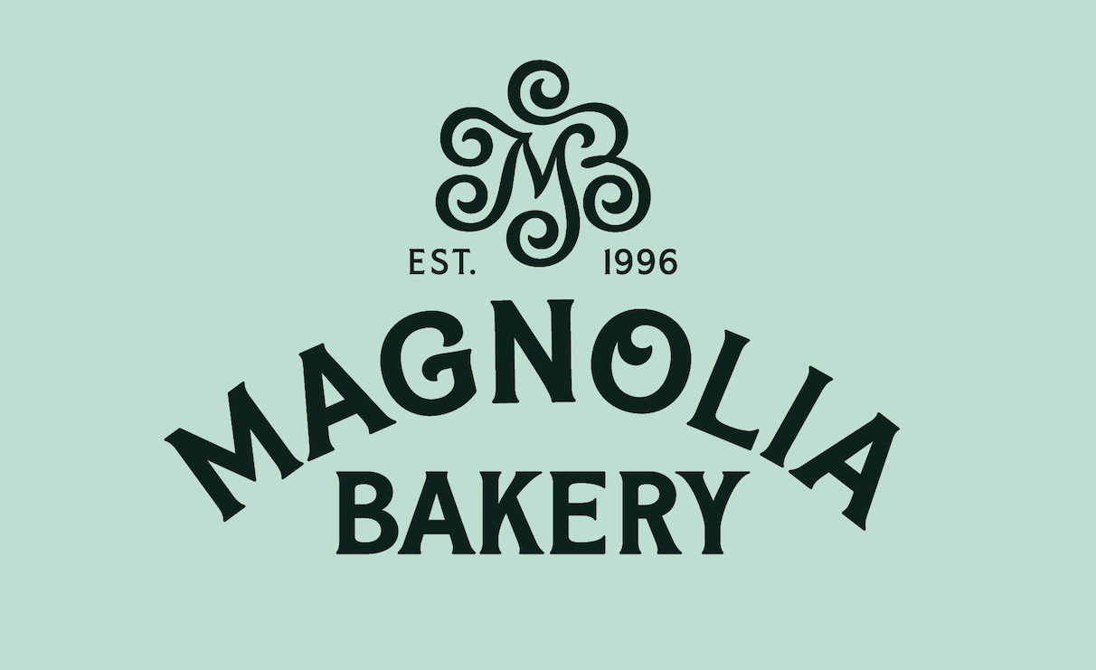
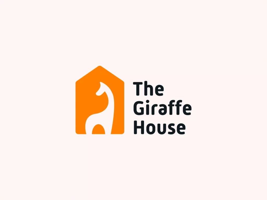
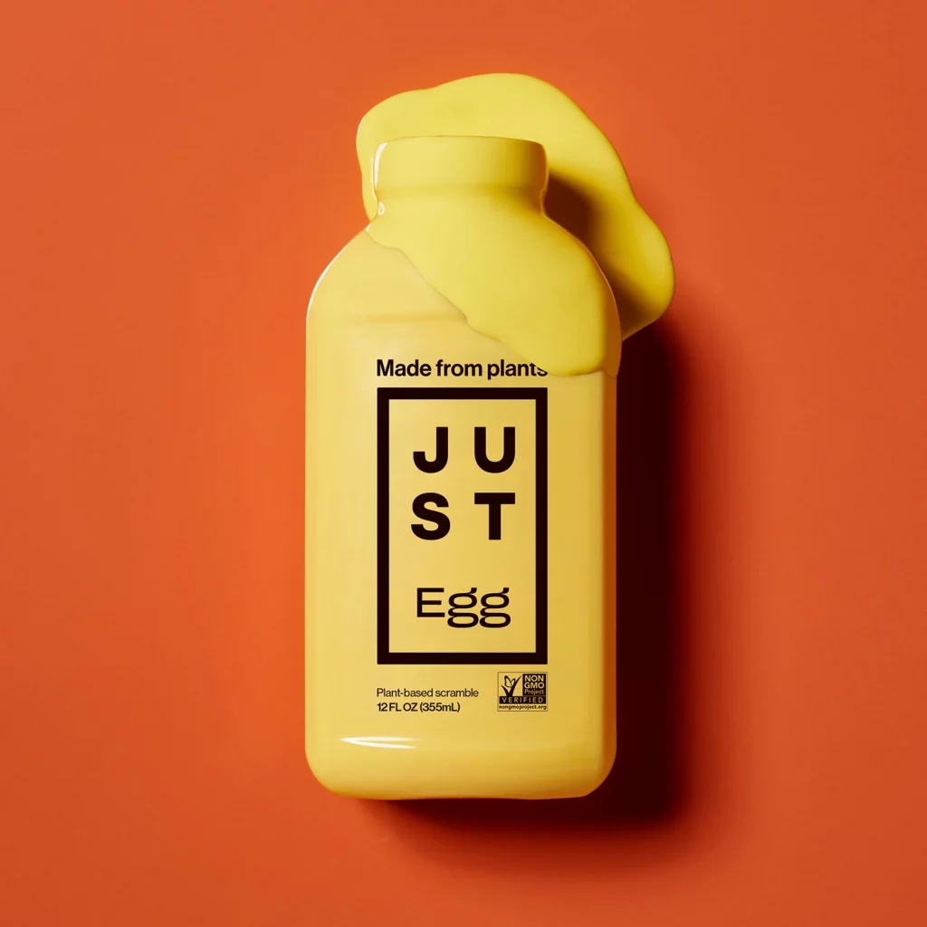
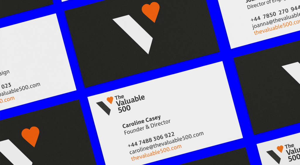
Custom Lettering: More and more companies today desire custom typefaces for their branding so that their identity is uniquely their own. Ownability can be achieved by using custom drawn letters, handwriting, manipulating existing fonts, and/or by adding illustrative elements into the type design. Designers often don’t want to be shackled to the typefaces that they can just type out. However, many font houses do not allow their fonts to be manipulated within the terms of their general licenses. Designers must navigate these waters carefully when customizing lettering by double checking their font licenses or drawing letterforms from scratch.
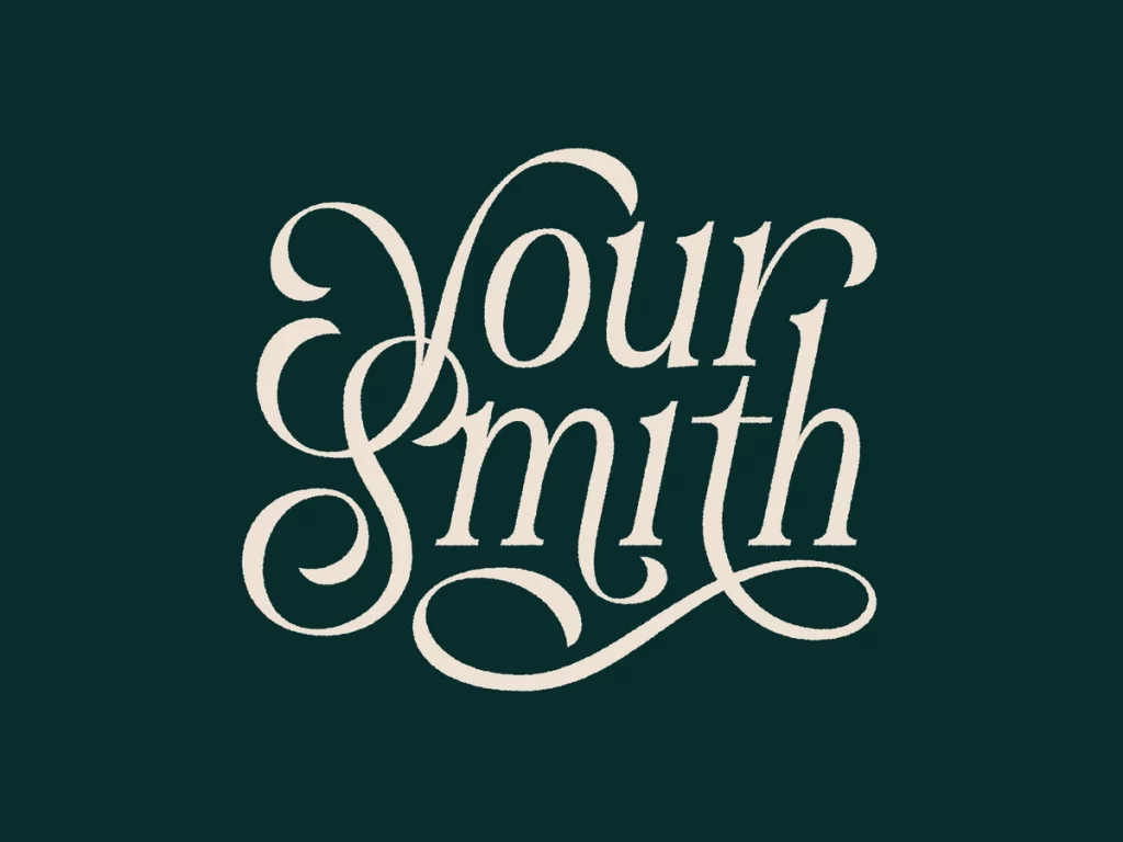

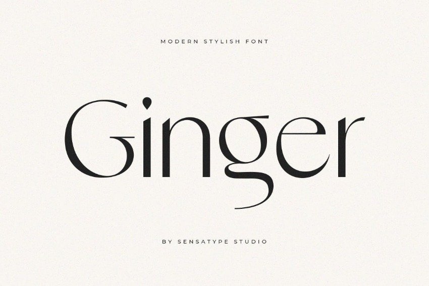
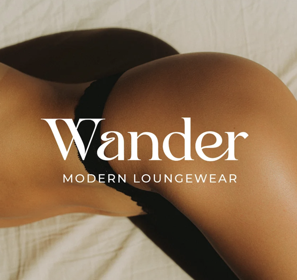
Art Nouveau Flow: These modern fonts have elegant thick and thin strokes and hint at a cursive-like connectivity, without sacrificing legibility. They are a reaction against our overly digitalized world. Useful for communicating luxurious and high quality branding, these typefaces are oozing with sleek sophistication.
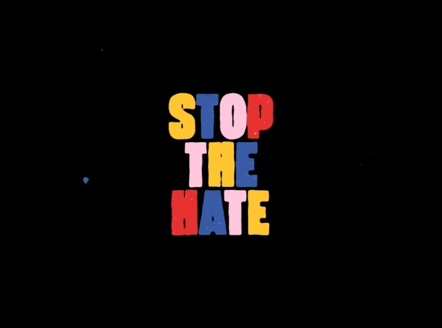
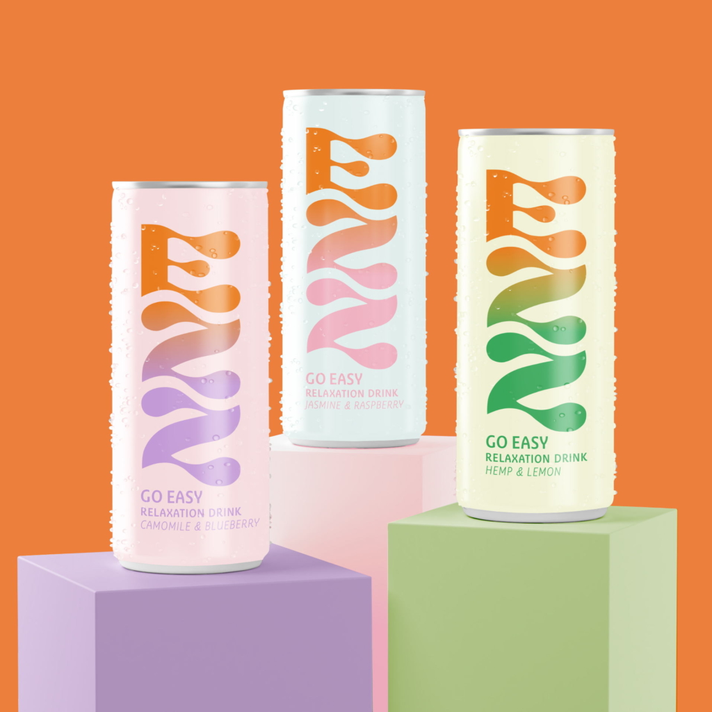
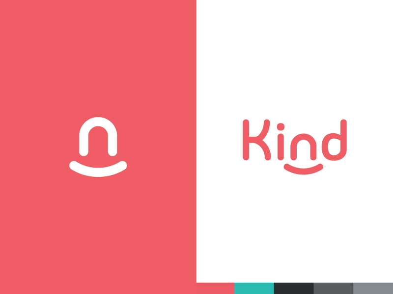
Rounded Edges: These approachable fonts are not just for kids branding anymore. A softened edge to each character delivers honesty and openness to any message. They are friendly and joyful in their expression.
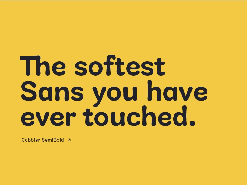
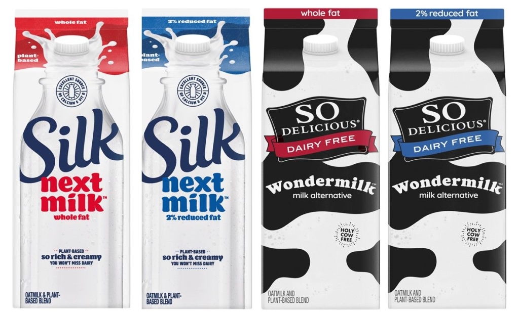

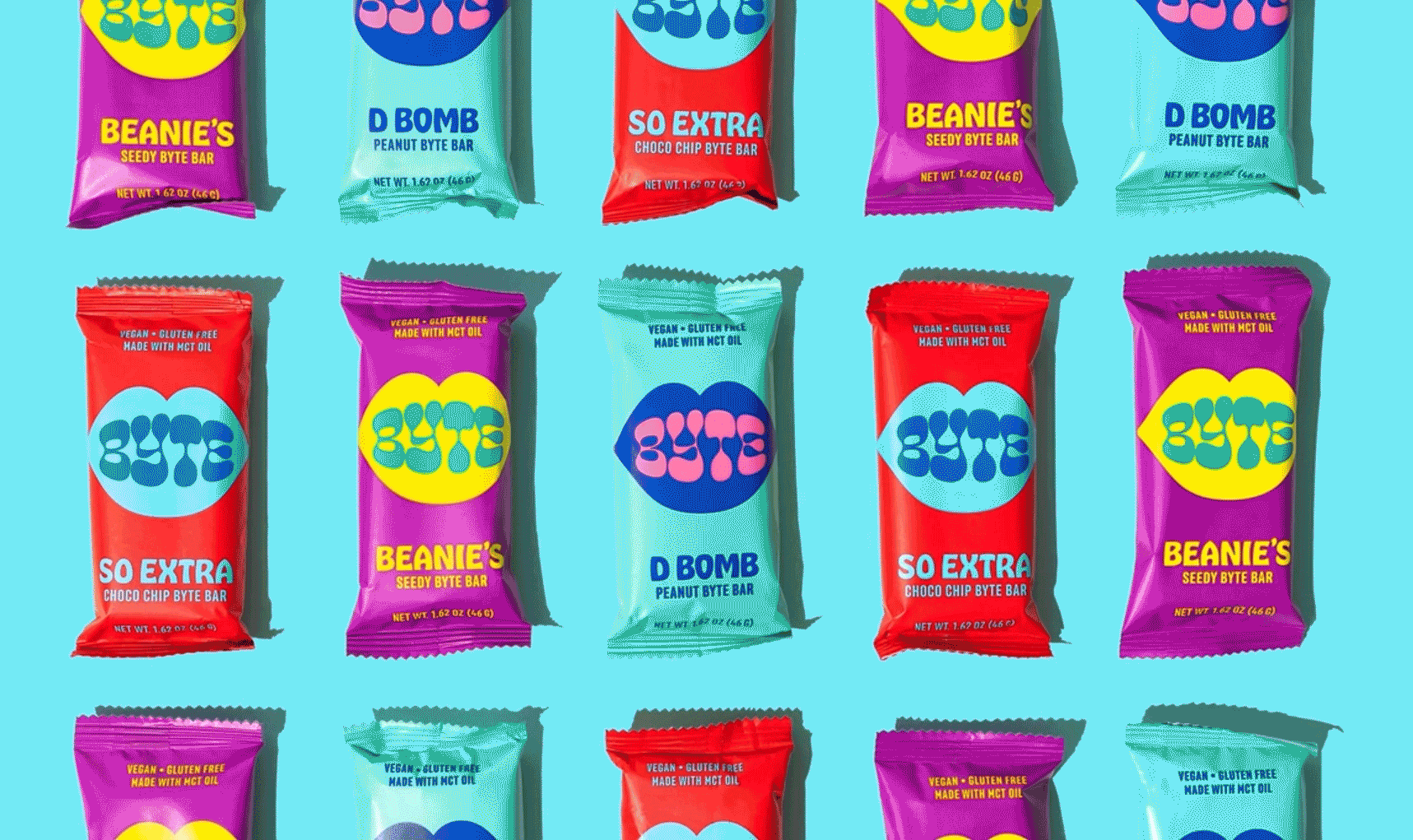
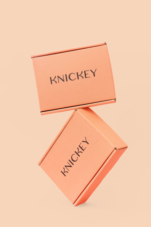
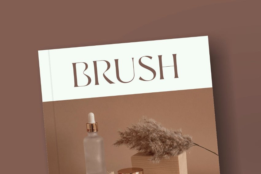
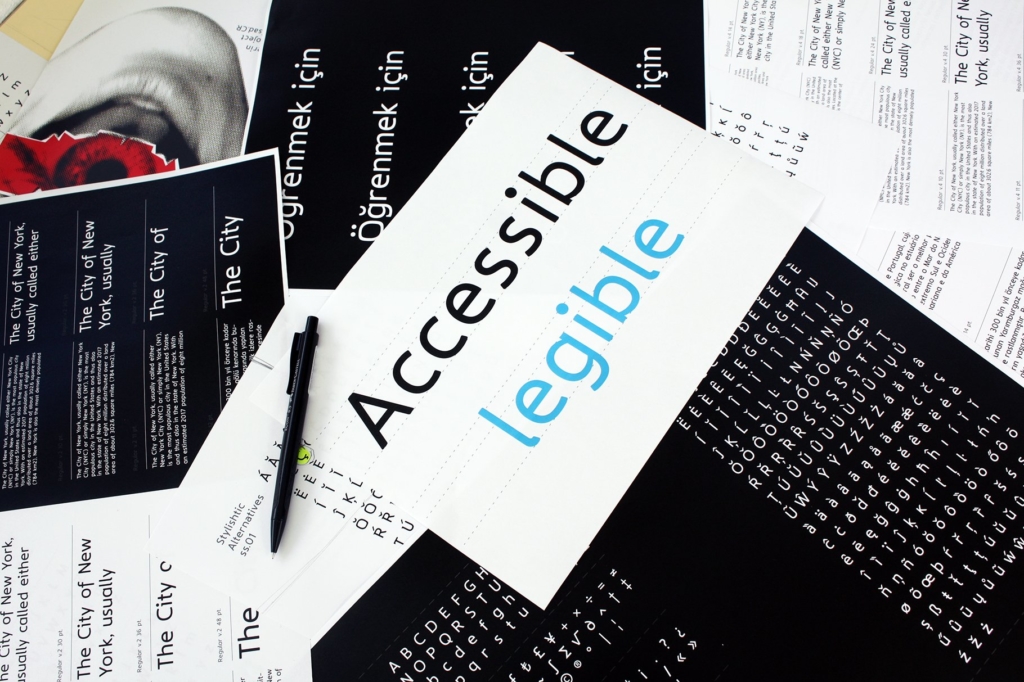
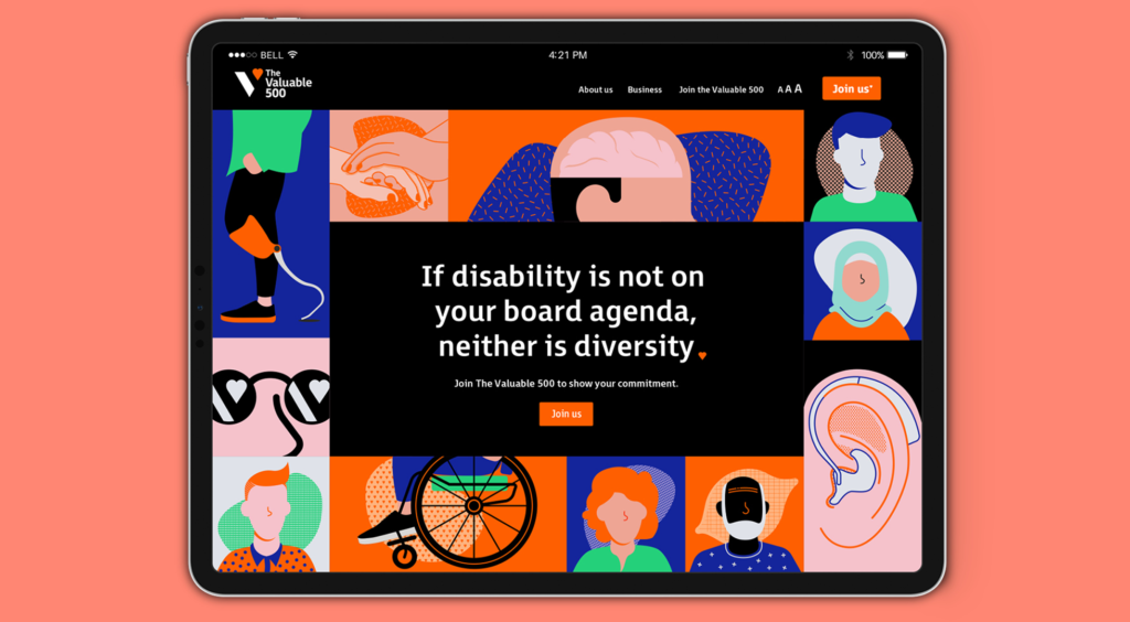
Inclusive to All: This trend toward increased legibility is here to stay. We have a diverse and aging population in the U.S., and with that comes a priority on accessibility in branding and messaging, both online and in store. These fonts are simple and bold, typically sans serif, and most importantly, easy to read.
Typestyles and trends are ever-evolving. The amount of fonts designers have to choose from these days is staggering. These trends in typography are just the starting point for designing this year’s best-dressed brand.