Magic Bullet and Nutribullet:
Innovation and Differentiation
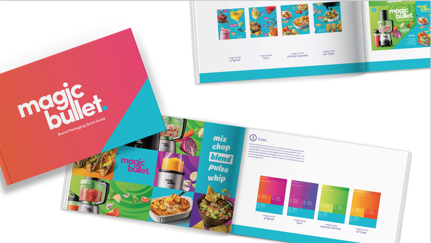
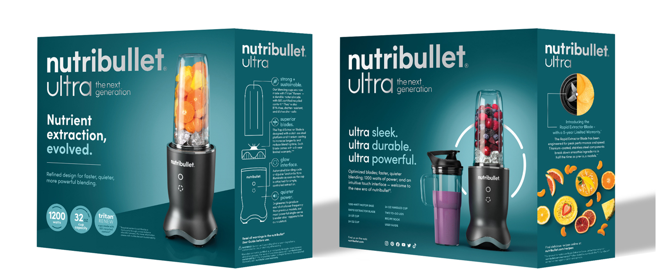
PACKAGE DESIGN | BRAND IDENTITY DESIGN | PHOTOGRAPHY | FOOD STYLING
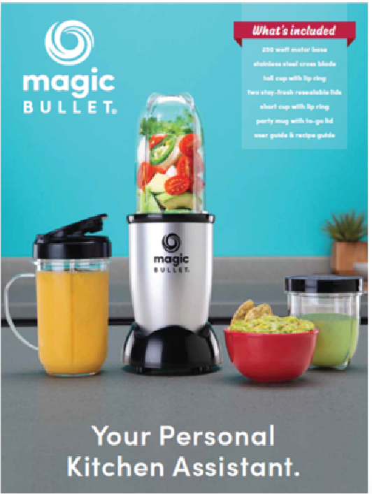
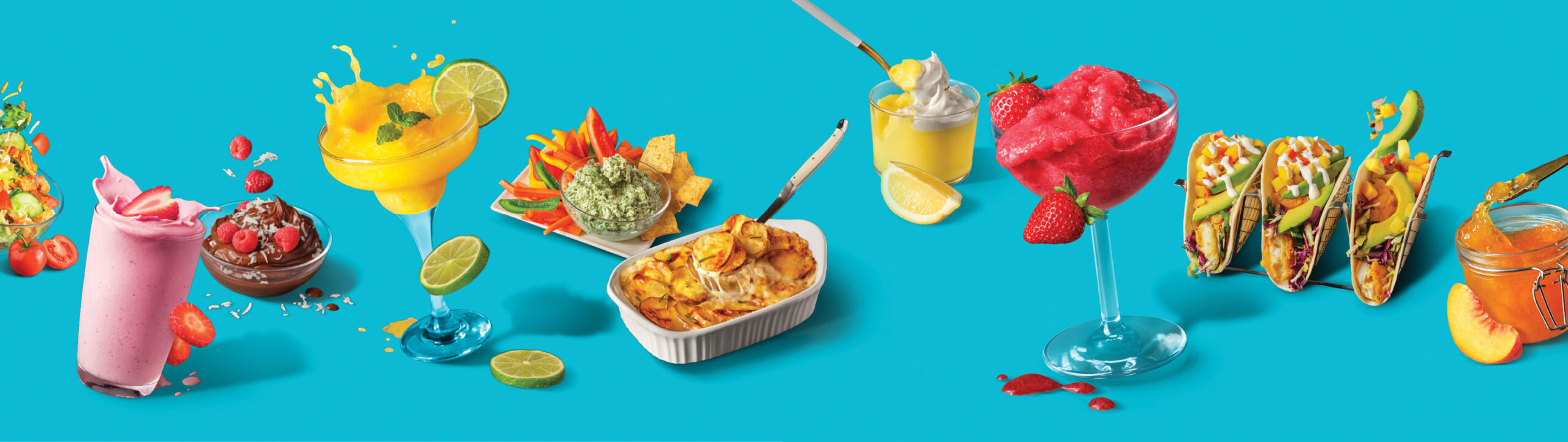
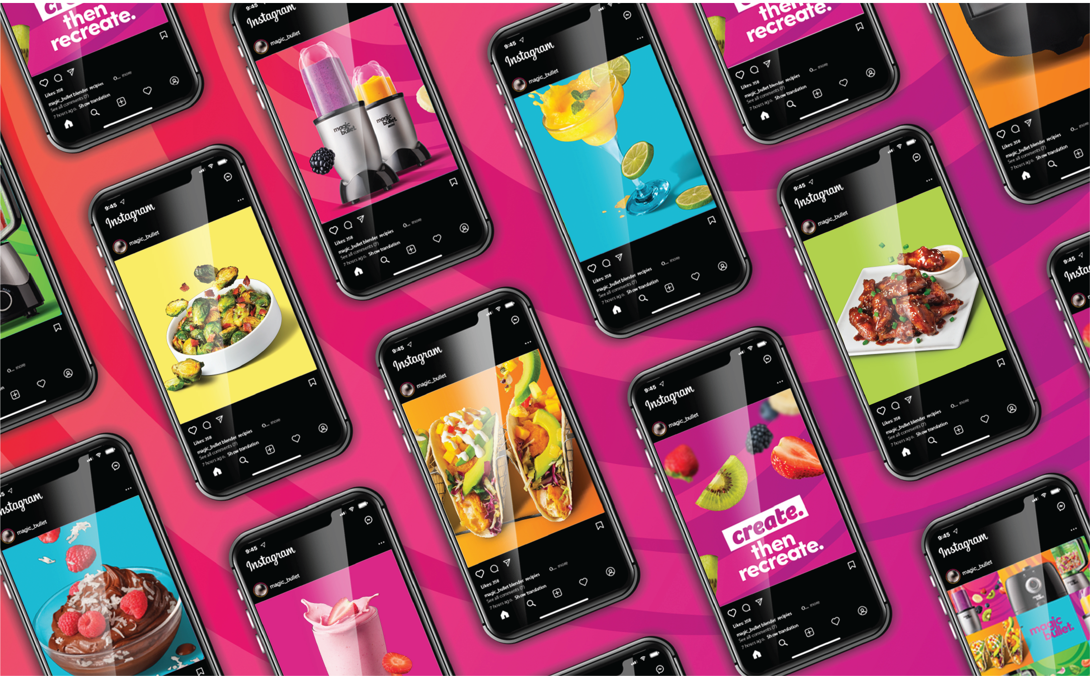
Does your brand face a unique challenge? Tell us about it.
BEFORE
AFTER
Packaging Design
Vibrant color, swirling graphics, and dynamic food photography were combined for this product’s packaging design to support the overall brand attributes: zesty, rousing, unexpected, and easygoing.
Photography & Food Styling
We translated these themes into our original food photography, using bold colors, movement, and enticing ingredients that express the joy of creation in cooking. These are devices for self-exploration in the kitchen!
Brand Guidelines
We defined the core elements of Magic Bullet’s identity, including logo design, usage, color palette, typography, imagery, and tone of voice, so every design execution, from packaging to digital, feels cohesive.
Nutribullet
Smith Design was asked to create a visual and verbal brand identity strategy for the premium-tier Nutribullet Ultra that would elevate the brand’s position and resonate with home cooks looking to express their creativity through recipe experimentation.
We developed a rich, sophisticated color palette and streamlined look for the packaging design that would reinforce the premium quality of the product while the food visuals on the side panels retained an upbeat and expressive vibe.

