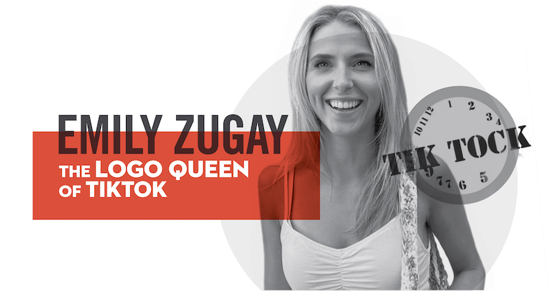
Emily Zugay has quickly become TikTok’s Logo Queen, gaining more than 12 million views in less than two weeks with her “tasteful” redesigns of famous logos.
Logo redesigns have been trending on TikTok for a little while. Most often, designers put their own spin on iconic logos and the result is usually in a more modern, sophisticated reimagining. Emily Zugay’s logos are not this. She has, to put it lightly, a style of her own. Zugay’s designs are intentionally and hilariously bad – and people are absolutely loving it.
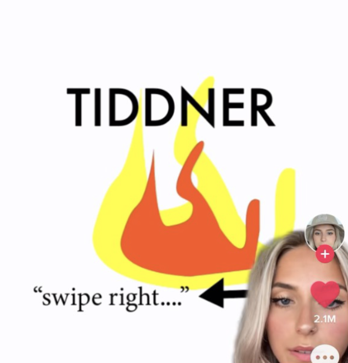
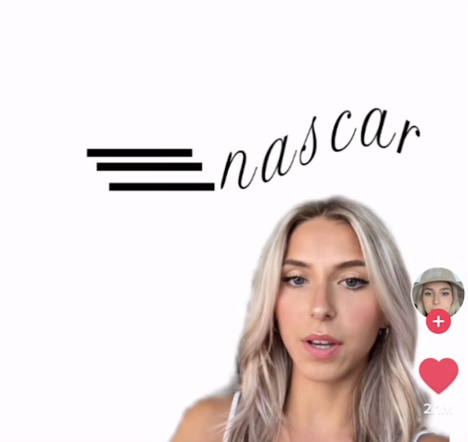
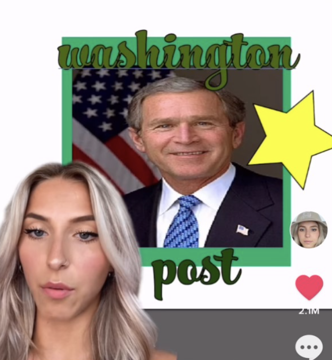
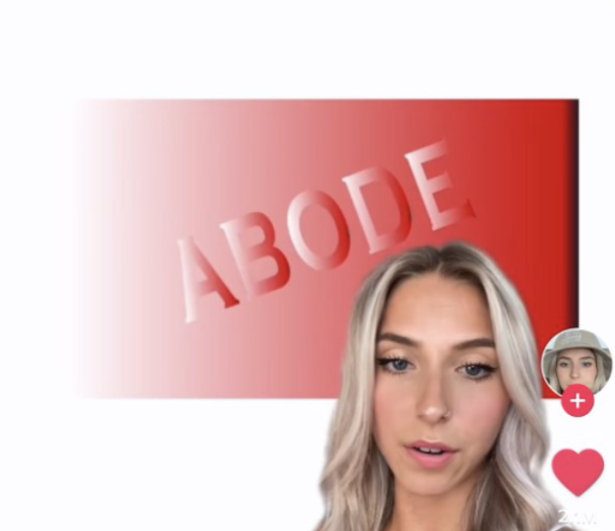
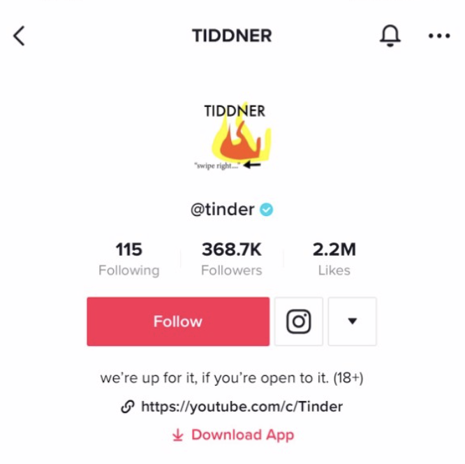
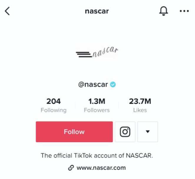
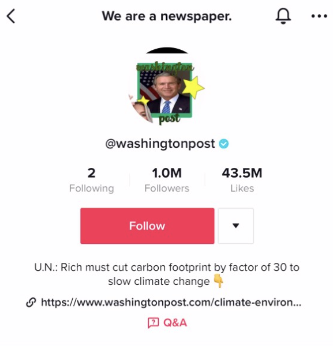
“I graduated college with a degree in design and I redesigned some popular logos I think we can all agree are ugly.” Taking on the likes of Nascar, Starbucks, Tinder, and the Washington Post, Zugay starts her videos by outlining the “faults” in each logo she’s decided to improve on.
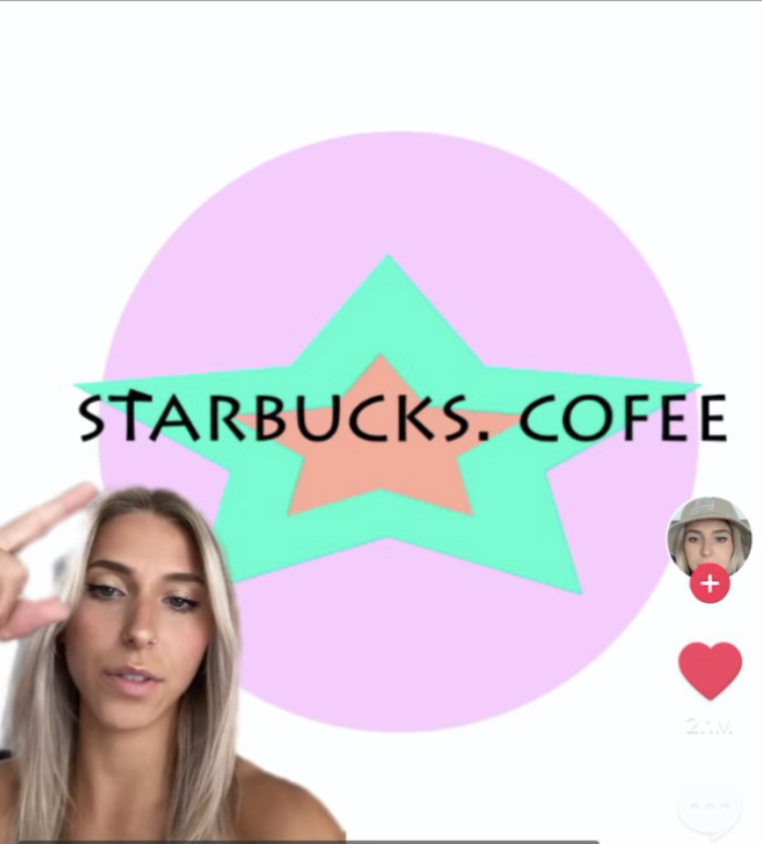
The first logo she tackled was Starbucks. She states that she did not like anything about the logo, doesn’t like the color and doesn’t understand the figure who may be “a president or something.” She decided to redesign it to give off a happier feel, explaining that she “wanted to maintain the integrity of the stars in the original logo” She came up with the following:
From there, she took on the iconic Apple logo. Explaining to her TikTok fans that there was no symmetry and no words indicating which brand it is – “You just have to guess, so I don’t like that.”
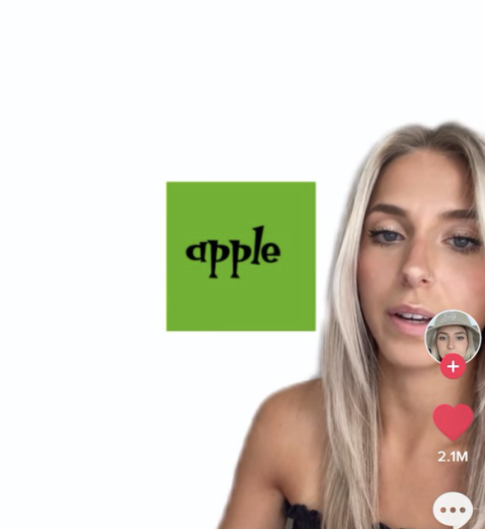
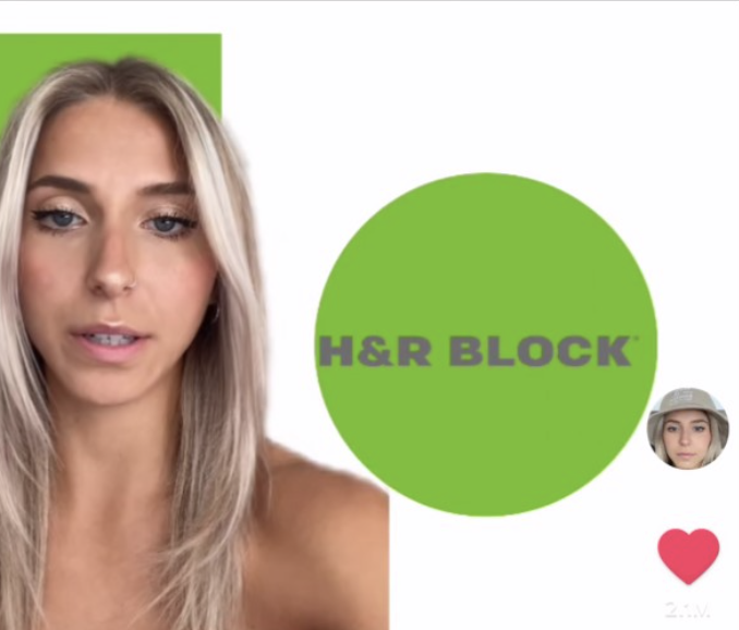
Her thoughts behind her redesign were that Apple needed a type that was fun and appealing to the youth like herself. Before the Apple logo she had redesigned the H&R Block logo and missed the green block that she took out of it, so decided to incorporate it into the Apple logo.
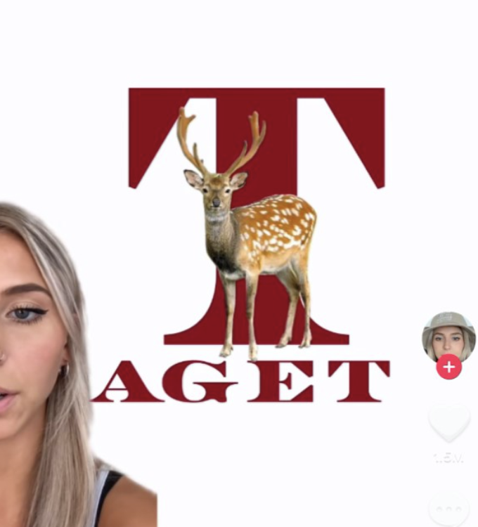
Her Target logo redesign was unique to say the least, as she left out the “R” in “Target” and ran with it, with absolutely no explanation. To her, the Target logo just didn’t make any sense. She felt that it was outdated and childish and wanted to take inspiration from Kmart’s logo, because she missed it. She chose the darker red with the thought that it was more mature, and a “nicer” font to elevate the design. Including a deer also “just made more sense.”
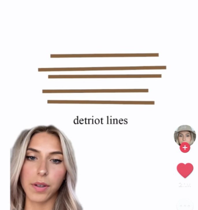
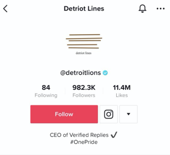
Zugay left it up to her viewers to comment on what brands logos they wanted to see redesigned next. With an overwhelming amount of feedback, she continued posting more. Brands noticed and started adding comments asking her to redesign their logos. Now she has growing list of brands looking for her tackle to their logos next: Disney Channel, McDonalds, Red Bull, Hulu, Amazon, Dove, Subway, Xbox, NFL… the list goes on! Check out some more of her redesigns and her creative direction behind them below.
Perhaps the most surprising fans of Zugay’s redesigns are the brand themselves. Many were happy to go along with the joke and responded by changing the logos in their TikTok profiles to Zugay’s design. Needless to say, TikTokers loved it and have been going crazy in the comments. Many brands have even reposted Zugay’s TikTok that features their “new” logo.
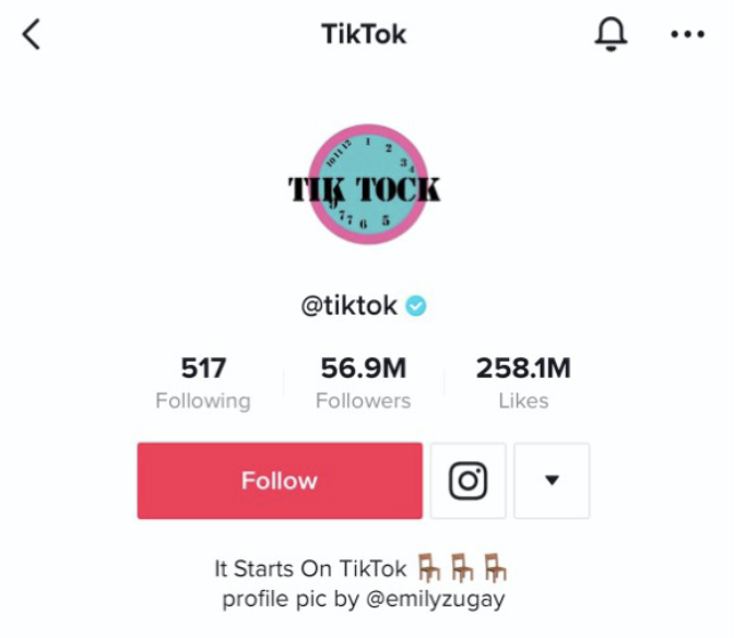
If you want some laughs and inspiration, check out more of Emily Zugay’s designs at her TikTok @Emilyzugay.