
Summer is finally here, which means the Fancy Food Show has once again returned to New York! Director of Account Management, Dave Bolton, and our summer intern, John, had an amazing time at the show, identifying and analyzing design trends across all types of food and drink.
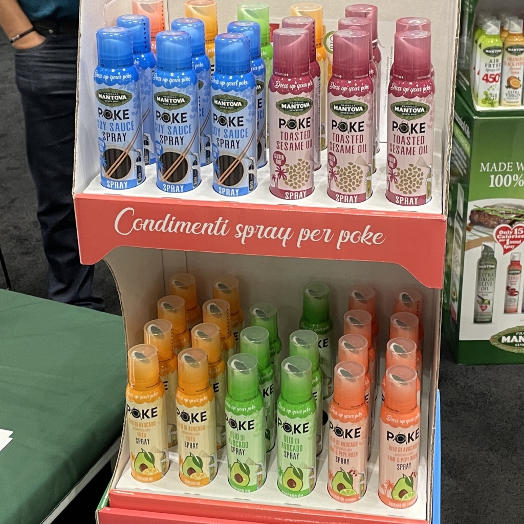
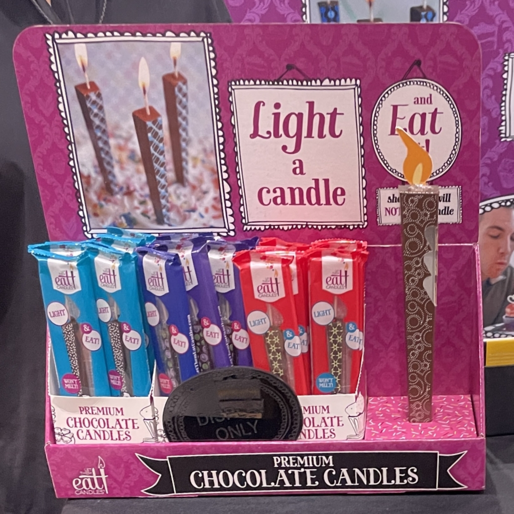
Upon stepping foot on the show floor, Dave and John were immediately intrigued and amazed by some of the products on display – and not because of their designs. The Fancy Food Show does pride itself in highlighting the newest innovations in all things food, so in reality, bold ideas like sprayable soy sauce and edible birthday candles felt right at home. If anything, it was a great reminder for Dave and John to expect the unexpected as they explored the rest of the convention.
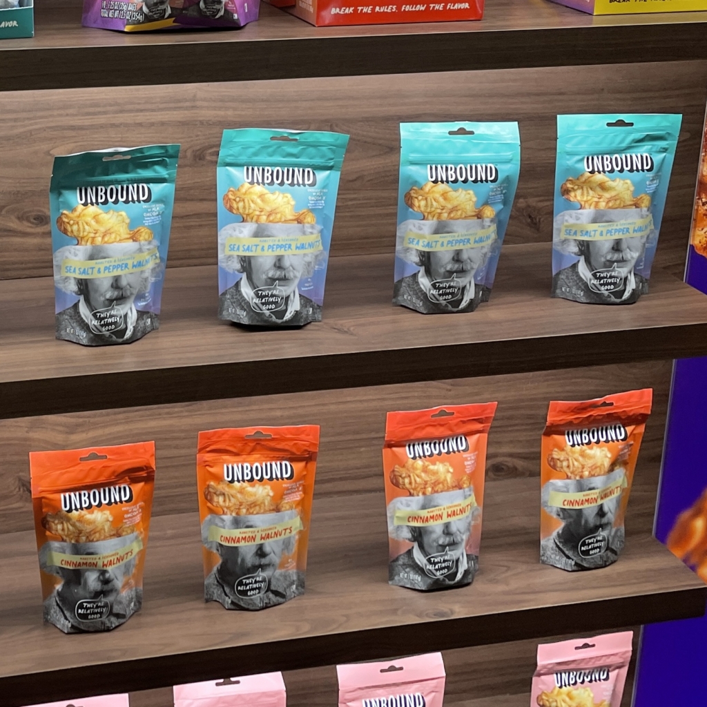
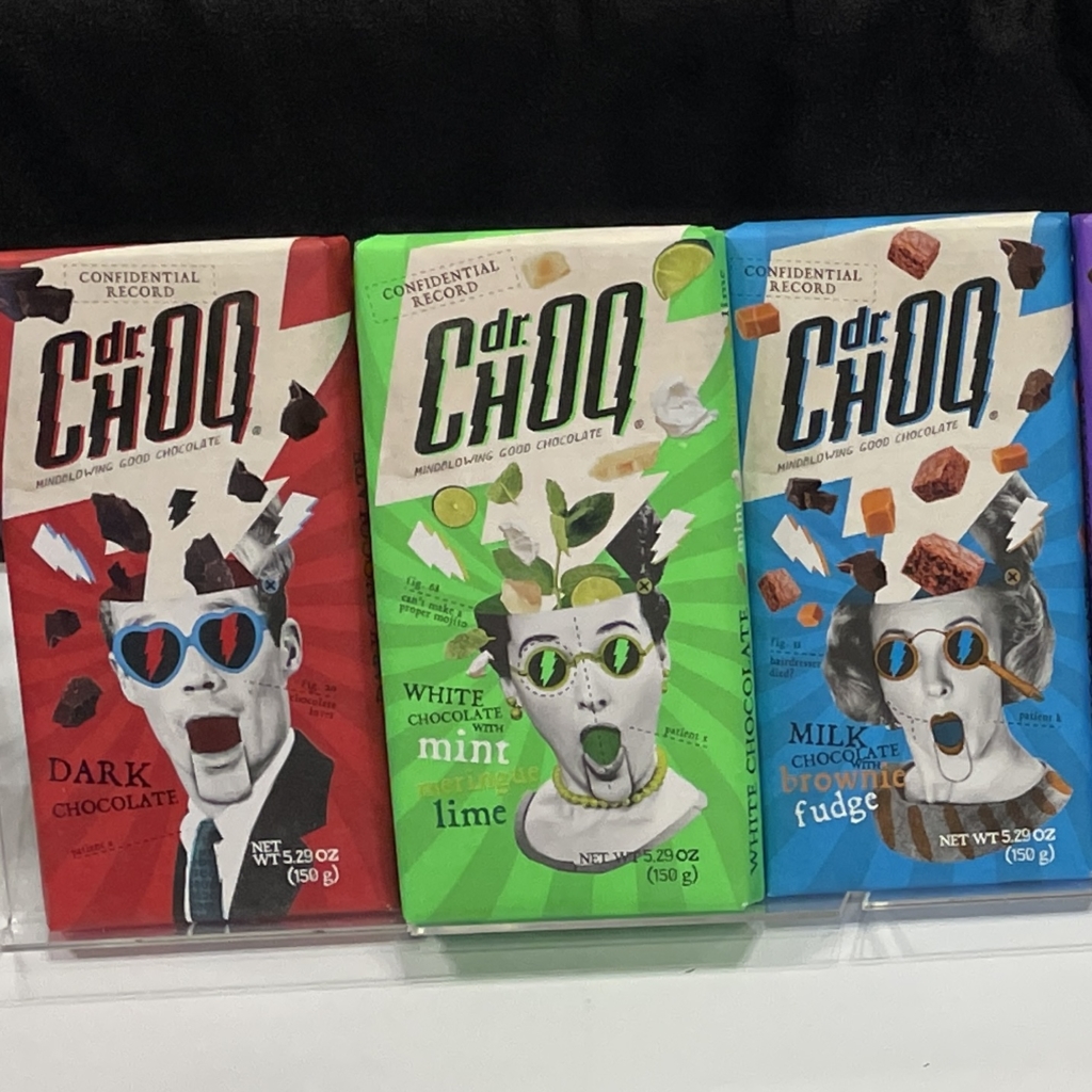
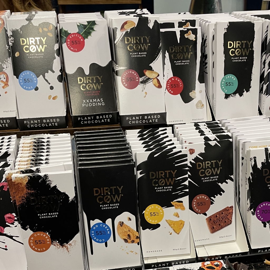
Speaking of the unexpected, some up-and-coming brands found common ground through a traditionally uncommon concept — exploding heads! Utilizing black-and-white imagery alongside handmade elements, these brands could easily show that their snacks were bursting with flavor — literally. As Dave put it, “The creative energy and excitement spills over into form and flavor – and compelling design. A feast for your tastebuds, a feast for your eyes, a feast for your mind.”
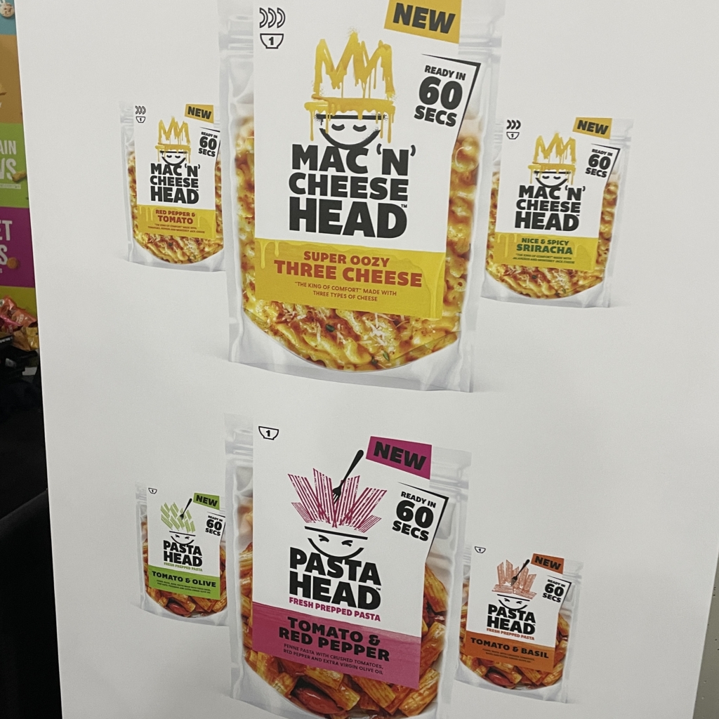
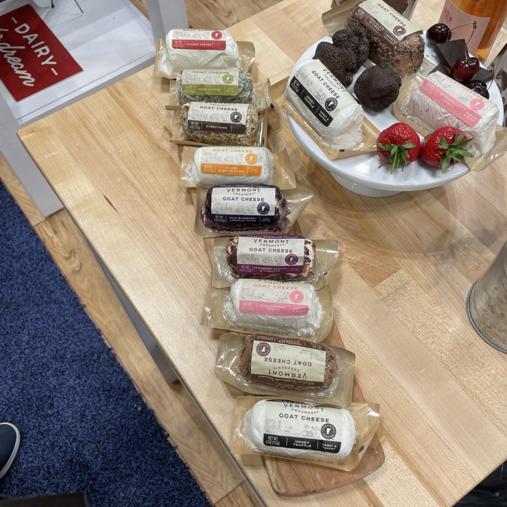
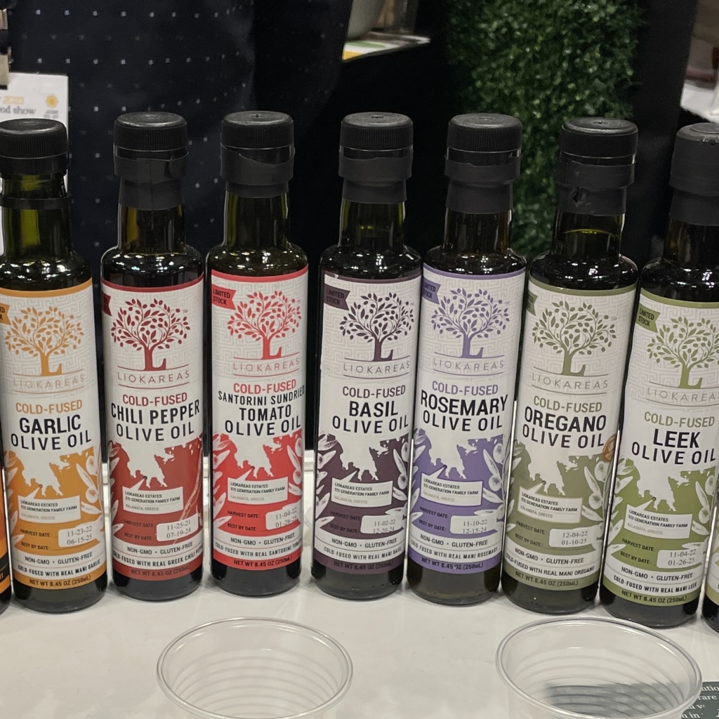
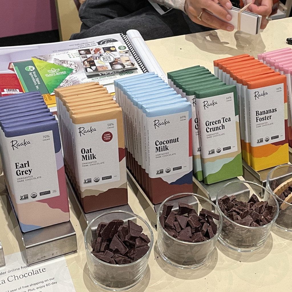
In contrast, we observed that most brands had latched onto minimalism, which is arguably the most prominent standing design trend over the last decade in both new and established brands alike. In trading excess for simplification, many companies had chosen to utilize a single pop of color on a white background to differentiate flavors, in some cases, to give complete focus to their flavorful food photography.
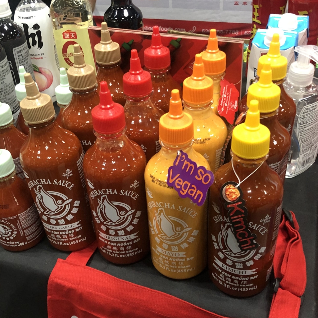
Alongside this, we also noticed an uptick in flavored products — that is to say, base “ingredients” such as olive oil and siracha that were given a unique additive that one might have previously mixed into it on their own.
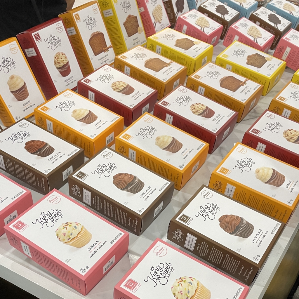
Confectioneries tended to follow a similarly simplistic path, opting to utilize that same color-to-flavor connection, but with the smart inclusion of unique textural elements to give their treats a refreshing edge amongst the competition.
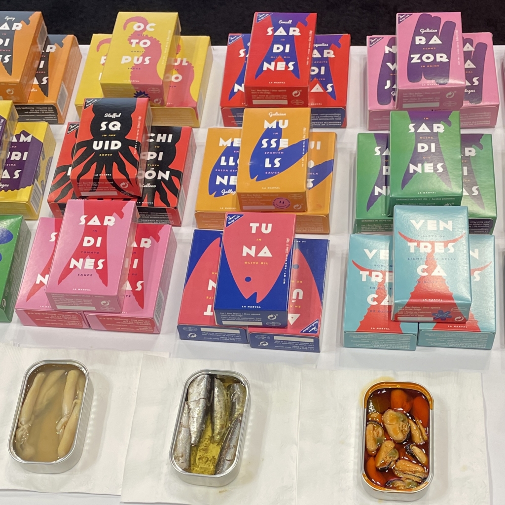
While some detractors of minimalism might argue that it’s been stretched thin by overuse, there’s still plenty of fun to be had with the style. At first glance, these packages may seem to be for some kind of luxury soap, but upon closer inspection, you’ll be quick to learn that something really fishy is going on. It’s difficult to position tinned fish as an item of grandeur, but seafood company La Narval has successfully done so through beautifully bold color schemes and simplified nautical shapes. “In some cases,” John remarked, “smaller brands held the biggest presence at the show thanks to their innovative design work,” and this is no better example of that at play.
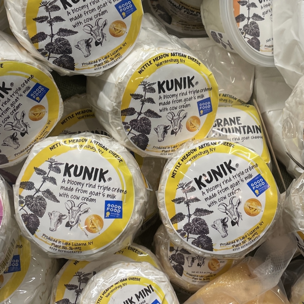
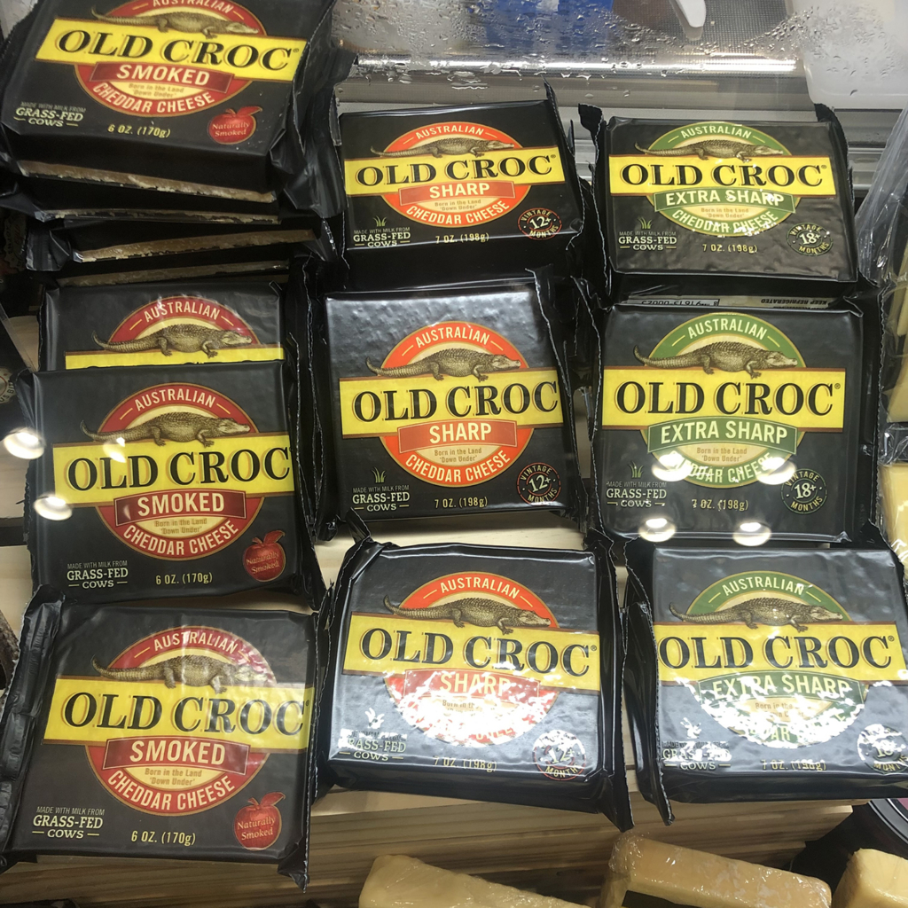
Out of all the food categories featured throughout the show, cheese absolutely had the most floor presence, and some brands also heavily associated their identity with animal imagery to increasingly memorable degrees. From the expected cow to the unorthodox crocodile, it was a gouda showing from all.
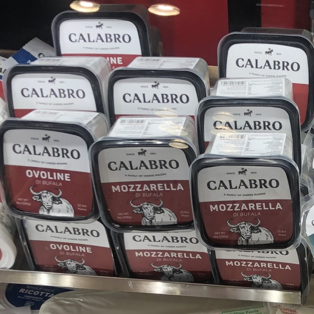
Calabro also acts as an excellent example of an established brand moving away from their expected packaging in order to turn heads in a crowded market, a trend witnessed in ways both big and small. Dave sees such a move as a way to “celebrate (a brand’s) heritage and earned respect, while transforming who they are to a modern marketplace.” In this instance, the usage of a solid color backdrop and striking illustrated buffalo ensures they maintain modern interest without forgoing their brand identity.
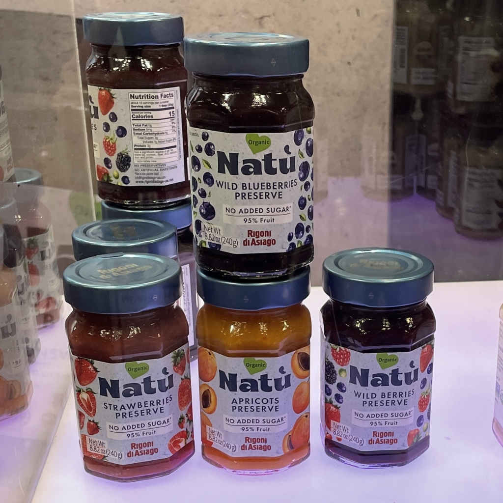
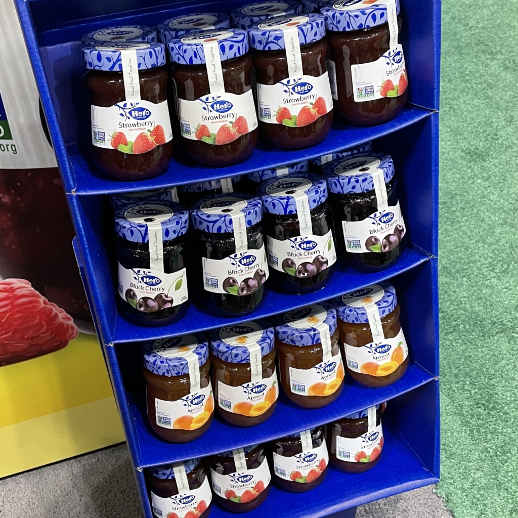
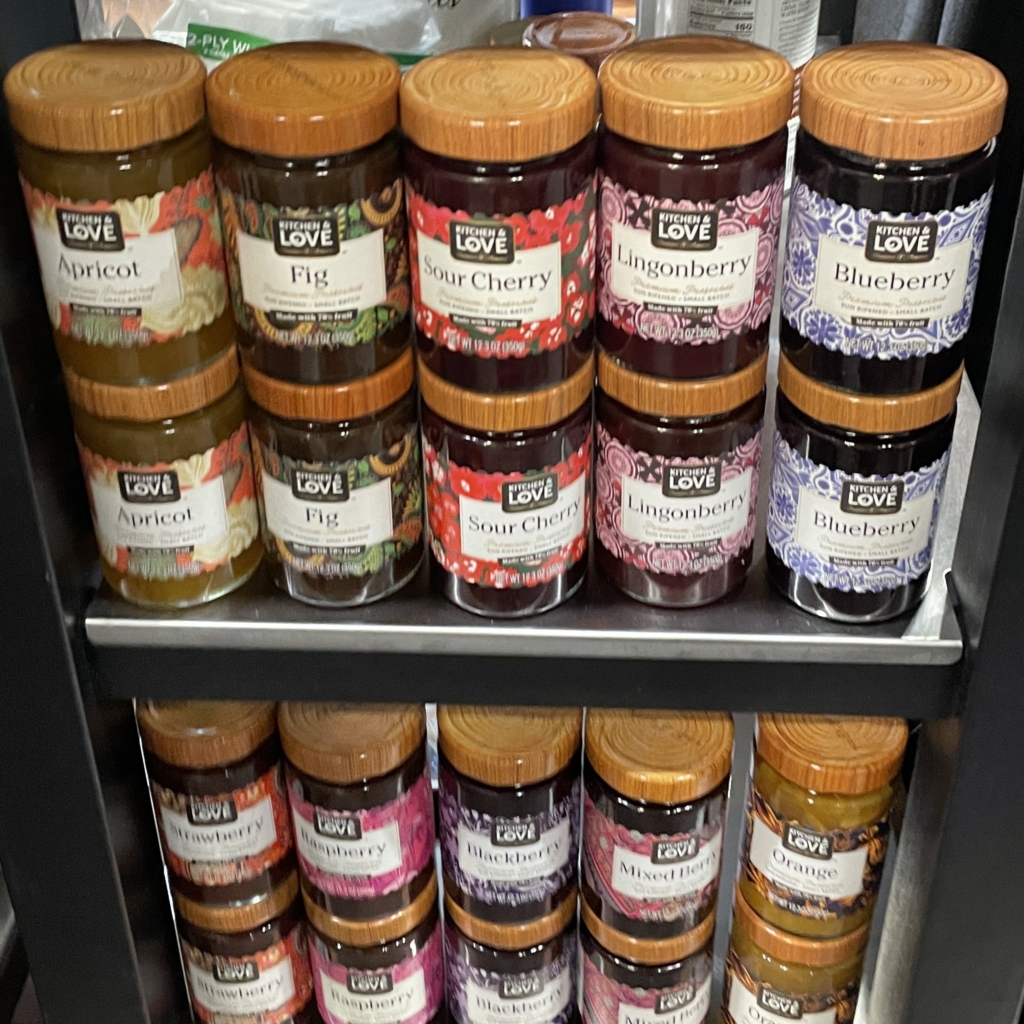
Of course, big design changes aren’t truly necessary to impress, as it’s often the smallest attention to detail that combine to make a memorable design. Therefore, these companies have chosen to define themselves via an oft-neglected aspect of their packaging – the lid. Not only do these textured tops help them stand out against the competition, but they open the possibility for these jars to be reused in a craftier context.
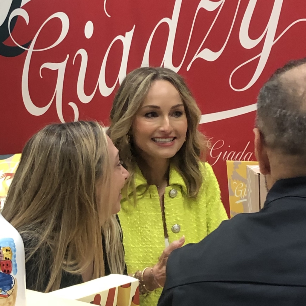
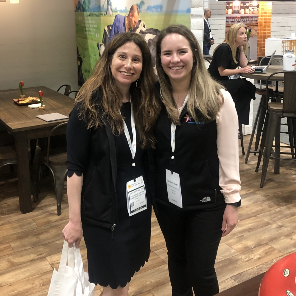
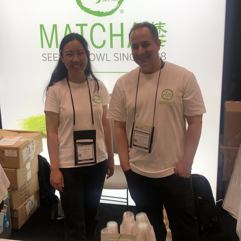
We were also fortunate enough to run into a few familiar faces, including Food Network star Giada De Laurentiis and two of our long-time clients, Aiya Matcha and Friesland Campina (in the aptly nicknamed Lower Cheese Side).
At the end of the show, Dave and John left with a bountiful supply of new insights and ideas — and also a bountiful supply of tasty samples. John felt that it was “truly an incredible opportunity to step foot into so many realms of design,” and we look forward to seeing how these brands continue to innovate in the future.