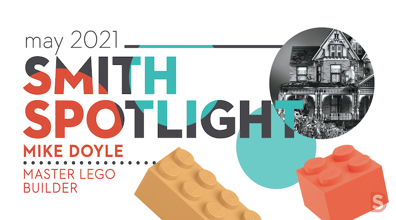
It probably goes without saying, but Smith Design is full of creatives. In our new Smith Spotlight blog series, we’re highlighting the talents of our team and their endeavors outside of our studio. Follow along to get to know the people who make Smith Design awesome.
Our first Smith Spotlight goes to our LEGO Master, Mike Doyle!
Mike’s journey to LEGO master began with a family trip to LEGOland. After exploring the park, he began to wonder about the artistic possibilities of LEGO. A quick search online showed him there are many LEGO artists building amazing pieces of art with LEGO, and he became inspired to create artful pieces himself.

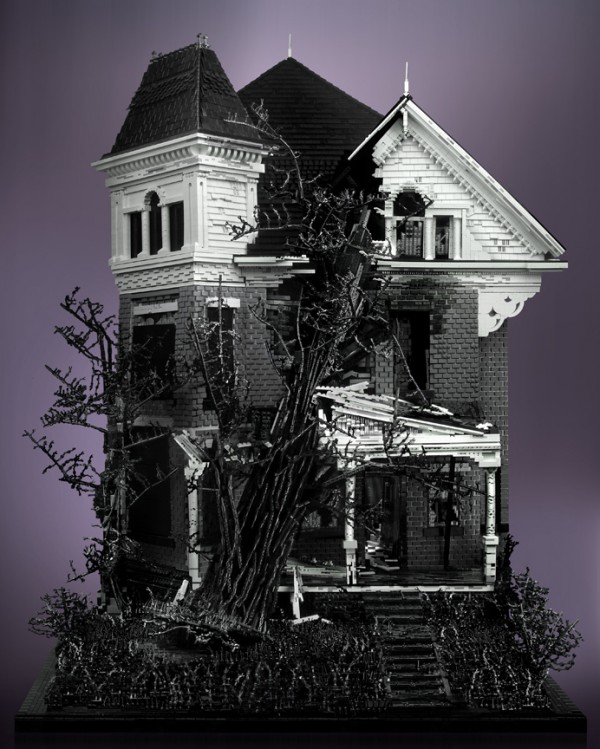
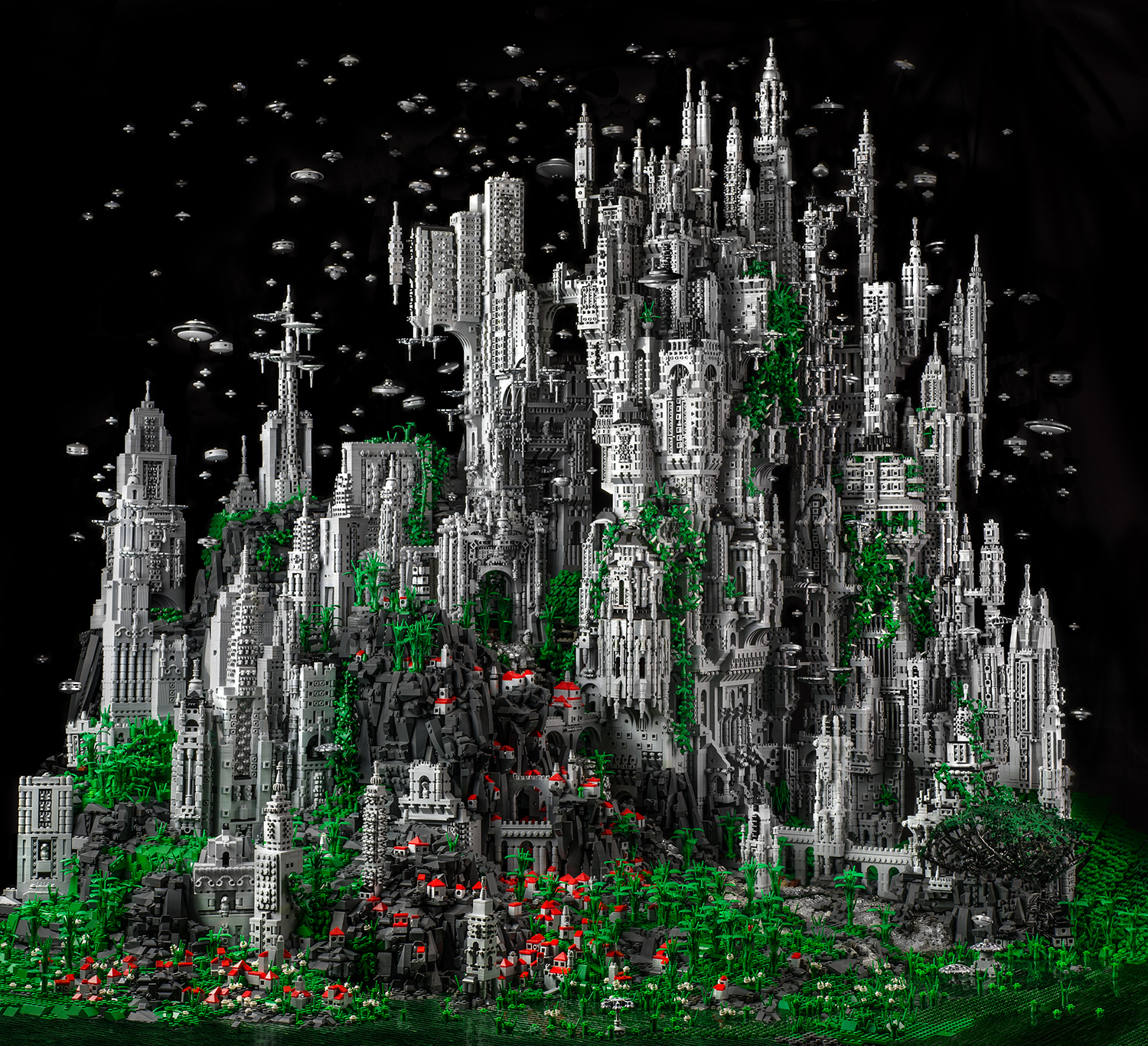
Through his builds, Mike wanted to elevate LEGO to fine art. Many of his pieces combine grayscale bricks, a stunning contrast to the typical primary colors people tend to associate with LEGO. Inspiration for his builds came from real life structures and settings, and often reflect social & cultural events.
What makes his builds unique is their organic nature. Despite the angular mechanics of the bricks, his builds flow with life, even simulating houses falling apart or the flames of an explosion (with no glue involved). The more pieces he built, the larger the pieces became, some getting to be 6 feet high. He has sold prints of his builds all over the world.

What Mike Doyle creates with LEGO has the power, mystery, pain, and intrigue that so many try to capture with more accessible forms of media. He creates deep worlds using something so innocent and unassuming that the medium in itself creates a fascinating juxtaposition: innocence with destruction, old and new, imagination versus reality.
Brooke Shaden, Artist
His work with LEGO gave him the opportunity to give back to his community. He hosted children’s programs where he led workshops on creating detailed houses with LEGO. At the end of the workshop, the kids put their houses together to create one large neighborhood of unique homes. He also enjoyed speaking about the art at museums and libraries throughout the country. His art has been showcased at museums such as the Morris Museum in New Jersey and the Cincinnati Art Museum.
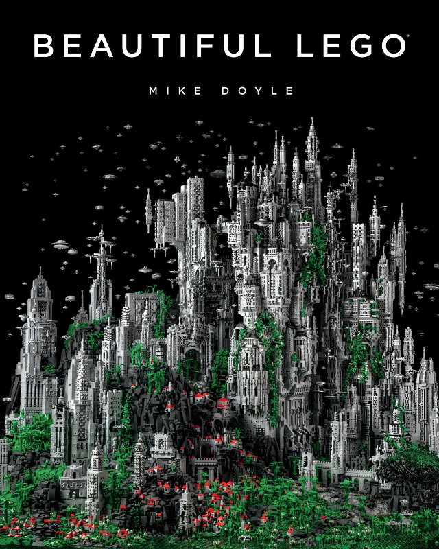
Mike has published 3 LEGO books that feature both his work and work by other artists – Beautiful LEGO, Beautiful LEGO 2 Dark, and Beautiful LEGO Wild. He describes the books as a “celebration of LEGO”, and he was glad to see the joy the books brought others, both for the readers and for the artists featured. These books, described by The Los Angeles Times as “one man’s quest to prove LEGO can be art”, can be purchased here.

Through his experience in creating LEGO art, Mike has learned to appreciate “taking the ordinary and making it extraordinary”. He discovered how to change the nature of things into something more. He applies this framework to all of his creative endeavors.

Some ask if LEGO brick-building is Art. To me, that is like asking is sculpting with clay, Art. Well… it could potentially be. Anything, absolutely anything can be made into Art in the right hands, even the ‘child’s toy’ LEGO. In the end, bricks are a medium, like oil paint or clay or pixels on a screen. It’s what you do with them that matters.
Mike Doyle
Mike has been a Smith Designer for about 5 years. Now a Design Director, he began his career with Smith as a freelancer before joining the team full time. The Smith team often looks to him for guidance in seeing the big picture, and we all appreciate his work ethic, expertise, and wit!
Stay tuned for our next Smith Spotlight!