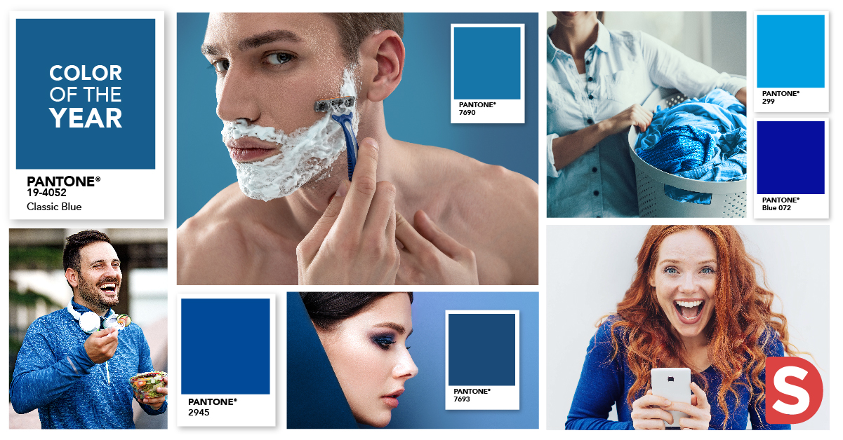
According to their website, Pantone’s 2020 color of the year “19-4052 Classic Blue” was chosen to offer the “hope of honesty and the promise of protection”. The color is a dense, darker shade of blue than the word “classic” implies, but for me, it is sophisticated, calming, and much more serious than previous years (2019’s “Living Coral” and 2018’s “Ultra Violet” being decidedly more upbeat and exciting). But I would add to those descriptions the word universal; as designers of brands, blue may be the most useful color we have in our tool kit.
It’s easy to underestimate the power of blue. It all comes down to a certain hue, density or tone to make or break a design, evoke emotion & create connection. Blue is a color that can have many meanings, and that meaning can change significantly from category to category, brand to brand.
We looked at several CPG categories, all of which we design for here at Smith, to find the best blue hue for the job:
Smart & Savvy: Technology (PMS Blue 072)

Next to white & silver (thanks, Apple), blue is the first color that comes to mind when we think of high-tech products. Blues in technology tend to be primary & evoke intelligence, trustworthiness, and innovation.
Strong & Masculine: Male Grooming (PMS 7690)

Blue, as expected, plays a big role in men’s grooming products. Darker hues veering towards black and brighter shades skewing into teal bring strength, depth & energy while also cueing cleanliness.
Fresh & Clean: Household (PMS 299)

An obvious choice for household cleaning products are blue tones. Aside from the clean cues that brighter blues and cyans provide for products like laundry detergent or dish soap, the softer, more pastel tones work well in fabric softener and soap.
Simple & Advanced: Personal Care/Pharma (PMS 646)

Blue brings trust & innovation to the personal care category, trading in softer, more feminine hues with a purple or greyish tone. When paired with the right graphics, these blues communicate quality, trust, and sophistication.
In Blue We Trust: Food/Beverage (PMS 2945)

Blue may be an unexpected choice for a food brand (less so for beverage, given its association with water), but many brands do well despite this. Think Skippy, Oreo or Kraft Mac & Cheese. Blue’s role here is one of a crowd-pleaser; a populist color that is known as the world’s most favorite color. In some cases, the blue can come to symbolize a long heritage – a brand that has stood the test of time and cues happy memories of a time gone by.
Blue seems to me a perfect choice for 2020. Its calming & unifying qualities lend themselves to the dawn of a new decade, where nothing is assured or guaranteed. And our ability to adapt to that unknown might be the most important skill of all.
-Jane Sayer, Director of Visual Strategy

