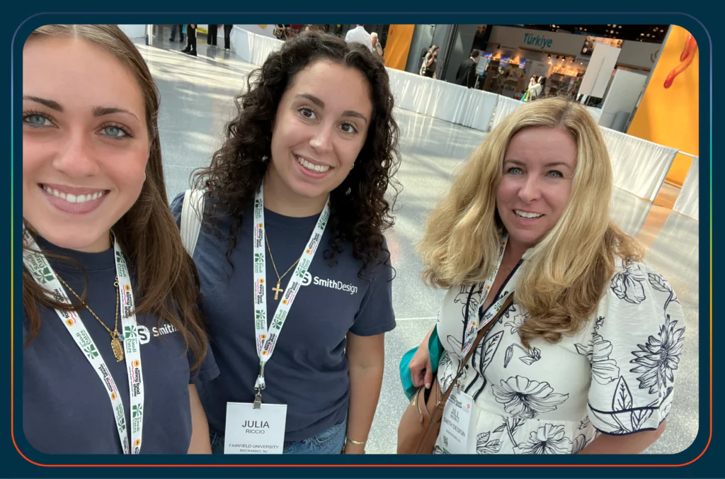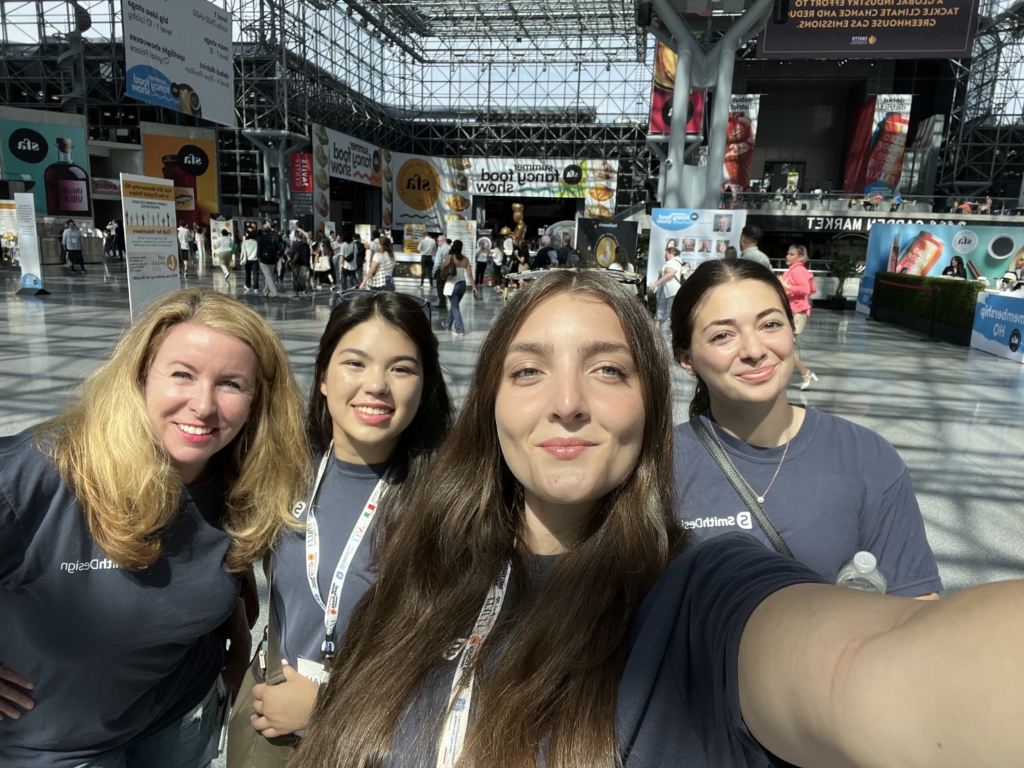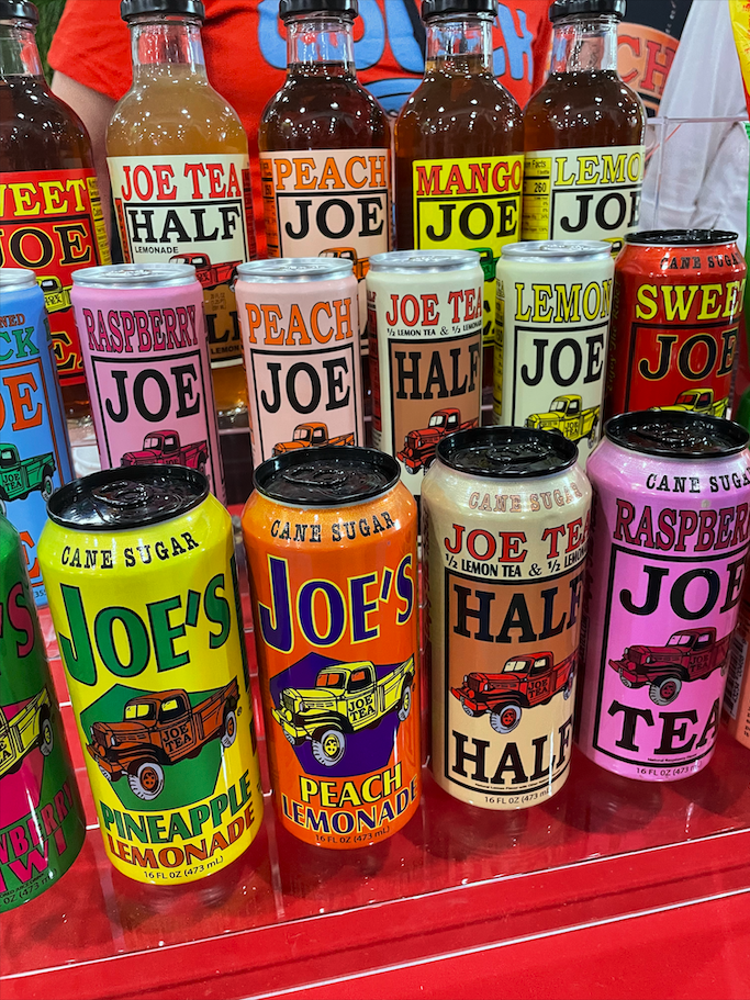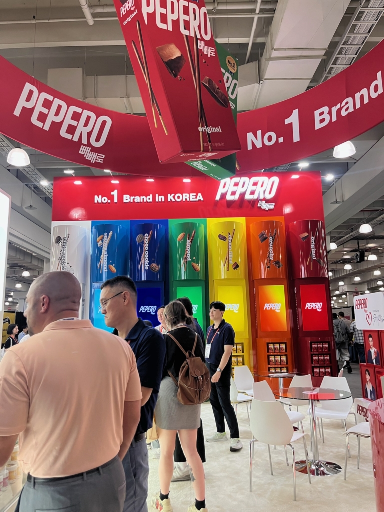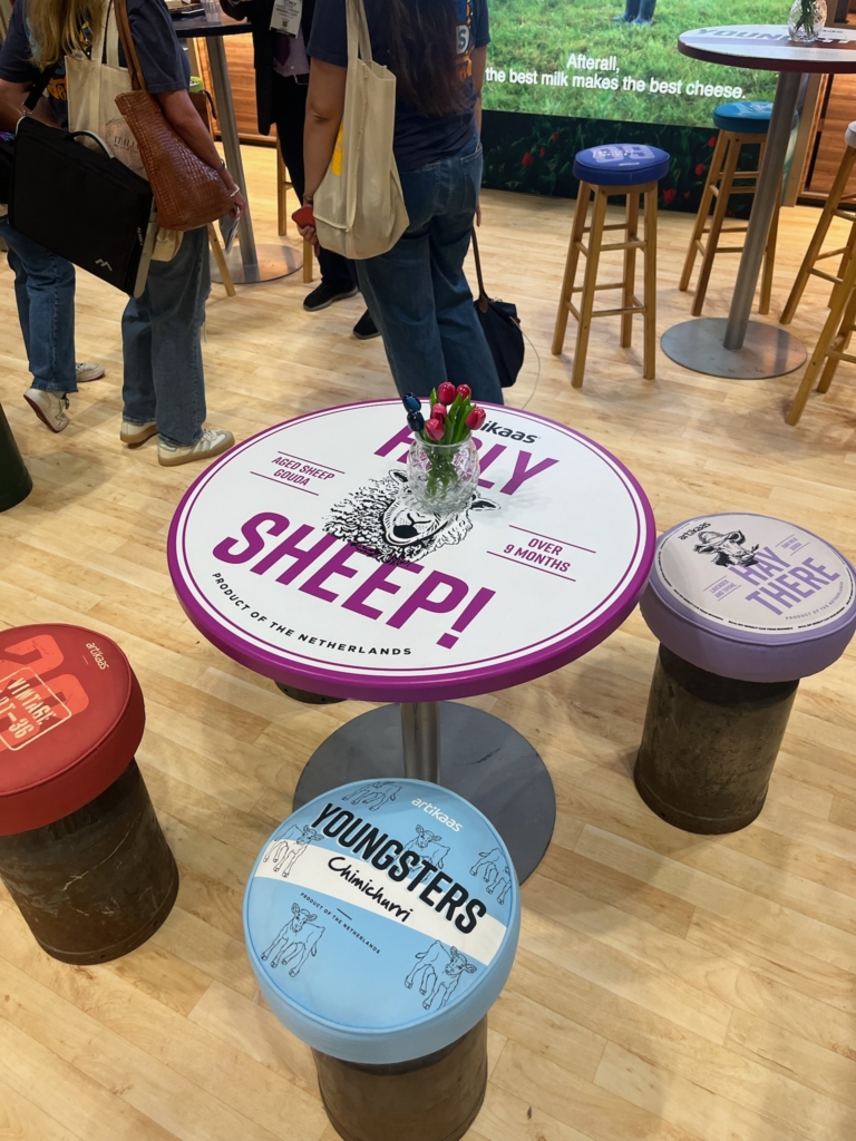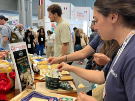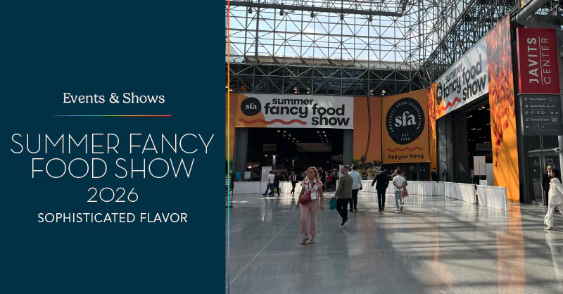
Every year, Smith Design sends a few of their own to SFA’s Summer Fancy Food Show in NYC to observe the hottest new food products of 2026. This year, Smith Design had the pleasure of attending two out of the three days of the food show where we had the opportunity to track the newest trends in food and packaging! This year’s attendees were Jill Weible, Senior Client & Business Growth Development Manager, and two of Smith’s Summer Interns Julia (Marketing Intern) and Miranda (Design Intern). Come along with us and learn what the fanciest foods of 2026 are!
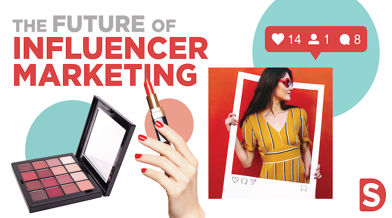
The Future of Functional Foods
It’s no secret that we’ve entered a global health awareness era in recent years, with millions of products providing healthier choices and benefits to consumers. As we walked through nearly 2,500 booths, we noticed an exponential boom in better-for-you food products, many of which included incredible amounts of protein and fiber, solutions to dietary restrictions, as well as ingredient substitutions, which we foresee changing the game of the food industry forever.
Collagen Goes Mainstream
One of the most interesting health trends at this year’s Summer Fancy Food Show was seeing collagen move beyond the supplement aisle and into everyday foods. Once primarily associated with powders and wellness drinks, collagen is now being incorporated into familiar snacks and pantry staples, making it easier than ever for consumers to add it to their daily routines. Instead of asking people to take another supplement, brands are finding creative ways to build collagen into foods they already enjoy.
One example was Rice Up, which transformed the trend into a sweet treat with its soft collagen cookies. Each cookie delivers 18 grams of protein and 8 grams of grass-fed collagen while remaining gluten-free, high in fiber, and free of added sugar. Building on the idea that functional ingredients don’t have to sacrifice flavor, Singing Pastures incorporated collagen into its slow-cooked meat sticks by blending them with nutrient-rich bone broth. Made with grass-fed beef and pasture-raised pork, the sticks provide 9–10 grams of protein while emphasizing clean, responsibly sourced ingredients.
The trend didn’t stop at snacks either. Jam Pack’d reimagined a pantry staple by infusing its strawberry, raspberry, and blueberry spreads with collagen, 8 grams of protein, prebiotic fiber, antioxidants, vitamins, and minerals. Marketed as a “complete superfood spread,” the jam contains no added sugar, no artificial ingredients, and low net carbs, proving that even traditional foods are being reinvented with added functional benefits.
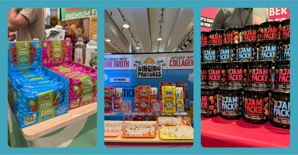
Together, these products painted a clear picture of where the industry is headed. Collagen is no longer being marketed as a specialty supplement reserved for smoothies and powders, instead, it’s becoming an everyday ingredient that fits naturally into consumers’ lifestyles. This shift reflects the broader movement toward functional foods that combine convenience, clean ingredients, and wellness, allowing consumers to support their health without changing the way they eat.
The Freeze-Dried Revolution
Another trend that continued to gain momentum at this year’s Summer Fancy Food Show was the evolution of freeze-dried foods. Once known mainly for camping snacks and dried fruit, freeze-drying is now being used across a wide range of food and beverage categories to create products that are convenient, shelf-stable, and full of flavor. Brands are proving that the technology can preserve taste and texture while extending shelf life, opening the door for entirely new product innovations.
One brand embracing this shift was Juju Oops, which showcased whole freeze-dried fruits, including pineapple, dragon fruit, mango, strawberry, and passionfruit. Instead of cutting the fruit into small pieces, the brand preserves each piece whole, creating a snack that feels more premium while maintaining the fruit’s natural flavor and ingredients.
Brands also extended the concept beyond fruit. FreezeCake demonstrated how freeze-drying can completely transform desserts with its shelf-stable cheesecake bites in flavors like Strawberry, Tiramisu, and Cookies & Cream. By taking a traditionally refrigerated dessert and making it portable without sacrificing its signature taste, the brand showed just how versatile freeze-drying has become.
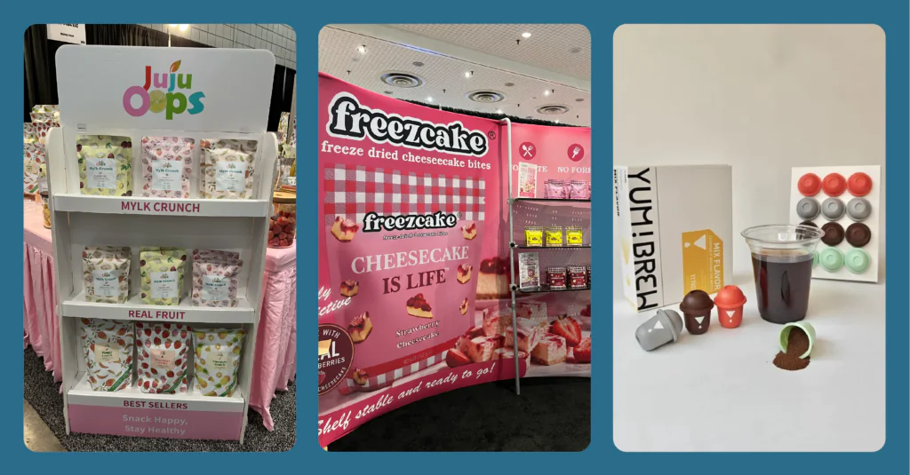
Even beverages are entering the freeze-dried space. Yumbrew introduced instant freeze-dried coffee made from 100% premium Yunnan Arabica beans that dissolves instantly in either hot or cold water without the need for brewing equipment. Available in flavors like Coconut Latte, Lemonade Americano, Espresso, and Jasmine Americano, the product highlights how freeze-drying is creating greater convenience while maintaining quality and flavor.
Each of these products contributed to a much larger shift in the food industry. Freeze-drying is no longer limited to preserving food; it’s becoming a tool for innovation. Whether it’s whole fruit, indulgent desserts, or premium coffee, brands are using the technology to reimagine familiar products in ways that better fit today’s consumers, who are looking for convenience, portability, and long shelf life without compromising on taste or quality.
The Rise of the Food Accommodation Industry
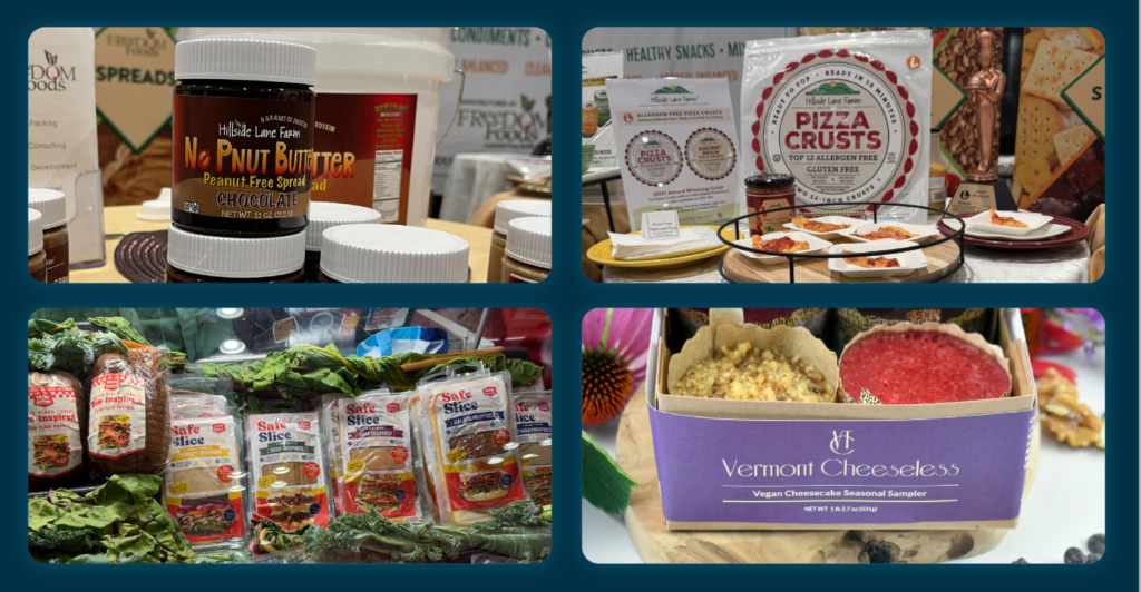
With dietary restrictions remaining a very prevalent issue within the food industry, we’ve witnessed a great amount of products directly targeting food intolerances with simple ingredient swaps. By substituting common allergens with healthier non-irritants, these brands directly target a large demographic of people who struggle to find foods that align with their dietary tolerances. Hillside Lane Farm is a primary example of brands doing food accommodation right. Their No Pnut Butter spread offers a delicious nutty taste and all the same benefits of peanut butter without the risk of an allergic reaction. They go a step further with their gluten-free pizza crusts, which are also free of an additional 12 allergens, including dairy, eggs, nuts, and soy. Their products include a wide variety of gluten-free, peanut-free, and dairy-free products, perfectly fit for a wide range of allergen-susceptible consumers. Similarly, Nikigo, an Asian-style sauce brand, introduces an alternative to the direct product market. It’s a bit of a tongue-twister, but their soyless soy sauce offers a delicious and convincing alternative to soy sauce in flavors such as classic soy, teriyaki, and noodle sauce. With no soy, no gluten, and no sesame, Nikigo battles all three allergens that classic soy sauce consists of, giving those with intolerances a truly delicious and convincing substitute.
Now, the Food Accommodation Industry doesn’t solely target allergens, that’s only one of its many sectors. A large part of this industry is simply about providing customers with healthier options rather than the typical processed products out on store shelves today.
With processed meats being at the top of the world’s most unhealthy foods, Prime Roots took note and supplied the market with Safe Slice: plant-based, meat-inspired deli meat. Crafted from mushrooms, Safe Slice contains no nitrates or celery salt, is GMO-free, and avoids the top nine allergens. They also make an important “Pregnancy safe” callout on their packaging, giving expectant mothers a better-for-you alternative to nitrate-filled deli meats that pose a threat to infant development and birth. Not only are they contributing to rectifying the health detriments of highly processed deli meats, but they are also giving pregnant women an outlet for their deli meat cravings, without the risk.
Ending on a sweeter note, the product that stole the whole show also happened to be a part of the Food Accommodation Industry and that was Vermont Cheeseless’ plant-based and cheeseless cheesecake. Made from a blend of tofu and raw cashews, the cheesecake was exceptionally creamy and flavorful, delivering all the indulgence of traditional cheesecake in a better-for-you dessert. They may have taken the cheese out of cheesecake and replaced it with natural ingredients, but you truly would never know!
Honey, Honey
Looking back on our time at the Fancy Food Show, there was one food in particular that seemed to follow us along every turn we took. We should’ve known right away by the sweet trail of liquid gold running across the floors, but it was the honey industry that seemed to pop up with new and innovative products.
It’s no secret that honey is a major power food filled with tons of health benefits, so that’s why Medora decided to highlight its advantages with its snappable honey pouches. Made with 100% raw, unfiltered clover honey, Medora focuses on cardiovascular health and creating a honey product that is good for the heart. Preportioned and perfect for daily use, their product contains natural antioxidants that protect blood vessels from oxidative stress, as well as provide cardiovascular support due to its infusion of pomegranate. Turning nature’s sweetener into nature’s medicine, this brand invites a whole new perspective on the perks of honey and turns it into its own functional health product.
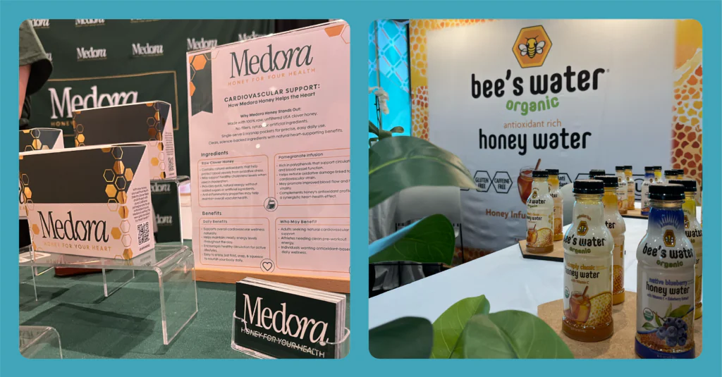
Similar to the benefits it provides, the list of forms that honey can take is extensive. Brands today are curating new ways to do honey differently, and that’s where Bee Water’s Organic Honey Water comes to play. Rich in antioxidants and Vitamin C, this new beverage offers a refreshing alternative to sugary sports drinks or sodas. With honey providing a concentrated source of natural carbohydrates, Honey Water offers a quick boost of natural energy that is unlike any of the current energy and sports drinks out on the market today. We foresee Honey Water becoming the next leading product in the realm of natural energy beverages in the coming years.
The Brighter & Bolder, the Better
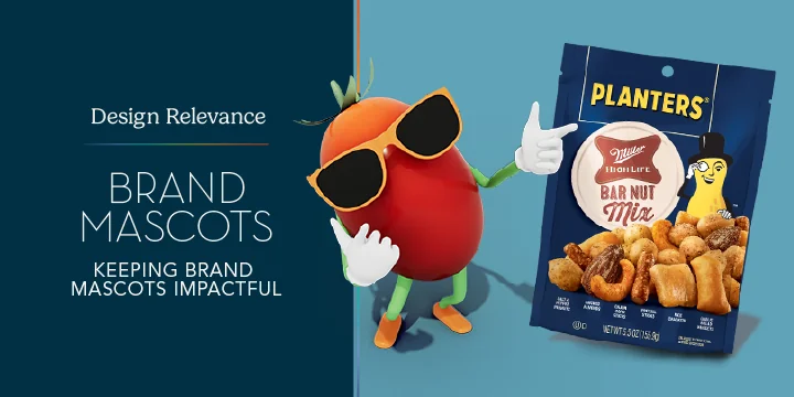
Smith Design is first and foremost a package design agency, so we obviously needed to include our impressions of the package design showcased at FFS. We noticed one genre of design that immediately caught our eyes and begged for attention and that was the packaging that included bright, vibrant palette combinations, paired with big, bold, and organic typography. An additional motif we noticed amongst this genre was the inclusion of illustrations and brand mascots. Pairing each aspect together: color, typography, and illustration, it’s safe to say that these brands had the utmost of personality at the show.
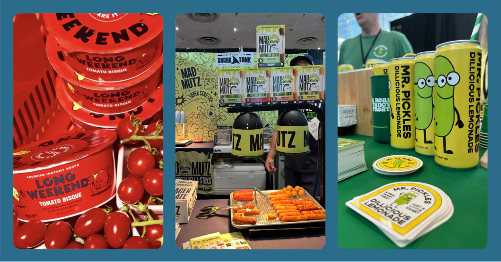
Take a look at Long Weekend – Premium Instant Soups: Each flavor has its own family of illustrated ingredients, each doing a variety of everyday activities. This brand comes to life by simply escaping the ordinary world of packaged soups, encouraging customers to interact and be immersed in the whole experience of eating their soups. Simply by having a calm, cool, and collected personality, it encourages their customers to feel just this same way, making the action of eating that much more experiential. In talking about experiential brands, Mad Mutz is a must! It was one brand that we saw at a distance and had no choice but to get a closer look due to its unique and personality-driven brand identity. With the theme of the brand surrounding a laboratory of all things, it welcomes a world of chaos, silliness, and a little bit of grunge. Their brand identity immediately came to life and shouted right in our faces, ensuring we would never forget them and their delicious mozzarella sticks!
We simply could never forget about Mr. Pickle’s Dillicious Lemonade! Although simpler in design, it packs in just as much personality as the previously mentioned products, all due to its adorable pickle mascot, Mr. Pickles. The unconventional concept of the beverage surely helps in grabbing customers’ attention, but it’s the look and feel of the product that ultimately remains in our minds. So if you’re a fan of unconventional, personality-driven beverages, give Mr. Pickle’s Dillicious Lemonade a try!
Who Doesn’t Love a Little Shine?
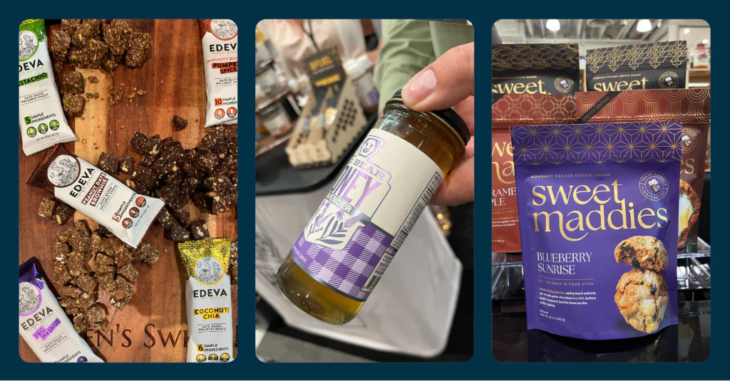
There was a common theme in design that we found pretty difficult to ignore, especially when the light hit it just right. The presence of metallic foil was seen a handful of times across multiple food categories giving every product a subtle but impactful differentiator from their prospective competitors. Just take a look at Edeva, Big Bear Honey, and Sweet Maddie’s and how the light simply illuminates their whole look!
Authenticity Sells
While innovative products and eye-catching packaging initially drew us into many booths, it was the people behind the brands who left the biggest impression. One of the most rewarding parts of attending the Summer Fancy Food Show was having the opportunity to speak directly with founders, family members, and brand representatives, who proudly shared the stories behind their companies. Hearing these histories firsthand made each product feel far more meaningful and demonstrated how powerful authentic storytelling can be in building lasting connections with consumers.
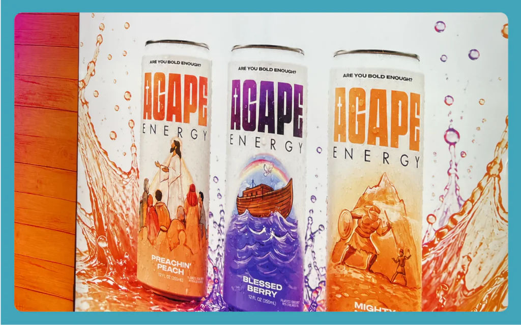
One brand that embodied this approach was Agape Energy. As we spoke with the team, it became clear that they weren’t simply selling an energy drink, they were sharing a mission. Centered around their “316 Mission,” every can is designed to inspire faith and spark conversations through scripture, giving consumers something much bigger than a caffeine boost. Their passion for the brand was evident, making their purpose feel genuine rather than just another marketing message.
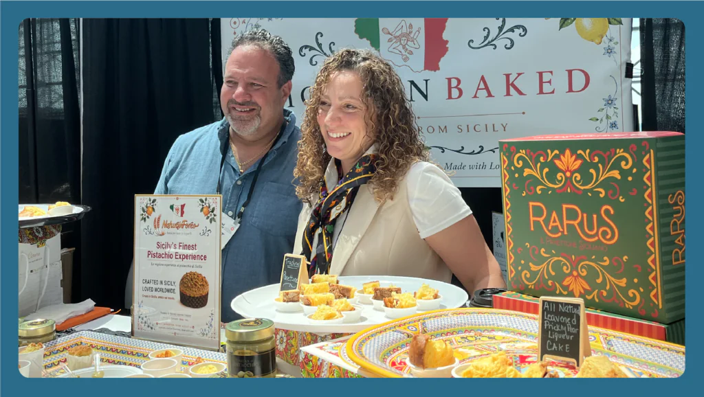
That same sense of passion was especially evident at Sicilian Baked. The family behind the brand welcomed us into their booth and shared the story of bringing authentic Sicilian tradition to the United States through their artisanal panettones. Their elegant packaging immediately reflected the premium quality of the product, but it was after tasting it that everything came together. The panettone was incredibly soft, rich, and flavorful, making it one of the most memorable products we sampled at the show. The combination of exceptional quality, beautiful packaging, and the family’s genuine passion for their craft made Sicilian Baked one of the most memorable brands of all.
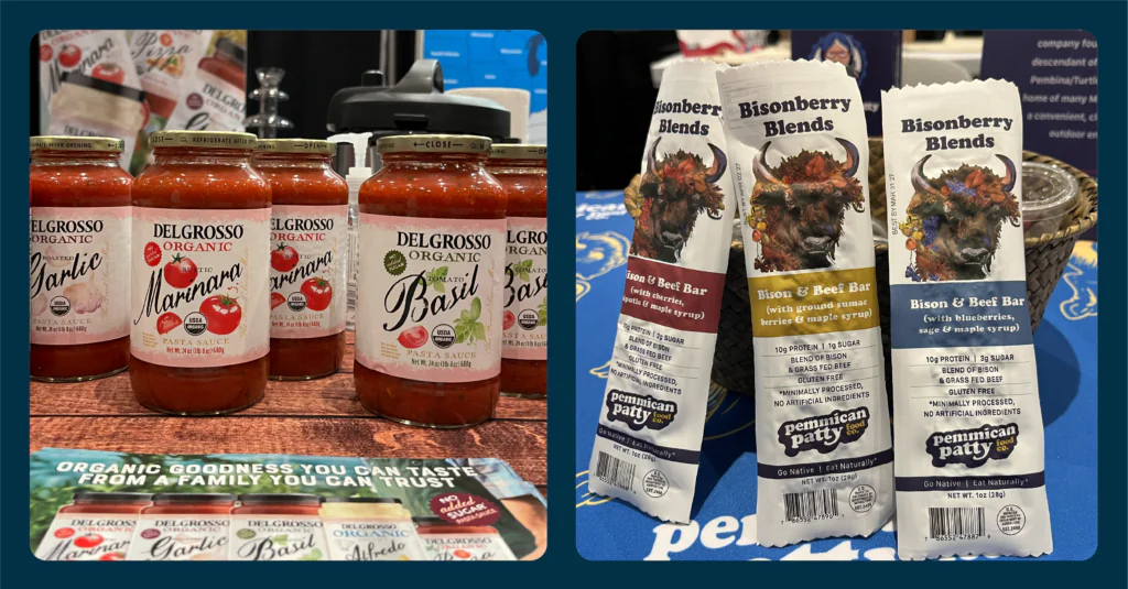
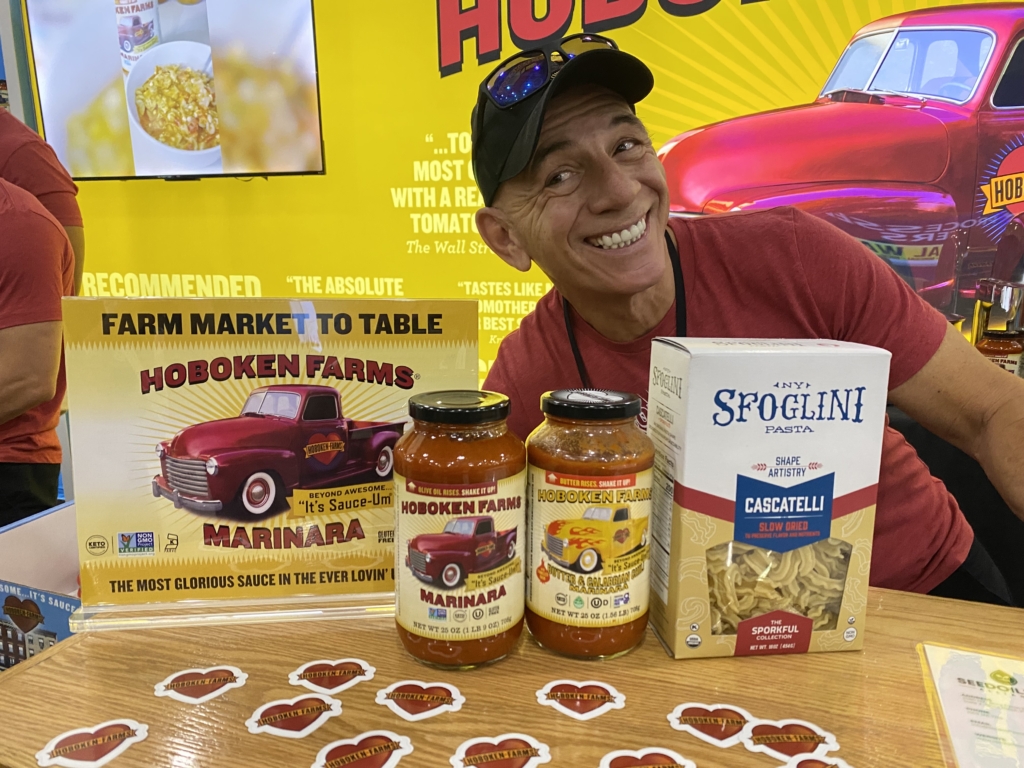
Continuing that theme of family legacy, DelGrosso Foods shared the remarkable history behind America’s oldest family-owned pasta sauce company. As we spoke with the team, it was evident that family remains at the heart of the business. The cousins working the booth proudly shared stories of their family’s history, creating an authentic connection that made the brand even more memorable. Their pride in carrying on the family’s recipes and values was reflected not only in their products but also in the way they welcomed and connected with attendees. It was a reminder that some of the strongest brands are built on genuine family traditions that continue to thrive generation after generation.
Even newer brands recognized the importance of sharing their story. Pemmican Patty Food Co.‘s Bisonberry Blends introduced us to its philosophy of “Go Native, Eat Naturally,” explaining how the brand is inspired by simple, minimally processed ingredients and traditional sources of protein. Their vision is to bring pemmican into the modern day by reimagining the age-old recipe with clean, natural ingredients while preserving its history for future generations. “Rooted in the past, yet tailored for the present”, Pemmican Patty Foods shares the legacy of their ancestors and vibrant culture with consumers, ultimately passing on the story of the Chippewa and Metis people. By taking the time to explain the purpose behind their products, they gave us a deeper appreciation for both the brand and its mission.
Across the show these experiences demonstrated that the strongest brands are built on more than just great products. Authentic storytelling, thoughtful design, memorable packaging, and genuine personal connections all worked together to create brands that stood out in a crowded show floor. When a compelling story is paired with a quality product and a memorable experience, it creates a connection that consumers are far more likely to remember.
Booths That Built Buzz
Despite strong branding and compelling stories being a confounding factor to what draws in customers to a brand, we found that it was the brands that created a full-on experience that stuck in our minds most. Rather than relying solely on product samples or traditional displays, exhibitors transformed their booths into interactive destinations that encouraged attendees to stop, participate, and share the experience with others. In a show filled with nearly 2,500 exhibitors, creating a memorable moment proved to be just as important as creating a memorable product.
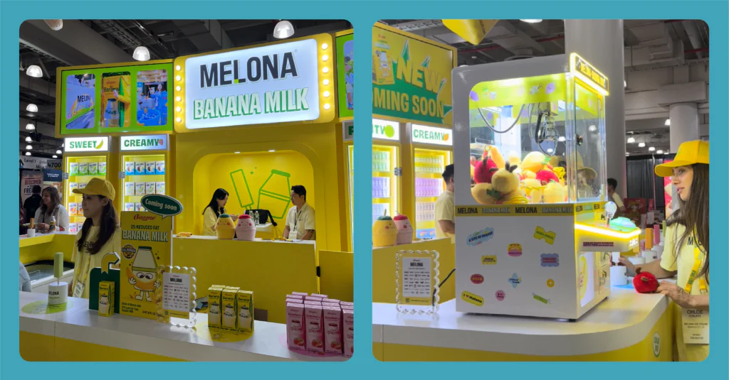
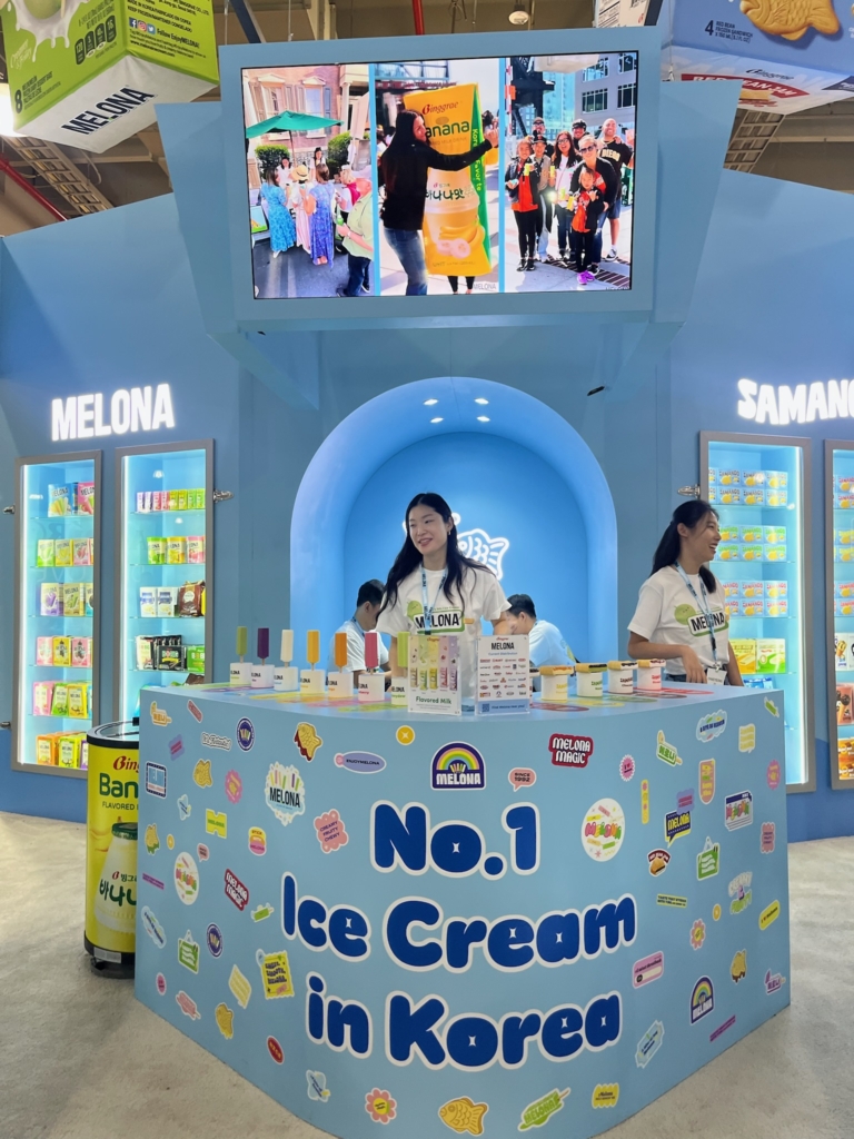
One of the best examples was Melona, whose booth remained busy throughout the day. The vibrant space featured a claw machine filled with prizes and a shopping cart overflowing with its new Banana Flavored Milk. The interactive setup encouraged visitors to engage with the brand rather than simply walk past it, and before long, attendees could be seen throughout the show carrying Melona ice cream bars. That visibility turned visitors into walking advertisements, naturally generating curiosity and drawing even more people to the booth. Combined with Melona’s reputation as America’s best-selling Korean ice cream, the experience reinforced how interactive marketing can strengthen brand recognition long after someone leaves the booth.
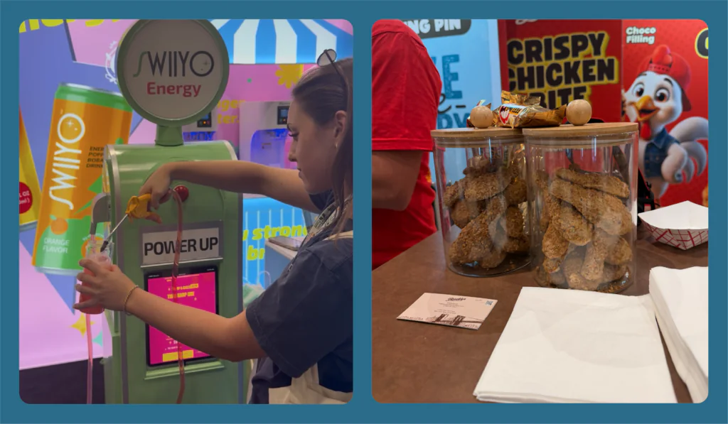
While Melona focused on interactive activities, Brooklyn Bites and Original Gourmet captured attention through surprise and entertainment. Instead of relying on a traditional sampling station, the team created a lively atmosphere around the launch of its viral Crispy Chicken Chocolate Bite. Vendors enthusiastically shouted, “It’s not chicken, it’s chocolate!” as attendees gathered to see what all the excitement was about. The playful surprise of discovering that a realistic-looking fried chicken tender was actually chocolate sparked laughter, conversations, and plenty of photos. It was a simple concept, but one that demonstrated how curiosity and entertainment can become powerful marketing tools.
Swiiyo took experiential marketing in an entirely different direction. Originally rooted in professional boba craftsmanship, the brand has expanded into functional beverages focused on clean energy and beauty. Its booth featured a bright gas station-inspired setup where visitors could “fuel up” their drinks at a life-sized pump as part of the brand’s Power Up Energy Station. Paired with trendy clear cans that showcased the colorful beverages inside, the entire experience reinforced the idea of giving your body clean energy in a fun and memorable way. Rather than simply explaining the product’s benefits, Swiiyo brought its brand message to life through an interactive experience that attendees were eager to participate in.
A common thread among these brands was that successful marketing extends far beyond the product itself. Interactive experiences, thoughtful branding, and creative displays captured attention, encouraged conversation, and gave attendees something worth remembering and sharing. In today’s crowded marketplace, creating an emotional connection through experience can be just as valuable as the product on the shelf, turning a simple booth visit into a lasting impression.
Our Lasting Impression
Attending the 2026 Summer Fancy Food Show was an incredible learning experience and gave us valuable insight into where the food and branding industries are headed. From the rise of functional foods like collagen-infused products and ingredient alternatives to eye-catching packaging, authentic brand storytelling, and interactive booth experiences, it was clear that today’s consumers are looking for products that offer both purpose and personality. Events like the Summer Fancy Food Show continue to inspire Smith Design by keeping the team up to date on emerging trends, helping spark new creative ideas, and strengthening relationships within the food industry. As interns, we had the opportunity to meet people from all over the world, discover innovative products, make meaningful connections, and gain a better understanding of how branding influences the way consumers experience food. We left the show feeling inspired, excited to apply what we learned, and grateful to have been part of such an unforgettable experience.