It probably goes without saying, but Smith Design is full of creatives. In our new Smith Spotlight blog series, we’re highlighting the talents of our team and their endeavors outside of our studio. Follow along to get to know the people who make Smith Design awesome.
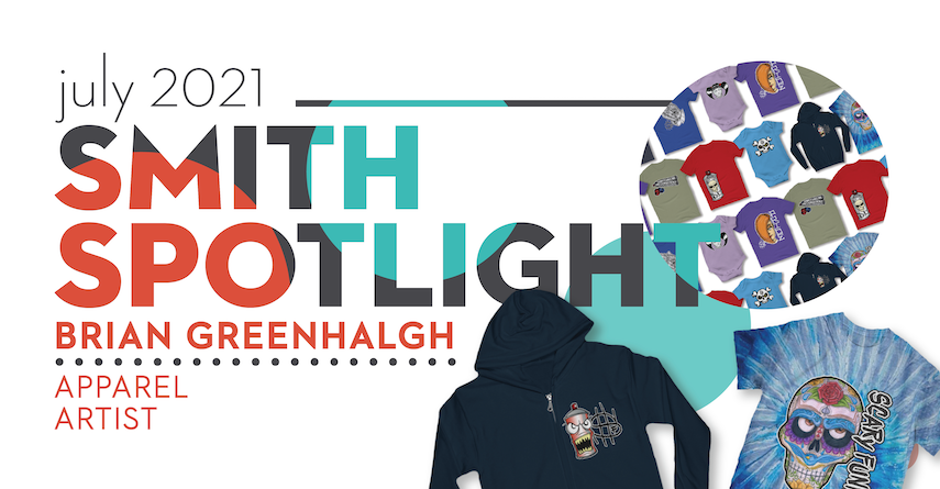
We’re excited to highlight the incredible art of Brian Greenhalgh in our third Spotlight!
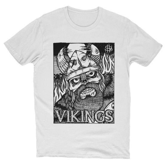
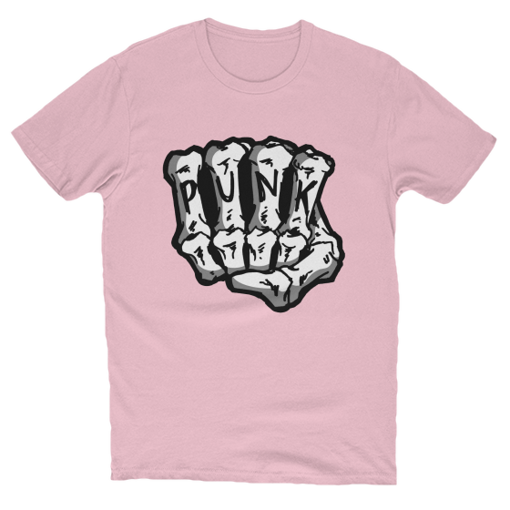
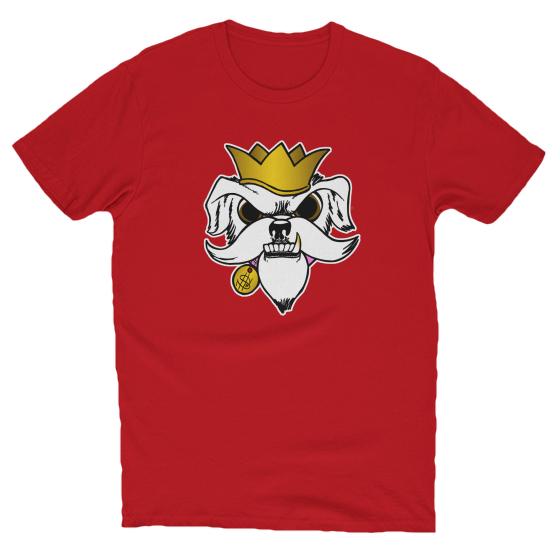
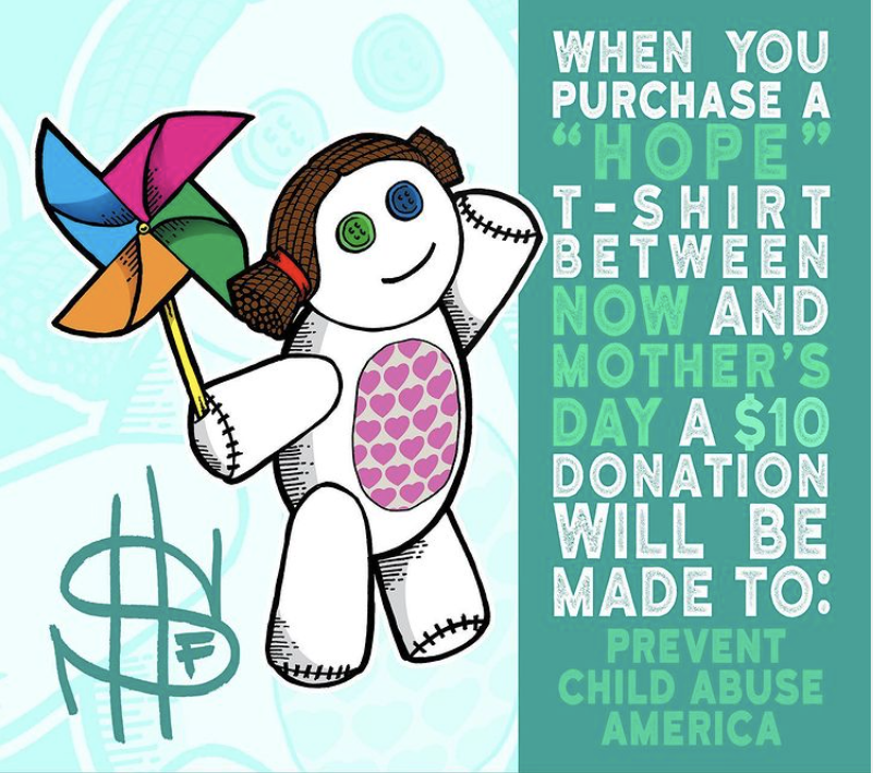
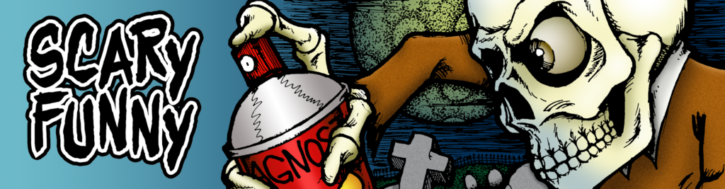
Brian sells unique apparel and stickers through his online store, ScaryFunny. As the brand name suggests, his art style combines a dark, punk style with a light-hearted sense of humor. Inspired by graffiti artists and Keith Haring, he creates eye-catching pieces that contain hidden meanings and clever twists. His collections include music-related pieces, towns he’s connected to, and other themes of cultural or personal relevance.
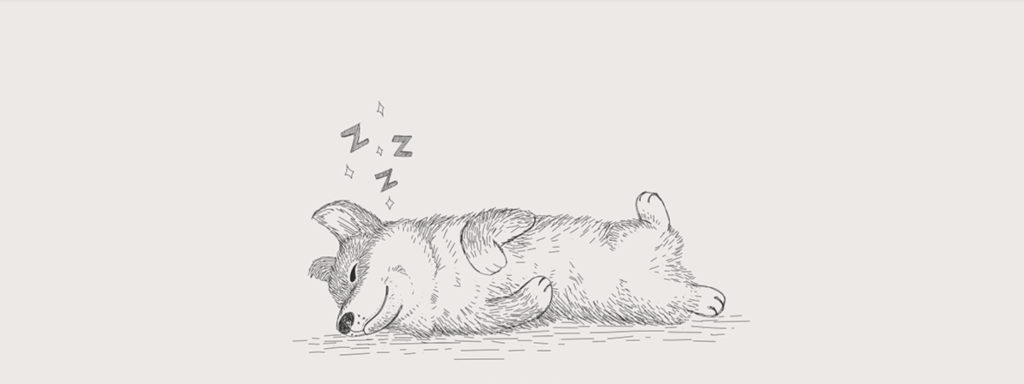
A piece inspired by Brian’s dog, Cali
When he gets an idea for a new illustration, he has to get it on paper and into existence. This drive has led to him having a diverse array of artwork to feature on apparel and stickers.
Turning his passion for art into an actual store is something he’s always had on his mind, but he committed to opening his store in December of 2020. He enjoys getting the chance to engage with his customers. He tries to respond to every message and post he sees on social media, and especially loves to see customers post pictures in their gear.
He mainly markets his brand and products through social media, but also shares stickers of his art with local businesses. Now that we’re able to be out and about in the world, he plans to kick up his marketing efforts by giving out stickers and fliers.
The store has also given him the opportunity to raise money for charity, including creating a special piece to support Prevent Child Abuse America.
The advice he’d give to artists pursuing a similar path is to just keep going. He explains that it’s easy to get discouraged, so don’t pressure yourself for perfection.
“Just make something fun, and enjoy yourself.”
To check out Brian’s merch, visit his online store here! scaryfunny
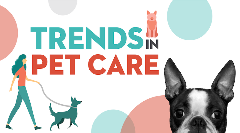
Already a booming category, the sharp rise in pet ownership during the pandemic pushed demand for pet care, products and services to new highs. The American Pet Product Association estimates that Americans spent an astounding $100 billion on their pets in 2020 alone. While pet services like grooming, training, vet care and even insurance are being disrupted by tech-enabled challenger brands, the consumer goods category is also experiencing unprecedented innovation.
Millennials in particular are leading a new generation of pet owners who view, treat and shop for pets as “part of the family.” This means not only higher spending but also higher standards. Younger pet owners are now more likely to shop for their pets along the same value lines they shop for themselves, prizing attributes like sustainability, transparency and brand purpose.
“Americans spent an astounding $100 billion on their pets in 2020 alone.”
American Pet Products Association
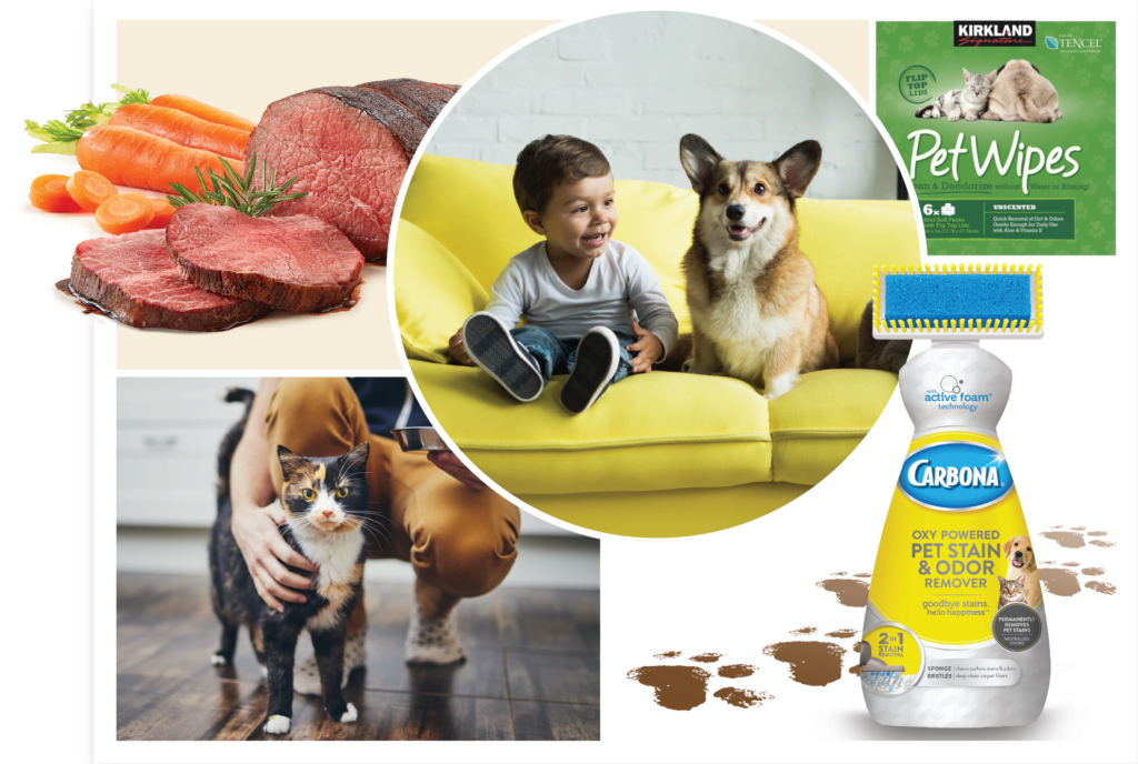
Sustainability in particular is a growing trend in pet care. While pet food has long used animal byproducts, more food and treat companies are now finding inventive ways to upcycle ingredients from the human food chain. Utilizing things like shells, bones and fruit pulp provides added nutrition to pets and helps to cut down on food waste. Beyond upcycling, consumers are beginning to demand greater transparency in ingredient sourcing, especially as it relates to supplier’s environmental practices.
In addition to food and treats, we’re seeing pet accessories like leashes, toys and bedding get sustainable makeovers as well, from plastic-free offerings to those using recycled, natural or biodegradable materials. Of course, any conversation around sustainability must also take packaging into account. Innovations in packaging allow brands who opt for greener materials new opportunities to reduce their footprint, especially when paired with ample communication that ensures consumers are educated on how to best recycle packaging when they’re finished with it.
When designing brands for pet owners, it’s equally important to be mindful of the new retail landscape. Many premium pet brands that have launched in the past 5 years have done so exclusively online, favoring a DTC model. These digitally native brands offered new standards of experience, convenience and personalization. In the mass channel, the runaway success of sites like Chewy.com have helped traditional brick & mortar shoppers acclimate to online shopping. To keep pace with new and innovative brands, and to ensure success as more pet owners shop primarily though ecommerce, pet brands must ensure that their brand presence and packaging are optimized for the digital experience.
In the thriving pet care industry, brands have an unprecedented opportunity to create delightful and innovative experiences. Tapping into the needs and wants of the new consumer and moving quickly to meet them will help brands of all sizes lead the pack.
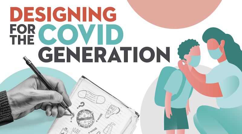
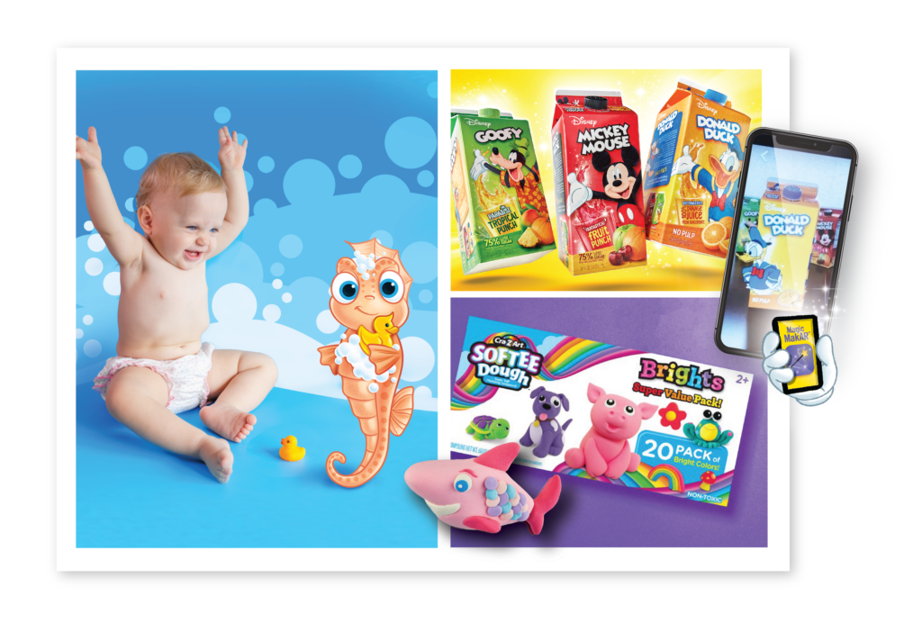
Designing meaningful products and experiences for kids carries unique challenges, and this has never been more true than for “Generation C”, the millions whose early formative years have been defined by living through the pandemic.
Despite the hardships of the last year, Gen C have proven themselves to be remarkably resilient. Whether it’s getting back up after a skinned knee, learning to read facial expressions under a mask, or even making friends over Zoom, there is no doubt that this cohort will continue to adapt and thrive in the post-pandemic world.
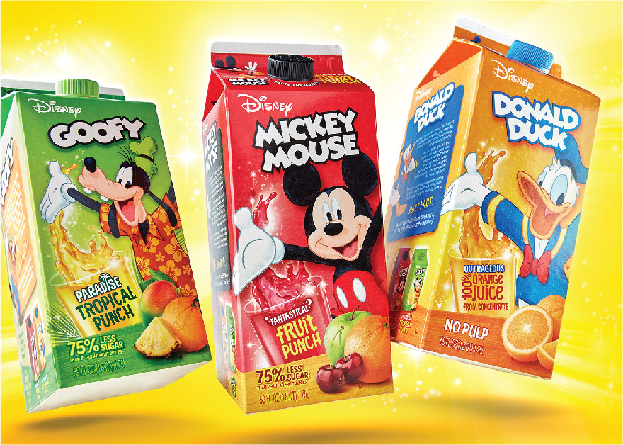
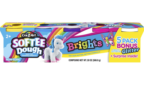
Throughout the past year and beyond, we’ve partnered with brands to find new ways to create engaging and memorable brand experiences, from custom characters for Dial that make washing up more fun, to an AR experience with Florida’s Naturals that livens up the breakfast table, to a brand world for Softee Dough that encourages endless, device-free imagination.
As Gen C prepares to re-enter the “normal” world they will do so with a perspective unlike any generation that’s come before them. In this new landscape, brands will have the opportunity to rethink ways to make meaningful connections, whether through online experiences that cater to Gen C’s digital fluency, innovative products that inspire play and creativity, or something new entirely.
It probably goes without saying, but Smith Design is full of creatives. In our new Smith Spotlight blog series, we’re highlighting the talents of our team and their endeavors outside of our studio. Follow along to get to know the people who make Smith Design awesome.
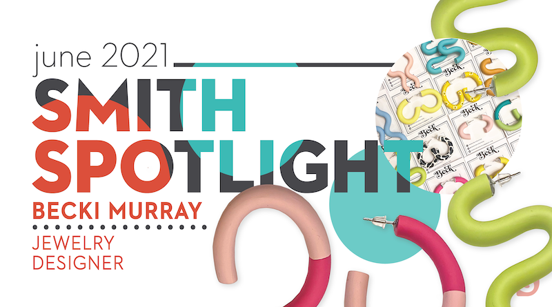
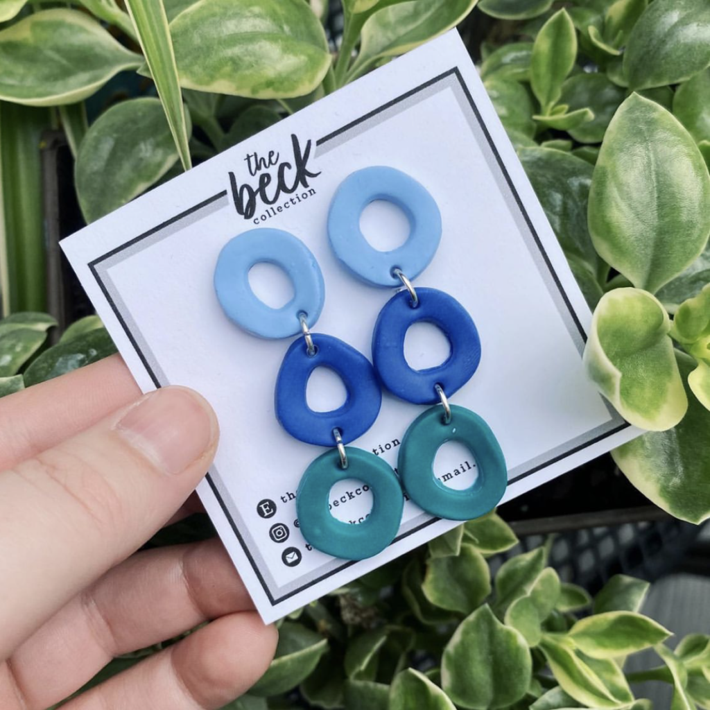
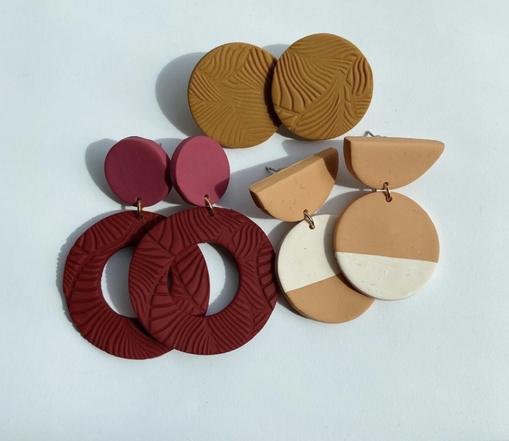
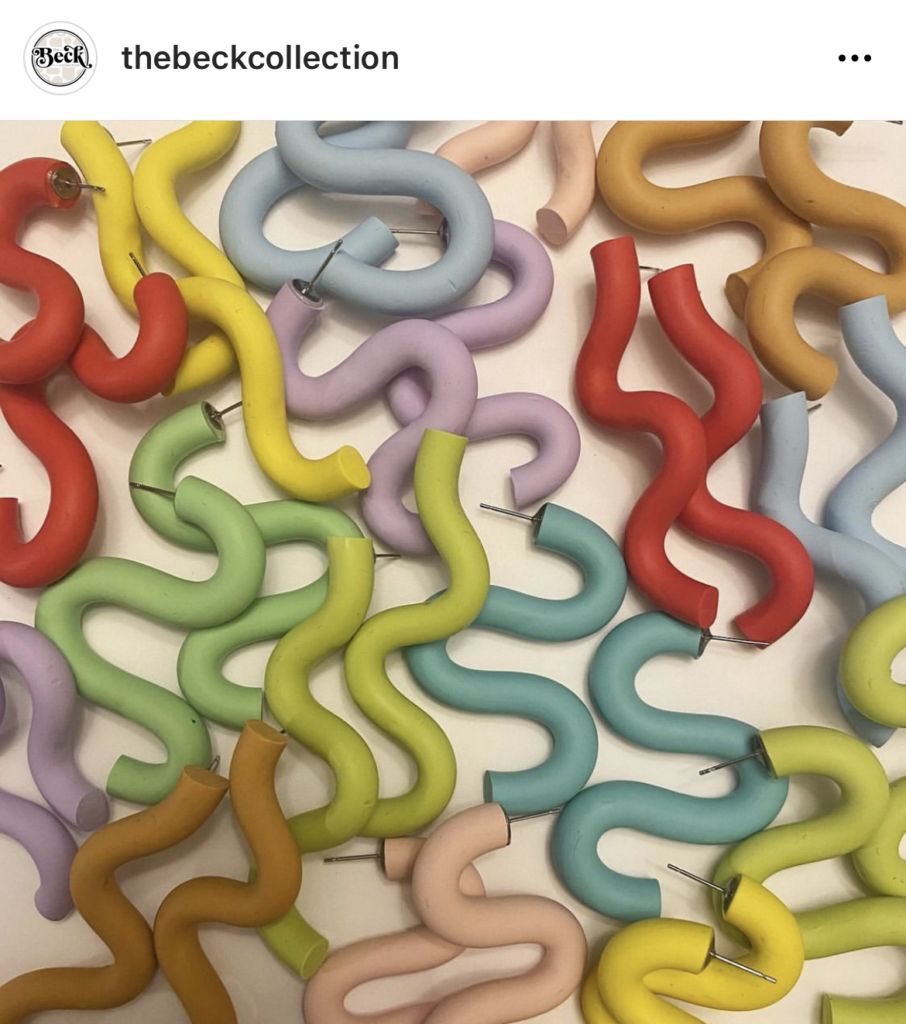
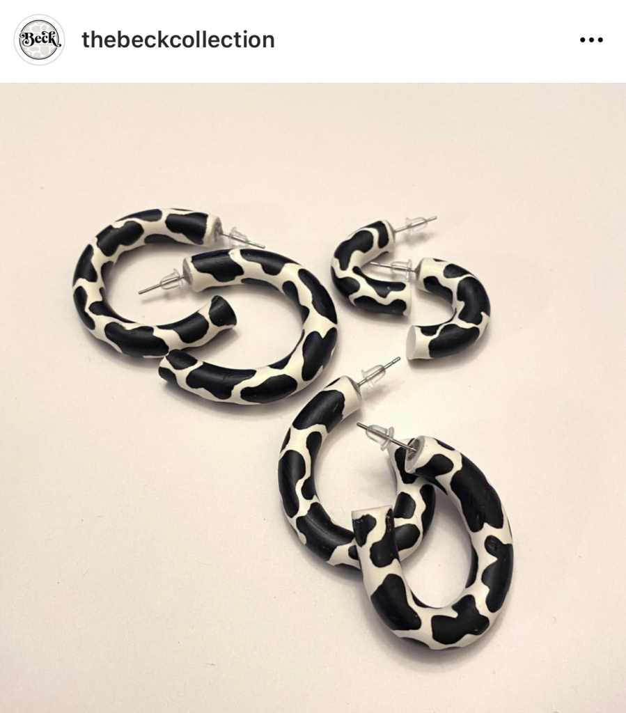
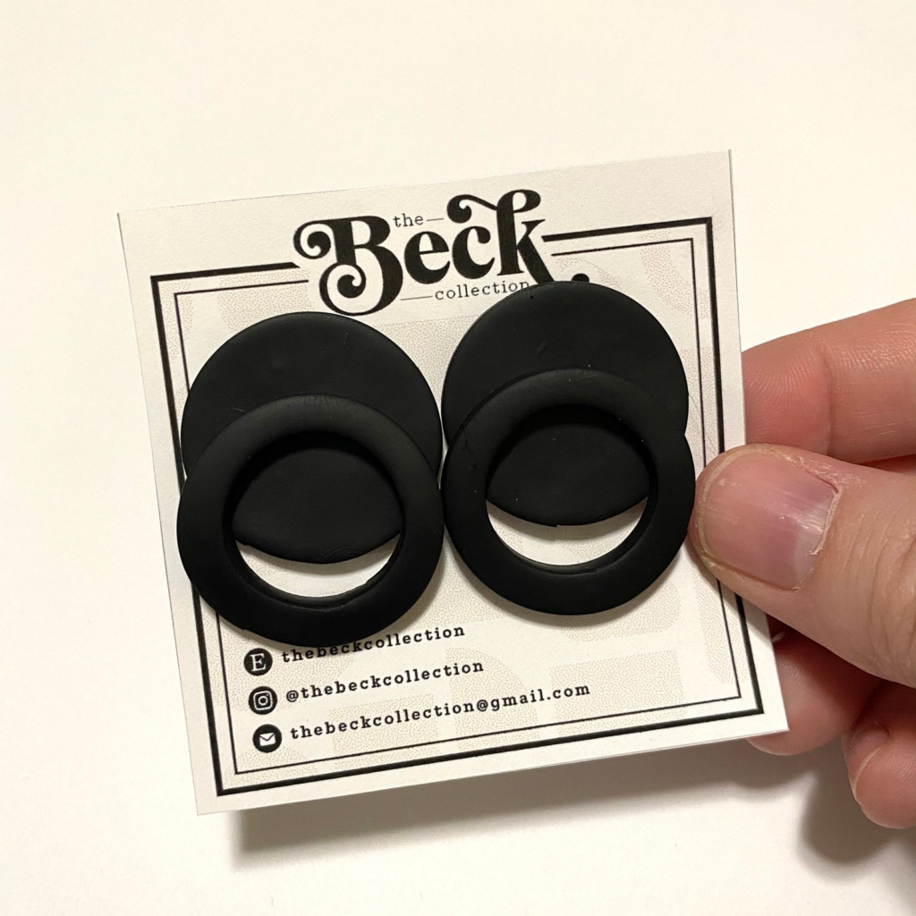
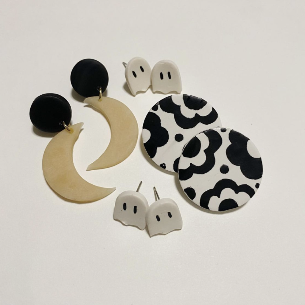
Our second Smith Spotlight features our fabulous jewelry designer, Becki Murray!
Like many of us, Becki had the chance to explore new hobbies during the quarantine of 2020. She began seeing colorful statement jewelry online that she loved, but she felt she could hand make similar pieces of the same quality, for a lower price. She started making a few pieces for herself, and after receiving compliments from her friends and family, she decided to start creating pieces to sell.
Her jewelry shop is run through Etsy @thebeckcollection. She advertises her designs through social media and word-of-mouth. The collections feature fun colors, unique shapes and forms, trendy patterns, and seasonal themes.
Through running a small business, she has learned to embrace the journey of learning new skills. She aims to continuously improve her processes for the best results, learning new tips and tricks along the way. From planning new ideas to executing the designs to packaging & handling shipping, she has learned the ins and outs of a small business, beyond the creative aspect.
Her favorite part of running this business is seeing people wearing her designs. She also enjoys advertising on social media. She likes to create fun promotional campaigns to drive business to her shop.
Her advice to other creatives starting their own small business would be to do plenty of research. When she first started out, she ordered a bulk shipment of boxes for her jewelry, only for the boxes to be too small with no option for return. She also recommends embracing social media as a powerful tool for marketing your brand and products.
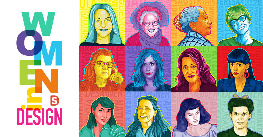
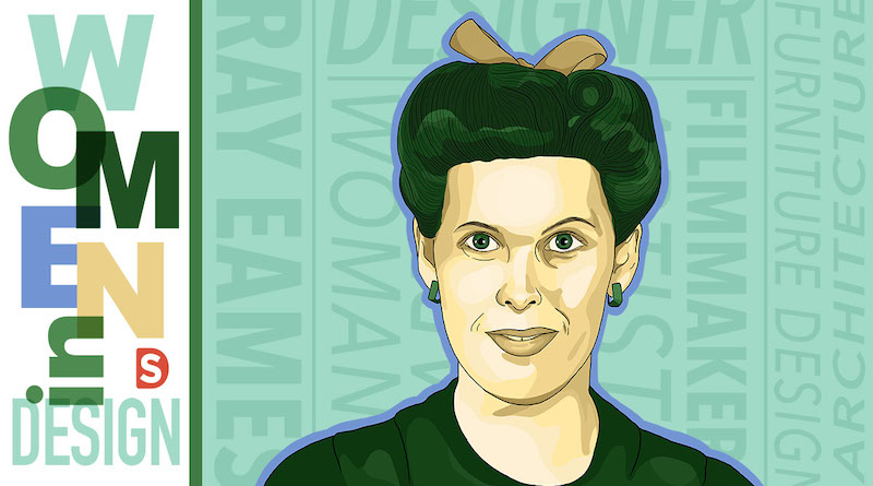
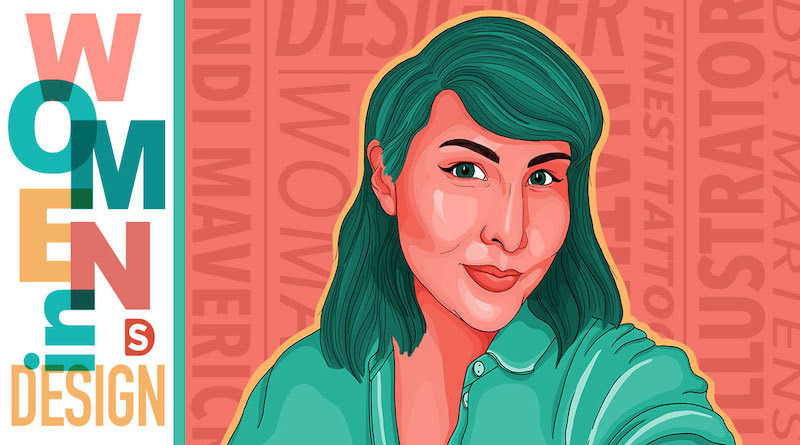
Becki has been with Smith Design as a Designer for over 2 years. If you followed our Women in Design series, you’ve seen her colorful portraiture work.
You can often spot people sporting thebeckcollection earrings around our studio, and many of us have a print of the above Women in Design poster at our desks. We can’t wait to see what she creates next!
Even as we welcome our clients and collaborators back into the studio, we’re excited to continue to offer the flexibility of remote photoshoots! Over the past year, we’ve honed our process to offer an engaging and attentive experience with our in-house photo team and studio, all without the time or expense of traveling to the set. Check out the below or get in touch to learn more about how we’re bringing the set to you!
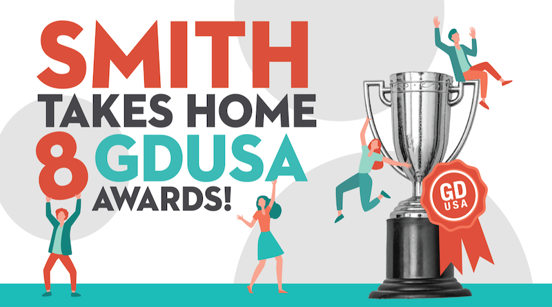
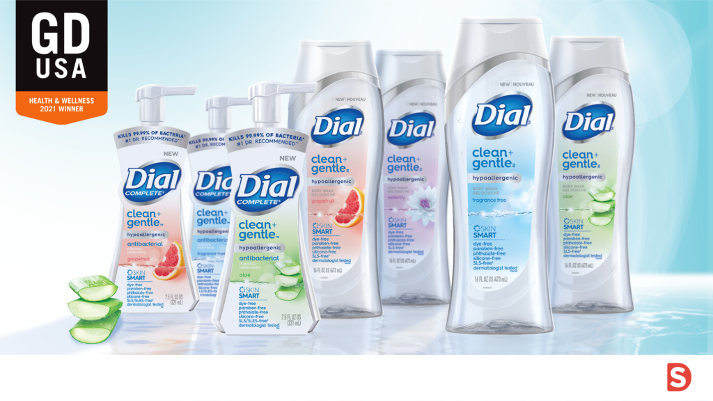
The results are in! We’re proud to announce that Smith Design has been awarded 8 GDUSA Awards, including 4 recent wins in the Health & Wellness category and 4 for American Package Design. We’re fortunate to work in partnership with our clients at Skippy, All, Snuggle, Robitussin, Dial and FulFil Nutrition to bring compelling design to life across products doing good for people and planet. Take a look at some of winning designs below.
To learn about these projects and more, check out these case studies
It probably goes without saying, but Smith Design is full of creatives. In our new Smith Spotlight blog series, we’re highlighting the talents of our team and their endeavors outside of our studio. Follow along to get to know the people who make Smith Design awesome.
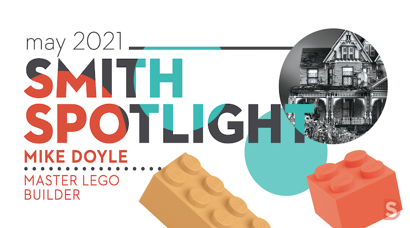
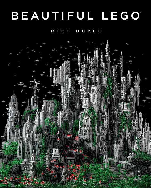
Our first Smith Spotlight goes to our LEGO Master, Mike Doyle!
Mike’s journey to LEGO master began with a family trip to LEGOland. After exploring the park, he began to wonder about the artistic possibilities of LEGO. A quick search online showed him there are many LEGO artists building amazing pieces of art with LEGO, and he became inspired to create artful pieces himself.
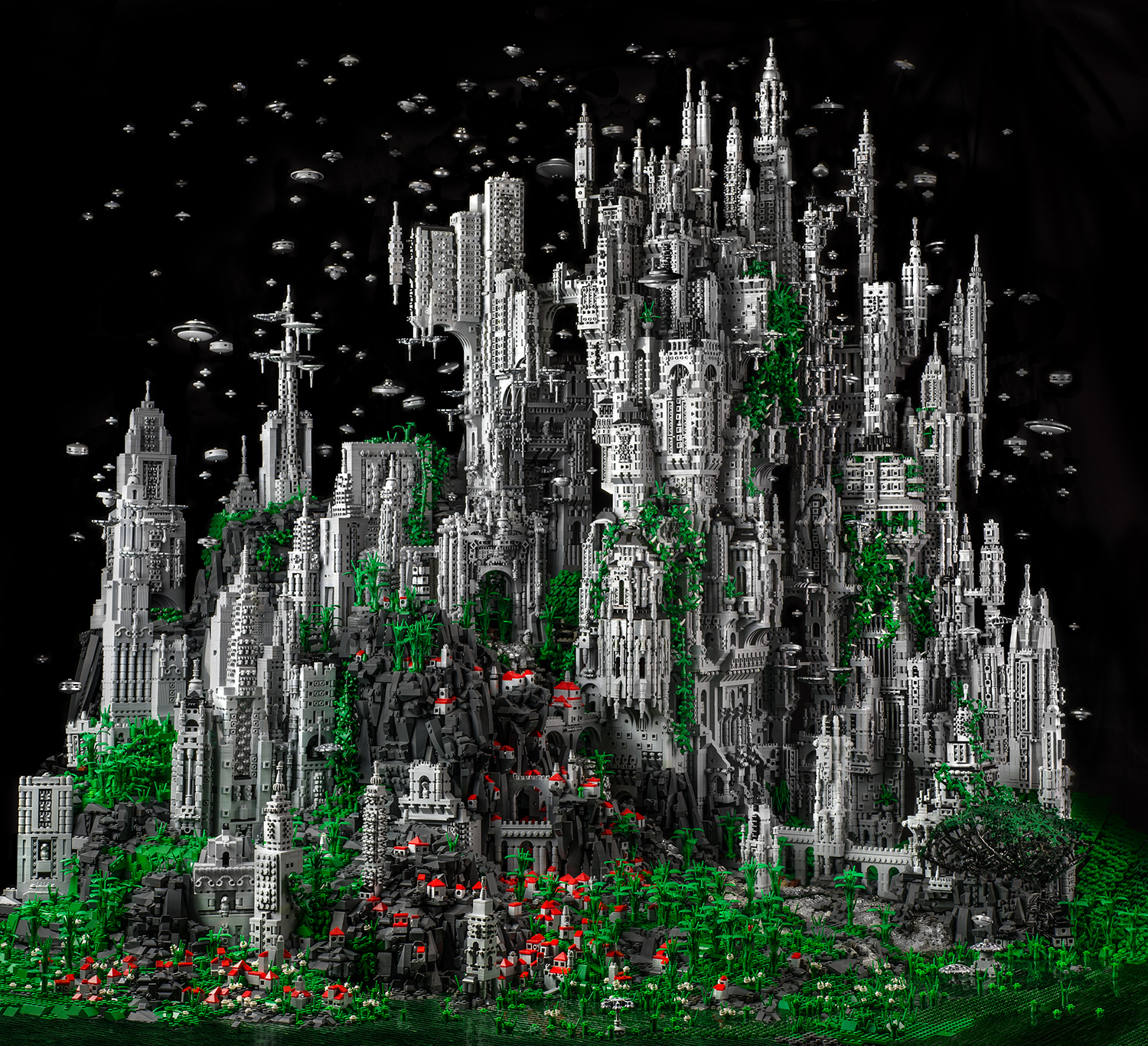
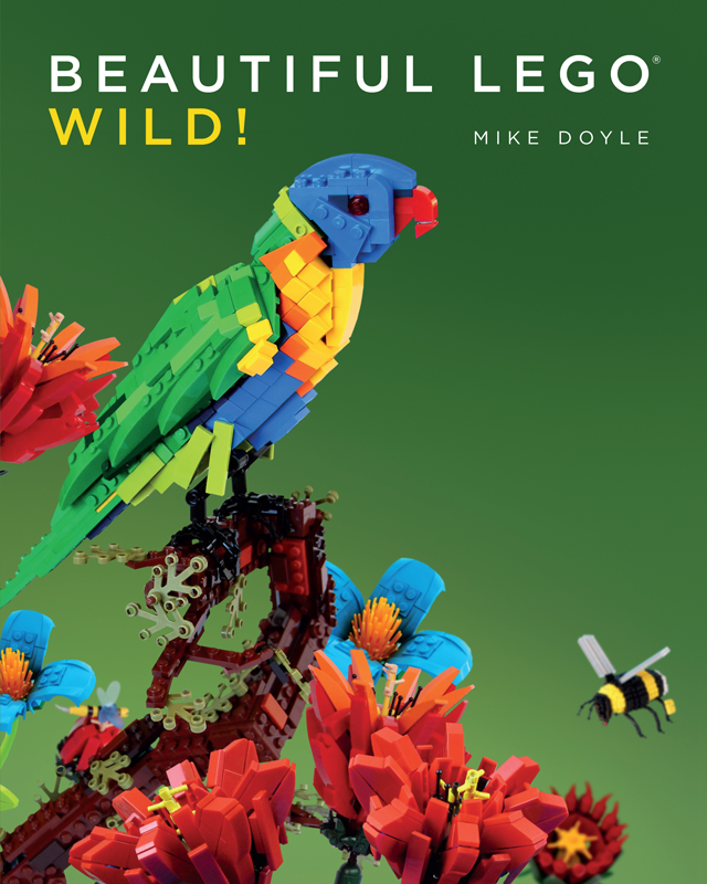
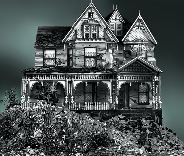
Through his builds, Mike wanted to elevate LEGO to fine art. Many of his pieces combine grayscale bricks, a stunning contrast to the typical primary colors people tend to associate with LEGO. Inspiration for his builds came from real life structures and settings, and often reflect social & cultural events.
What makes his builds unique is their organic nature. Despite the angular mechanics of the bricks, his builds flow with life, even simulating houses falling apart or the flames of an explosion (with no glue involved). The more pieces he built, the larger the pieces became, some getting to be 6 feet high. He has sold prints of his builds all over the world.
What Mike Doyle creates with LEGO has the power, mystery, pain, and intrigue that so many try to capture with more accessible forms of media. He creates deep worlds using something so innocent and unassuming that the medium in itself creates a fascinating juxtaposition: innocence with destruction, old and new, imagination versus reality.
His work with LEGO gave him the opportunity to give back to his community. He hosted children’s programs where he led workshops on creating detailed houses with LEGO. At the end of the workshop, the kids put their houses together to create one large neighborhood of unique homes. He also enjoyed speaking about the art at museums and libraries throughout the country. His art has been showcased at museums such as the Morris Museum in New Jersey and the Cincinnati Art Museum.
Mike has published 3 LEGO books that feature both his work and work by other artists – Beautiful LEGO, Beautiful LEGO 2 Dark, and Beautiful LEGO Wild. He describes the books as a “celebration of LEGO”, and he was glad to see the joy the books brought others, both for the readers and for the artists featured. These books, described by The Los Angeles Times as “one man’s quest to prove LEGO can be art”, can be purchased here.
Through his experience in creating LEGO art, Mike has learned to appreciate “taking the ordinary and making it extraordinary”. He discovered how to change the nature of things into something more. He applies this framework to all of his creative endeavors.
Some ask if LEGO brick-building is Art. To me, that is like asking is sculpting with clay, Art. Well… it could potentially be. Anything, absolutely anything can be made into Art in the right hands, even the ‘child’s toy’ LEGO. In the end, bricks are a medium, like oil paint or clay or pixels on a screen. It’s what you do with them that matters.
Mike Doyle
Mike has been a Smith Designer for about 5 years. Now a Design Director, he began his career with Smith as a freelancer before joining the team full time. The Smith team often looks to him for guidance in seeing the big picture, and we all appreciate his work ethic, expertise, and wit!
At Smith Design, giving back is at the heart of our actions. In 2020, it was an honor to be a part of incredible causes and campaigns that provide support to those in need and advocate for progress on important issues.
Earlier this year, we partnered with multiple organizations to bring relief to those impacted by COVID-19. Through the #EN95 Campaign, on our social media channels we brought attention to the need for PPE and encouraged donations of masks, money, blood, and food to assist the medical community and their patients.
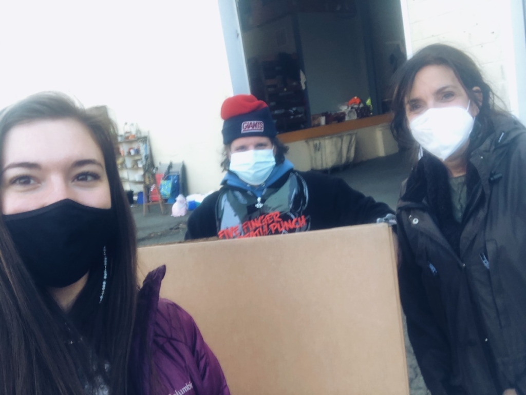
We pulled together as a team to provide support for the responders on the front line of COVID-19. We worked with FLAG, Front Line Appreciation Group, to create Flag Fuel Boxes. These Fuel Boxes provided food and words of encouragement for front line and essential workers. Members of our team and their families purchased and packed these care packages and wrote personal notes for these unsung heroes. Together, we completed 172 boxes! We can’t thank our frontline workers enough for all that they have done throughout these challenging months.
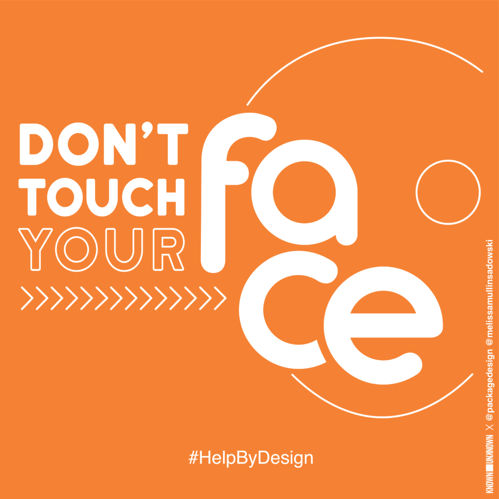
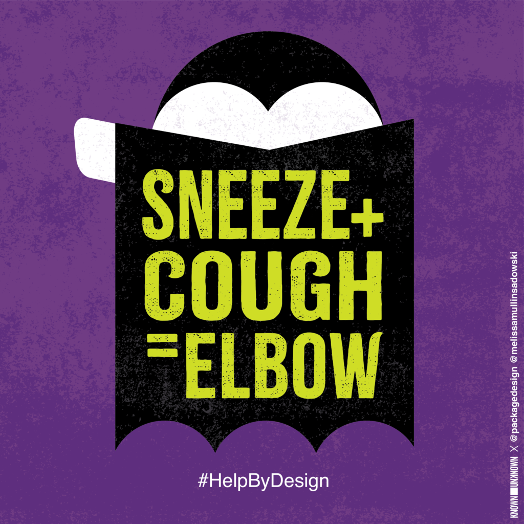
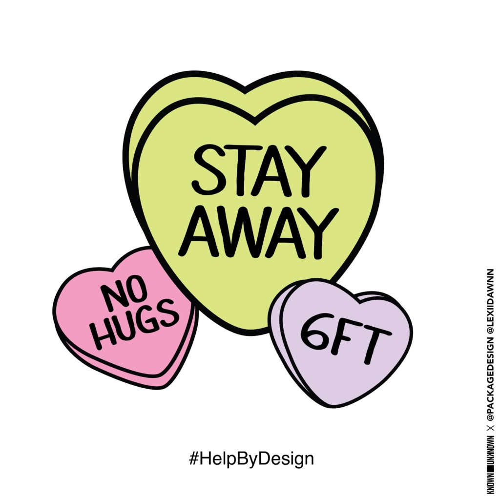
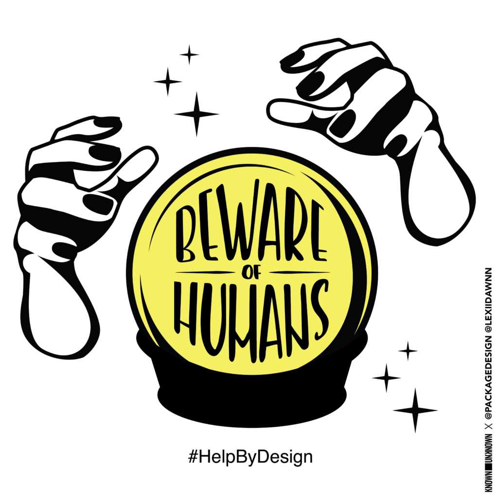
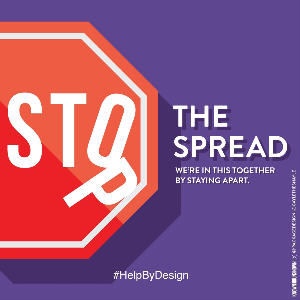
To continue to drive awareness of CDC guidelines and to help #StopTheSpread, our design team created graphic PSAs for the #HelpByDesign campaign. This initiative brings messages of hope during this time of uncertainty throughout lockdowns, restrictions, and social distancing. The campaign is run by the group Known Unknown, a global community of designers. Participating in this campaign helped connect us with designers all over the world and proves the importance of visual communication as a unifying tool in times of crisis.
In support of the fight against systemic racism, Smith Design made contributions towards the organizations Black Lives Matter and Color of Change. Through our social media network, we strived to bring attention to these additional organizations that seek to dismantle the injustices and inequalities perpetuated by racism:
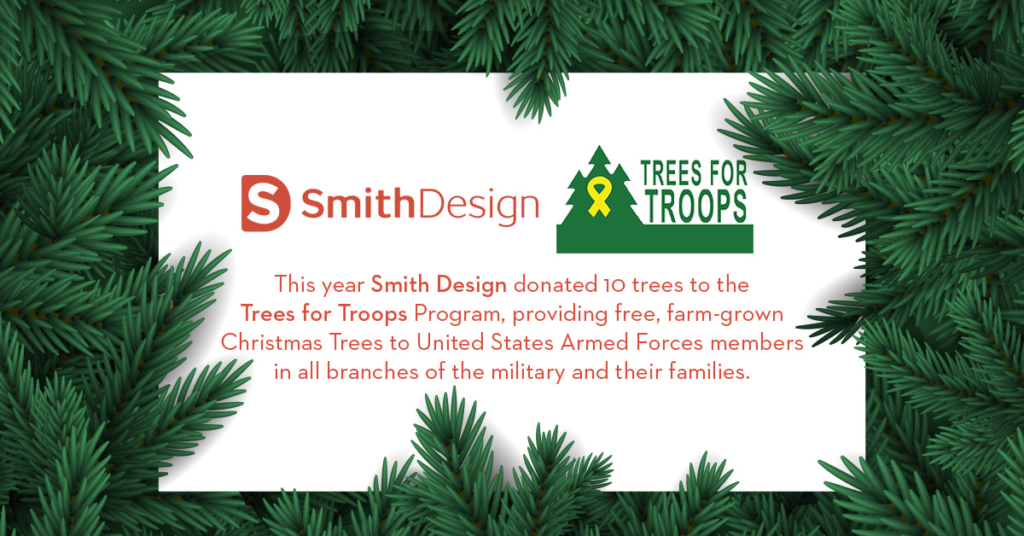
This holiday season, Smith Design proudly supported our troops via Trees for Troops. Our donation of 10 trees meant free farm-grown Christmas Trees were provided to United States Armed Forces members and their families across all branches of the military. Visit treesfortroops.org to learn more about their program that delivers “the spirit of Christmas to military families – one Christmas Tree at a time”.
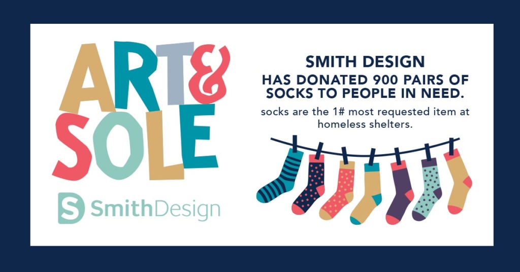
Believe it or not, the #1 requested item in homeless shelters is socks. Knowing this crucial shortage during the winter months ahead, we donated 900 pairs of socks to people in need, including our local shelter.
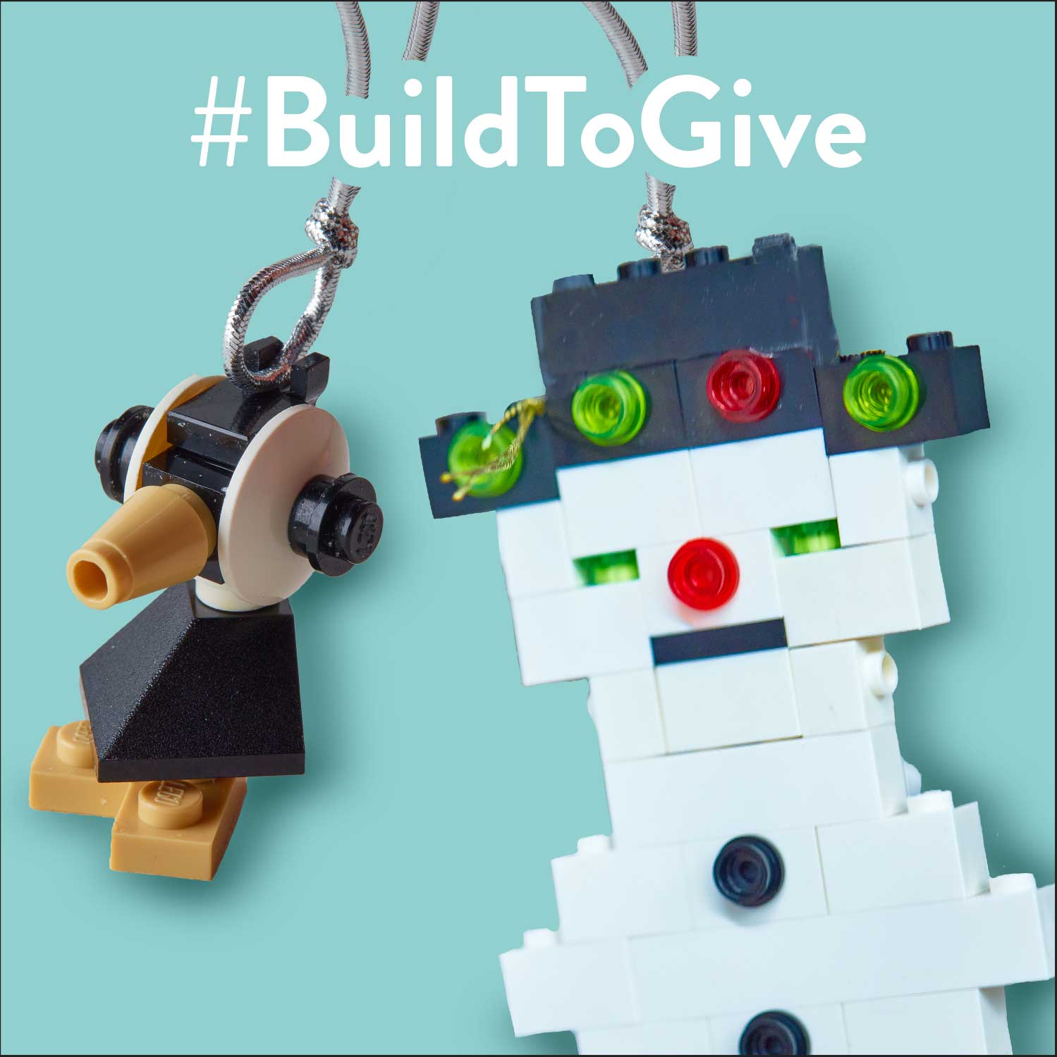
Our team was excited to participate in LEGO’s #BuildToGive initiative, a campaign that donates sets of LEGO to children in need for every LEGO ornament shared online with the hashtag. It was a joy to create the ornaments for a good cause, with our teams’ very own LEGO Master leading the way.
In a year of uniquely challenging circumstances, we have strived to push kindness and caring forward through these giving back initiatives. We look forward to continuing to support these and other great causes in 2021. Here’s to another year of compassion, optimism, altruism and teamwork!
In this blog series, we shine a light on women trailblazers in the design industry – women who have earned a Wikipedia page (or are likely to very soon). You might not know them by name, but definitely by their work and influence on the design world as a whole.
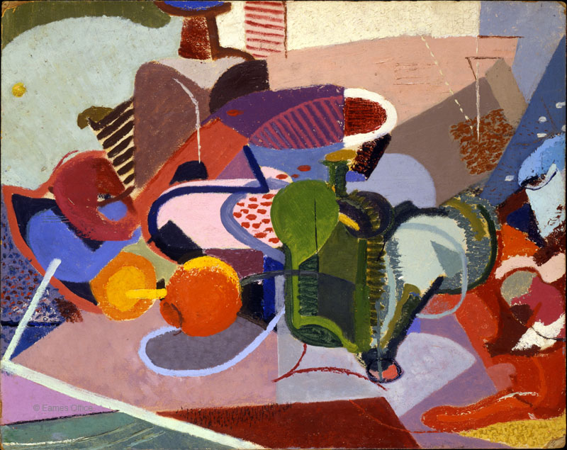
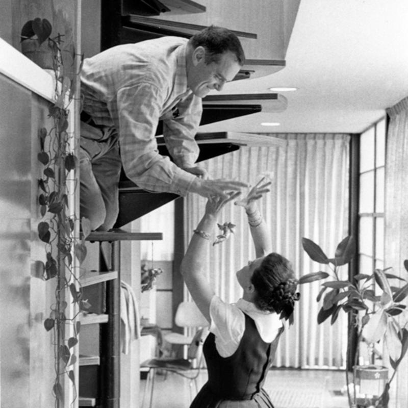
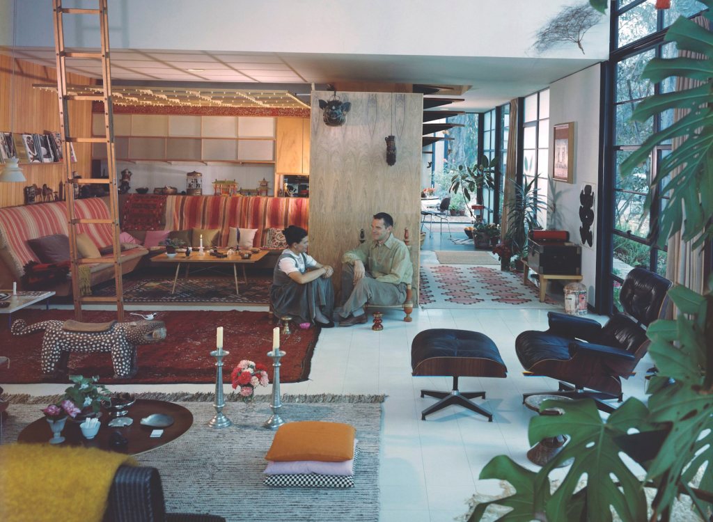
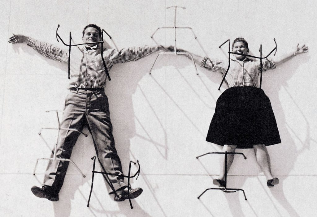
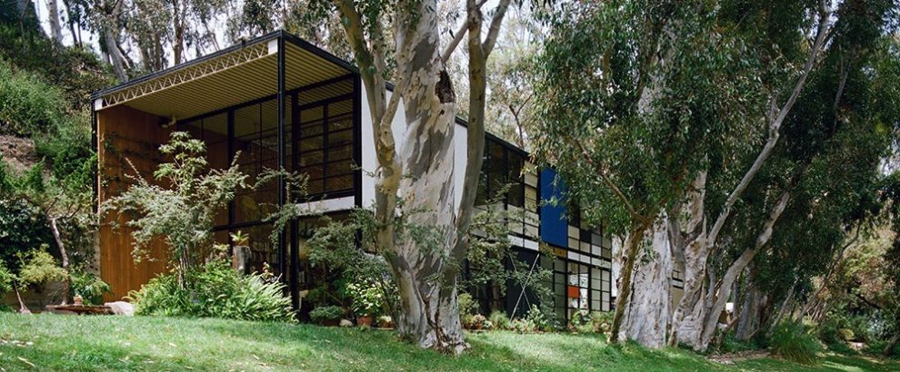
Born Bernice Kaiser, Ray Eames, along with her husband Charles, had a prolific career that ran the gamut from furniture design and architecture to filmmaking, textiles, toys, graphics, exhibition design and much more. Growing up in Sacramento, California, she credits her ability to appreciate and enjoy her surroundings to her parents, who referred to her as Ray Ray.
Mentored by renowned painter Hans Hofmann, Ray started out her creative life as a student of abstract expressionist painting in New York City. Sadly, much of her artwork from this period of her life is lost but her influence on the movement pushed appreciation of abstract artwork to the mainstream. She became a founding member of American Abstract Artists, a group that promoted abstract art in a time that major art galleries refused to embrace it.
“I never gave up painting, I just changed my palette.”
Ray went onto study at the prestigious Cranbrook Academy of Art in Michigan, where she expanded her artistic talents from painting to other medium and met her future creative collaborator and husband, Charles Eames. This powerhouse design duo went onto reshape the world of industrial design.
Ray’s vision was unique in that she possessed an innate ability to understand the connectedness between the form of things and their uses, between the details and the bigger picture. In creative collaboration with Charles, Ray’s innovations in furniture design, architecture, and even toys emphasized quality, form, and function at a reasonable cost.
Not surprisingly, Eames did not receive the same accolades as her husband but despite this lack of deserving recognition, her legacy remains as impactful as her husband. Charles, to his credit, strived to ensure she was acknowledged as an equal partner.
Ray Eames will be remembered for her ever-evolving innovations within her design – how to best use materials, how to anticipate the needs of the end user, and how details come together to make a whole. Charles probably said it best in the now-famous quote; “Anything I can do, Ray can do better”.
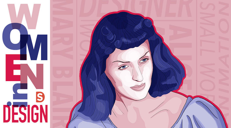
This concludes our year of acknowledging women in design through this series, featuring portraits by Becki Murray, a designer on the Smith Design team.
In this blog series, we shine a light on women trailblazers in the design industry – women who have earned a Wikipedia page (or are likely to very soon). You might not know them by name, but definitely by their work and influence on the design world as a whole.
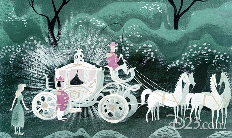
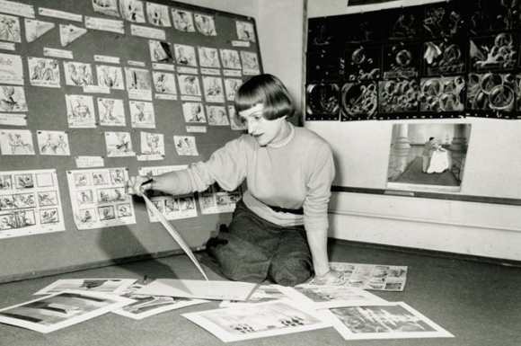
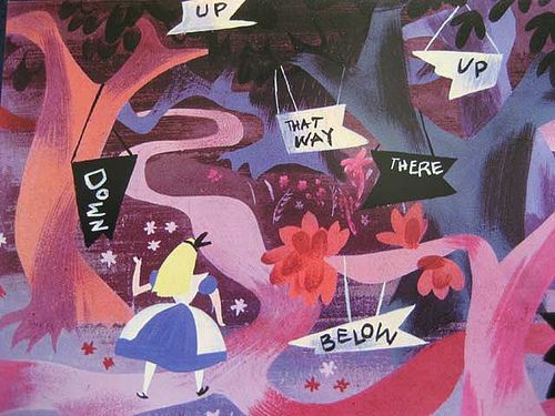
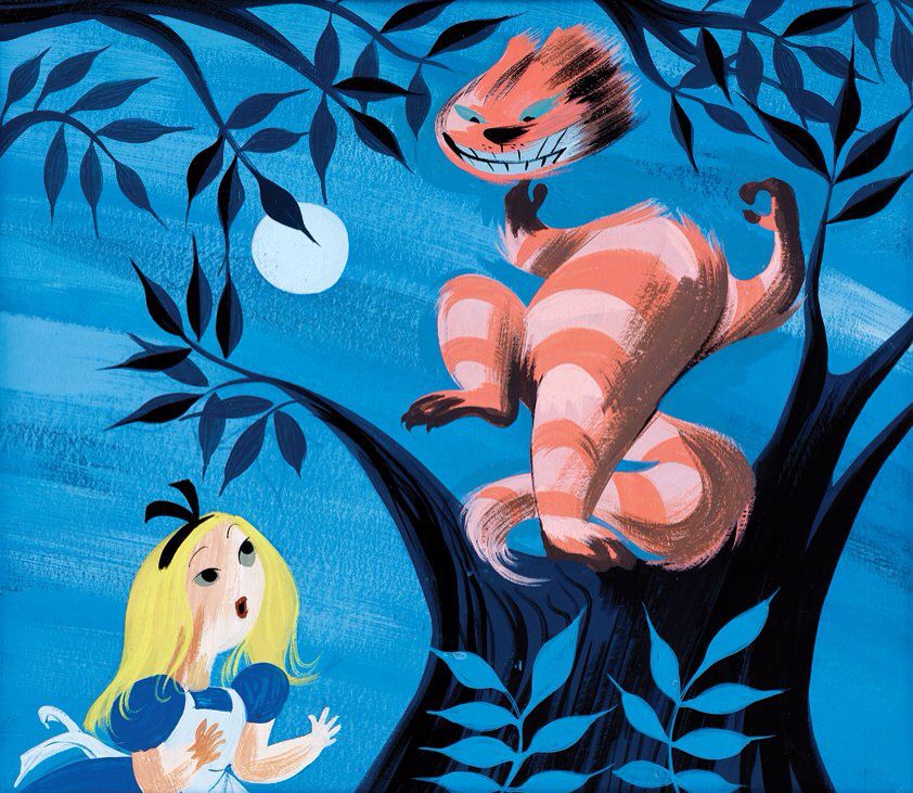
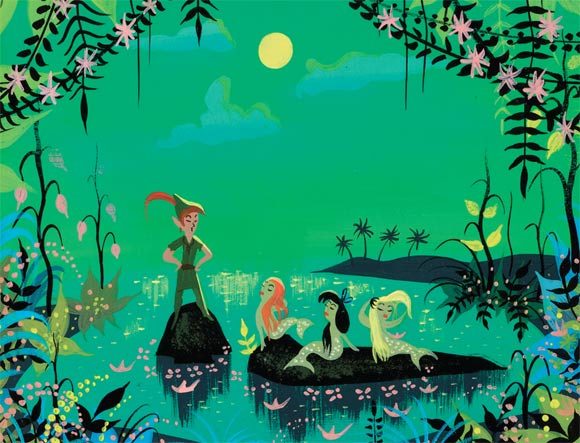
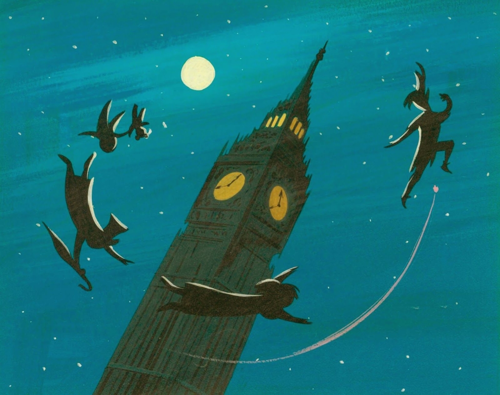
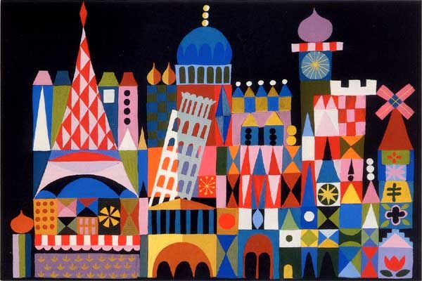
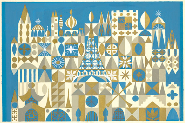
Mary Blair was an impactful artist and animator who brought fairytales to life through dreamy concept art and color styling. She introduced Modernism to Disney’s animation studio, helping to create the artistic style for films such as Cinderella, Alice in Wonderland, and Peter Pan. Thanks to Blair, the visuals of these stories resonate across generations.
Mary Blair grew up in Texas in the early 1900s before moving to California in the early 20s, where she would attend San Jose State University. During her education, she was recognized as a bright, emerging talent, and was awarded a scholarship to Chouinard Art Institute. Here, she honed her watercolor and color styling skills and met her husband Lee Blair, a fellow artist who would also go on to work at Disney.
After graduation, Blair’s talent soared early on in her career. She quickly became known for the unique color styles of her designs, earning the attention of both the art community and animation studios. She became a professional animator at Metro-Goldyn-Mayer. As her distinct style developed, she was welcomed to join the prestigious California Water-Color Society. Her watercolors impressed Walt Disney, and she joined Disney’s animation studios as an art supervisor and color stylist. Walt Disney said that Blair “knew about colors he had never heard of before”.
Blair had a major influence on Disney’s animation, but she faced challenges in her efforts. Despite having the respect of Walt Disney, her other supervisors were quick to dismiss her work as overly abstract and too colorful. In a time where animation studios were dominated by men, she had to fight to push through her ideas, disregarding jealous resentment from her male colleagues. Her determination led to the modernization of the studio’s art style, and her imagination is present in many of Disney’s most iconic films of the time. Her concept art set the foundation for the style that has become associated with a sense of comfortable nostalgia to people who grew up with these classics on their screens.
In addition to her accomplishments at professional animation studios, Blair was also a successful freelance designer. She illustrated several Little Golden Books with beautiful, whimsical drawings.
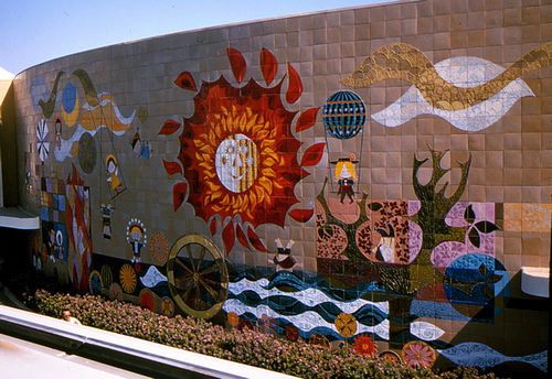
While she was freelancing, Walt Disney reached out to her again, asking if she would help design a new attraction that would eventually find fame at Disneyland, “It’s a Small World”. She also created stunning murals that are showcased throughout Disney’s parks.
Mary Blair’s innovative influence on animation is undeniable. The worlds she designed through her artwork made children believe in magic, while bringing modern art to the screen. She was posthumously honored for her effect on the art of animation by being inducted into the Disney Legends hall of fame. To learn more about Blair, visit the website presented by her nieces, magicofmaryblair.com.
“Her most distinctive factor is that she is kind of showing us her soul…she puts herself into her art work and it transcends the greatest of the Disney movies.”
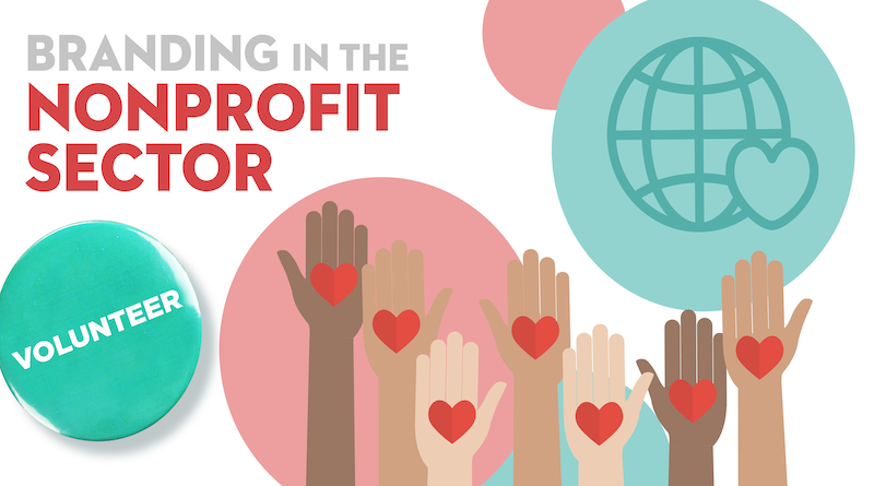
Nonprofit organizations face a unique challenge when it comes to branding. Nonprofits are inherently rooted in emotions, and capturing that essence in a brand can be difficult. There is temptation to shy away from branding efforts and allow the mission and values of the organization to speak for themselves. However, strategic branding is critical in a competitive climate for funding, attention, and volunteers. Due to shifting consumer expectations, for-profit brands have been engaging more and more in values-driven marketing, further emphasizing the need for nonprofit organizations to build a strong, cohesive brand that defines their identity and increases recognition.
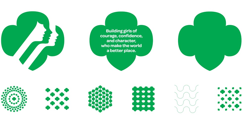
For example, Girl Scouts is a nonprofit that has greatly benefited from restructuring their brand over time. As a result, Girl Scouts avoids becoming stagnant in a fast-paced landscape. Their branding aims to capture the holistic Girl Scout experience. Their logo represents confidence, empowerment, and unity. The trefoil and the three faces within it tie back to the Girl Scout’s three-part promise. Their extensive brand guidelines ensure this essence is captured in all of their initiatives and communications. Thanks to these branding efforts, most people have an understanding of the organization’s mission and goals.
As a part of their branding initiatives, Local Minds, a UK-based organization that provides mental health services, developed a logo that beautifully encompasses the goal of their programs. The scribble to the left illustrates the mental state people can find themselves in when dealing with a mental health issue. The scribble is smoothed out nicely to write out “mind”, representing the transition to a healthy mind.
The American Heart Association updated their mission and logo in 2018 to modernize their brand and better reflect their main objective, “to be a relentless force for a world of longer, healthier lives”. Their brand guidelines consolidate the organization’s positioning under a clear message: “life is why”. All of their communication touchpoints are related to this message and their mission. The simplification of their branding and messaging keeps their organization current and engaging, without losing the strength of their heritage.
It is important to recognize that many smaller nonprofit organizations do not have the same branding and marketing budget as larger organizations. However, there are many cost-effective options for nonprofits to seek out help with their branding and marketing initiatives. At Smith Design, we’re always excited to support nonprofit missions through our pro bono strategic branding and design efforts.
The Nevada Blind Children’s Foundation, an organization dedicated to providing essential educational and extracurricular activities for children who are visually impaired, partnered with us during the opening of their new Children’s Learning Center. We developed a logo for the center that utilized core brand equities while differentiating the center as a unique initiative. We also designed a branded booklet for the foundation’s After School Programs & Events.
God’s Creatures Ministry reached out to us for assistance with a challenge they were facing in the development of their branding. Their mission relates to Noah’s Ark, providing a safe place for all species, but they were struggling with how to fully capture this nurturing spirit in a logo. With this goal in mind, we explored brand colors, ark shapes, and various animal illustrations before creating the final logo.
As Marty Neumeier explains, a brand is “not what you say you are, it’s what they say you are.” A strategic nonprofit brand approach should communicate the mission, differentiate the organization, motivate the team, and promote engagement with new and current supporters. Through this process, thought leadership is attainable for nonprofits of all sizes.
Through insight-driven strategic branding, a unique and ownable positioning can inspire meaningful communications across all touchpoints. For help with nonprofit branding efforts and navigating the ever-changing world of consumer trends, reach out to our team below.
In this blog series, we shine a light on women trailblazers in the design industry – women who have earned a Wikipedia page (or are likely to very soon). You might not know them by name, but definitely by their work and influence on the design world as a whole.
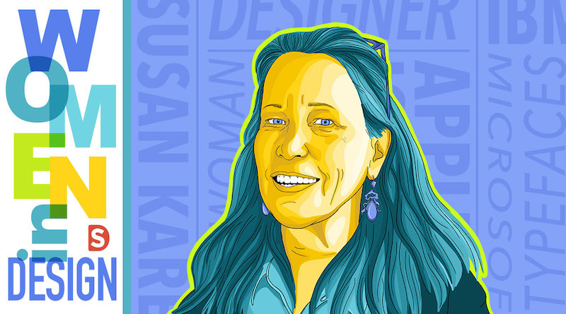
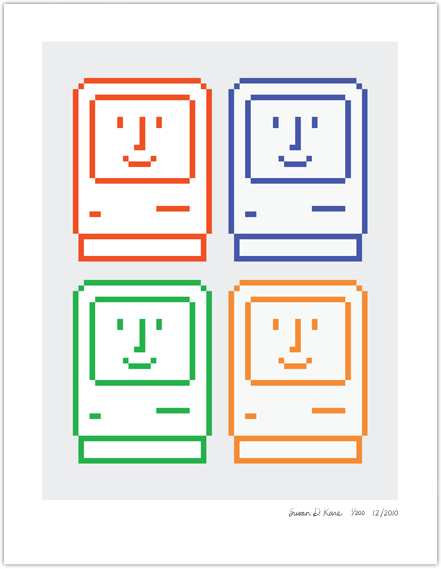
Our October Woman of the Month is Susan Kare, a founding mother of modern design and the creative genius behind some of the most recognizable icons, typefaces, and graphic elements in the world. If you have a Mac, you can see Kare’s looped box design on your Command key.
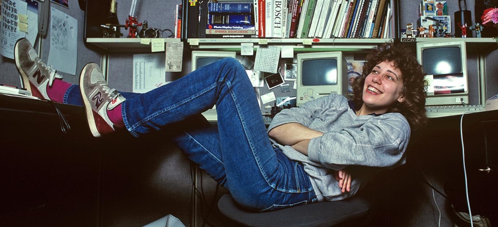
Known as “the woman who gave the Macintosh a smile”, Kare’s digital career took off when she was asked to mock up a few icons and font elements for Apple. She showed up to her interview with a notebook full of pixelated sketches on graph paper, some of which became the iconic elements that gave Macintosh the wit that has charmed users for generations.
Despite having no previous experience with computers, her designs for Apple revolutionized the industry. Her pixel art went beyond graphic design – drawing from experience gained in a Fine Arts PHD and by incorporating aspects of mosaics, needlepoints, and pointillism. By focusing primarily on meaning and clarity, she made computer graphics approachable and available to a wide audience for the first time. Before, knowledge of code was necessary for simple commands like cut, copy, and paste. Kare’s images became a guide for users of all experience levels to interact with computers.
“An icon is successful if you could tell someone what it is once and they don’t forget it…the best icons are more like traffic signs than graphic illustrations.”
Susan Kare
In addition to the icons she designed, Kare created several fonts for Apple that became the standard operating fonts that come with every computer today. She designed these fonts with the screen in mind, aiming to optimize the user’s experience.
After her time at Apple, Kare continued to work with Steve Jobs at NeXT, Inc., eventually becoming an independent designer. She worked with technology giants Microsoft, IBM, Intel, and Sony Pictures, continuing to bring that combination of simplicity and accessibility to everything she touched. Her art can be found in Microsoft’s Windows 3.0, including the deck of cards of the computer’s solitaire game that was more than just a casual way to pass the time, but was actually designed to help users become comfortable using a mouse.
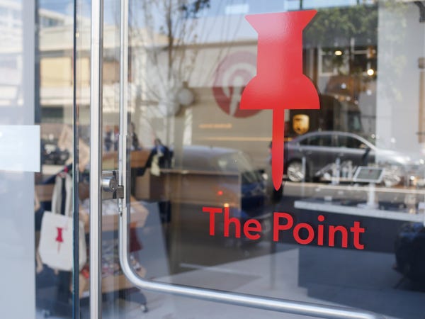
Recipient of the AIGA Medal in recognition of her achievements in design and human-computer interaction, today Kare is Creative Director of Special Projects at Pinterest, heading up the design of The Point, Pinterest’s café in their headquarters.
The seamless interaction we have with computers today is largely due to Kare’s dedication to making computers enjoyable for everyone. The personality in Susan Kare’s work resonates on screen and beyond. Her continuing impact on design is that of wit, whimsy, and maintaining human charm in an increasingly digital landscape.
In this blog series, we shine a light on women trailblazers in the design industry – women who have earned a Wikipedia page (or are likely to very soon). You might not know them by name, but definitely by their work and influence on the design world as a whole.
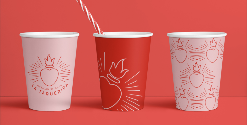
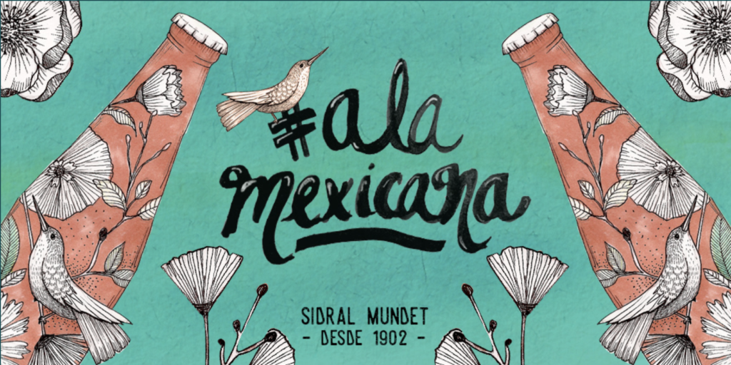
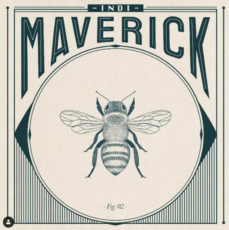
This month, we’re highlighting Mexican graphic design and illustrator, Indi Maverick.
Mexico has long been a source of creative inspiration and a home to incredible artists. In the footsteps of powerhouses like Frida Kahlo, more and more Mexican women are pushing the boundaries of modern art, in their country and around the world. Recognized as one of Mexico’s best female illustrators and designers, Indi Maverick is an emerging talent to keep an eye on. Her work can be found in books, in magazines, on furniture, and on products through various brand partnerships.
Inspired by nature, Maverick’s fine lines flow organically, often integrating leaves, flowers, and animals. Her process creates intricately detailed pieces out of seemingly simple lines and geometric patterns. In this simplicity, she is able to capture a very human personality, one that feels authentic and not overly cutesy. Her brand work for Dr. Martens, Stella Artois and Michael Kors shows how she can apply her techniques to fashionable brands in a way that feels relevant and fresh.
Maverick has participated in several important cultural collaborations. Her illustrations are featured in Sidral Mundet®’s campaign #ALaMexicana. This campaign seeks to use the phrase #ALaMexicana, or “The Mexican Way”, as a positive recognition the spirit, culture, passion and accomplishments of Mexicans.
Maverick has already proved she is a design force to be reckoned with, and her creative journey is definitely one to pay attention to. To see more of her work, visit her website or her Instagram profile.
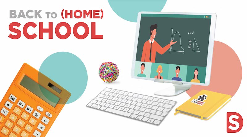
Back-to-school shopping is one of the biggest retail holidays of the year. In 2019, consumers spent more than $26 billion in their shopping to stock up for the school year. Like so many traditions impacted in 2020, the usual back-to-school scramble felt different this year. Supply lists shifted to include Chromebooks, teaching easels, and kid-sized desks, as parents are doing their best to make their home an efficient learning space.
Technology needs of the online classroom drove sales up, for an estimated total of $33.9 billion. Online retail sales are seeing an unsurprising increase across all industries, and school supplies have been no exception. 70% of parents and students have shifted to buying supplies online due to COVID-19.
Retail brands that typically see a surge in demand during the back-to-school season had to pivot their tried-and-true strategies to meet the suddenly changing needs of their consumers. These brands now have to support their consumers in a different way. Going forward, they have to determine and communicate how their products can fit into our new virtual, homebound routines.
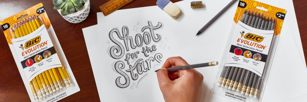
Positioned as “communication essentials”, Bic is a brand that has become fundamental to back-to-school supplies. In a time of changing communication structures, they have an opportunity to build trust in their consumer base by striving to remain the go-to supplies for learning, despite the shift to virtual classrooms. For example, their Evolution® pencils are sturdy and long-lasting, and could be positioned to parents as perfect for stocking up shelves with supplies that won’t need constant replacing.
Tasked with finding hands-on activities that encourage creativity and provide a break from the screen, parents are purchasing supplies like Softee Dough. Softee Dough recently launched a new look for their modelling clay kits. The new design stands out both on shelf and digitally, a necessity in this era of increased online shopping.
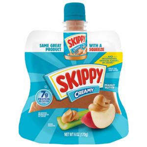
In addition to school supplies, parents have been looking for quick and easy snack options for their kids at home. Snacks that kids can access independently during their virtual lessons are in high demand. Skippy’s mess-free peanut butter in their new squeeze pouch is convenient for snacking between online assignments.
This back to school season brought attention to the need for nimble and flexible brand strategies. With the holiday season quickly approaching, brands will need to apply learnings from this fall to their holiday retail strategies.
For help navigating the ever-changing world of consumer trends, subscribe to our newsletter or reach out to our team below.
In this blog series, we shine a light on women trailblazers in the design industry – women who have earned a Wikipedia page (or are likely to very soon). You might not know them by name, but definitely by their work and influence on the design world as a whole.
This month, we’re highlighting Jessica Walsh, a bright star in the design field and an all-around creative. Her agency, &Walsh, founded in July of last year has become one of only 36 female-led creative studios in the United States.
Unsurprisingly, Walsh was a self starter from the get-go. Teaching herself coding at age 11, she soon had a growing client base of middle school students looking to launch their own websites. Although web was her first introduction to design, her style really flourished years later at art school and then during her internship at Print. Described as daring, surreal and bold, she cleverly utilizes the tools available to create thought provoking, hilarious, clever and heartfelt pieces.
Jessica Walsh unapologetically commits to the big idea. While some of us might struggle with execution, she commits to the idea first and executes without compromise, often without the use of a computer. In this way, she is operating in a world where technology is used as a tool, but not the only tool. Her creations, more than just graphic works, commit to a big idea first.
“What I have learned over the years is that a computer is a great tool, but it’s just a tool. Sometimes when you just get off the computer and start working with your hands, you end up having a lot of accidental discoveries and ideas that never would have happened if you are just sitting there all day pushing pixels on the screen.”
Walsh joined Sagmeiter INC., in 2012, making partner 3 years later. Remarkable as that may sound, her true accomplishments during this time are in her personal projects. First, in 2013, Walsh catalogued in video and graphics (later becoming a book) her experience dating Timothy Goodman, a designer friend in “40 days of dating”. A film is currently in the works. Then in 2016 she teamed up with the same friend in “12 kinds of kindness” , exploring ways to be kinder and other similar themes. These social experiments are fascinating, thought provoking, beautifully designed, and ultimately very personal and exposing, appealing to young people familiar with the reality TV experience.
Walsh is aware of her responsibility as a female leader in a male dominated category. She includes Paula Scher, Gail Anderson & Maira Kalman as sources of inspiration as she acknowledges that the agency world has in the past been a tough place for women leaders. She also is aware of how her position as a female can be used as a competitive advantage. When Walsh posed naked with Sagemiter to announce their partnership, (a call back to a similar image Sagmeister himself released when he founded his company in 1993) they received instantaneous notoriety through social media, according to a February 2013 interview with The Creative Influence Director Mario De Armas.
To quote Ms Walsh, it achieved its goal… “it was quite a functional piece of design.”
Now, at 33, with Walsh running her own agency servicing clients such as Museum of Modern Art, The New York Times, and The School of Visual Arts, it is still her genre defying personal work that stands out above the rest. While her former partner Stephan Sagmeister takes 1 year off in every 7 to recharge his creative batteries, Jessica Walsh seems to keep her creativity flowing by focusing on the human experience, something we can all relate to. By sharing her inner world, we the audience are invited to take a look at our own personal creativity to see where it can lead us.
In 2018, growth of the plant-based market had reached $4.6 billion. It is predicted to grow to $85 billion over the next 10 years. This rise can be attributed to growing concerns for health, sustainability, and animal welfare, especially among Gen-Z and Millennial consumers.
The increase in popularity is also due to improvements of the products themselves. With developments in technology and manufacturing, plant-based meat alternatives are getting better and better at mimicking the texture and taste of real meat, becoming more appealing to general consumers, not just health-conscious shoppers.
With these meat-free options becoming mainstream, many large brands have developed their own plant-based innovations. Burger King embraced the trend with their Impossible Whopper. This new take on the classic Whopper was one of their most successful product launches, attributing to one of their best quarters in recent years.
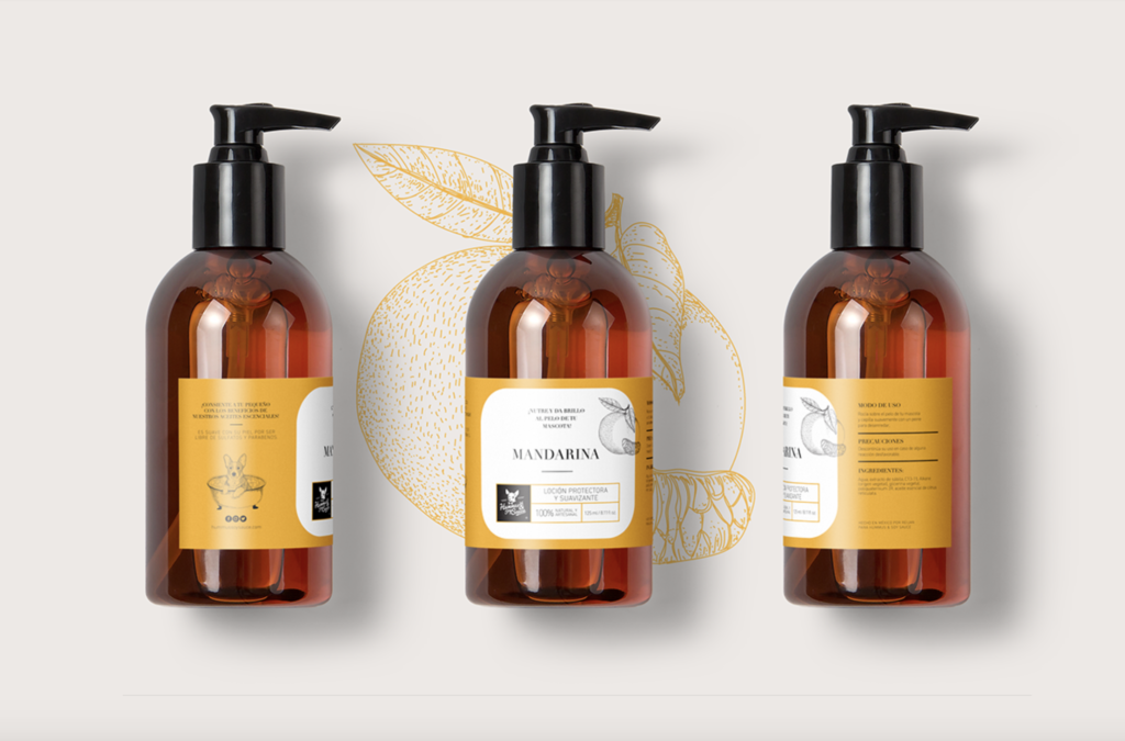
SKIPPY®, Farm Rich, and Green Giant also expanded into the plant protein space, partnering with Smith Design to develop effective brand identities and packaging designs.
Green Giant’s Harvest Protein Bowls are frozen meals that pack 12g-14g of plant-based protein punch. The packaging communicates the plant-based point of difference, appealing to the growing number of consumers interested in easy incorporation of natural, healthy foods into their diets.
One of SKIPPY®’s newest products features their well-loved peanut butter with the added benefit of plant protein, in a unique, squat jar that helps consumers avoid “peanut butter knuckles”. We ensured that the label demonstrates a visual connection to iconic SKIPPY® equities, while clearly communicating the enhanced protein offering. The innovation is already generating buzz in the category.
When Farm Rich extended their wholesome portfolio with a line of plant-based snacks and appetizers, we were careful to develop a brand identity that differentiates these from the core line of products while staying true to established equities. The details in the handwritten font subtly emphasize the plant-based offering and work with the whitewashed wood background to indicate naturalness. We targeted health-conscious consumers through the photography, pairing healthy sides with the meat-free products.
The demand for plant-based protein sources has already had a powerful impact on product innovation, and its growth won’t be slowing down anytime soon.
For help navigating the ever-changing world of consumer trends, subscribe to our newsletter or reach out to our team below.
In this blog series, we shine a light on women trailblazers in the design industry – women who have earned a Wikipedia page (or are likely to very soon). You might not know them by name, but definitely by their work and influence on the design world as a whole.
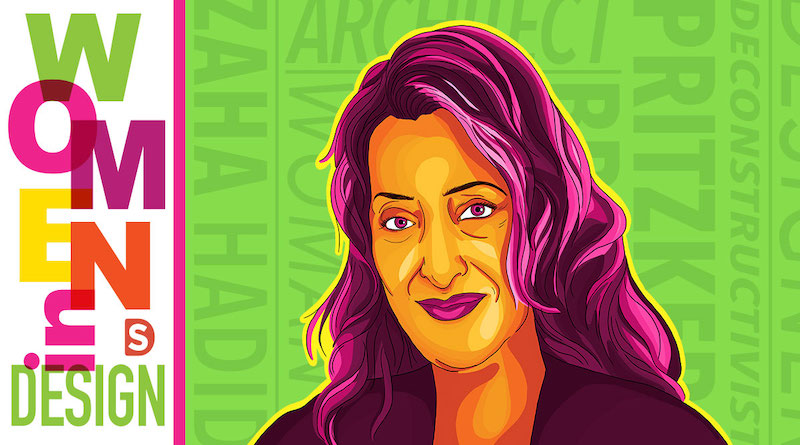
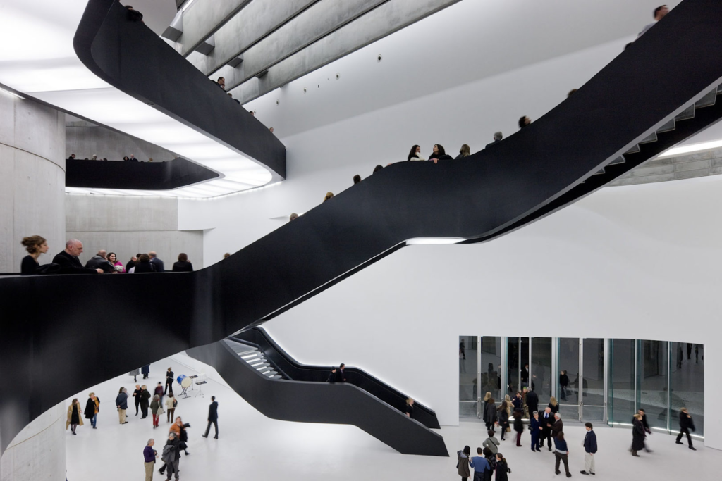
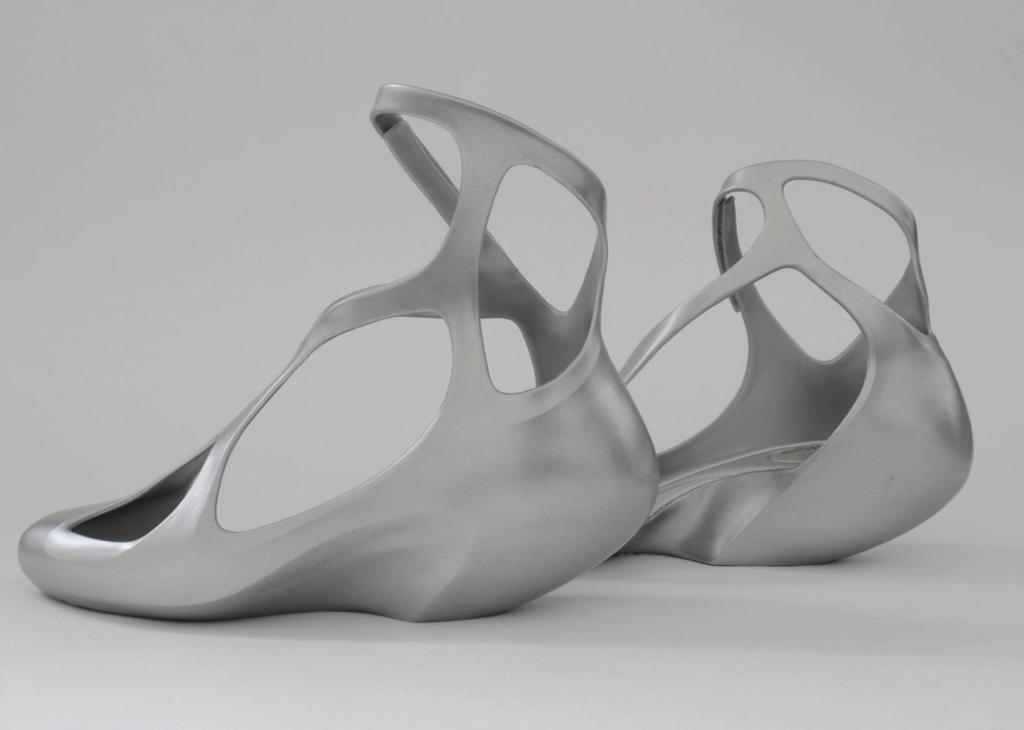
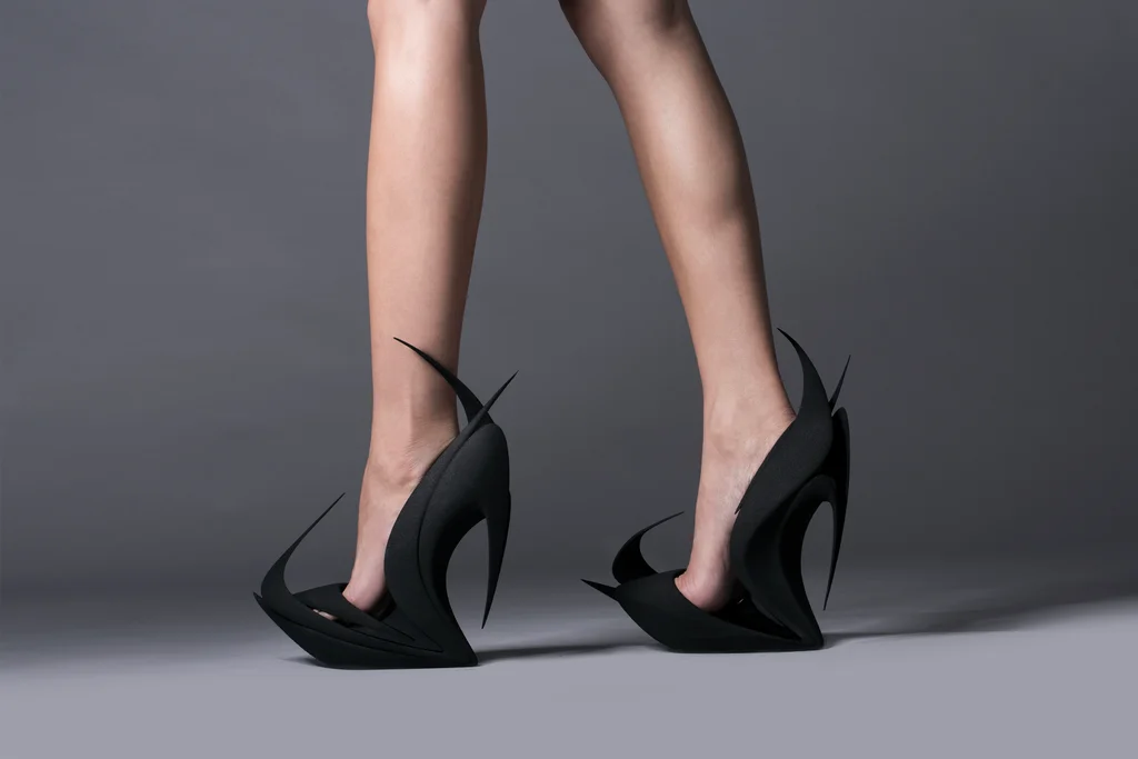
This month, we’re celebrating renowned architect Zaha Hadid. As her professor described her at graduation, Zaha Hadid was “a planet in her own orbit”. She stayed true to her unique vision throughout her impressive career and continuously moved architectural design forward. She became the first woman to receive the prestigious Pritzker Architecture Prize.
Hadid was often called the “queen of the curve“. Her expressive designs pushed the limits of architectural geometry. Famously opposed to straight lines and mediocrity, her fluid-like structures breathe new life into the spaces around them. Her work includes some of the most iconic buildings in the world. She designed museums, opera houses, stadiums, art & science centers, and more. She loved designing buildings she knew would encourage culture in the community.
Hadid was born in Baghdad, Iraq. In an interview with The Guardian, she credited “the rivers and the dunes” of Iraq as inspiration for her concepts. She studied architecture in London, and was touted by her professors as one of the best students they ever taught. Even early in her career, people recognized her ability to bring the seemingly impossible to life. She went on to open her own architecture firm, Zaha Hadid Architects, and taught architecture at several schools, such as Harvard Graduate School of Design and Cambridge University.
While she is widely regarded as the world’s top female architect, Hadid often refused this categorization, insisting that she was simply an architect and should be referred to as such. She expressed that she experienced sexism and racism during her career, and she hopes her journey shows young women that the glass ceiling can be broken.
Hadid’s creativity wasn’t limited to architecture. She explored other mediums, such as collaborating with brands in the fashion industry to create conceptually and visually stunning shoes.
Zaha Hadid’s enduring impact on architecture and design as a whole is undeniable. The world experienced a great loss when she passed away in 2016. Her strong, creative spirit lives on through her work and the many people she’s inspired.
“When people see something fantastic they think that it’s not possible to achieve it in real life. But that’s not true. You can achieve amazing things.”
Zaha Hadid, The Guardian Interview “Zaha Hadid: I Don’t Make Nice Little Buildings”
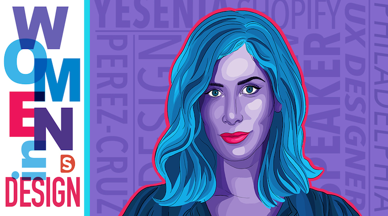
In this blog series, we shine a light on women trailblazers in the design industry – women who have earned a Wikipedia page (or are likely to very soon). You might not know them by name, but definitely by their work and influence on the design world as a whole.
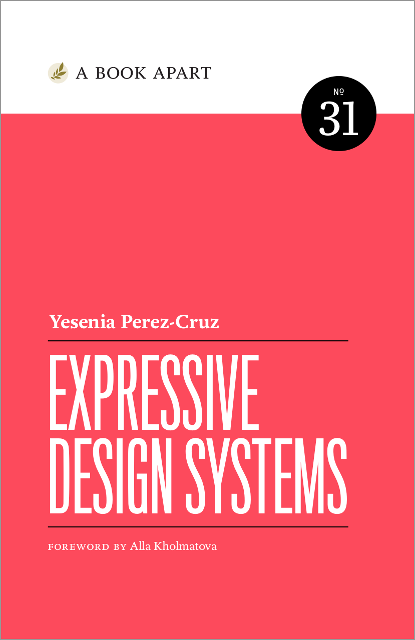
This month, we’re highlighting Yesenia Perez-Cruz, an accomplished designer, speaker, and author. Yesenia Perez-Cruz is a great role model for women and people of color who are interested in design and technology. Her drive towards innovation and passion for inclusivity make her a strong leader in this traditionally male, white industry.
Initially Perez-Cruz, who came to the US when she was 5 years old, thought she would grow up to be a writer. Her time was spent at this early age reading books as a way to teach herself English. Reading and writing became the foundation for her creative curiosity and that self-motivated drive can be attributed to her success today. A graphic design course in her senior year of high school changed all that and led to her acceptance to the design program at Drexel University.
It was here that Perez-Cruz first became interested in web and user interface design and, eventually, more specifically, UX design.
UX design, simply put, “refers to any interaction a user has with a product or service”. Her work in UX puts her on the forefront of innovations which consumers experience first-hand and in real time. Her inclusive mindset ensures that technology is designed responsibly with all humans in mind, creating a seamless, positive interaction for all end users.
In her current role as Senior UX Manager at Shopify, she’s noted that her love of writing now plays a bigger role in her career than she expected with UX design presenting an opportunity to tell an interactive story. Her work, visually stunning as well as highly functional, has earned her street-cred awards like Rad Girl’s 2015 Designer of the Year and a Webby.
Winner of the 2012 Webby in “Celebrity/Fan” category
She is especially passionate about the relationship between technology and design, providing audiences with applicable inspiration for their own work. In her book, “Expressive Design Systems” she explores the ways in which design systems can elevate design and innovation, and how to avoid becoming stifled by processes.
Perez-Cruz, a self described introvert, travels the world as a speaker at conferences and events, sharing her expertise and passion but also as a way to advocate for inclusivity and for women of color in the highly competitive design/tech world.
In an interview with The Great Discontent, she explained “When I was going to conferences for the first time, I never saw people on stage who looked like me—there weren’t a lot of women or Latinas. I realized that if I wanted to see more Latinas on stage, I’d have to push myself to get up there. I hope that others will be inspired by that.”
Yesenia Perez-Cruz’s viewpoint is one we should all pay attention to. Through her own self advocacy and inclusive approach, she hopes to encourage others to pursue a similar path.
COVID-19 will undoubtedly leave an unprecedented impact on the world. All industries and business markets will be affected, even the digital landscape.
However, budget cuts are impacting digital campaigns and partnerships. In order for companies to weather the current situation, many budgets have been reduced and reworked. Marketing budgets have come under more detailed scrutiny than ever, so paying for sponsored content partnerships tends to get deprioritized. Influencers have been reducing their rates to try and continue partnerships with brands, but unfortunately, many campaigns have been paused or cancelled, despite the positive metrics.
With the increase in social media usage and the quickly accelerating growth of e-commerce, brands across all categories shouldn’t dismiss sponsored content as a valuable marketing strategy in a post-COVID-19 world. There is now an opportunity for brands and influencers to create a more authentic connection with each other and with their audiences. Sponsored partnerships are being approached openly and honestly, parameters being laid out with an understanding of the difficulties COVID-19 has caused. As Later points out, influencers are able to approach brands with reduced pricing for sponsored campaigns and content, creating partnerships that may not have happened before. If your brand is considering starting or refreshing an influencer marketing campaign, now might be the perfect time to solidify plans.
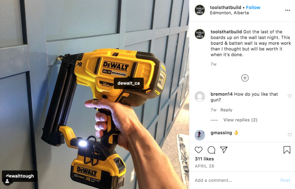
Great examples of brands successfully utilizing social media channels and influencer partnerships, even during this time of new challenges, are found in the tool industry. Many brands of tools partner with influencers on social media, who use and review their products in their professions. Their opinion is reliable because these influencers actually use these products on jobsites. They naturally relate to the brands’ target audience, building community and trust, while encouraging others in their field to try the products they recommend. This digitally connected network of influencers and audiences will continue to drive positive results for the partnered brands, especially with the ongoing rise of e-commerce.
In addition to reevaluating existing partnerships and developing new ones, there is an opportunity to reframe content to be more effective in the changing world. Recently, sponsored content through a filtered lens has been losing its charm on audiences. In an analysis of the fashion magazine industry, The Times asked “In a world where toilet paper is hard to come by, is there a place…for magazines selling dreams of luxury?” This question applies to influencers and their content as well. Influencers will be more successful with their sponsored content if their voice is honest and reliable. Consumers crave authenticity. Audiences, especially from Generation Z (who make up the majority of Instagram users), will respond well to content that does not feel disconnected from reality.
The perspective of influencer marketing has to change from “don’t you want to be like me?” to “I am just like you”. Now more than ever, people want to feel comforted by honesty, authenticity, and familiarity. Campaigns that achieve this will connect with their target audiences and earn brand loyalty.
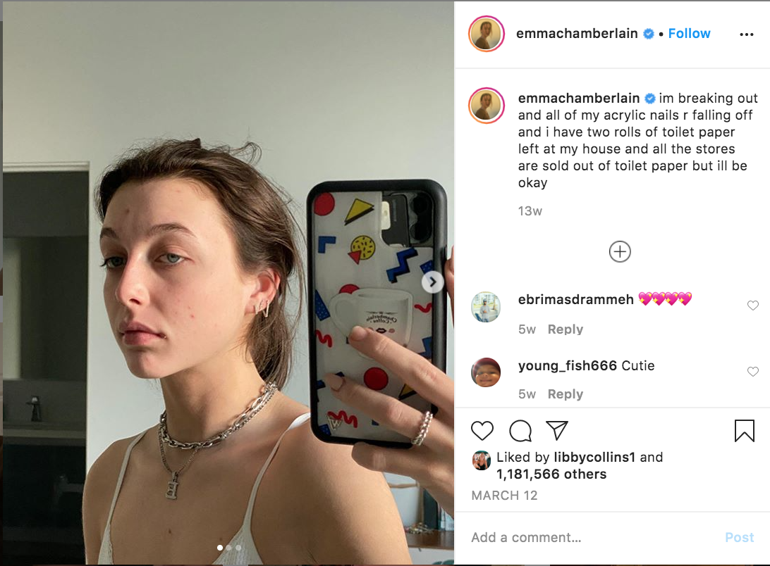
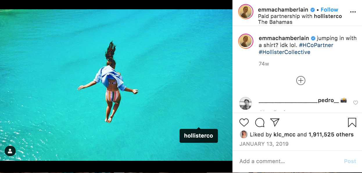
Emma Chamberlain, a YouTuber and influencer who is especially popular with Gen Z, has built her entire personal brand around authenticity, often taking it to the extreme with her content. Her content is so real and relatable that it makes her followers feel like they are on the inside of a private joke with her.
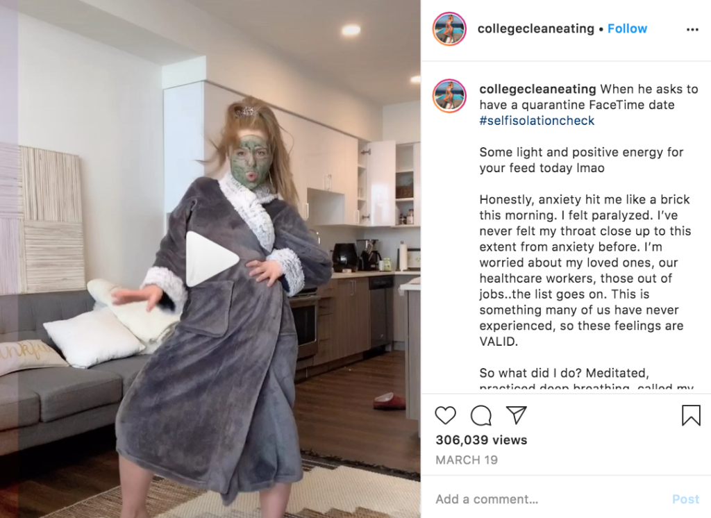
Another example of successful authenticity is fitness influencer Katrina @collegecleaneating. She posts engaging content, opening up about relationships, mental health, and body positivity struggles she’s experienced on her fitness journey. Her approachable, empathetic digital presence has earned her about 650,000 followers on Instagram and differentiates her profile from other fitness accounts that rely heavily on perfection. When she shares sponsored content, her followers are ready to engage and inherently trust her opinion.
As the world moves forward and marketing teams are faced with many decisions, influencer marketing shouldn’t be overlooked. With the right content, partnerships, and strategy, influencer marketing is a powerful tool that B2C brands can use to leverage the rising popularity of e-commerce, build brand loyalty, drive traffic to websites, and ultimately increase digital sales. Questions about developing effective brand and digital marketing strategies? Contact us below.
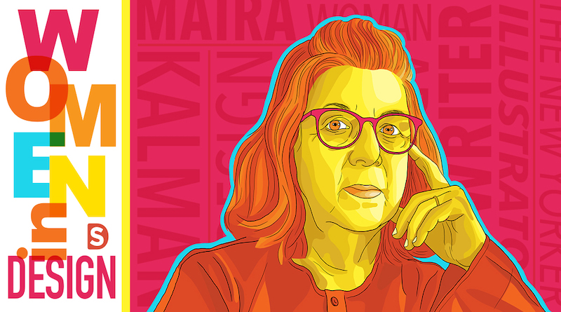
In this blog series, we shine a light on women trailblazers in the design industry – women who have earned a Wikipedia page (or are likely to very soon). You might not know them by name, but definitely by their work and influence on the design world as a whole.
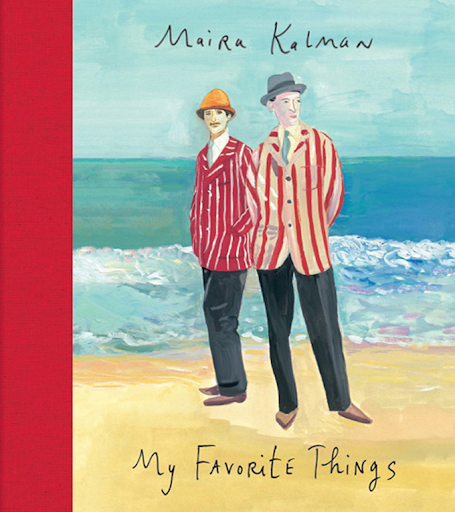
Maira Kalman is a renowned artist and writer. She was born in Tel Aviv, Israel and moved to NYC when she was a young girl, where she continues to reside. She was married to the famed graphic artist Tibor Kalman for 18 years until his death in 1999. They founded the agency M & Co together and were highly successful, blending illustration, typography and imagery to create iconic art for prestigious institutions, including the National Audubon Society and MOMA, and covers for the acclaimed Interview magazine.
After the birth of their children, Maira took a new, independent path that led her to become a design legend in her own right.
Over the course of her career, she has written and illustrated books for both children and adults that feature her playful take on the world. Her style perfectly captures the whimsical and wise, combining a naive style with a sage’s vision. As a storyteller, which is how she refers to herself, her careful use of language and image work together to capture the eccentric, intelligent way Kalman herself views the world and her appreciation for society, history, and the humorous aspect of life.
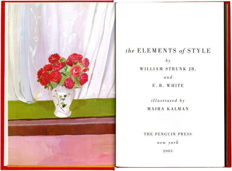
She was commissioned to illustrate the iconic design bible “The Elements of Style” in 2005, which promoted this quote from the New York Times – “While The Elements of Style has never lacked fans or dutiful adherents, appreciation for this slim volume has taken a turn toward the whimsical and even surreal.”
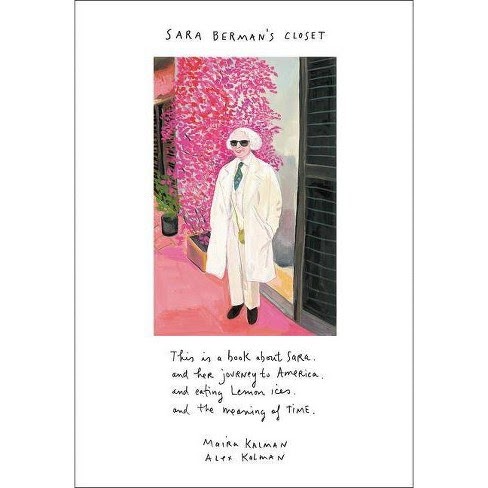
Her work is almost always uniquely personal, capturing her point of view on anything from politics to family. Working with her son Alexander, Maira created an exhibition dedicated to the memory of her mother Sara Berman, an early inspiration, which later became a book titled ‘Sara Berman’s Closet’. She has also collaborated on a short firm with her son called “The Most Wonderful Day” which can be seen here on YouTube.
Her wit, charm and intelligence come through most famously in the The New Yorker magazine cover published in December 2001. She collaborated with her partner Rick Meyerowitz, redrawing the New York City map post 9/11 and renaming it ‘New Yorkistan’. The response to the cover was overwhelming, the magazine disappearing from newsstands in two days and becoming the best selling issue in the magazine’s history.
Maira Kalman’s impactful work is a reminder to notice and appreciate life. She inspires audiences to look closer at seemingly common things, to see the importance of the ordinary. She elevates politics and philosophy to higher levels of thought, commanding worthy attention. To learn more about Maira Kalman, visit her website, Instagram, or watch her Ted Talk.
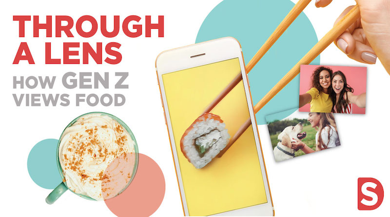
“Gen-Z”. The generation under the scrutiny of marketers who want to understand their shopping preferences, their consumer habits, and TikTok. Generally speaking, this generation is an ethnically diverse, socially-conscious group of digital natives who are growing up with unprecedented access to technology. As this group of people (born between 1995-2015) gets older, their impact on all industries, including the food and restaurant industry, is becoming increasingly evident.
This generation is practical and realistic. They crave authenticity, which causes them to opt away from artificial ingredients and preservatives if they can help it. Ethical and sustainable sourcing is also important to them, as they are careful about the impact their actions have on the greater good. Studies show that Gen-Z is more eager than previous generations to go meatless, 79% of the generation wanting to at least reduce their overall meat intake in an effort to be more sustainable. As major influencers of the rise in popularity of veganism, they will find it odd if a brand or restaurant does not offer vegan and/or vegetarian options. In addition to wanting to see food brands be inclusive with their dining options, they especially appreciate brands that engage with relevant trends, and in some cases, politics.
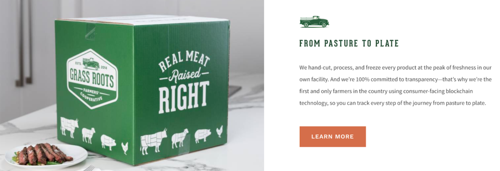
As Melissa Abbott explained in Food Business News, Gen-Z is all about transparency. “Gen Z is the first generation to completely grow up in the digital age, so to them there is no question that can be unanswered. This is really affecting the food that they eat because they want to know where it’s from, how’s it grown, who made it.” Perceptions of shadiness won’t be tolerated by these consumers. A good example of transparency that would resonate with Gen-Z is Grass Roots’ pasture-raised meat. They explain the mission and pasture-raised farm methods behind their products, and even emphasize transparency in their shipping process. Their digital presence is engaging and their message is clear.
At the center of many stereotypical jokes about this younger crowd is the trend of photographing and posting meals on social media. This habit doesn’t come as a surprise, as this generation accounts for about 75% of Instagram users. In reality, the act of pausing for a moment to appreciate the meal and share it with others actually makes the meal more satisfying. A study from the Journal of Consumer Marketing found that the attention to detail and delay in gratification has a positive effect on the senses.
Brands and restaurants can benefit from creating a digital relationship with their consumers through social media. It only makes sense to engage with consumers where they spend time – and in many cases for food, that is Instagram. An Instagrammable dish seen on social media is a call to action for these adventurous eaters.
In addition to Instagram, TikTok is also having a strong impact on this generation’s food trends and habits. Lots of food trends have gone viral on TikTok, especially with the help of the platform’s many food influencers. From cute cereal made out of tiny pancakes to recipes for full meals, TikTok’s bite-sized videos are perfect for sharing food content with Gen-Z.
Growing up with social media, Gen-Z’s digital attention moves at a fast pace. The short recipe videos through TikTok are this generation’s ideal way of learning to cook – convenient, clear, and fun. Brands can leverage this type of content to showcase how to cook with or use their products.
While Gen-Z eaters are adventurous and like a photogenic experience when it comes to food, they also appreciate convenience. Even before COVID-19, take out and drive through meals were increasing in popularity as younger people chose to take their food home and dine on their own terms. Often, this includes streaming something on the TV while eating. In this situation, the combination of convenient food and entertainment of their choice creates a tailored dining experience in the comfort of their home. Retail brands will benefit from this trend as well, as more and more grocery stores offer delivery or pickup options.
It is key for brands to understand how Gen-Z’s conscious consumerism and digital habits affect their preferences in food and dining, and how those preferences will affect those industries as a whole. To learn more about generation z’s consumer habits, visit our POV analysis here.
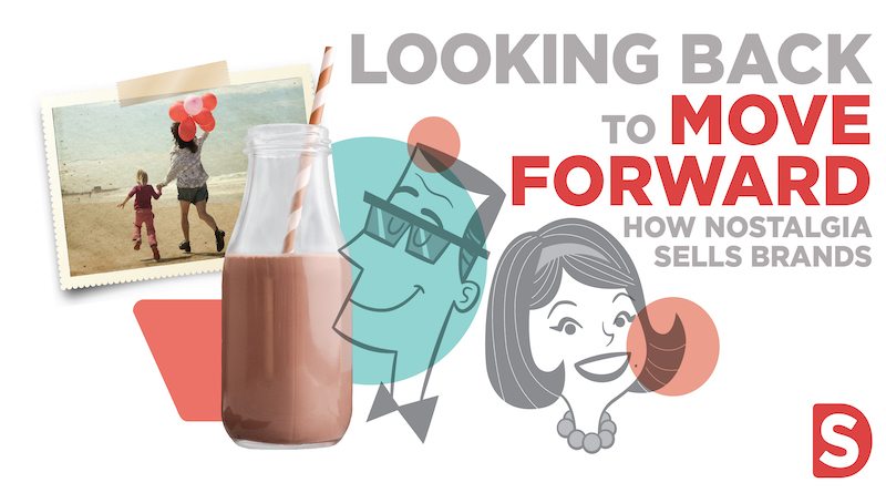
If I’m being honest, recent global events have made me nostalgic. Typically, I like to live in the moment but recently I’ve found myself digging through old photos and journals in search of…? I’m not sure. These trips down memory lane feel comforting thoughts, in a childlike way. There is a tendency to glamorize the past, looking through rose-colored spectacles at simpler, less complex times. But one thing is for sure – Marketers know that these nostalgic feelings sell brands.
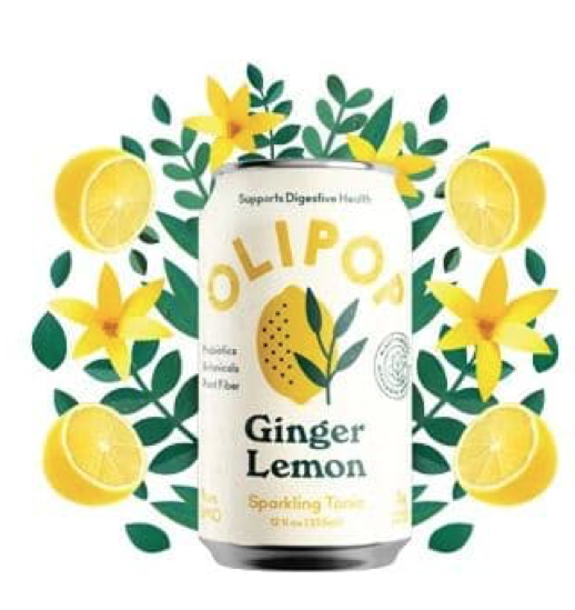
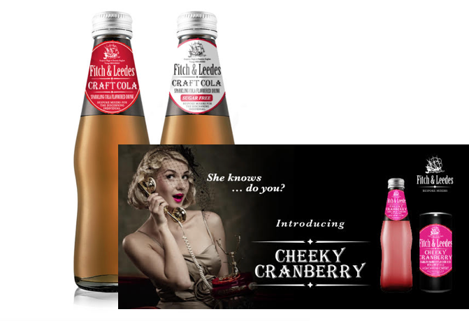
Take for example recent additions to the marketplace such as the Olipop soda brand. Their simple chic packaging leverages nostalgia in a way that triggers a recall that isn’t there – but somehow we believe in its authenticity. Fitch and Leedes lean heavily into a kitschy 50’s genre for their brand of tonics and mixers. The retro brand sends strong trust & quality signals to consumers that say “this is a brand that has stood the test of time and endured.”
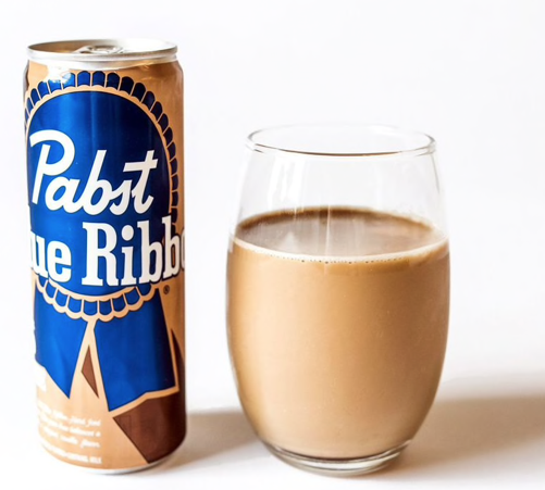
A few years ago, a flagging cereal category released limited edition nostalgic packaging in the hope of inspiring Gen X and younger Boomers into revisiting their favorite childhood flavors. The problem with this is that it’s a short-lived fantasy. Say Fruity Pebbles was your thing back in the day. You see it packaged the way you remember it and it sparks good memories of Big Wheels and The Flintstones. You might even buy it. But these types of purchases are one-offs as most of us don’t have the constitution to eat sugary cereal the way we used to. Predictably, nothing could save the cereal category from its inevitable decline. However, Pabst Blue Ribbon has found an ingenious workaround. Their newest offering -– a Hard Coffee – is said to taste exactly like YooHoo Chocolate Milk. By tapping into a taste instead of just a graphic approach, PBR may well have found the perfect way to be nostalgic for childhood without abandoning reality completely.
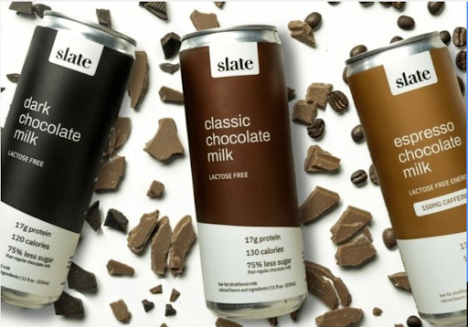
Other brands are using flavor as a way to bring consumers into the fold by leveraging holistic wellness in an unusual way. With flavors like Classic Chocolate and Dark Chocolate Milk, Slate beverages with a low sugar and high protein claim will certainly bring back happy memories and cue happier times thus keeping your mind AND body healthy. Cue the serotonins!
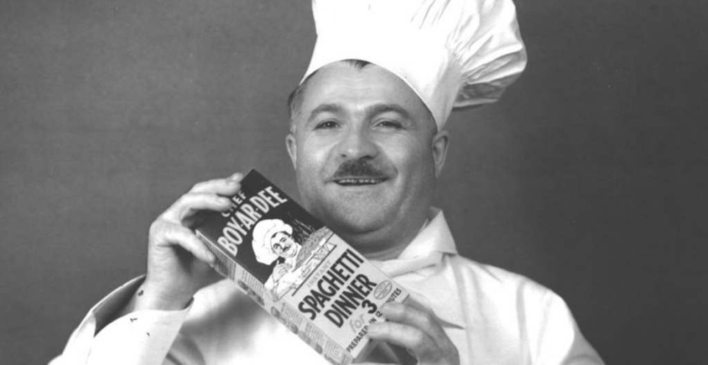
Finally, let’s not forget the heritage brands that are having another minute in the spotlight. As we face challenges buying fresh food during this time of social distancing, tried and true shelf stable brands are thriving as consumers rediscover their favorites from childhood – foods like Hamburger Helper and Chef Boyardee. Time will tell whether this is a permanent change in consumer behaviors but, Jon Nudi, head of General Mills, North American would like to think so.
“Right now, we have people trying the products they haven’t had for a while, and we hope they’re surprised and find that they’re delicious and that we have them come back,” he is quoted as saying in the New York Times back in early April.*
Regardless, brands that focus on creating stronger emotional bonds between consumers and their products, especially in childhood and early adulthood, will find that those bonds are strong and lasting. As we weather our current circumstances, when the future is uncertain, we can all take some comfort in reminiscing in the way things used to be – because sometimes looking back is the best way to move forward.
This May 5th, organizations around the world are coming together for #GivingTuesdayNow, a new global day that celebrates generosity and unity in response to COVID-19. As a Pledge 1% member, Smith Design has committed to leveraging our assets to have an impact, and now– more than ever– we are rallying our teams and partners to give back.
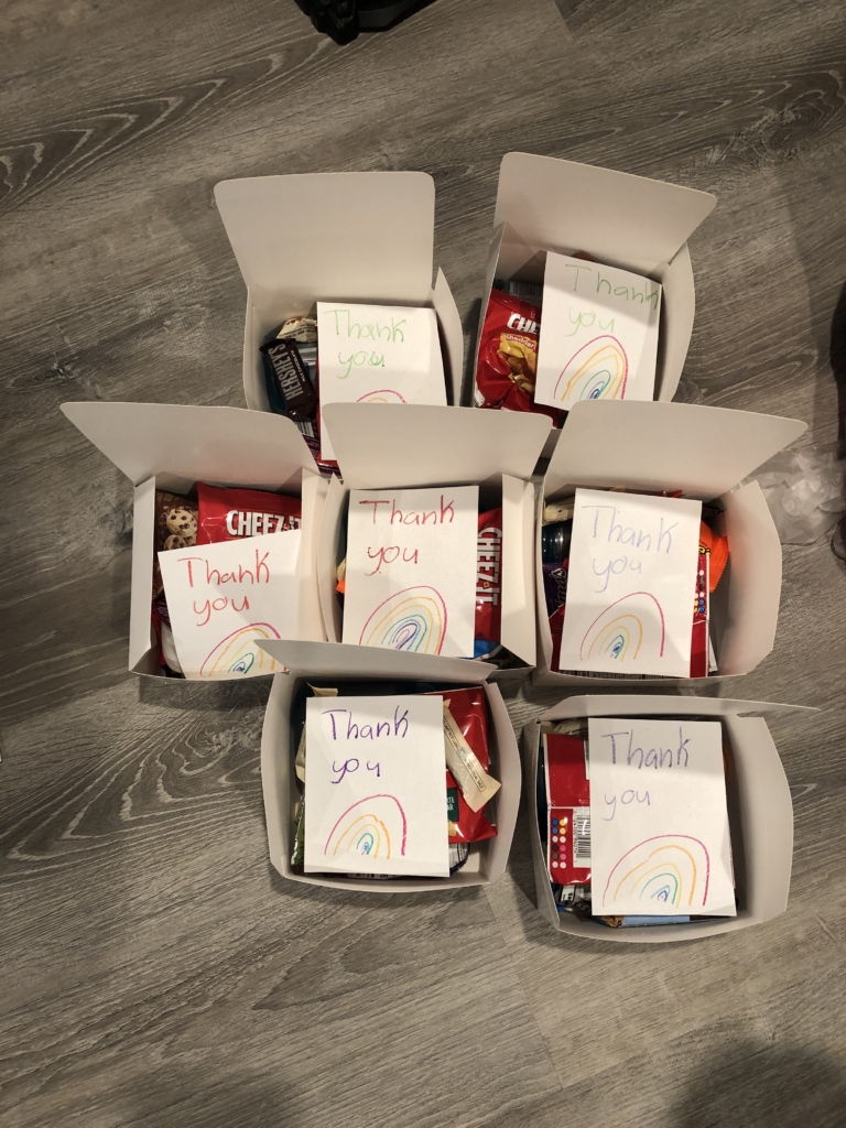
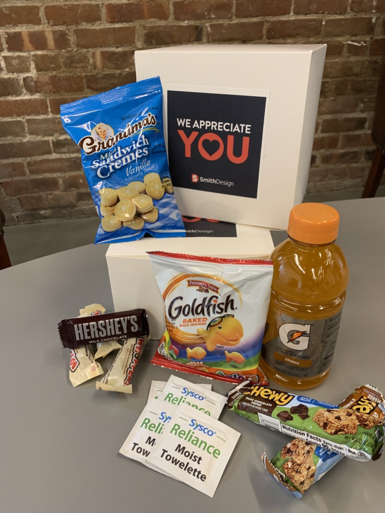
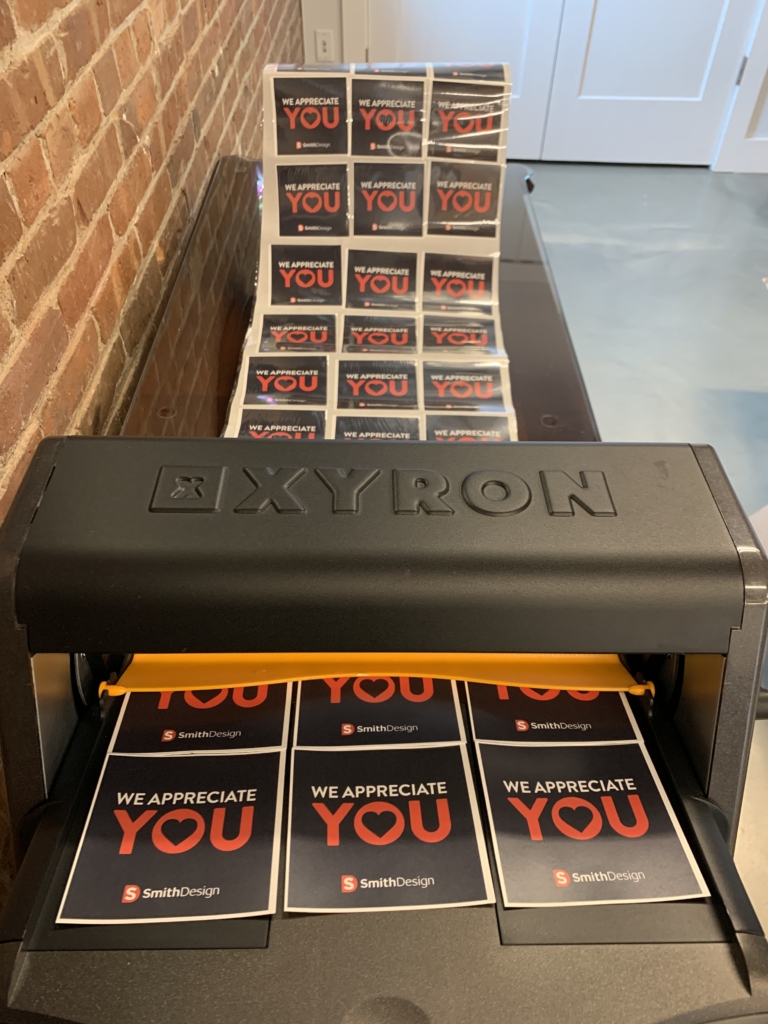
As a way to give back to our frontline heroes, Smith Design participated in FLAG, Front Line Appreciation Group. The group was started by 2 women in New Jersey and has grown nationwide. Their mission is to ensure that frontline workers are fed and cared for. Our team joined their cause by filling out Flag Fuel Boxes. These Fuel Boxes provide food and words of encouragement for the frontline and essential workers who are helping all of us during this time.
Supplies for the boxes were purchased and donated by Smith Design. 7 employees and their families packed the care packages and wrote personal notes for the heroes. We designed a sticker to emphasize our appreciation. Together, we completed 172 boxes!
We can’t thank our frontline workers enough for all that they are doing.
This pandemic is affecting every person on Earth. Only together will we heal and recover. We encourage you to join us and other members of the business community in giving whatever you can to help. Together, we are a force for good.
To learn more about Pledge 1% or to access their tools and resources for companies to navigate this pandemic visit www.pledge1percent.org.covid19.
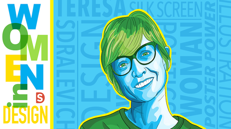
In this blog series, we shine a light on women trailblazers in the design industry – women who have earned a Wikipedia page (or are likely to very soon). You might not know them by name, but definitely by their work and influence on the design world as a whole.
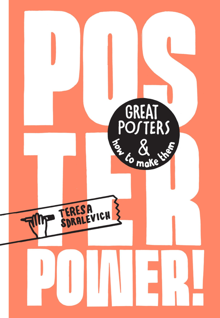
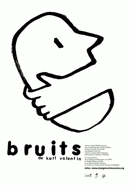
This month, we’re featuring acclaimed graphic designer, illustrator, silk-screen printer, and author, Teresa Sdralevich.
Sdralevich is a highly regarded designer of posters that hold social, cultural, and political relevance. Her impactful work has reached all corners of the world.
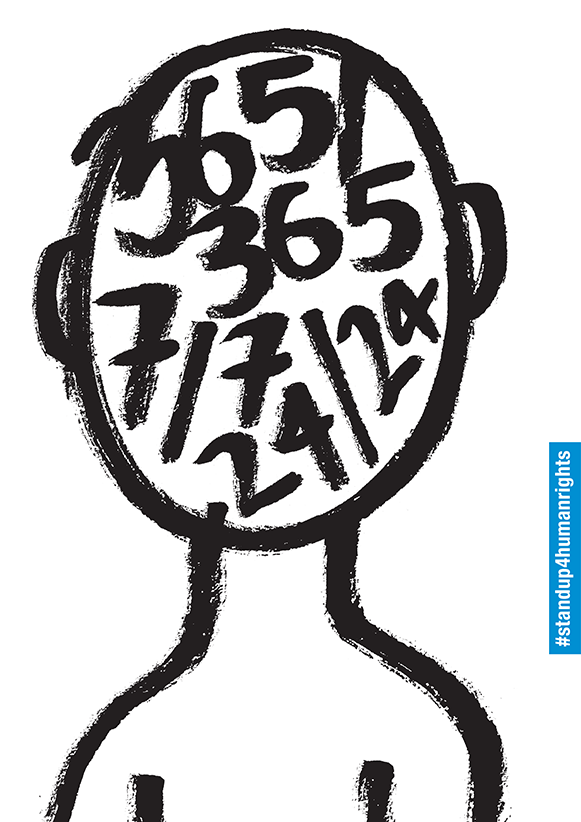
#standupforhumanrights Poster for the 70th Anniversary of the Universal Declaration of Human Rights
She has also illustrated many books for young readers, published across Europe.
Sdralevich’s 2018 book “Poster Power! Great Posters and How To Make Them” received a British Design and Production Award & is referenced as a source of truth and inspiration for designers of all ages. What makes the book so special is that it is uniquely personal – Sdralevich’s sharp humor and wisdom, both informative and engaging, is evident in the interactive pages.
Her style is playful and lyrical, every mark made is both purposeful and expressive. You can see the influences of Keith Haring and Basquiat in her naive, simple characterizations while the messages have a clever sophistication. As graphic artists, we are all challenged to distill down complex themes into simple visual messages which is what Teresa Sdralevich does so brilliantly. We can all learn from her simple, straightforward, no-nonsense style.
Sdralevich is currently based in Brussels, where she continues to hone her craft, but she can be found traveling all over the world to lead workshops or participate in poster events.
Through her art, books, and workshops, Teresa Sdralevich is truly making a positive impact on the world and on the minds of aspiring designers. To learn more and see her work, visit her website, Instagram, or Facebook.
Sustainability, environmental impact, eco-friendliness – these are more than just trending buzzwords. Not only is it ethical for companies to consider the environmental impact of their operations, but it is also necessary in order to be trusted by their consumers (especially socially-conscious millennials). The way many brands approach sustainability in their products and packaging has adapted with increased environmental focus and research.
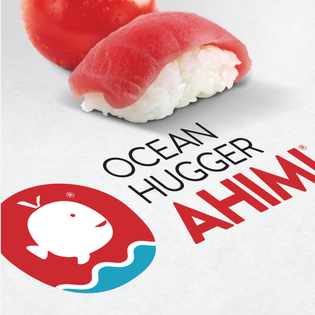
Some brands are created with green-friendliness at the core of their products. Ocean Huggers produces plant-based alternatives to seafood. Ahimi replicates raw tuna with tomatoes, and unami utilizes eggplant to replace freshwater eel. The goal is to reduce the stress overfishing causes on our oceans.
In addition to eco-friendly products, many companies incorporate sustainability into their packaging as well. Seed Phytonutrients, a producer of natural bath products, is credited with developing the first shower-friendly paper bottle. These unique bottles use 60% less plastic than traditional bottles. The paper is able to withstand water without getting damaged, then it dries to look good as new.
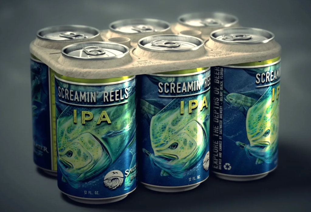
Pretty famously, Saltwater Brewery created a biodegradable six-pack holder in response to the overwhelming amount of plastic in our oceans. The sustainable holder safely disintegrates in water and is actually edible for ocean wildlife. The Florida brewery hopes this innovation will draw attention to the environment and inspire people to find ways they can contribute to a sustainable future.
As the impact we have on the environment becomes increasingly apparent, people are discovering new ways to innovate towards a healthier future. From creative shampoo bottles to new enzymes that break down plastic in record time (learn more in our newsletter), every step towards sustainability is progress.
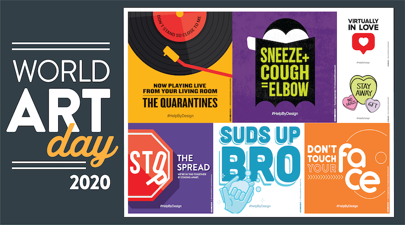
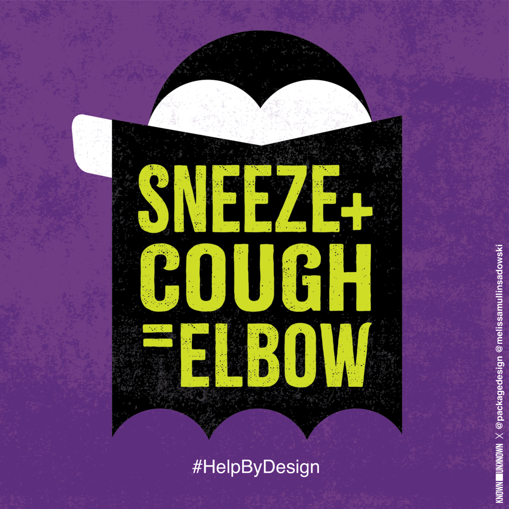
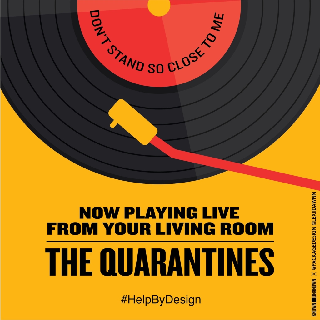
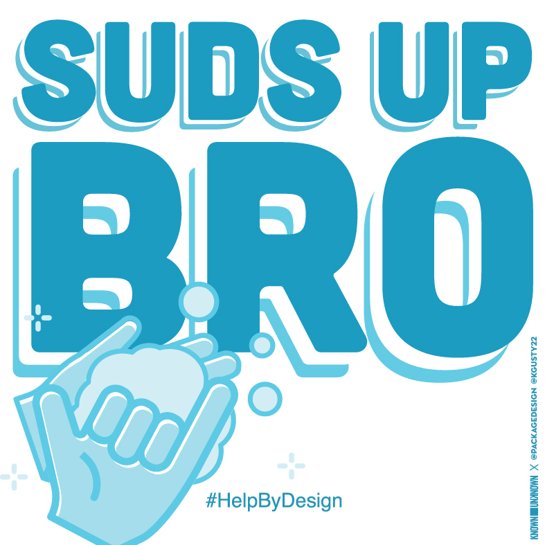
World Art Day is an international celebration of art in all the ways it impacts our world. In honor of this year’s World Art Day, our team participated in #HelpByDesign. #HelpByDesign is a design campaign that brings messages of hope during this time of uncertainty and social distancing. The campaign is run by the group Known Unknown, a global community of designers. Options for messages to include in the typographic designs are provided as inspiration, but designers are welcome to create their own as well.
Each designer was given free rein to communicate their chosen message in any way they wanted. The best part was seeing how each square showcased the designer’s personality and unique style.
Participating in this campaign helped connect us with designers all over the world and highlights the importance of visual communication as a unifying tool in times of crisis. To see more artwork for this campaign, visit @known_unknown on Instagram.
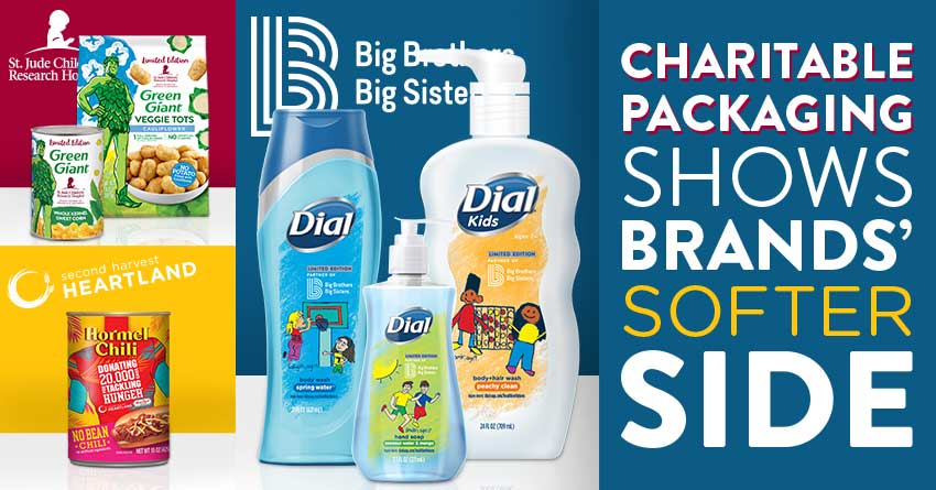
It’s always nice to see brands support great causes, and packaging is a creative way to emphasize the importance of giving back.
Charitable packaging supports important causes by raising awareness. This packaging can also be a call-to-action, inspiring others to support the cause as well. Charitable packaging is often a smaller part of a brand’s overall partnership with a cause. Consumers have come to expect brands to make a conscious effort to give back to the community. Showing their charitable side through these partnerships help brands connect with their consumers on a human level.
Dial® partnered with Big Brothers Big Sisters through the Healthier Futures™ program. Healthier Futures™ promotes healthy hygiene habits. To show their support, Dial® featured artwork on their packaging that incorporates drawings by the children who participate in Big Brothers Big Sisters. The packaging captures the spirit of Big Brothers Big Sisters so delightfully with scenes that represent the mission of the organization and raises awareness of their initiatives to support children and their communities.
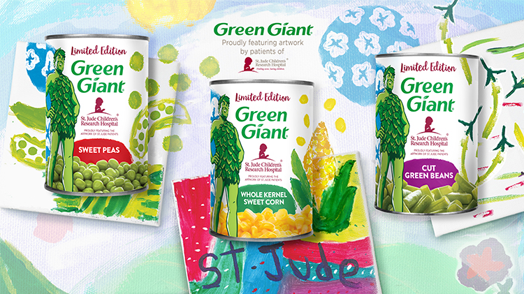
Patients of St. Jude Children’s Research Hospital showcased their artwork on Green Giant’s limited edition packaging. The cans featured illustrations of vegetables; sweetcorn growing tall, dancing green beans and sunny blue skies are all featured prominently in the colorful labels. The cans are one of the ways Green Giant shows their support of St Jude. The brand also donates money towards St. Jude’s amazing research, and encourages their employees to support the cause as well. In 2018, B&G Foods donated $350,000 on behalf of the Green Giant brand.
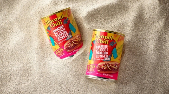
Hormel Foods raised awareness of childhood hunger with their limited edition Chili can designs. The limited-edition label represents the first time the brand has shifted away from its conventional yellow, orange, and red color scheme on its Hormel®Chili No Bean variety in more than 80 years. The cans represent the brand’s partnership with professional football player Adam Thielen for a campaign called “Thursdays with Thielen”. For every yard Thielen gained during a game, Hormel Foods donated Hormel Chili to Second Harvest Heartland in the Twin Cities. Hormel Foods was able to donate 20,000 cans, which provided about 15,000 meals.
Now more than ever, consumers need to see that the brands they support are kind, caring, and human. The brands featured above are going beyond a charitable donation by making a powerful statement on their actual packaging – a proud and bold declaration of support to their causes.
For those new to the conversation, gender neutrality is the concept that social institutions should not distinguish roles according to a person’s sex or gender. In recent years, parents with young children are focusing on personal identity, offering children plenty of choices and encouraging traits that make a good human – not just man or woman.
The CPG industry has been slow to follow suit. Darby Saxbe, Ph.D., associate professor of psychology at USC, has found “there is an unspoken taboo that prevents marketing traditionally “girl” toys to boys.
“We want girls to play with a chemistry set but we don’t want boys to play with dolls or tea sets. But in fact, learning how to care for others, taking turns, and interacting socially might be really important values for building a better society,” Saxbe says*.
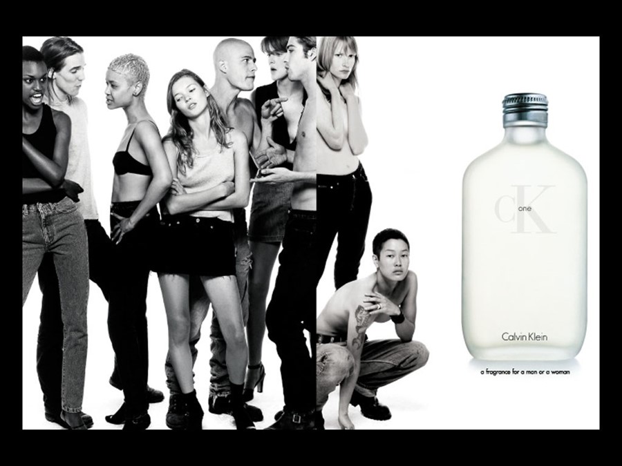
Some brands, however, are starting to challenge whether gender even has a place in design. Just like the ahead-of-its-time Calvin Klein One fragrance of the 80’s – why can’t brands be for a boy AND a girl? A recent Mintel study implies that brands might do better to focus on the need they are fulfilling rather than the gender they are targeting. Basic human needs, after all, are usually not gender specific.
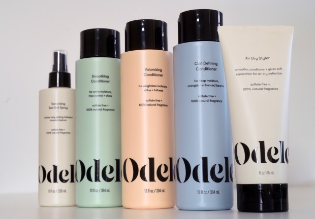
Odele bath products appeal to both our need for simplicity and gender neutrality. The women-owned business states on their website “we decided to throw this whole his/hers/theirs nonsense out the bathroom window and start Odele.” They go on to say “Our 100% natural fragrance is ungendered, and our products are developed based on needs by hair type; not by gender, age, or any other measure”. We say Brava!
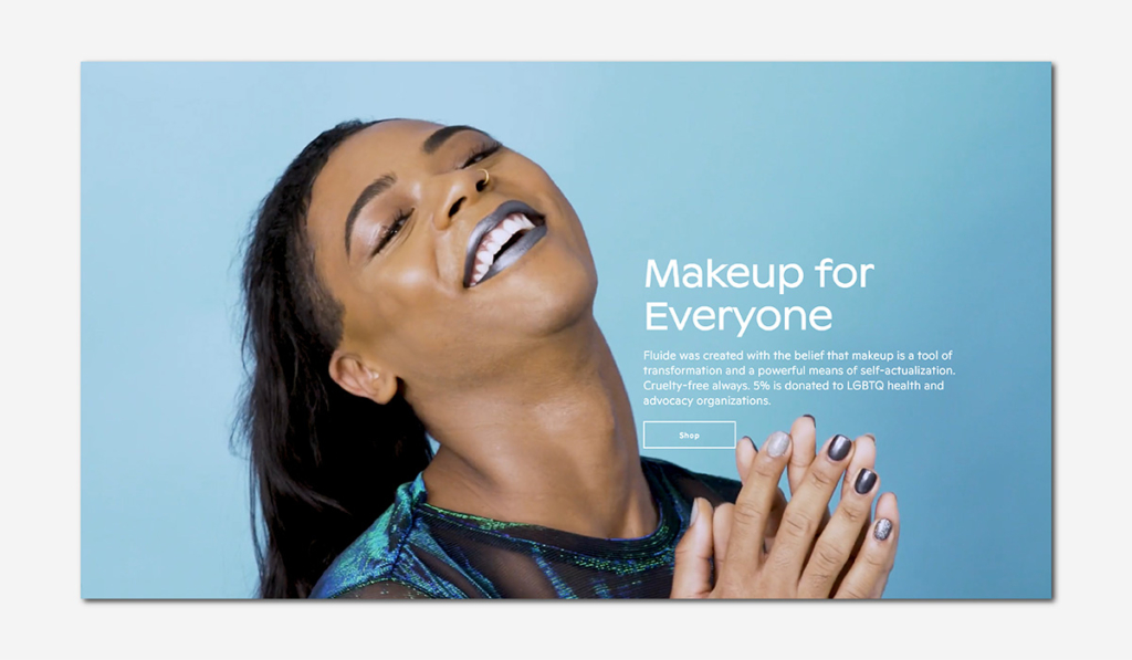
Another brand throwing out traditional rules is the aptly named Fluide. The make-up brand was established to cater to a growing number of people who do not identify with a gender or as they put it “…gender expansive identities.” Fluide’s partnerships with LGBTQI health & advocacy groups show that they are prepared to live by their line “We are they. We are them. We are you.”
How can designers support this evolution and serve as actors of change? By acknowledging their gender biases and stereotypes, prioritizing the needs of the target consumers as people, looking beyond the history of gendered graphics – but most of all, by being aware of the gender neutral movement and understanding how to respectfully address the needs of an evolving population.