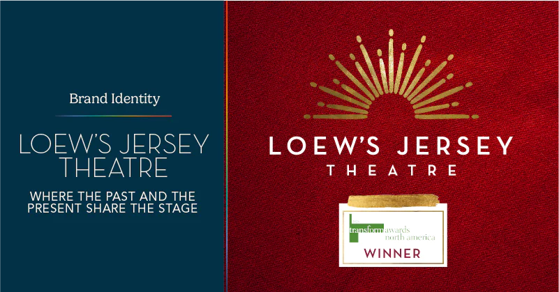
Loew’s Jersey Theatre: Where the Past and the Present Share the Stage

A Night Out at Loew’s Jersey Theatre in the 1930s

If you were walking through Jersey City’s Journal Square in the early 1930s, you would have been standing at the center of the region’s live entertainment scene, and the talk was all about who would take the stage that weekend. Was it Bing Crosby? Duke Ellington? Cab Calloway? Whoever it was, you knew it was bound to be a night you’d talk about for years, and at a venue that made every show feel like an event.

Anyone who was anyone knew Loew’s Jersey Theatre.

When it opened on September 28, 1929, the city described it as “The Most Lavish Temple of Entertainment in New Jersey.” Behind a terra cotta facade and a curved marquee facing the square, more than 3,000 seats sat beneath gold ceilings and red drapes. Originally designed for “talkie films,” the building was designed by architects Rapp and Rapp for theater magnate Marcus Loew between 1927 and 1929, blending Spanish Baroque and Italian Rococo/Renaissance styles at a cost of $2 million. It was one of five Loew’s “Wonder Theatres” in the New York area, and it belonged to the neighborhood as much as to the stars performing on stage.
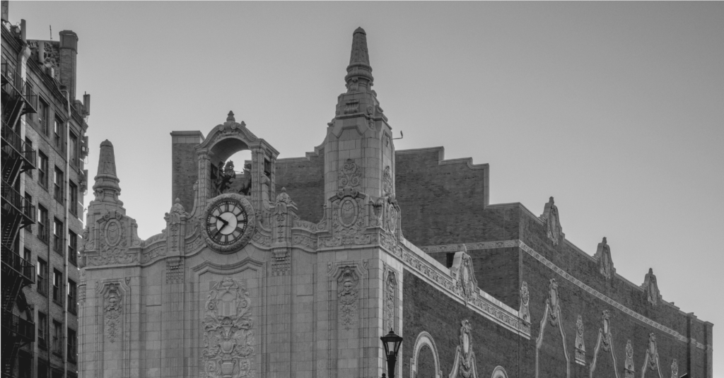
However, the shows didn’t last forever. Live acts faded in the mid-1930s, and in August of 1986, Loew’s Jersey Theatre closed its doors. A group called the Friends of the Loew’s then spent years trying to keep the building standing, and Jersey City bought it in 1993. Now, a $130 million remodel brings back original details and charm while adding modern sound, lighting, and flexible seating.

In fall 2026, the theatre will welcome people who remember it and many who never saw the inside. 

Building a Brand for a New Era

A reopening is only the beginning. The theatre needed an identity with the same presence as the building itself, one that could welcome a new generation without leaving the old one behind.

The goal was never to recreate 1929; it was to capture the soul and energy of the building in a brand world that feels current and lasting, and that holds together across a variety of media.

There was a bigger picture, too. As Jersey City builds its reputation as an arts destination, Loew’s Jersey Theatre has the chance to become a hub for live performance and community engagement again, and to support the city’s arts and economic revitalization along the way.

HBSE, the group overseeing the Loew’s Jersey Theatre’s restoration and operation, partnered with Smith Design to develop its new brand. The work began with an audit of the theatre’s history, architecture, programming, and audience, backed by research into how historic venues are being revived and how people choose live entertainment. A brainstorming workshop with the HBSE team followed, laying out the groundwork for a new brand positioning and a visual and verbal strategy to guide the theatre through its launch.

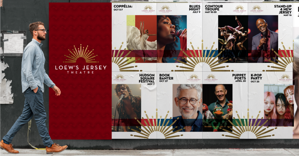
From here, our team built a complete brand: a custom logo and pattern, the brand guidelines to keep them consistent, collateral for marketing and merchandise, and digital activations to carry it on social and web.
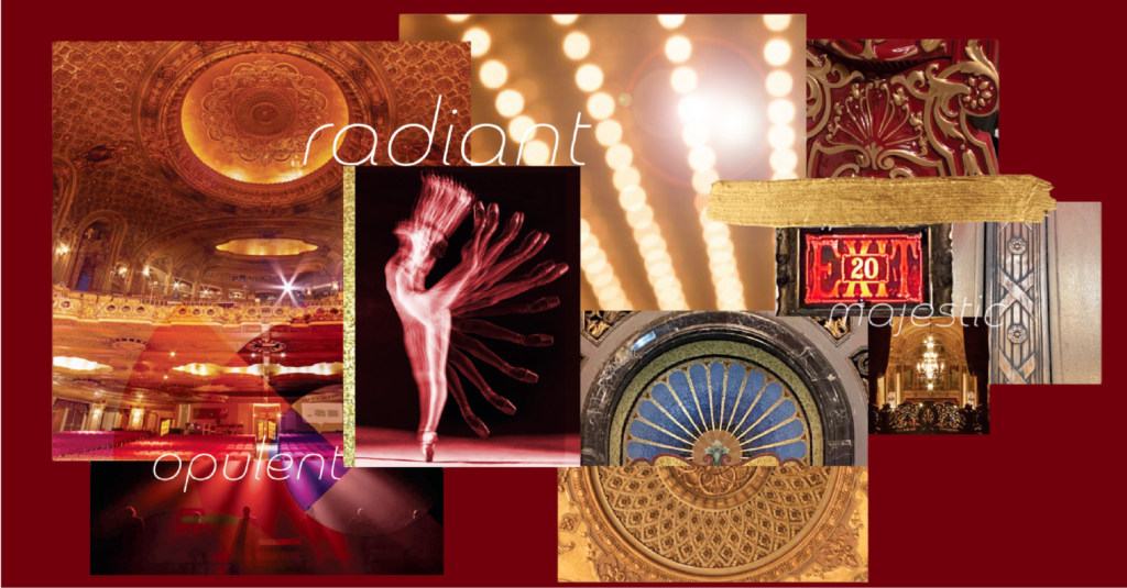
Designed From the Details

It started with the building: our design exploration focused on translating its decorative details into a modern mark, and the logo that emerged feels familiar without feeling borrowed. The custom patterns and graphic elements we developed draw on motifs found throughout the venue.

To keep that point of view steady, brand guidelines were built around the patterns, typography, and logo, showing how each one adapts across signage, digital campaigns, and event collateral while staying tied to the theatre’s architecture. That range matters for a venue whose calendar spans film screenings, live performances, and community events.
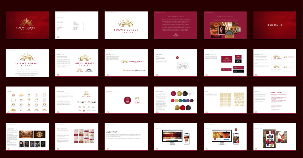
From ticket stubs to posters to program guides, the identity was applied across everyday materials that shape an audience’s experience with the theatre, extending to digital activations such as social content and web presence. These touchpoints give visitors a consistent sense of place, whether they’re planning a visit online or holding a piece of paper in hand at the box office.
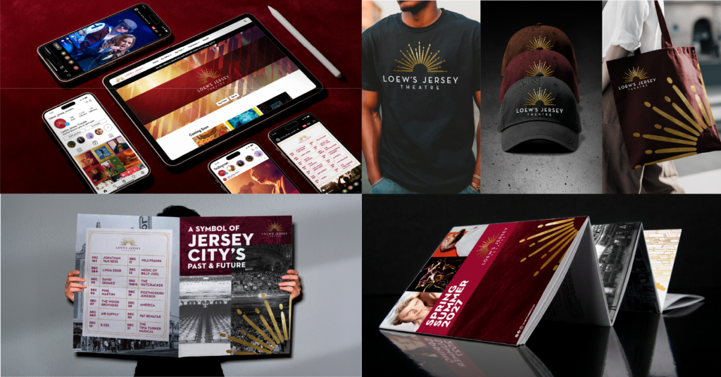
Check out our full Loew’s Jersey Theatre case study below:

Majestic Reinvention with a Nod to Heritage

For decades, Loew’s Jersey Theatre has stood in Journal Square as a landmark. The new brand asks for more than admiration from the sidewalk. Its unified look draws on the 1929 original while speaking clearly to the present, positioning the theatre as an active venue for live performances, screenings, and community events. It carries forward the idea that guided our first conversations with the HBSE team: capture the spirit of the original rather than completely recreating it. That approach has recently earned silver for Best Visual Identity from the Sports and Leisure Sector at the Transform Awards North America 2026.


Loew’s Jersey Theatre’s Grand Reopening Weekend is coming up on November 13 and 14, kicking off with performances by Trey Anastasio Band and The War on Drugs. The lineup continues into the new year with music, comedy, and dance, bringing the historic building back to the city it was built for.
Smith Design helps brands with a past worth keeping build an identity made for what comes next.

Have a similar challenge?


References

Reimagined Loew’s Jersey Theatre Set to Reopen in ’26

Historic NJ theatre set for grand reopening after $130M restoration

Jersey City’s historic Loew’s Theatre to reopen this fall after $130M restoration
Loew’s Jersey Theatre

Expanding Palates: The Continued Rise of Globally Inspired Flavor Exploration

As Millennials and Gen Z continue expanding their palates, global flavors have become integral to their culinary experiences. Both generations grew up surrounded by diverse global cuisine, and for Gen Z, global food is more than just about taste; it’s an immersive experience that combines authenticity, culture, and emotional connection. This shift towards adventurous eating reflects a desire for more sophisticated palates as a way to enhance their culinary explorations. As retailers and brands respond to this growing interest, the availability of unique and complex flavors is expanding across various food and beverage categories. From snacks to drinks, options are becoming increasingly diverse, catering to audiences eager for new taste sensations.

Traditional brands that have historically relied on American flavor profiles are now expanding their horizons by embracing globally-inspired varieties. This shift allows them to connect with the adventurous tastes of Millennials and Gen Z while staying aligned with ever-evolving culinary trends.

Where Flavor Innovation Meets Authentic Design

But flavor innovation alone isn’t enough. As shelves become more crowded with globally inspired offerings, package design plays a critical role in signaling authenticity, communicating flavor cues, and inviting consumers to explore something new. Color palettes, typography, patterns, and imagery all work together to evoke cultural inspiration while maintaining a brand’s own visual equity. When done thoughtfully, packaging becomes a gateway, helping consumers quickly understand unfamiliar flavors and feel confident trying them.

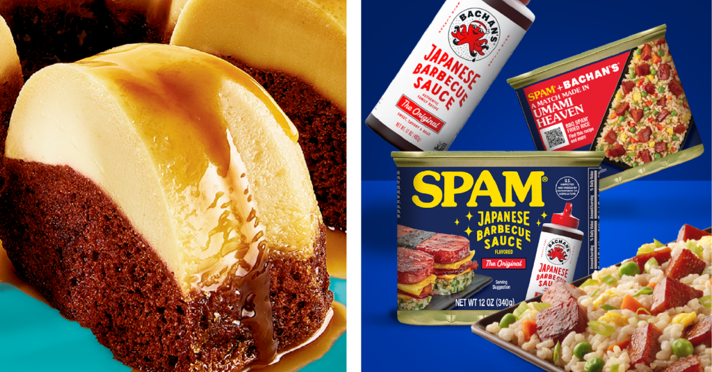
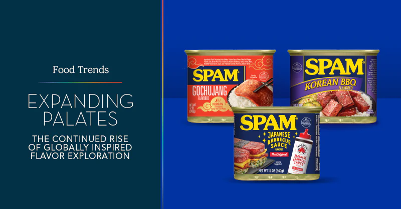
SPAM has long held a meaningful place in Asian American food culture, where it’s been embraced across generations in dishes like musubi, fried rice, and other comfort-driven fusion meals. Recent limited-time offerings continue to build on that cultural connection, blending familiar pantry staples with globally inspired flavors to celebrate community and culinary creativity. A recent collaboration between the SPAM brand and Bachan’s Japanese Barbecue Sauce brings this idea to life, combining two pantry staples rooted in Asian American food culture into a single, umami-rich experience inspired by a pairing fans have been creating at home for years.

The SPAM Japanese Barbecue Sauce flavored variety, made with Bachan’s Original Japanese Barbecue Sauce, delivers a savory balance of sweet, garlicky, and soy-forward notes while celebrating Japanese American culinary traditions. Smith Design partnered with the SPAM team to help shape the packaging for this collaboration, translating the bold flavor fusion into a package design system that feels culturally informed, modern, and shelf-ready.

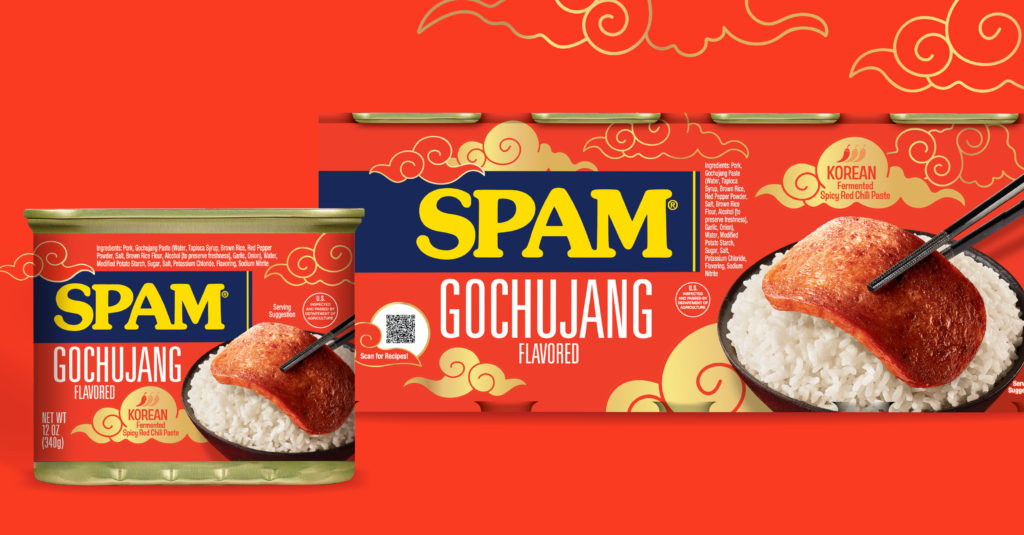
The launch of SPAM Gochujang, inspired by the popular Korean condiment, is another example of this trend. This limited-edition variety combines spicy, sweet, smoky, and umami elements, making it a great addition to any occasion. Smith Design also had the pleasure of collaborating with SPAM to shape the visual aesthetic of this product, ensuring it resonates with Korean heritage and aligns with the essence of gochujang sauces found in adjacent categories. This focus on design not only elevates the product’s appeal but also creates a deeper connection with consumers seeking immersive culinary experiences.

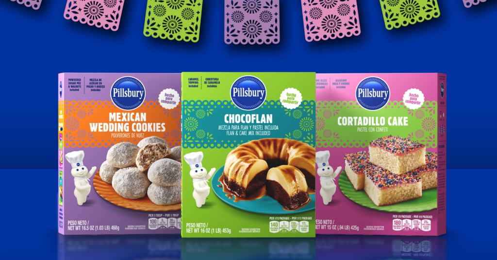
Beyond globally inspired heat and fusion, brands are also finding growth in traditional Hispanic flavors rooted in nostalgia, cultural pride, and the comfort of home. Consumers are gravitating toward offerings that feel authentic and emotionally resonant, creating a compelling opportunity for brands to expand into heritage-driven spaces with credibility and warmth. This insight guided our recent partnership with Pillsbury Baking and Hometown Foods to launch a new line of Hispanic Recipe baking mixes.

Following an in-depth cultural and visual audit and market analysis, we helped translate deeply familiar flavors into a modern retail experience that feels both genuine and accessible. The resulting packaging for Mexican Wedding Cookies, Chocoflan, and Cortadillo Cake blends vibrant, culturally inspired color palettes and patterning with photography that evokes homemade indulgence. The design honors time-tested recipes while staying true to Pillsbury’s playful, trusted brand voice, creating a bridge between tradition and contemporary shelf appeal.

Flavor Communication to Cultural Storytelling

As interest in global flavors continues to grow, packaging is evolving from simple flavor communication to storytelling. Whether highlighting regional ingredients, showcasing flavor mashups, or using design to convey heat, sweetness, or spice, brands have an opportunity to turn global inspiration into a compelling shelf presence. The result is packaging that doesn’t just describe the product, it sparks curiosity and encourages discovery.


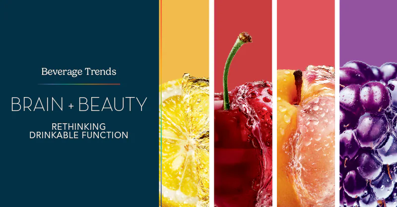
Brain + Beauty: Rethinking Drinkable Function

Functional beverages continue to evolve, and a new dual-focus trend has emerged, with drinks that support both cognitive wellness and visible beauty. Consumers are no longer satisfied with single-purpose beverages; they want products that enhance how they feel and how they show up in daily life. Expo West 2026 highlighted this shift, revealing brands that combine wellness benefits, flavor, and lifestyle-focused experiences to redefine what drinkable function can be.

From Single Benefit to Integrated Wellness

Five years ago, functional beverages were largely defined by a single promise: energy, hydration, immunity, or digestion. Bold ingredients like adaptogens, probiotics, and nootropics dominated.

Today, the category is moving toward integrated wellness. Hydration incorporates broader mineral profiles. Energy is expected to feel balanced and sustainable. Magnesium has emerged as a key ingredient, supporting stress response, recovery, and overall equilibrium.

Consumers also evaluate flavor, design, and experience alongside efficacy. The most successful brands integrate benefits seamlessly, providing a daily ritual that fits naturally into modern lifestyles.

Trends in Action at Expo West

Expo West 2026 made these shifts tangible. Leading brands no longer focus on single ingredients. They combine multiple benefits into cohesive, everyday experiences.

Everyday wellness is evolving. Drinks now blend adaptogens, nootropics, and hydration with lifestyle benefits. Classic formats are being reimagined. Soda-inspired beverages feature functional ingredients and bold, nostalgic flavors. Protein is increasingly incorporated to support satiety and sustained energy. Bright, fruit-forward flavor combinations make functional benefits approachable and enjoyable.

Together, these trends reinforce a key insight: success is no longer defined by one ingredient. It comes from how well benefits, flavor, and experience are integrated.

Brain + Beauty: A Defining Shift

A major emerging trend is the convergence of cognitive wellness and beauty. Consumers no longer see these areas separately. Stress affects skin. Hydration impacts both mental clarity and appearance. Recovery, sleep, and overall balance influence how people feel and present themselves.

Magnesium plays a central role in this shift. Traditionally associated with relaxation and muscle function, it now supports calm, recovery, and overall balance. These benefits influence both cognitive clarity and visible well-being. In this way, magnesium bridges brain and beauty, connecting internal wellness with external expression.

ELOS: Launching at Expo West

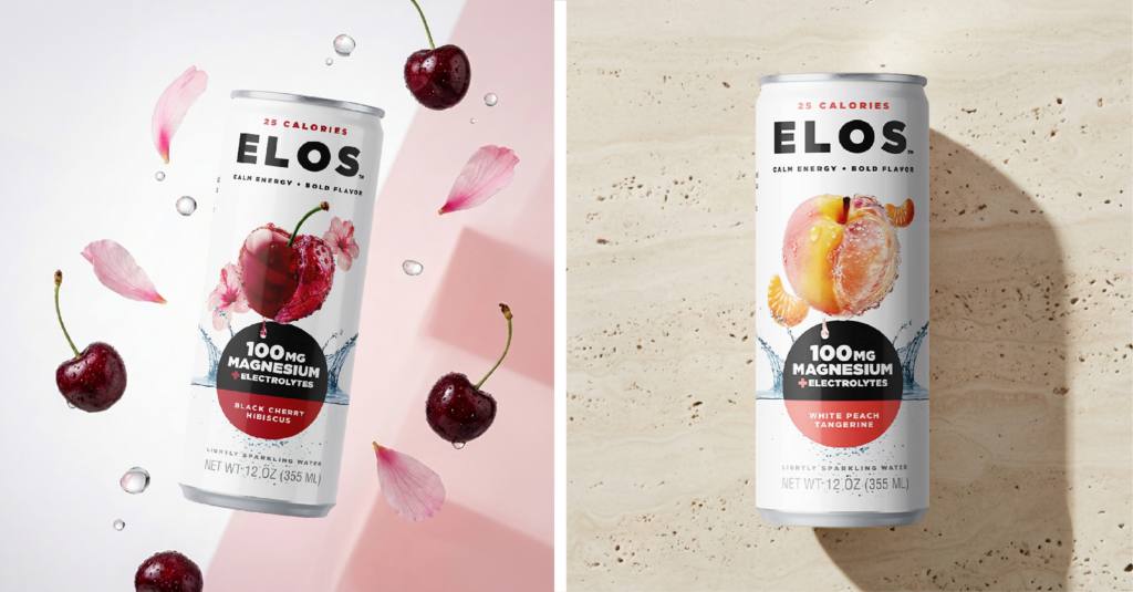
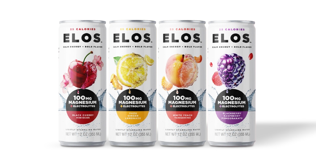
At Smith Design, we recently partnered with Accelerated Manufacturing Solutions (AMS) to launch ELOS, a functional sparkling water brand that officially debuted at Expo West 2026. From the beginning, we worked end to end: naming guidance, brand positioning, visual identity, packaging, and comprehensive brand guidelines.

Our process began with a deep dive into the beverage category and broader wellness landscape. We analyzed competitors, consumer motivations, and emerging cultural signals to identify strategic opportunities for differentiation.

Smith Design collaborated closely with AMS to shape every aspect of the brand:

  • Naming: We explored potential brand names and strategies, ultimately landing on ELOS, a modern, flexible identity designed to grow with the category
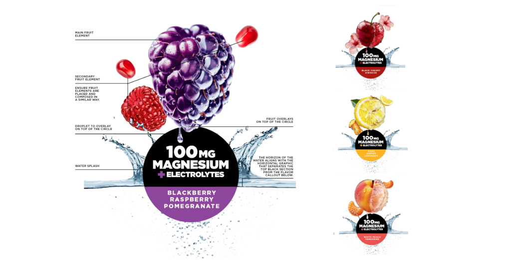
  • Brand Positioning: We defined a promise of refreshment paired with everyday wellness benefits, expressed through a bold, rebellious personality. Large hyper-liquified fruit graphics signal energy, edge, and shelf presence
  • Visual Identity and Packaging: Design systems communicate premium refreshment while reflecting the playful, bold spirit of ELOS
  • Brand Guidelines: Comprehensive guidelines ensure consistency across packaging, marketing, and future product extensions

The initial product delivers a lightly sparkling beverage with magnesium, electrolytes, essential vitamins, and fruit-forward flavor. ELOS is designed as a flexible brand platform capable of evolving with trends, flavors, and consumer expectations.

By combining functionality with flavor, design, and experience, ELOS reflects the future of integrated wellness beverages and the Brain + Beauty movement.

Looking Ahead

Expo West 2026 confirms a clear trajectory for the category: integration is key. Consumers want products that deliver benefits, enjoyment, and balance, seamlessly woven into everyday rituals.

The brands that will lead combine credible wellness claims with strong identity, thoughtful design, memorable flavors, and compelling storytelling. ELOS demonstrates this evolution, pairing wellness, flavor, and personality in a way that feels current, forward-looking, and fully integrated.

For brands and partners, the takeaway is clear. Success comes from building platforms designed to evolve alongside consumers, where integrated wellness, enjoyment, and experience define the next chapter of functional beverages.


Let’s Talk.
close slider
Contact Form_Home