Some of the most powerful brand moments don’t start with something new; they start with a memory. SunnyD identified an innovation opportunity by tapping into a reference that had already been part of culture for decades and launched its long-anticipated “Purple” flavor.
The reference dates back to a well-known 1990s commercial where a refrigerator full of drink options included the now-famous line, “purple stuff.” While the moment was brief, it stuck in viewers’ minds and quickly became part of the brand’s cultural footprint.
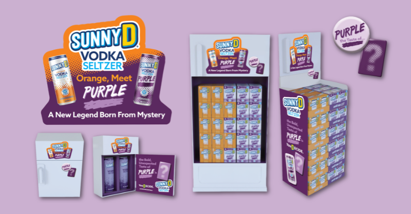
By bringing “purple stuff” to life through SunnyD’s latest launch of their Vodka Seltzer RTD beverage named Purple, the result wasn’t just a new product launch, but a moment of recognition for audiences who grew up with the reference.
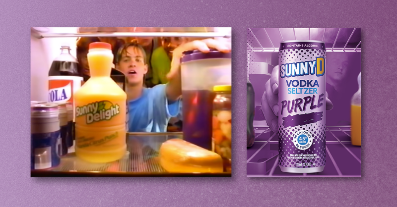
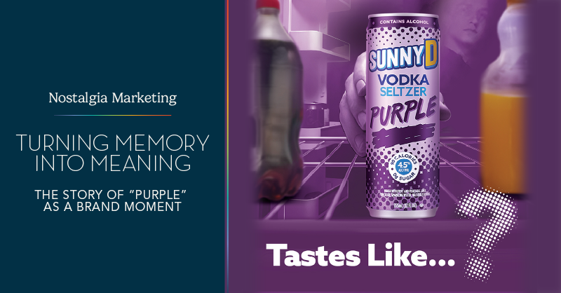
Commercial circa. 1991 | Key Visual, SunnyD Vodka Seltzer Purple
Reframing Nostalgia for Cultural Impact
Nostalgia remains one of the most effective tools in marketing because it resonates with people, creates immediate familiarity, and piques their interest. When people recognize something from their past, there’s no need to introduce it or explain it – the connection is already there.
This approach has become increasingly common as brands revisit recognizable elements from the 1990s, from the return of Dunkaroos, which came back after years of fan demand, to the revival of Floyd D. Duck across Bubble Yum’s social channels. By reintroducing familiar products and characters, these brands tap into shared cultural memory while also introducing those references to younger audiences encountering them for the first time.
The difference often comes down to how that nostalgia is applied. Forced nostalgia often tries to recreate moments too literally, relying on imitation rather than meaning. Authentic callbacks work differently; they take something that already exists in culture and give it new context, allowing audiences to complete the story themselves.
That’s what made this moment for SunnyD Vodka Seltzer work. The reference to “purple stuff” was already recognizable and understood, rooted in a 1990s cultural moment. It carried a kind of multi-generational awareness, resonating with those who grew up with it, while sparking interest through new eyes experiencing it for the first time. It also created a built-in curiosity. “What does purple taste like?” became part of the appeal, turning a long-standing joke into a real question people finally had the chance to answer.
Building Cross-Channel Campaigns from Cultural Relevance
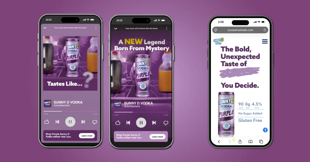
Because the idea was rooted in a cultural reference that already carried meaning, the real challenge became ensuring the campaign could live consistently across every place consumers might encounter it. In today’s digital landscape, the strength of a campaign concept depends on how seamlessly it can translate without losing its recognizability. That is where we came in.
The Smith Design team helped the campaign come to life across a full ecosystem of touchpoints. We developed digital assets that carried the core “purple” idea into e-commerce, the brand website, Instacart, paid digital advertising, Spotify audio, trade advertising, and on in-store POS materials. In just three days, the campaign generated 117 million impressions, including 4.2 million from Walmart and Instacart display and 135.6K from Spotify ads, two key areas where we created digital assets for the campaign.
The goal wasn’t to reinvent the idea at every step, but to maintain consistency, so whether someone encountered it on their phone, in a store, or while streaming music, it felt like part of the same story.
Where Memory Becomes Experience
At its core, the SunnyD Vodka Seltzer Purple campaign launch shows how powerful it can be when brands don’t try to invent meaning but instead build from something that already exists in culture. Purple wasn’t created in the moment; it was something people already knew.
By turning that shared reference into a real product and a full campaign, the idea moved from memory to experience. And for audiences, that shift is what made it stick, not just seeing it again, but finally getting to experience it.