
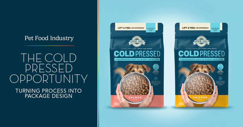
The pet food industry has shifted significantly in the last decade. Owners are increasingly reading nutrition labels more closely: asking where ingredients come from and looking for pet food options that feel closer to real food.
The Rise of Cold-Pressed Dog Food
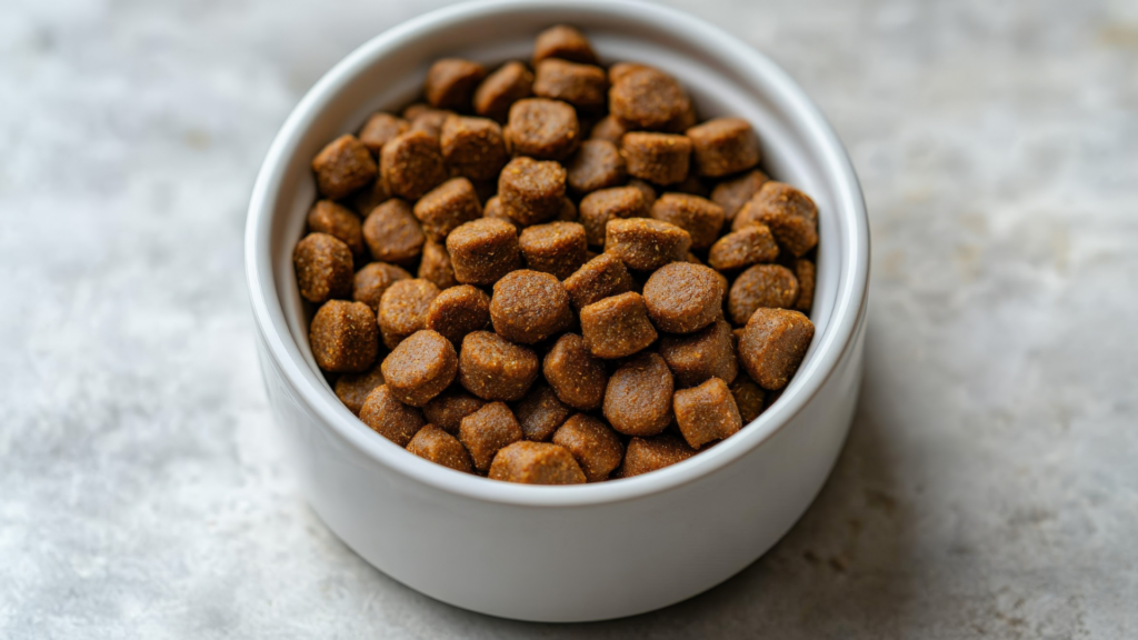
This shift has paved the way for processing methods that previously had little presence in the pet food aisle. Originating in Germany and the Netherlands in the early 2000s, cold-pressed dog food is one of these methods, made by combining ingredients with water and pressing them into pellets at low temperatures rather than cooking them at high heat. This gentler process helps preserve more of the food’s natural nutrients and flavor, and the pellets break down faster once a dog eats them, making it easier to digest.
These qualities are just the starting point. Cold-pressed food comes with a range of other benefits for pups:
- Gentler on sensitive systems: The minimal processing makes it a great choice for puppies, senior dogs, and dogs prone to stomach sensitivity.
- Dry and shelf-stable: Cold-pressed food stores the same as traditional kibble in that it doesn’t need refrigeration or freezer space, all while delivering some of the same nutritional advantages associated with raw diets.
- Pairs well with raw feeding: Because it breaks down at a similar rate, some owners use it alongside raw food or in its place when convenience matters.
- Supports skin and coat health: Many owners report a softer coat and fewer skin issues after switching.
- Better energy levels: Owners often notice more consistent energy throughout the day rather than spikes and crashes.
For pet food brands, cold-pressed represents a chance to expand into a category that’s still relatively new to most consumers. The opportunity isn’t just in offering the product; it’s in explaining what makes the process and benefits different, and doing so clearly enough to stand out in a category that’s becoming more premium and crowded.
Many pet owners don’t know what separates cold-pressed from freeze-dried, air-dried, or traditional kibble, so brands need to communicate the process itself, often before a shopper ever picks up the bag on shelf.
Why That First Glance Matters
Nextrition, one of our past clients that is now within the cold-pressed space, describes the cold-pressed process as delivering food that’s “up to 30% more nutrient-dense than traditional kibble.” (Pet Age). They’ve also noted that even picky eaters, dogs that have rejected fresh, freeze-dried, and air-dried options, often respond well to cold-pressed food specifically, which they attribute to how much of the ingredients’ natural flavor survives the process.
That kind of response from dogs is one thing. Getting a shopper to notice the difference before the food ever reaches a bowl is another challenge entirely, and it’s the exact challenge we took on with another brand: Supreme Source.
Bringing Cold-Pressed to Shelf with Supreme Source
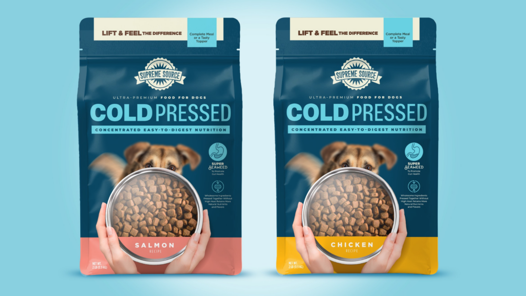
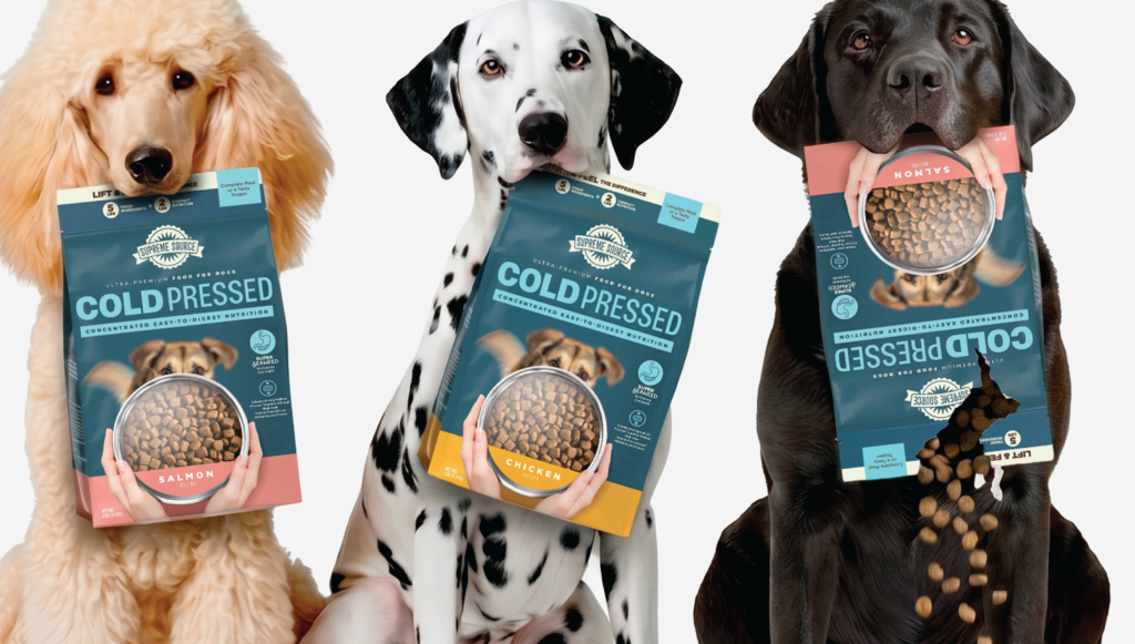
For Supreme Source’s new cold-pressed line, the goal was to make the format instantly understandable in the few seconds a shopper actually spends looking at a shelf. Our team explored multiple directions before landing on an approach that balanced shelf standout with premium credibility and felt distinct within Supreme Source’s existing portfolio. Cold-pressed reads as a confident and intentional choice, rather than a term shoppers have to stop and decode.
In addition, the viewing window became the centerpiece of that strategy, putting the product on display so the food makes its own case. Ingredient callouts, like seaweed and mushrooms for digestive health, are visible enough to inform without cluttering a design built to communicate faster.
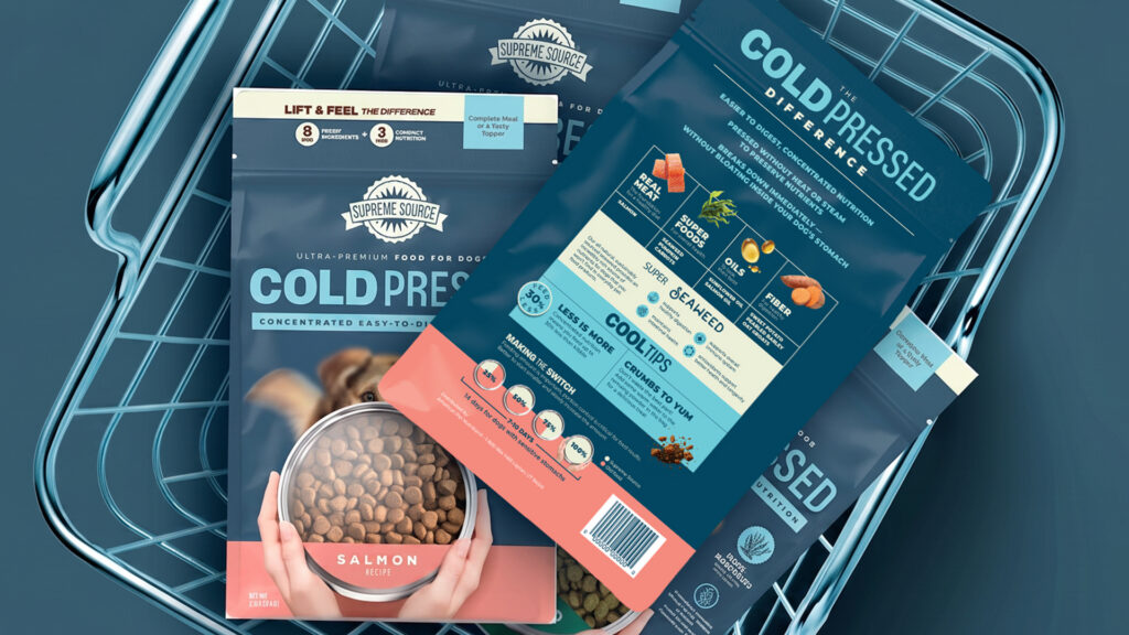
Check out our full Supreme Source case study below:
Getting Ahead of the Curve
Cold-pressed is still early in its growth, but that won’t last long. As more brands move into the space, shoppers will have more options to compare and less patience for packaging that doesn’t quickly explain what sets one product apart from the next. Right now, a lot of the education still falls on the brand itself, since most consumers don’t yet have a baseline understanding of what cold-pressed means, the way they do with terms like “freeze-dried.”
That gap is an opportunity for brands willing to invest in it, but it won’t stay open forever. As awareness grows and more competitors enter the category, cold-pressed will likely follow the same path as other formats: what once needed a full explanation on pack will eventually become a term shoppers recognize at a glance. The brands that get the story right now, while there’s still room to define what cold-pressed means to a new customer, will have a real head start in how pet parents come to understand and trust the format.
Smith Design helps CPG brands turn complex stories into packaging that makes sense at shelf.
Have a similar challenge?
References
Dog Food Innovation: Is Cold Pressed the Next Game Changer in Nutrition? (Pet Age)