As Millennials and Gen Z continue expanding their palates, global flavors have become integral to their culinary experiences. Both generations grew up surrounded by diverse global cuisine, and for Gen Z, global food is more than just about taste; it’s an immersive experience that combines authenticity, culture, and emotional connection. This shift towards adventurous eating reflects a desire for more sophisticated palates as a way to enhance their culinary explorations. As retailers and brands respond to this growing interest, the availability of unique and complex flavors is expanding across various food and beverage categories. From snacks to drinks, options are becoming increasingly diverse, catering to audiences eager for new taste sensations.
Traditional brands that have historically relied on American flavor profiles are now expanding their horizons by embracing globally-inspired varieties. This shift allows them to connect with the adventurous tastes of Millennials and Gen Z while staying aligned with ever-evolving culinary trends.
Where Flavor Innovation Meets Authentic Design
But flavor innovation alone isn’t enough. As shelves become more crowded with globally inspired offerings, package design plays a critical role in signaling authenticity, communicating flavor cues, and inviting consumers to explore something new. Color palettes, typography, patterns, and imagery all work together to evoke cultural inspiration while maintaining a brand’s own visual equity. When done thoughtfully, packaging becomes a gateway, helping consumers quickly understand unfamiliar flavors and feel confident trying them.
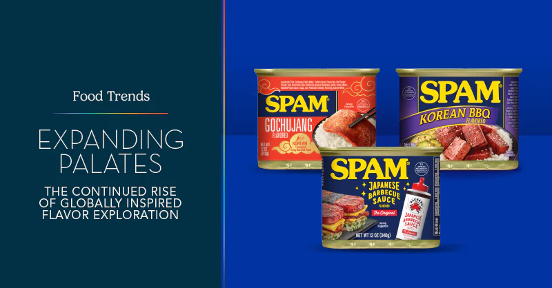
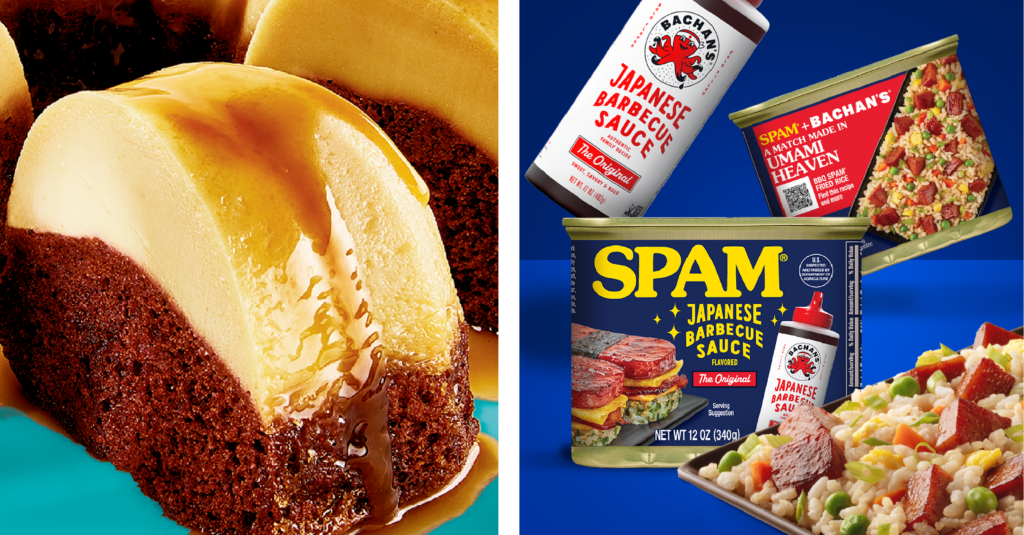
SPAM has long held a meaningful place in Asian American food culture, where it’s been embraced across generations in dishes like musubi, fried rice, and other comfort-driven fusion meals. Recent limited-time offerings continue to build on that cultural connection, blending familiar pantry staples with globally inspired flavors to celebrate community and culinary creativity. A recent collaboration between the SPAM brand and Bachan’s Japanese Barbecue Sauce brings this idea to life, combining two pantry staples rooted in Asian American food culture into a single, umami-rich experience inspired by a pairing fans have been creating at home for years.
The SPAM Japanese Barbecue Sauce flavored variety, made with Bachan’s Original Japanese Barbecue Sauce, delivers a savory balance of sweet, garlicky, and soy-forward notes while celebrating Japanese American culinary traditions. Smith Design partnered with the SPAM team to help shape the packaging for this collaboration, translating the bold flavor fusion into a package design system that feels culturally informed, modern, and shelf-ready.
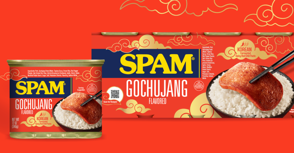
The launch of SPAM Gochujang, inspired by the popular Korean condiment, is another example of this trend. This limited-edition variety combines spicy, sweet, smoky, and umami elements, making it a great addition to any occasion. Smith Design also had the pleasure of collaborating with SPAM to shape the visual aesthetic of this product, ensuring it resonates with Korean heritage and aligns with the essence of gochujang sauces found in adjacent categories. This focus on design not only elevates the product’s appeal but also creates a deeper connection with consumers seeking immersive culinary experiences.
Beyond globally inspired heat and fusion, brands are also finding growth in traditional Hispanic flavors rooted in nostalgia, cultural pride, and the comfort of home. Consumers are gravitating toward offerings that feel authentic and emotionally resonant, creating a compelling opportunity for brands to expand into heritage-driven spaces with credibility and warmth. This insight guided our recent partnership with Pillsbury Baking and Hometown Foods to launch a new line of Hispanic Recipe baking mixes.
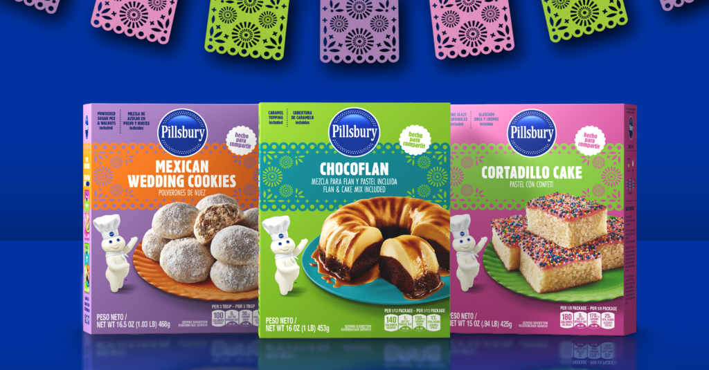
Following an in-depth cultural and visual audit and market analysis, we helped translate deeply familiar flavors into a modern retail experience that feels both genuine and accessible. The resulting packaging for Mexican Wedding Cookies, Chocoflan, and Cortadillo Cake blends vibrant, culturally inspired color palettes and patterning with photography that evokes homemade indulgence. The design honors time-tested recipes while staying true to Pillsbury’s playful, trusted brand voice, creating a bridge between tradition and contemporary shelf appeal.
Flavor Communication to Cultural Storytelling
As interest in global flavors continues to grow, packaging is evolving from simple flavor communication to storytelling. Whether highlighting regional ingredients, showcasing flavor mashups, or using design to convey heat, sweetness, or spice, brands have an opportunity to turn global inspiration into a compelling shelf presence. The result is packaging that doesn’t just describe the product, it sparks curiosity and encourages discovery.