
A Night Out at Loew’s Jersey Theatre in the 1930s
If you were walking through Jersey City’s Journal Square in the early 1930s, you would have been standing at the center of the region’s live entertainment scene, and the talk was all about who would take the stage that weekend. Was it Bing Crosby? Duke Ellington? Cab Calloway? Whoever it was, you knew it was bound to be a night you’d talk about for years, and at a venue that made every show feel like an event.
Anyone who was anyone knew Loew’s Jersey Theatre.
When it opened on September 28, 1929, the city described it as “The Most Lavish Temple of Entertainment in New Jersey.” Behind a terra cotta facade and a curved marquee facing the square, more than 3,000 seats sat beneath gold ceilings and red drapes. Originally designed for “talkie films,” the building was designed by architects Rapp and Rapp for theater magnate Marcus Loew between 1927 and 1929, blending Spanish Baroque and Italian Rococo/Renaissance styles at a cost of $2 million. It was one of five Loew’s “Wonder Theatres” in the New York area, and it belonged to the neighborhood as much as to the stars performing on stage.
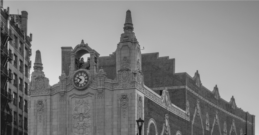
However, the shows didn’t last forever. Live acts faded in the mid-1930s, and in August of 1986, Loew’s Jersey Theatre closed its doors. A group called the Friends of the Loew’s then spent years trying to keep the building standing, and Jersey City bought it in 1993. Now, a $130 million remodel brings back original details and charm while adding modern sound, lighting, and flexible seating.
In fall 2026, the theatre will welcome people who remember it and many who never saw the inside.
Building a Brand for a New Era
A reopening is only the beginning. The theatre needed an identity with the same presence as the building itself, one that could welcome a new generation without leaving the old one behind.
The goal was never to recreate 1929; it was to capture the soul and energy of the building in a brand world that feels current and lasting, and that holds together across a variety of media.
There was a bigger picture, too. As Jersey City builds its reputation as an arts destination, Loew’s Jersey Theatre has the chance to become a hub for live performance and community engagement again, and to support the city’s arts and economic revitalization along the way.
HBSE, the group overseeing the Loew’s Jersey Theatre’s restoration and operation, partnered with Smith Design to develop its new brand. The work began with an audit of the theatre’s history, architecture, programming, and audience, backed by research into how historic venues are being revived and how people choose live entertainment. A brainstorming workshop with the HBSE team followed, laying out the groundwork for a new brand positioning and a visual and verbal strategy to guide the theatre through its launch.
From here, our team built a complete brand: a custom logo and pattern, the brand guidelines to keep them consistent, collateral for marketing and merchandise, and digital activations to carry it on social and web.
Designed From the Details
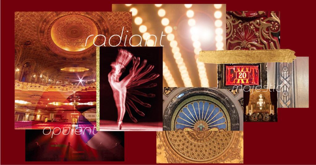
It started with the building: our design exploration focused on translating its decorative details into a modern mark, and the logo that emerged feels familiar without feeling borrowed. The custom patterns and graphic elements we developed draw on motifs found throughout the venue.
To keep that point of view steady, brand guidelines were built around the patterns, typography, and logo, showing how each one adapts across signage, digital campaigns, and event collateral while staying tied to the theatre’s architecture. That range matters for a venue whose calendar spans film screenings, live performances, and community events.
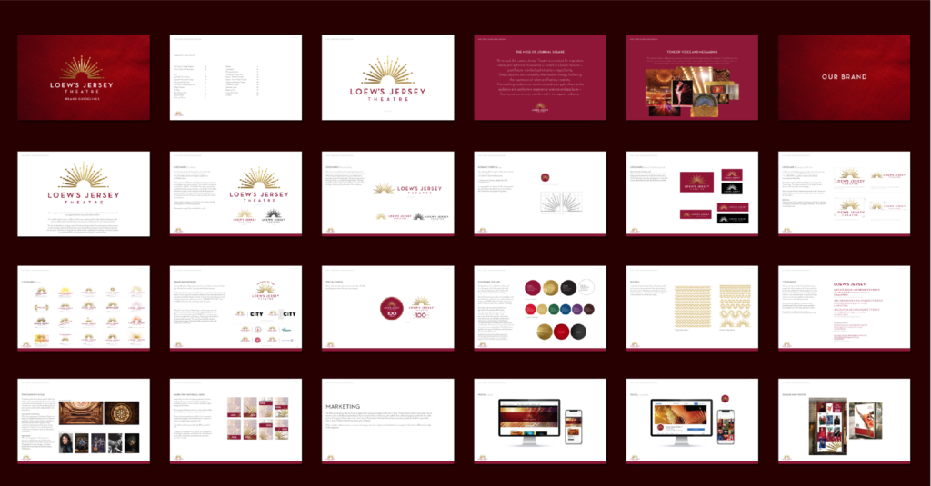
From ticket stubs to posters to program guides, the identity was applied across everyday materials that shape an audience’s experience with the theatre, extending to digital activations such as social content and web presence. These touchpoints give visitors a consistent sense of place, whether they’re planning a visit online or holding a piece of paper in hand at the box office.
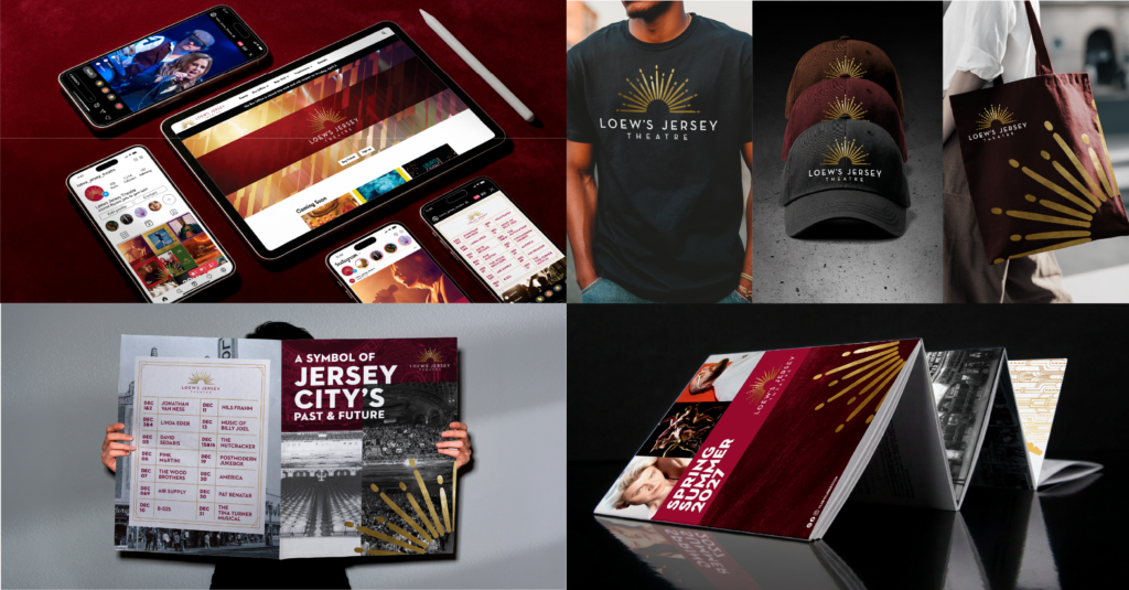
Check out our full Loew’s Jersey Theatre case study below:
Majestic Reinvention with a Nod to Heritage
For decades, Loew’s Jersey Theatre has stood in Journal Square as a landmark. The new brand asks for more than admiration from the sidewalk. Its unified look draws on the 1929 original while speaking clearly to the present, positioning the theatre as an active venue for live performances, screenings, and community events. It carries forward the idea that guided our first conversations with the HBSE team: capture the spirit of the original rather than completely recreating it. That approach has recently earned silver for Best Visual Identity from the Sports and Leisure Sector at the Transform Awards North America 2026.
Loew’s Jersey Theatre’s Grand Reopening Weekend is coming up on November 13 and 14, kicking off with performances by Trey Anastasio Band and The War on Drugs. The lineup continues into the new year with music, comedy, and dance, bringing the historic building back to the city it was built for.
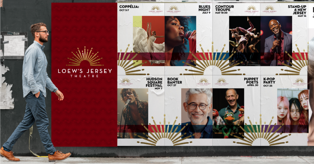
Smith Design helps brands with a past worth keeping build an identity made for what comes next.
Have a similar challenge?
References
Reimagined Loew’s Jersey Theatre Set to Reopen in ’26
Historic NJ theatre set for grand reopening after $130M restoration
Jersey City’s historic Loew’s Theatre to reopen this fall after $130M restoration