
When it comes to visual aesthetics, a trend can be defined as a style, look, or design approach that gains popularity or widespread adoption for a period of time. These periods are becoming increasingly brief, making it even more crucial to recognize what’s hot—while it’s still hot—and understand how to leverage those trends effectively.
Putting our best foot forward in any design project starts with understanding the competitive landscape. That includes being aware of common aesthetic choices (i.e., trends), but more importantly, understanding why those choices are being made. That “why” often comes from deeper influences such as user experience, interaction patterns, accessibility standards, and evolving audience expectations. We will dig into those factors a bit more below.
Still, visual design direction should not be dictated solely by trendiness. A popular look is not automatically right for a brand. Merit, substance, and quality must come first. The goal is not to mimic “the cool kids”, but to understand what makes them perceived as cool, and then interpret those qualities in a way that is authentic to your brand.
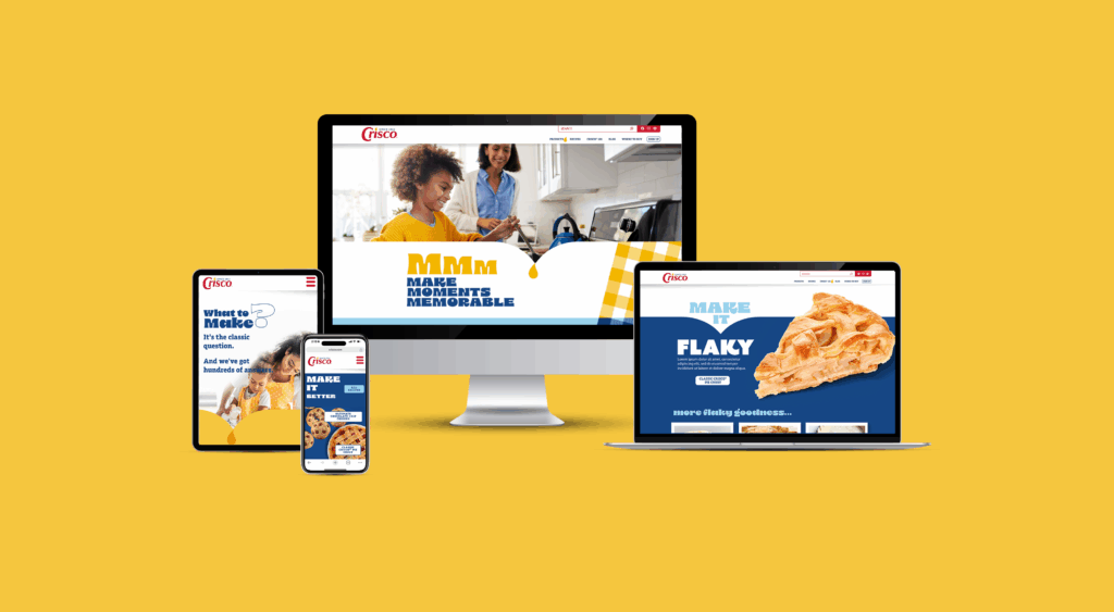
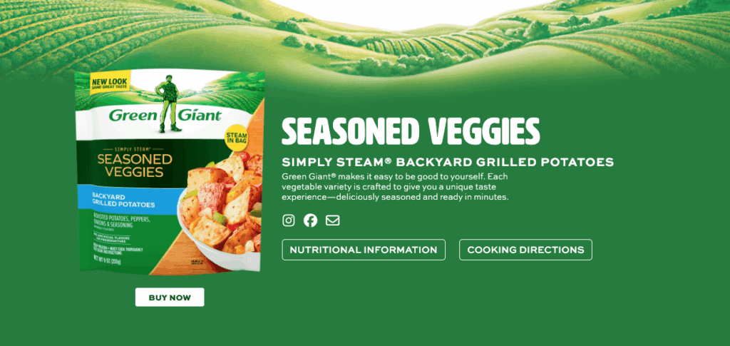
The in-depth research and insights that guided our most recent web design work for Green Giant, Grandma’s Molasses, and Crisco, all of which launched this year, still resonate with many aspects of today’s trends.
Now, let’s dive into the trends…
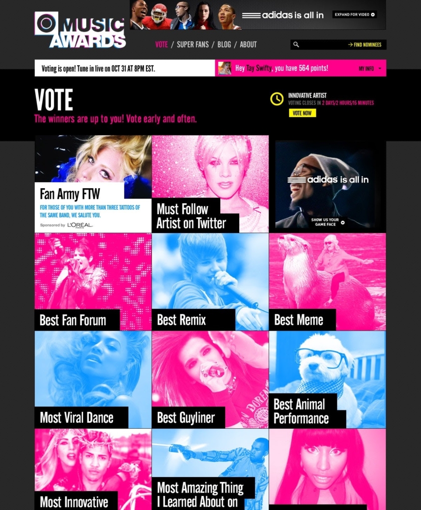
Minimalism and Clean Design
Minimalism is still having its moment, mostly because users want clarity. With so much competing for attention online, clean, intentional design feels like a breath of fresh air. Avoid being overly stark, think minimal, but with a purpose. Key design principles still apply. The layout, hierarchy, and content are all carefully planned and intentional.
You will usually see this trend show up through:
- generous amounts of whitespace
- simple, readable type
- fewer competing elements on the page
- clear visual hierarchy that guides the eye
The end result for this minimalistic trend is having pages that load quickly and content that is easier to absorb.
Dark Mode and High-Contrast Themes
Although not everyone is a fan, Dark Mode remains a very popular trend and is an easy way to make a website look sleek.
Here are the benefits of Dark Mode:
- strong contrast that boosts readability
- richer colors that pop against darker backgrounds
- a streamlined, contemporary vibe
Tip: Offering a toggle (light ↔ dark) is a strong UX move that accommodates user preferences. Giving users control over how they view your site is a small touch that goes a long way.
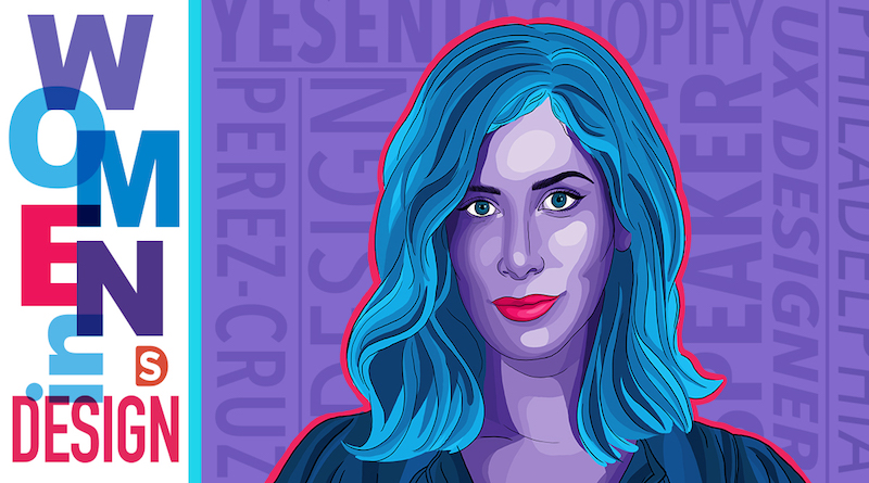
Bold Typography and Expressive Fonts
Type is doing a lot of heavy lifting these days. Instead of decorative flourishes, brands are leaning into typography to set the tone and deliver personality instantly.
- oversized headlines, expressive, and creative fonts are tricks that seem to never get old
- variable fonts (which can change weight/width dynamically) are becoming more common for adaptability
3D Visuals, Animations, and Immersive Elements
The web is getting more dynamic, sometimes in subtle ways, sometimes in totally immersive ones. A little motion can make a site feel alive, but we are also seeing more sites lean into 3D elements, scroll-triggered effects, and interactive elements.
Some hallmarks of this trend are:
- animations that guide attention
- 3D models or illustrations used as focal points
- optimization for a smooth experience
These “user engagement” visuals help create memorable experiences and reinforce quality, but must be done with performance in mind, so they don’t bog down the user’s machine. Use animations/motion where they add meaning, not just for decoration.
Organic Shapes, Asymmetry and Fluid Layouts
There has been a steady shift away from perfectly rigid grids and sharp, rectangular shapes.
You will spot this trend through:
- curved edges instead of sharp corners
- sections that overlap or flow into each other
- a more human, dynamic, and fluid feel, versus overly mechanical layouts
Tip: Asymmetry can draw attention, but make sure the layout still feels balanced, and navigation remains intuitive.
Grids and “Bento Boxes”
Counter to the above is a layout style where content is divided into distinct, modular “boxes” or compartments, much like the sections of a Japanese bento box, where the trend gets its name. Clarity, balance, and modularity are their key features.
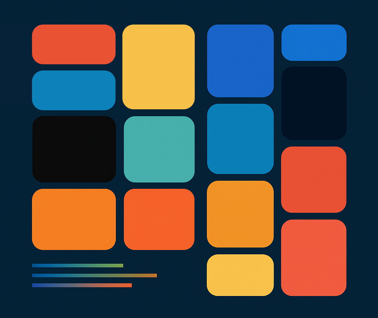
- boxes can vary in size, not limited to just uniform squares
- different sized blocks working together cohesively
- size and various configurations of the grid are used to create an overall architecture as well as visual hierarchy
It’s not just decorative. Each box serves a purpose, presenting a specific type of content (text, image, video, link, etc.) It is clean, modern, and makes perfect sense for content heavy experiences.
Customization and Personalization
With AI involved with so much of our digital activity, personalization and adaptive experiences are becoming the norm, even if we do not realize it. Sites are starting to adjust themselves based on how and where people use them.
This shows up through:
- content recommendations tailored to each visitor
- navigation that prioritizes what you need most
- location aware messaging or features
- layouts that adapt based on user behavior
When done well, personalization feels intuitive, not invasive.
Privacy and Security
With all this customization comes stricter rules and regulations around Privacy and Security. These measures are in place to protect users and control how their information is shared, which is why cookie-consent popups are now appearing everywhere you look.
Accessibility
In order to discuss accessibility trends, it is only fair to start with WCAG 2.1/3.0 standards. While being compliant to these standards reduces the risk of lawsuits, 85% of organizations see accessibility as a competitive edge, with the added benefit that accessible sites improve SEO and conversions.
Meeting these standards, along with adding even more options for users to adjust contrast and point sizes for readability, only makes the experience that much better for the user.
Voice Navigation & Assistive Tech Integration are becoming increasingly popular. With AI assistants like Siri, Alexa, and Google Assistant searching the internet and assisting users, it is key to make sure the sites are developed in a way that they can access information easily and correctly.
Sustainability in Web Design
The internet accounts for about 3.7% of global carbon emissions, rivaling that of the airline industry, and could consume as much as 8% of global electricity by 2030.
To be sustainable, we need to recognize that websites rely on energy-intensive servers and data centers, which often utilize fossil fuels and substantial amounts of water for cooling. The key to reducing the carbon footprint is to minimize the energy required to maintain, operate and consume the site.
- optimizing code creates a more efficient site, quicker load times, and less bandwidth
- fewer unnecessary scripts which create less draw from servers
- mobile-first design that prioritizes essentials
- green hosting providers have their own initiatives in place to help reduce their carbon footprint
A lighter site is not just greener. It is faster and more user-friendly.
Web design trends are evolving faster than ever, driven by technology, user expectations, and cultural shifts. While it’s tempting to chase what’s popular, the most effective designs balance trend awareness with brand authenticity, usability, and accessibility. Minimalism, dark mode, bold typography, immersive visuals, and adaptive layouts all offer exciting opportunities, but they should serve a purpose beyond just aesthetics. Personalization powered by AI, sustainability considerations, and compliance with accessibility standards are no longer optional; they’re essential for creating inclusive, future-ready experiences. Ultimately, great design isn’t about following trends blindly; it’s about understanding why they resonate and using that insight to craft meaningful, user-focused solutions that stand the test of time.