From Core to Curious: When Brand Stretch Becomes Opportunity (and When It Becomes Polarizing)

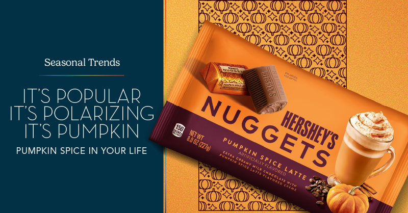
Brand extension is no longer a cautious step into closely related categories. Today, brands are making bolder, more visible leaps, sometimes logically, sometimes provocatively, into new spaces in pursuit of relevance, growth, and cultural momentum. In an era defined by fast-moving trends and fragmented consumer attention, expanding beyond the core can feel like a necessary survival strategy. Yet recent launches reveal a critical tension: not every stretch is embraced. Some feel like natural evolutions of what a brand already represents, while others ignite confusion, skepticism, and even backlash across social platforms. The question is no longer whether brands can stretch, but when that stretch feels authentic, and when it crosses the line into cultural dissonance.

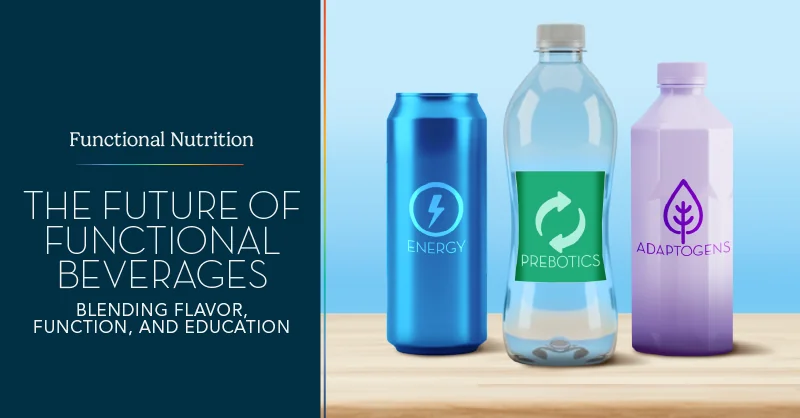
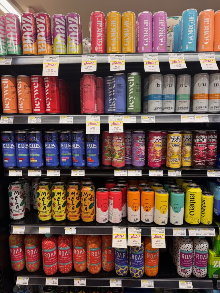
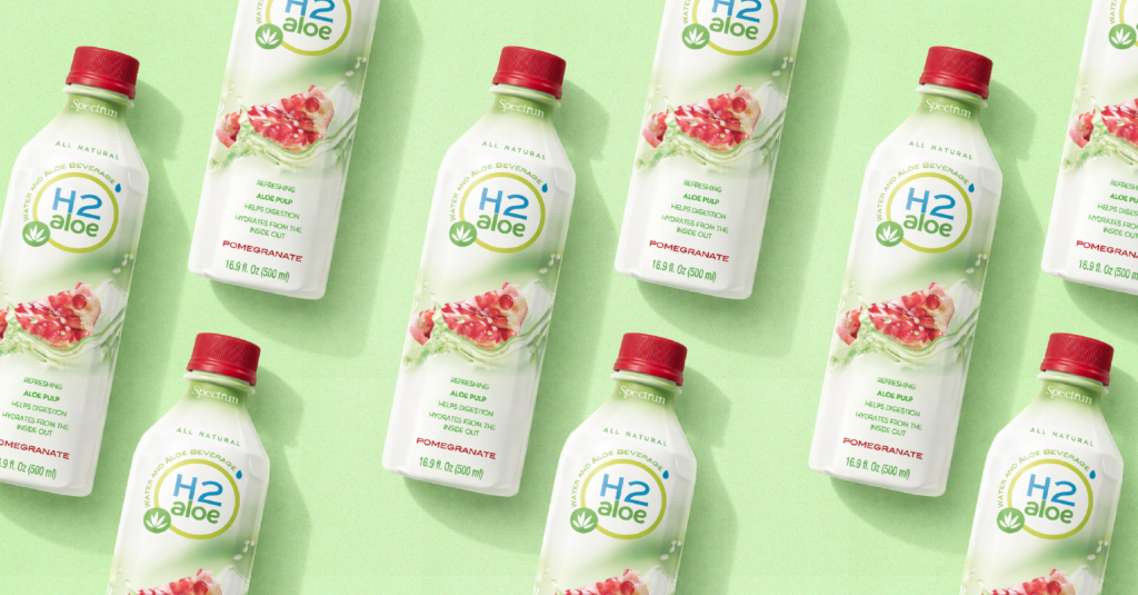
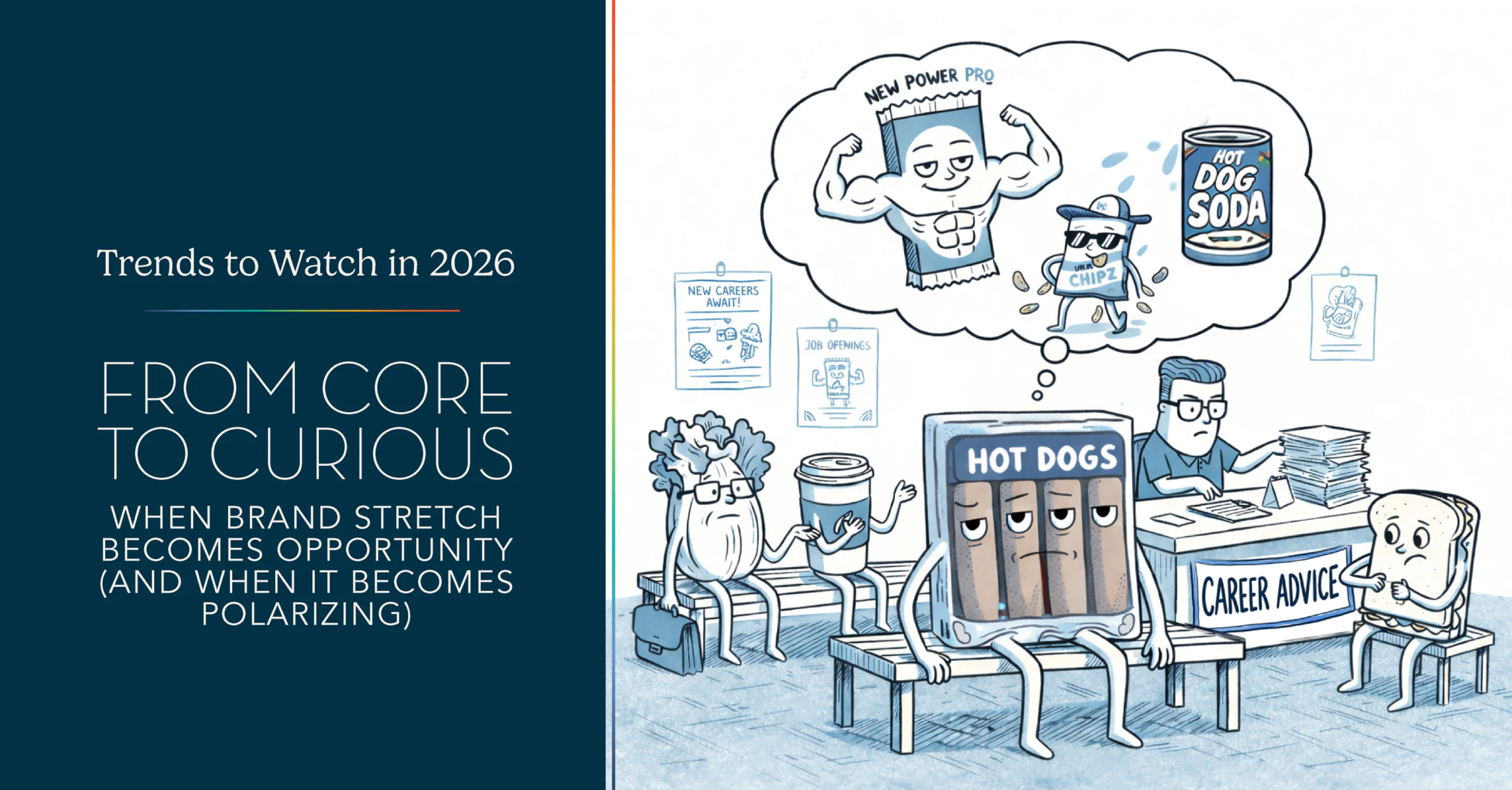
A recent and highly visible example is Beyond Meat’s move into the functional beverage space. For some consumers, the launch signaled innovation and a broader lifestyle platform built around plant-based nutrition. For others, it felt disconnected from what Beyond Meat has historically stood for: meat alternatives grounded in food science, sustainability, and savory meal occasions. The polarized reaction underscores a growing challenge in modern brand strategy. Consumers expect brands to evolve, but only if that evolution aligns with the mental model they already hold. When the connection is unclear, even well-intentioned innovation can feel forced or opportunistic.

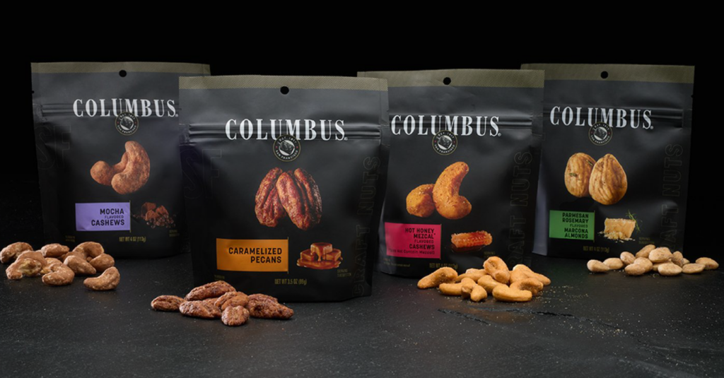
In contrast, several recent brand extensions demonstrate how stretching can succeed when rooted in clear brand logic and occasion relevance. Columbus Meats’ expansion into premium nuts felt intuitive because it extended the same world of craft, quality, and elevated snacking that the brand already owned. Premium nuts naturally fit into charcuterie boards, entertaining moments, and upscale grazing occasions—spaces where Columbus already had cultural permission to play. Rather than redefining the brand, the move simply broadened how and when consumers could interact with it.

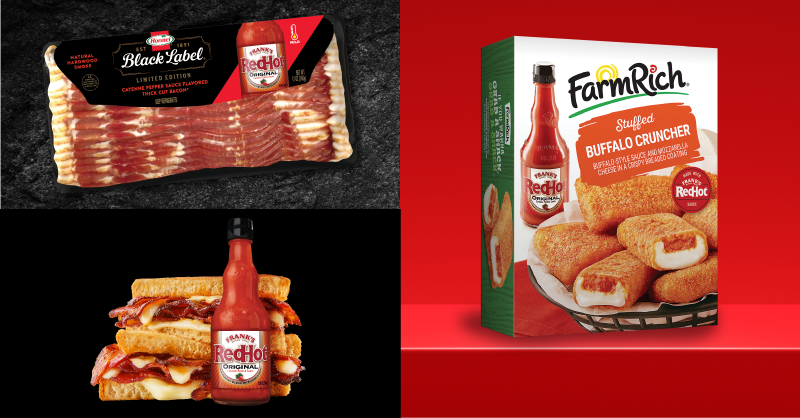
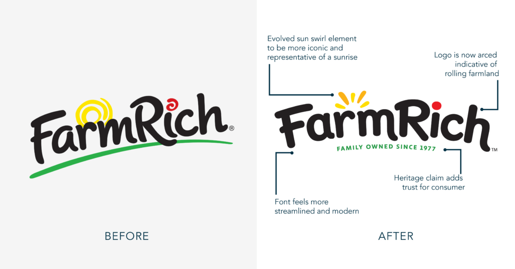
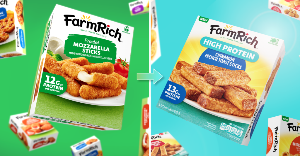
Similarly, Farm Rich’s expansion from frozen appetizers into frozen breakfast built upon its existing equity in comfort, convenience, and freezer-aisle familiarity. Breakfast was not a reinvention but a natural adjacency, allowing the brand to show up at a new daypart while delivering the same promise of easy, crowd-pleasing food. Skippy’s launch of PB Bites followed a comparable logic. By translating its strongest equity, iconic peanut butter taste, and nostalgic appeal, into an on-the-go snacking format, Skippy responded to modern consumption behavior without abandoning its core identity. This was not a leap into a new category as much as a format evolution, meeting consumers where their routines had shifted.

Boar’s Head’s recent entry into indulgent dessert dips may be the boldest example, yet it still remains grounded in the brand’s long-standing reputation for premium, deli-counter craftsmanship. By reframing its role from strictly savory to “premium entertaining,” Boar’s Head expanded into a new emotional territory while staying true to its values of quality and indulgence. The move widens its relevance at social gatherings, extending the brand beyond meats and cheeses into dessert moments without eroding its upscale positioning.

Across these successes, three strategic principles consistently emerge. First, effective brand stretches expand existing occasions rather than inventing entirely unrelated ones. Columbus did not jump into soda; it deepened its presence in snacking and entertaining. Skippy did not become a wellness brand; it stayed in the snack lane and simply made peanut butter more portable. Beyond Meat, by contrast, entered a beverage category defined by different emotional and functional expectations, creating friction between what consumers knew the brand for and what it was suddenly offering.

Second, successful extensions leverage true brand equity, not just brand awareness. They draw from taste cues, trust, quality signals, and the emotional role a brand already plays in consumers’ lives. When Farm Rich entered breakfast, it carried forward its promise of easy comfort food. When Boar’s Head entered the dessert dips market, it leaned into premium indulgence and special-occasion appeal. Extensions fail when they rely solely on logo recognition without translating the brand’s deeper story into the new category in a meaningful way.

Finally, the most successful stretches feel additive rather than opportunistic. Today’s consumers are highly attuned to trend-chasing, especially in saturated spaces like functional beverages and wellness products. Without a clear narrative bridge, Beyond Meat’s move risked being interpreted as a business maneuver rather than a brand evolution. By contrast, Skippy PB Bites addressed a real, practical need: peanut butter without the spoon, making the extension feel purposeful and consumer-driven rather than reactive.

As categories fragment and consumption moments multiply, brand stretching will only accelerate. But the brands that win will not be the ones that stretch the farthest; they will be the ones that stretch with coherence. The difference between opportunity and polarization lies in narrative continuity—whether a new product feels like a natural next chapter or an unrelated side quest. When a brand extension expands an existing role, honors core equities, and solves a genuine consumer need, it builds relevance and long-term growth. When it breaks the mental contract consumers have with the brand, it risks becoming a headline instead of a strategy. In today’s culture, visibility may spark conversation, but authenticity is what sustains trust—and trust remains the most powerful currency a brand can carry into any new category.

The Future of Functional Beverages: Blending Flavor, Function, and Education

The functional beverage market is entering its next phase of growth, one defined not only by efficacy but also by experience. As consumers increasingly look to drinks for energy, calm, focus, hydration, and gut health, these products are becoming integrated into daily rituals rather than treated as occasional supplements. Functional beverages are now staples for consumers seeking holistic wellness solutions. However, as the category becomes increasingly crowded, differentiation is no longer driven solely by ingredients. According to NielsenIQ and Euromonitor, the number of functional beverage launches has surged across various channels, resulting in a proliferation of similar claims and formats. In this environment, branding, packaging, and marketing clarity have become the primary drivers of trust, trial, and repeat purchase.

Branding: From Functional Claims to Confident Guidance

Consumers today are highly informed—but also increasingly skeptical. FMCG Gurus reports that shoppers want functional benefits, but they do not want to “decode” labels to understand them. This places new pressure on brands to act as guides, not just product providers. Mintel highlights that transparent, educational messaging is now table stakes, particularly for ingredients like adaptogens, nootropics, probiotics, mushrooms, and cannabinoids. Successful brands are simplifying complex science into clear, benefit-led language, using terms like “calm,” “focus,” “restore,” and “unwind,” while offering deeper education through secondary panels, QR codes, and digital extensions. WGSN further notes a shift toward reassuring familiarity: pairing emerging ingredients with well-known nutrients (such as magnesium, B vitamins, or electrolytes) helps lower the barrier to trial.

From a brand strategy standpoint, this means:

  • Clear brand architecture that ladders products to moments or outcomes
  • A confident, authoritative tone that educates without overwhelming. Replace ambiguity with confidence and truth.
  • Consistent language across packaging, paid media, and owned channels

Packaging: Designing for Shelf Clarity and Sensory Appeal

While functionality drives consideration, flavor ultimately drives purchase. Mintel identifies taste as the top attribute consumers associate with functional beverages, ranking above health benefits. Beverage Marketing Corporation reinforces this insight, noting that repeat purchase is overwhelmingly tied to flavor satisfaction. Packaging must strike a careful balance by clearly and quickly communicating function, while simultaneously evoking flavor, enjoyment, and sensory reward—positioning the product within the realm of “permissible wellness,” where it feels indulgent yet justified. This has led to packaging systems that borrow cues from premium food, beauty, and even spirits categories. 

Design trends include:

  • Rich, flavor-forward color palettes paired with clean benefit callouts
  • Elevated typography and restrained layouts that signal credibility
  • Ingredient photography or illustration that suggests natural origins and taste

We see a growing role for high-quality, in-house photography in enhancing flavor appeal and trust, especially in categories where taste can feel abstract. Products that look delicious feel less medicinal and more lifestyle-oriented. For brands targeting the sober-curious or alcohol-alternative consumer, WGSN highlights a shift toward cocktail-inspired aesthetics featuring glass cues, botanical illustrations, and ritual-driven design, positioning functional drinks as social, rather than solitary.

Marketing: Occasion-Based, Ritual-Driven, and Social by Design

Functional beverages are no longer confined to “me time.” Mintel & Nielsen both report that nearly 60% of consumers want to see functional drinks offered in bars and restaurants, signaling a major expansion in usage occasions. By 2027–28, the report predicts these beverages will become commonplace at concerts, fitness studios, sporting events, and sober-curious social spaces. This shift has significant implications for marketing strategy, as brands seeing the strongest growth are those that anchor products to moments, not just benefits. People are looking for products that focus on morning productivity and rituals, midday stress relief or hydration resets, and even winding down or alcohol replacement occasions. Marketing that highlights when and how to drink, rather than just why, helps consumers integrate functional beverages into their daily lives. Social content, sampling programs, and experiential activations are increasingly centered on shared moments, positioning these drinks as connectors rather than utilities.

For functional beverage brands, success begins by leading with flavor and reinforcing it with function. Taste is what captures attention at shelf, while clear, educational messaging is what builds trust and confidence over time. Consumers want products that deliver on health benefits, but they are far more likely to engage when those benefits are framed through an enjoyable, craveable experience. Clear benefit communication, evocative visuals, and credible design cues must work together to quickly convey value, differentiate from competitors, and signal quality in a crowded set. At the same time, brands must simplify the science, making complex ingredients and formulations easy to understand without undermining authority or credibility.

The functional beverage category is rich with opportunity, but it is also increasingly unforgiving. The brands that will win are those that treat brand strategy and packaging not as decoration, but as strategic tools that translate function into desire. When flavor, function, and education work in harmony, functional beverages transcend claims and become part of culture.


References

Mintel, Functional Drinks – US – 2024

NielsenIQ, Beverage Category Insights

Euromonitor International, Health & Wellness Drinks

WGSN, Food & Drink Trend Forecasts

FMCG Gurus, Consumer Attitudes to Functional Nutrition

Beverage Marketing Corporation, Functional & Better-for-You Beverages

Unveil the Future: Captivating Visual/UX Web Trends You Can’t Miss

When it comes to visual aesthetics, a trend can be defined as a style, look, or design approach that gains popularity or widespread adoption for a period of time. These periods are becoming increasingly brief, making it even more crucial to recognize what’s hot—while it’s still hot—and understand how to leverage those trends effectively.

Putting our best foot forward in any design project starts with understanding the competitive landscape. That includes being aware of common aesthetic choices (i.e., trends), but more importantly, understanding why those choices are being made. That “why” often comes from deeper influences such as user experience, interaction patterns, accessibility standards, and evolving audience expectations. We will dig into those factors a bit more below.

Still, visual design direction should not be dictated solely by trendiness. A popular look is not automatically right for a brand. Merit, substance, and quality must come first. The goal is not to mimic “the cool kids”, but to understand what makes them perceived as cool, and then interpret those qualities in a way that is authentic to your brand.

The in-depth research and insights that guided our most recent web design work for Green Giant, Grandma’s Molasses, and Crisco, all of which launched this year, still resonate with many aspects of today’s trends.

Now, let’s dive into the trends…

Crisco brand website development

Minimalism and Clean Design

Minimalism is still having its moment, mostly because users want clarity. With so much competing for attention online, clean, intentional design feels like a breath of fresh air. Avoid being overly stark, think minimal, but with a purpose. Key design principles still apply. The layout, hierarchy, and content are all carefully planned and intentional.

You will usually see this trend show up through:

  • generous amounts of whitespace
  • simple, readable type
  • fewer competing elements on the page
  • clear visual hierarchy that guides the eye

The end result for this minimalistic trend is having pages that load quickly and content that is easier to absorb.

Dark Mode and High-Contrast Themes

Although not everyone is a fan, Dark Mode remains a very popular trend and is an easy way to make a website look sleek.

Here are the benefits of Dark Mode:

  • strong contrast that boosts readability
  • richer colors that pop against darker backgrounds
  • a streamlined, contemporary vibe

Tip: Offering a toggle (light ↔ dark) is a strong UX move that accommodates user preferences. Giving users control over how they view your site is a small touch that goes a long way.

Green Giant Website Design

Bold Typography and Expressive Fonts

Type is doing a lot of heavy lifting these days. Instead of decorative flourishes, brands are leaning into typography to set the tone and deliver personality instantly.

  • oversized headlines, expressive, and creative fonts are tricks that seem to never get old
  • variable fonts (which can change weight/width dynamically) are becoming more common for adaptability

3D Visuals, Animations, and Immersive Elements

The web is getting more dynamic, sometimes in subtle ways, sometimes in totally immersive ones. A little motion can make a site feel alive, but we are also seeing more sites lean into 3D elements, scroll-triggered effects, and interactive elements.

Some hallmarks of this trend are:

  • animations that guide attention
  • 3D models or illustrations used as focal points
  • optimization for a smooth experience

These “user engagement” visuals help create memorable experiences and reinforce quality, but must be done with performance in mind, so they don’t bog down the user’s machine. Use animations/motion where they add meaning, not just for decoration.

Organic Shapes, Asymmetry and Fluid Layouts

There has been a steady shift away from perfectly rigid grids and sharp, rectangular shapes.

You will spot this trend through:

  • curved edges instead of sharp corners
  • sections that overlap or flow into each other
  • a more human, dynamic, and fluid feel, versus overly mechanical layouts

Tip: Asymmetry can draw attention, but make sure the layout still feels balanced, and navigation remains intuitive.

Grids and “Bento Boxes”

Counter to the above is a layout style where content is divided into distinct, modular “boxes” or compartments, much like the sections of a Japanese bento box, where the trend gets its name. Clarity, balance, and modularity are their key features.

  • boxes can vary in size, not limited to just uniform squares
  • different sized blocks working together cohesively
  • size and various configurations of the grid are used to create an overall architecture as well as visual hierarchy

It’s not just decorative. Each box serves a purpose, presenting a specific type of content (text, image, video, link, etc.) It is clean, modern, and makes perfect sense for content heavy experiences.

Customization and Personalization

With AI involved with so much of our digital activity, personalization and adaptive experiences are becoming the norm, even if we do not realize it. Sites are starting to adjust themselves based on how and where people use them.

This shows up through:

  • content recommendations tailored to each visitor
  • navigation that prioritizes what you need most
  • location aware messaging or features
  • layouts that adapt based on user behavior

When done well, personalization feels intuitive, not invasive.

Privacy and Security

With all this customization comes stricter rules and regulations around Privacy and Security. These measures are in place to protect users and control how their information is shared, which is why cookie-consent popups are now appearing everywhere you look.

Accessibility

In order to discuss accessibility trends, it is only fair to start with WCAG 2.1/3.0 standards. While being compliant to these standards reduces the risk of lawsuits, 85% of organizations see accessibility as a competitive edge, with the added benefit that accessible sites improve SEO and conversions.

Meeting these standards, along with adding even more options for users to adjust contrast and point sizes for readability, only makes the experience that much better for the user.

Voice Navigation & Assistive Tech Integration are becoming increasingly popular. With AI assistants like Siri, Alexa, and Google Assistant searching the internet and assisting users, it is key to make sure the sites are developed in a way that they can access information easily and correctly.

Sustainability in Web Design

The internet accounts for about 3.7% of global carbon emissions, rivaling that of the airline industry, and could consume as much as 8% of global electricity by 2030.

To be sustainable, we need to recognize that websites rely on energy-intensive servers and data centers, which often utilize fossil fuels and substantial amounts of water for cooling. The key to reducing the carbon footprint is to minimize the energy required to maintain, operate and consume the site.

  • optimizing code creates a more efficient site, quicker load times, and less bandwidth
  • fewer unnecessary scripts which create less draw from servers
  • mobile-first design that prioritizes essentials
  • green hosting providers have their own initiatives in place to help reduce their carbon footprint

A lighter site is not just greener. It is faster and more user-friendly.

Web design trends are evolving faster than ever, driven by technology, user expectations, and cultural shifts. While it’s tempting to chase what’s popular, the most effective designs balance trend awareness with brand authenticity, usability, and accessibility. Minimalism, dark mode, bold typography, immersive visuals, and adaptive layouts all offer exciting opportunities, but they should serve a purpose beyond just aesthetics. Personalization powered by AI, sustainability considerations, and compliance with accessibility standards are no longer optional; they’re essential for creating inclusive, future-ready experiences. Ultimately, great design isn’t about following trends blindly; it’s about understanding why they resonate and using that insight to craft meaningful, user-focused solutions that stand the test of time.

Adobe MAX 2025: Creativity Evolved – The Intersection of Artistry and Technology

Adobe MAX 2025 underscored a central truth: artificial intelligence is transforming creative work — not by replacing it, but by expanding what’s possible. The overarching theme was clear throughout the keynotes and sessions: AI is a partner in the process, enabling faster workflows, more connected collaboration, and entirely new ways to visualize ideas.
For our team, the experience was both inspiring and grounding. The tools may be evolving at a rapid pace, but the creative spark — the part that connects vision, intuition, and craft — remains unmistakably human.

Elana’s Take: A Thoughtful Evolution

This year’s keynote positioned AI as a support system for creativity rather than a substitute for it. Adobe’s rapid development of Firefly — now fully integrated within Photoshop and enhanced with third-party app compatibility — demonstrates how technology can amplify ideation and collaboration.


Firefly Boards, in particular, stood out as a meaningful innovation. The shared digital workspace encourages teams to ideate, iterate, and refine in real time, bridging the gap between brainstorming and execution. It’s a glimpse at how creative processes can become more dynamic without losing their human nuance.


Still, the conversation around AI sparked necessary tension. Some designers celebrated its limitless potential, while others questioned its implications. That balance — curiosity and caution — feels essential to how our industry moves forward.


Miles’ Take: Tools that Empower

As a first-time attendee, I found the experience both overwhelming and exhilarating. Adobe delivered a mix of innovation and practicality — from the headline-grabbing generative features to a range of “quality-of-life” updates that genuinely improve daily workflows.

Features such as “Name All Layers,” MotionMap animation in Illustrator, and Project TurnStyle for perspective shifting are redefining what’s possible within a single software suite. These are not gimmicks; they’re efficiency upgrades that allow more time for actual design thinking.

Even more impressive are tools like the AI Assistant, which can visually analyze work and offer creative recommendations. Combined with generative upscaling, color harmonization, and dynamic lighting adjustments, designers can now refine and elevate work that once required complex manual adjustments or reshoots.


Shared Insights

Across the sessions and demos, a few key lessons emerged:

  • Collaboration is evolving. Tools like Firefly Boards bring co-creation into the heart of the digital workspace.
  • Prompting is a skill. The quality of AI results depends on creative clarity — specificity matters more than ever.
  • Experimentation remains vital. Many of the best results came from unexpected outcomes, reminding us that play and discovery still drive creativity.
  • Human direction is irreplaceable. Even the most advanced features require the designer’s taste, judgment, and narrative vision to succeed.

Closing Reflection

Adobe MAX 2025 made one thing clear: the future of creativity isn’t automated — it’s augmented. As technology continues to evolve, so too must our curiosity and adaptability. These tools are here to help us work smarter, iterate faster, and bring ideas to life with more precision and imagination than ever before.


The craft remains human. The tools are simply catching up.

Turning Up the Heat: How “Spice Culture” Is Redefining Flavor and Brand Collabs in 2026

Spice isn’t just a flavor; it’s a cultural force. Over the last decade, heat has evolved from a fringe fascination to a defining characteristic of modern food culture. As consumers chase bolder, more layered flavor experiences, brands find new and unexpected ways to bottle that energy. 

From Cult Favorite to Collaboration Powerhouse

Few brands embody this evolution like Frank’s RedHot. What began as a pantry staple has transformed into an icon of crave culture and a symbol of familiarity, fandom and flavor. 

In recent years, Frank’s has proven that strategic collaborations can amplify equity on both sides. The BLACK LABEL® Bacon with Frank’s RedHotFarm Rich Frank’s RedHot Stuffed Buffalo CrunchersSpaghettiOs Frank’s RedHot, and Goldfish Frank’s RedHot partnerships each leveraged the brand’s cult following to infuse new energy and buzz into beloved household names.

Smith Design helped bring two of these partnerships to life: BLACK LABEL® Bacon with Frank’s RedHot and Farm Rich Frank’s RedHot Stuffed Buffalo Crunchers. The packaging captures the playful spirit and bold attitude consumers expect from both brands. Each collaboration merges everyday comfort with heat-driven excitement, creating products that feel familiar yet turned up a notch. Consumers are buying into a shared cultural moment built around boldness, fun, and nostalgia.

The Rise of Regional Heats

While established brands ride the wave of co-branded spice, a new generation of products is shaping the next era of “smart heat.” Emerging names like Tari Hot Sauce, inspired by Peruvian culinary traditions, showcase the vibrancy of regional peppers such as aji amarillo — bringing nuanced, citrusy brightness rather than pure fire.

Similarly, Hoboken Farms’ Calabrian Chili Marinara brings buttery, sweet heat to a comfort classic.  Spice is no longer reserved for snacks or condiments but has become a staple in sauces, spreads, and meals.

These products speak to a broader trend: heat as a marker of sophistication. Today’s consumer wants flavor that feels crafted, not chaotic. Products with depth, balance, and a sense of story behind every bite will win with consumers in 2026. 

Sweet Heat

The “sweet heat” movement continues to sizzle as consumers crave more dynamic flavor experiences and brands find creative ways to deliver balance and bite in one irresistible pour. What began with the hot honey craze has evolved into a full-fledged flavor category, expanding into syrups, sauces, and snacks that combine indulgent sweetness with a kick of spice.

One of the newest standouts in this space is Maple Grove Farms’ Hot Maple Syrup, a just-released product that turns classic comfort into a bold flavor adventure.

Working with Maple Grove FarmsSmith Design developed packaging that reflects this balance, blending the warmth of maple tradition with a modern, fiery twist. The design brings the product’s duality to life, pairing heritage and edge in a way that mirrors its rich sweetness and subtle chili kick.

This launch embodies a defining flavor trend for 2026: sweet heat as a bridge between indulgence and intensity. It’s not about overpowering spice, but about contrast, how warmth and sweetness can coexist in ways that feel elevated, sensory, and new.

The Design Opportunity in “Heat”

For brands and designers alike, heat is more than a sensory trend, it’s a visual and emotional language. Red, orange, and smoky hues evoke intensity and warmth, while typography and texture can telegraph authenticity and craft. Successful “spice branding” balances attitude with accessibility: leaning into energy without alienating mainstream audiences.

As the category grows, co-branding and limited editions have become key storytelling tools. When done well, these collaborations extend the shelf life of excitement and tap into audiences eager for something familiar but turned up a notch.

What’s Next for Heat in 2026

Looking ahead, the conversation around heat will continue to evolve. Expect more emphasis on regional authenticitysweet-heat pairings, and cross-category experimentation — from spicy honeys and chili oils to heat-infused snacks, condiments, and even beverages.

The brands winning in this space understand that heat isn’t just about Scoville units — it’s about emotion, culture, and experience. In 2026, spice is less about pain and more about personality.


It’s Popular. It’s Polarizing. It’s Pumpkin.

’Tis the season of the Great Pumpkin, and with it comes the onslaught of Pumpkin Spice everything. Although the media, social and otherwise, love to poke fun at the plethora of products out there – consumers look forward to it and embrace it wholeheartedly.

Spice maker McCormick recently conducted a survey about seasonal spice mixes used at home – their Pumpkin Pie Spice Mix came in as the “top seasonal flavor consumers look forward to the most throughout the year.” According to the McCormick Proprietary Consumer Survey for 2025, 72% of respondents use pumpkin pie spice at least once a week.

Melt In Your Mouth Pumpkin!

Packaged goods companies fill our shelves with an ever-growing array of pumpkin-spiced products to make it convenient for all to get in on the fall flavor fun. Smith Design has partnered with several clients to bring their brands into this flavor trend. We very recently worked with Hershey on Pumpkin Spice Latte Nuggets, embracing the warmth of fall with a rich, spice-toned color palette, custom illustrations, and in-house photography. The result is a cozy, craveable package that signals fall at first glance and stands out in the seasonal candy aisle.​

Pumpkin Goes Nuts!

We also created seasonal packaging for Planters, and this year, you can enjoy both the design and the satisfying crunch of Pumpkin Spice Almonds. If the season really grabs you, also look for Planters Apple Cider Donut Cashews to fully fall into fall flavors. Smith Design has established a successful seasonal look for Planters offerings with bold graphics, illustration, and in-house photography to tempt your snack buds. There are holiday mixes as well to warm your winter, like Festive Fancifuls, but let’s not rush things!

Planter's Pumpkin Spice Almonds and Planter's Apple Cider Donut. Seasonal packaging design.

From the Great Pumpkin comes the Greek Pumpkin

The yogurt aisle is always representing with the latest flavor trends and the most up-to-date seasonal tastes. Our work with Hain Celestial Group includes the launch of several limited-edition yogurt SKUs for The Greek Gods, including Pumpkin Spice. The packs have fun, illustrative flavor cues and photography to enhance the special seasonal attraction of this SKU to their main line of delicious yogurts.

The Greek Gods Greek Yogurt Pumpkin Spice. Seasonal fall packaging design.

Listen, whatever you may feel about Pumpkin season, don’t let it pass untasted. Frankly, we are here for it. If your brand is looking for tasty and trendy design launches, Smith Design is ready with a skilled team known for strategic thought leadership, stunning graphics, impactful illustrations, and delicious photography that sells. Put down that Pumpkin Margarita and give us a call!


References

https://www.thepioneerwoman.com/just-for-fun/a65898827/pumpkin-spice-popularity-survey-2025

Evolving Without Alienating: What Recent Rebrands Are Teaching Heritage Brands

Over the past year, we have seen a wave of brand redesigns, some honoring equities while others completely abandoning them. As a design agency that partners with category-leading heritage brands, our take is simple: treat equities as irreplaceable assets, not creative constraints. 

Respecting Memory While Refreshing Meaning

  • Pepsi’s identity refresh channeled 1990s visual memory, returning to a bolder wordmark locked inside the globe, with a darker palette and black accents to elevate Zero Sugar. It’s a case study in nostalgia with intent – contemporary, but instantly “Pepsi.” 
  • Jell-O leaned into a retro-playful packaging system and jiggle-forward visuals, trading clinical cues for joyful appetite appeal. Jell-O is an excellent example of a heritage brand made current by amplifying, not erasing.
  • Dial evolved its identity by honoring core brand equities while expanding beyond cleanliness to build emotional and sensory connections. In collaboration with Smith Design, the brand introduced modernized illustrations, streamlined packaging, and distinct subline expressions that transform its heritage into a foundation for fresh, relevant storytelling.

Why these landed: each began with an audit of non-negotiable equities (shapes, colors, wordmarks, pack architecture) and then used those as springboards. Heritage was a tool to increase recognition and warmth, not the strategy itself.

Breaking the Bond with Loyalists

  • Cracker Barrel attempted a modernized logo and store refresh that muted hallmark cues (the “old country store” feel). Customer backlash resulted in a swift halt of the rollout and reinstating the original logo, a lesson in how deeply an experience and brand mark are intertwined for legacy brands. 
  • Jaguar in a bold push toward electrification, rolled out a campaign centered on the tagline “Copy Nothing”, featuring a new minimalist logotype and sleek visuals. Fans and critics accused Jaguar of abandoning its storied heritage, claiming the company “killed a British icon.”

What went wrong: backlash isn’t just about logos; it’s about signals towards a bigger change that will affect the core of what consumers know and love about a brand.  When the new expression seems to disinvite your base, consumers start to recognize what may be changing at a deeper level, leaving the new visual strategy to take the brunt of the negativity for the bigger organizational change. 

Our Philosophy for Heritage Leaders

We design with two truths in mind:

  1. Equities are capital. You don’t delete assets that took decades to accrue; you reinvest in them.
  2. Growth requires stretch. New, younger audiences need fresher codes to see themselves in the brand. The backlash received by some brands should not deter heritage brands from making necessary updates; mindful reimagination will make sure you are evolving to meet those new consumer needs.

 The job is to hold the line on what must endure and evolve what can invite.

How We Do It (and what you can expect)

  • Equity Map & Hierarchy. We inventory distinctive assets (color, iconography, pack silhouettes, taglines). Then we tier them: Keep / Evolve / Explore.
  • We purposely use dual-audience testing. We test current users and next-gen prospects separately first and then together, so we can see where preferences diverge rather than averaging them into something not rooted in strong support. 
  • Scenario design, not one-offs. We prototype territories:
    • Conserve: tight evolution, maximum continuity.
    • Bridge: bolder motion with protected core equities.
    • Breakthrough: novelty option pressure-tested for stretch.
  • Decision by “Equity + Effect.” We combine recognition/fit metrics with persuasion and “would try/buy” lift. The winning route protects recognition and grows relevance.

When current vs. new consumers don’t agree…this is the hard part, and it happens. How do we continue forward without abandonment?

  • Find the overlap first. Identify assets both groups rate as “makes it feel like the brand.” Those become untouchables.
  • Localize the novelty. Concentrate change where your base is least sensitive and keep primary marks, core colors, and hero pack elements consistent.
  • Stagger the leap. If the breakthrough route wins with prospects but alarms loyalists, roadmap it: launch the Bridge system now, pre-wire the “why,” and schedule feature releases toward the bolder behaviors once familiarity builds.
  • Narrate the change. Use brand storytelling to frame evolution as a return to purpose, not a departure. Communicate how the launch narrative connects the past to the future in human terms.

Great redesigns don’t choose between heritage and modernity; they translate heritage into modernity. When you honor what people already love, you earn the right to show them what they’ll love next.


References

Pepsi Logo: https://www.printmag.com/branding-identity-design/the-new-pepsi-logo-proves-the-mass-appeal-of-nostalgic-rebrands/

Jello Logo: https://logos-world.net/bright-rebranding-of-the-jell-o-logo/