Elos

ELOS:

Building a Brand Around Empowerment

STRATEGIC POSITIONING | VISUAL STRATEGY | PACKAGE DESIGN | BRAND IDENTITY DESIGN

ELOS was built around a functional idea: wellness should feel personal, not prescriptive. Rather than telling consumers who they should become, the brand empowers them to define what betterment means on their own terms. That strategic foundation informed everything from the name to the verbal and visual strategy, resulting in a bold, energetic brand personality that feels confident, rebellious, and distinctly human.

Does your brand face a unique challenge? Tell us about it.
Strategic Positioning & Naming

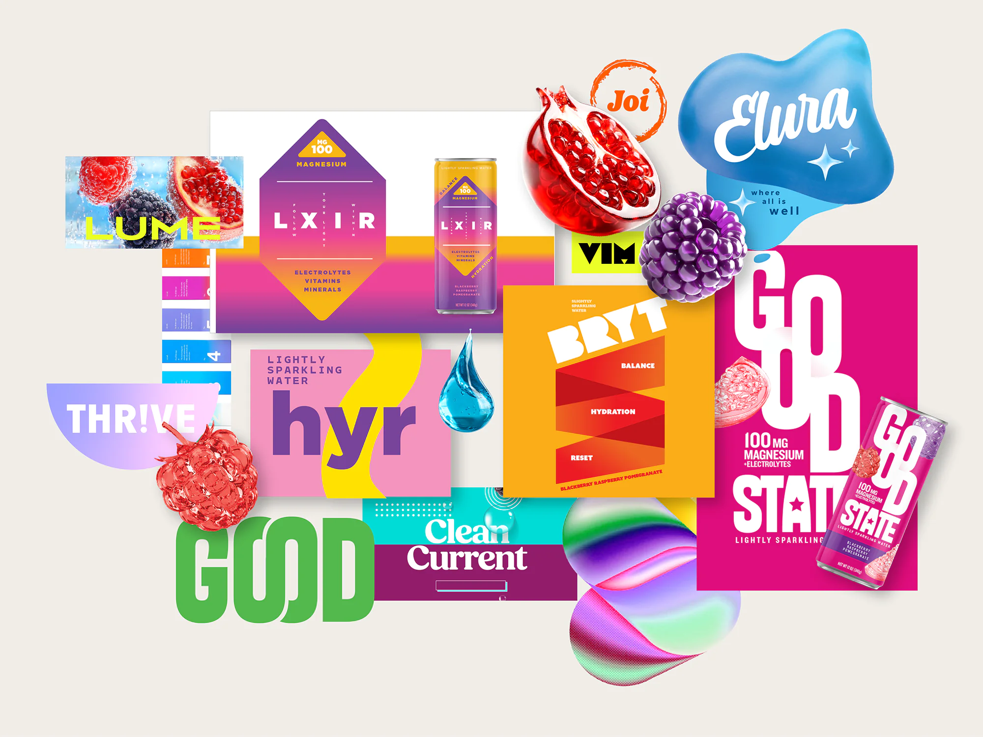
The functional water category is crowded with brands promising better versions of yourself, all competing for the same shelf space and the same skeptical consumer. To help ELOS stand apart, the Smith Design team flipped the script on that convention, shifting the story away from brands dictating wellness and toward putting empowerment directly in the consumer’s hands. This shift shaped everything from the name itself to the brand’s core personality: bold, rebellious, and built for people who define self-betterment on their own terms. The result is a brand that shifts the traditional dynamic, giving consumers control over their own wellness journey.

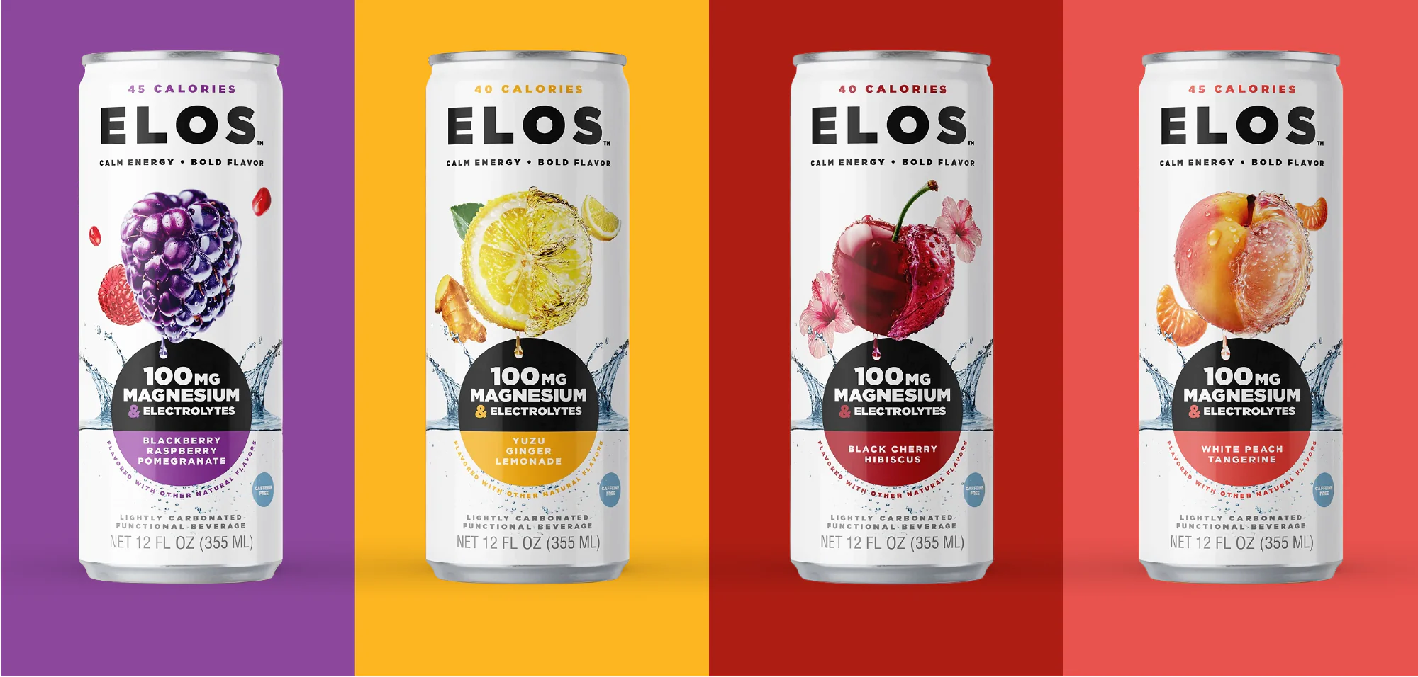
Elos packaging design extensions

An Identity Designed to Energize

The ELOS identity captures the brand’s vibrant energy through hyper-liquified fruit illustrations that instantly communicate flavor, function, and refreshment. A bold color architecture creates strong shelf recognition across the portfolio while balancing premium cues with an expressive, modern aesthetic that reflects the brand’s empowering spirit.

Creating a Distinctive Visual Language

Comprehensive brand guidelines establish the principles that keep ELOS consistent across every expression. From packaging and communications to future innovations, the system provides a flexible framework that allows the brand to evolve while maintaining a cohesive identity.

Bringing the Brand to Life

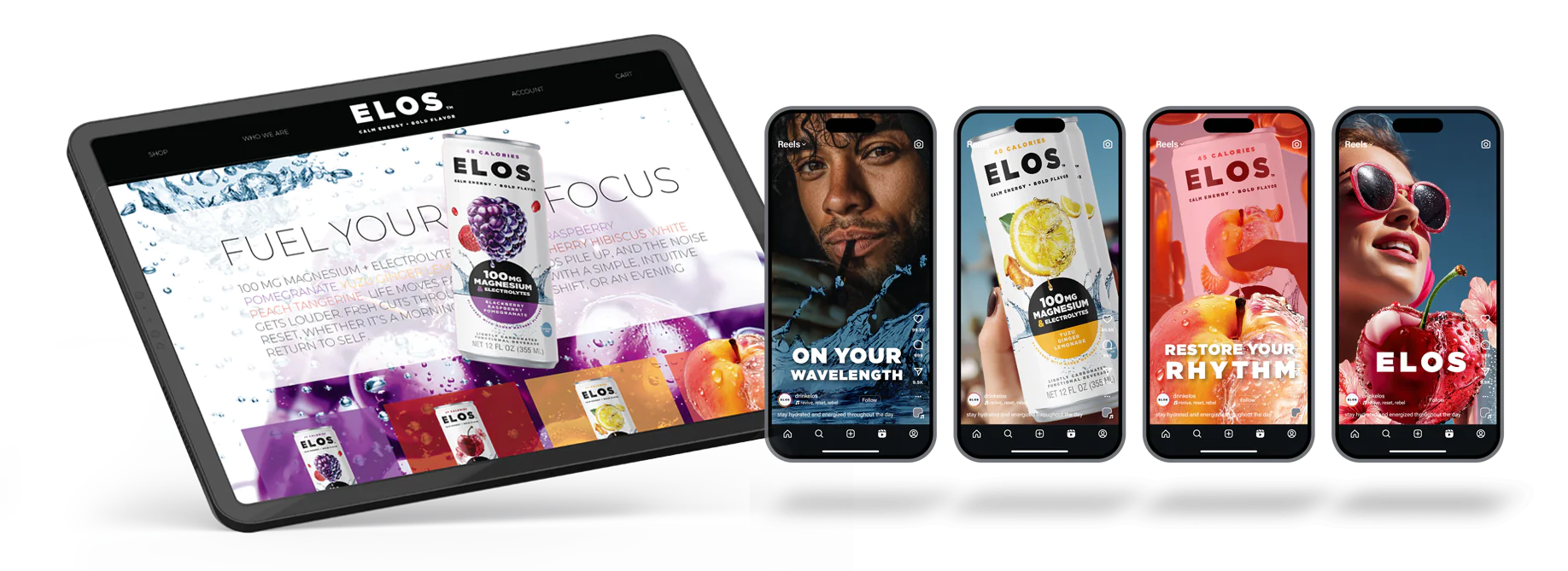
To demonstrate how ELOS extends beyond the shelf, the identity was translated into a range of digital touchpoints across web and social. The result is a connected brand experience that carries the same energy and personality wherever consumers engage with it.

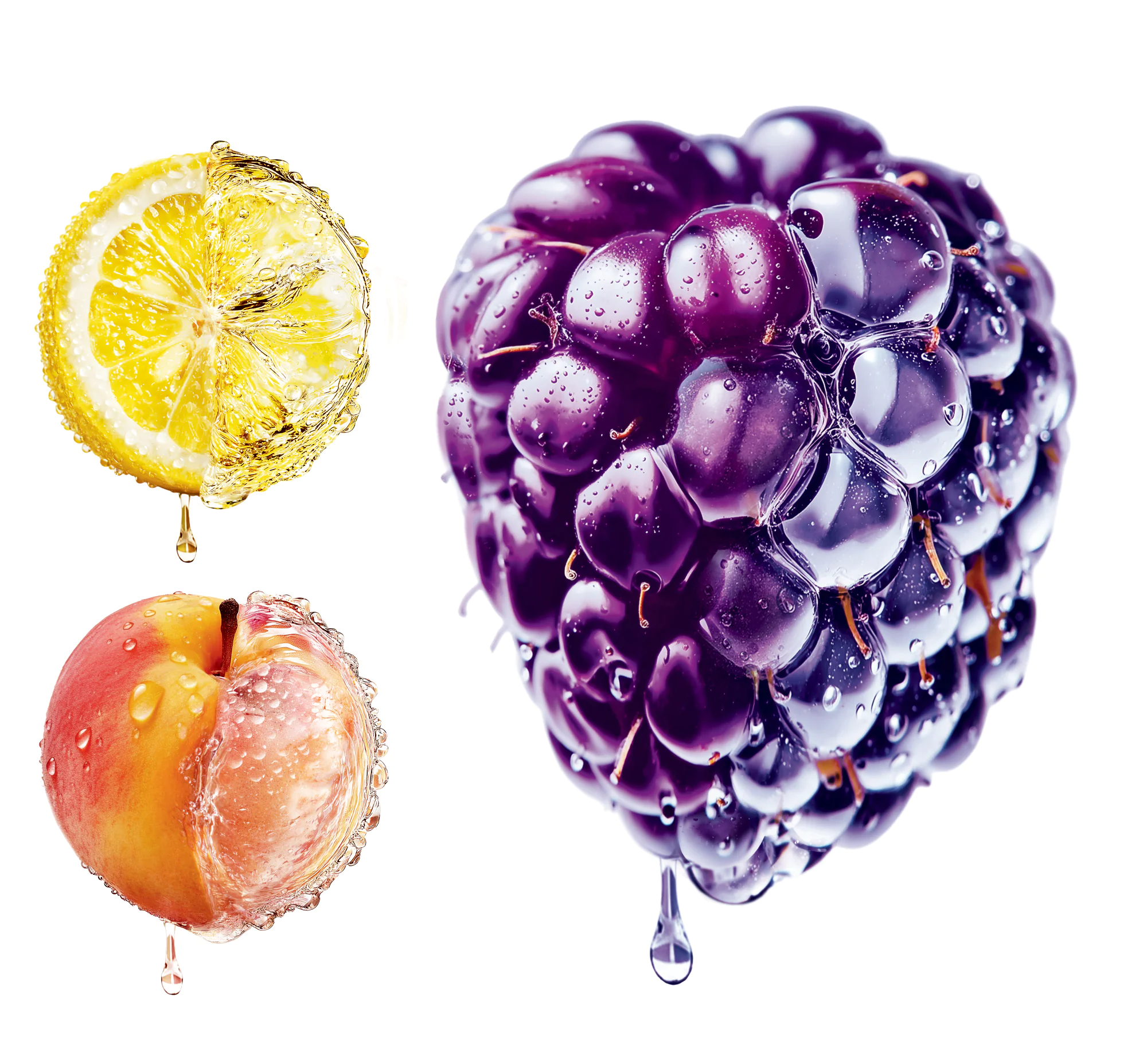
Elos digital illustration fruit

Crafting a Signature Visual Language

Custom fruit illustrations became a signature brand asset, adding movement, dimension, and appetite appeal to every flavor. The illustration style creates immediate shelf impact while establishing a distinctive visual language that is uniquely ELOS.

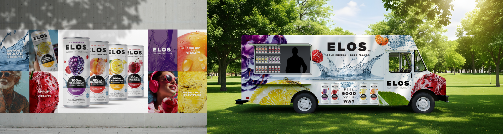
Elos packaging truck

Designed for Growth: A Launch-Ready Brand with Wellness Appeal​

The ELOS identity was designed to perform well beyond packaging. Branded merchandise, environmental graphics, website, social, vehicle wraps, posters, and other activation concepts demonstrate how the system scales seamlessly across physical and experiential touchpoints, bringing the brand to life wherever consumers encounter it.

200+

NAMES EXPLORED

4

ALL-PANEL SKUs
DESIGNED

1

COHESIVE BRAND
SYSTEM

Let’s Talk.
close slider
Contact Form_Home