Dial Redesign:
Modernity For A Heritage Brand:
BRAND IDENTITY DESIGN | PACKAGE DESIGN | VISUAL STRATEGY | ILLUSTRATION | PRODUCTION
Smith Design created consistency across a ‘Brand Universe’ by modernizing heritage equities into a bold, multi-pillar portfolio spanning hand soaps, body washes, Kids, and Men’s-engaging today’s consumers while attracting a younger audience.


BEFORE
AFTER
Dial Branding
The Dial logo rebrand embodies freshness and simplicity, featuring a modern refresh for the company. The iconic brandmark, rooted in blue and silver, did not need a complete overhaul. Instead, simplifying gradients, drop shadows, and letterforms brought the company logo into the present day without sacrificing any of the brand’s core equities.
Dial Branding
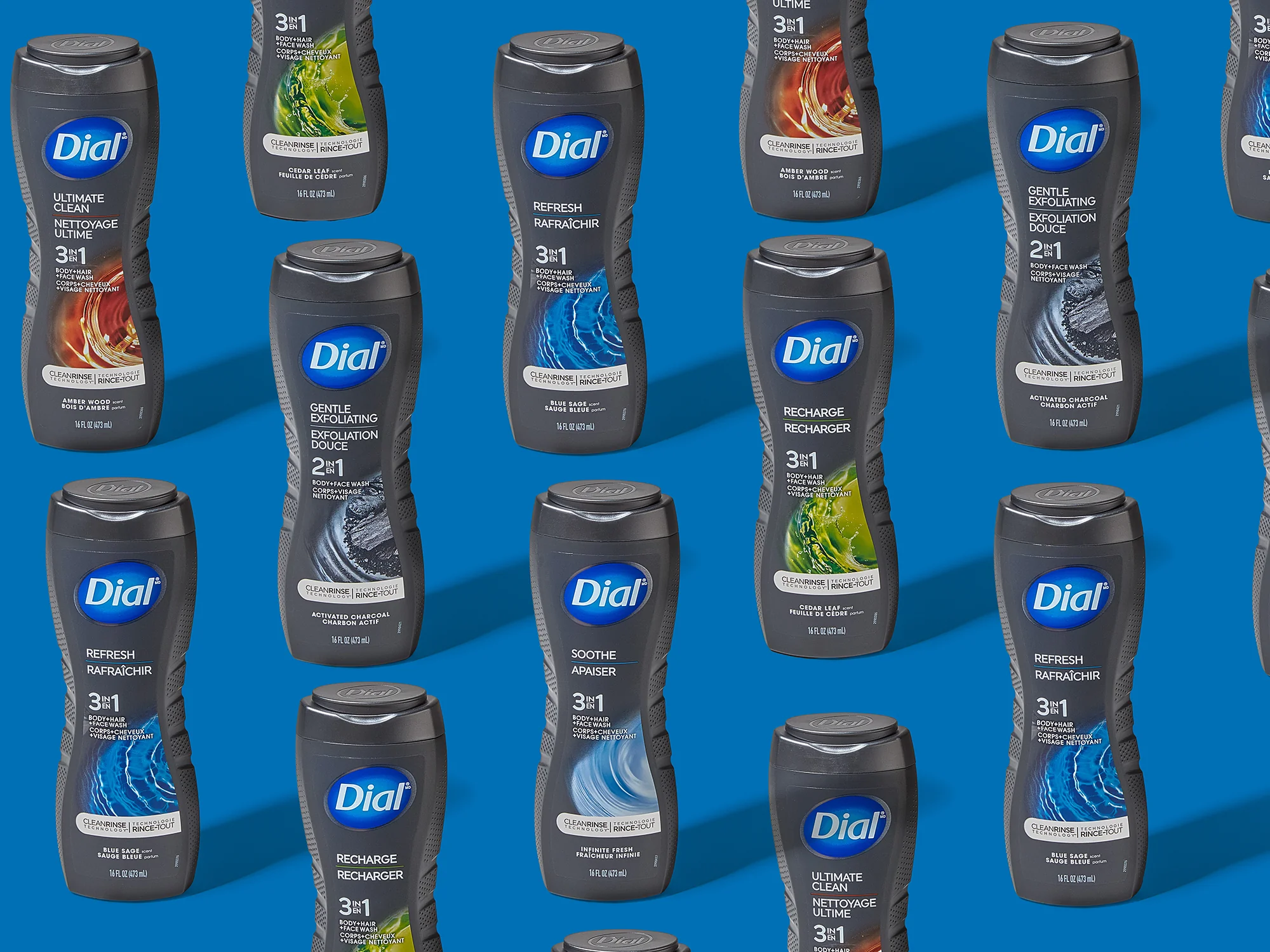
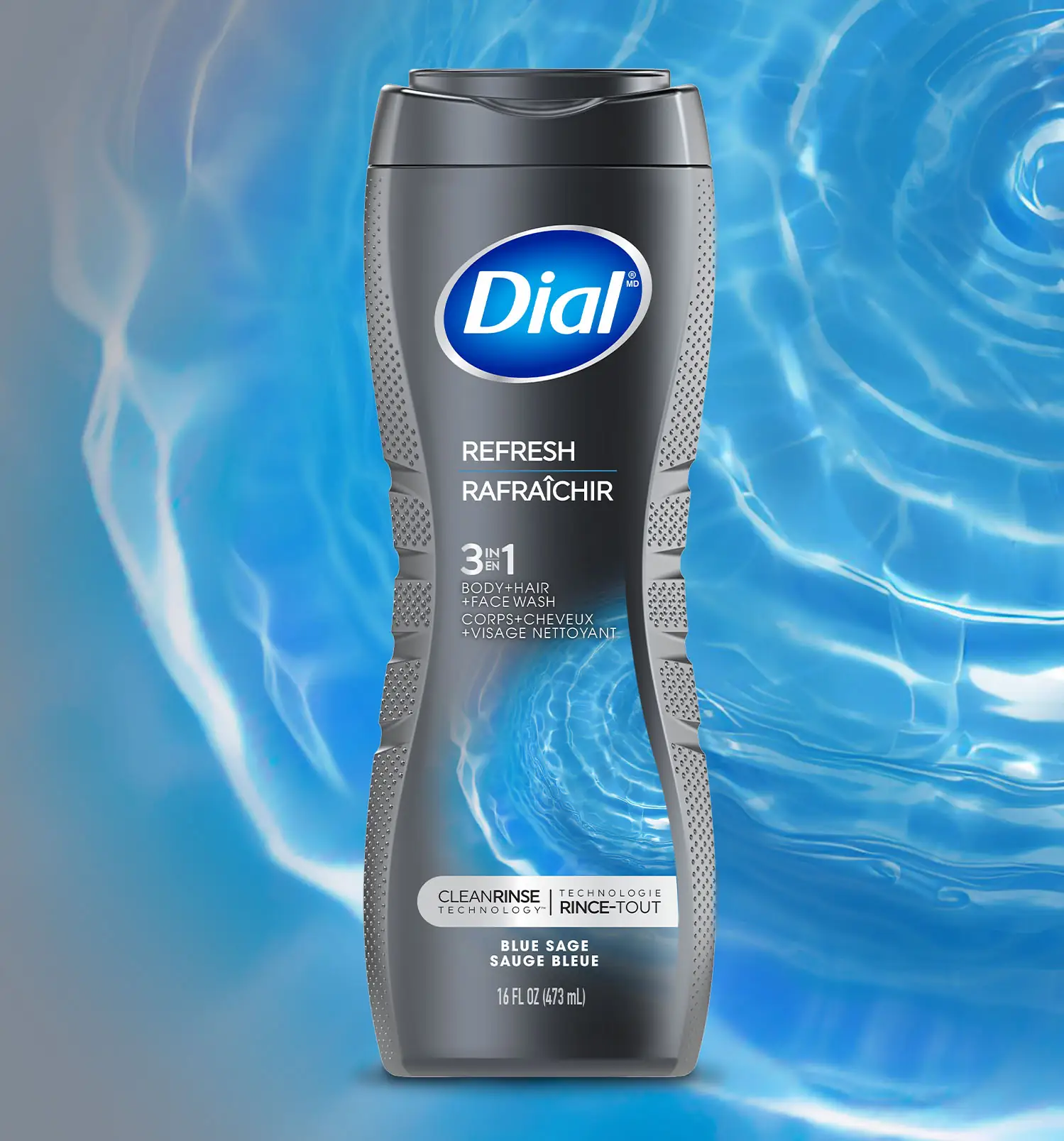
Smith Design refreshed Dial Men’s product packaging to infuse activated abstract design elements while simplifying communication to highlight the patented clean rinse technology. Our streamlined package design delineates between scents to ensure easy shopability, retaining color equities known to core consumers while adjusting the brand positioning to capture the attention of a new, younger audience.
Dial Mens
Smith Design refreshed Dial Men’s product packaging to infuse activated, abstract design elements that visually represent hydration and water cues while also simplifying communication to highlight the patented clean rinse technology. Our streamlined package design delineates between abstract scents like “Refresh” and “Ultimate Clean” and ensures easy shopability by retaining color equities known to core consumers while adjusting the brand positioning to capture the attention of a new, younger audience.

Dial Kids
Dial Kid’s relaunched with three scents of All-In-One Hair, Body, and Bubble Bath formulations, positioning the brand to target parents who seek innovative, better-for-you solutions for a gentle, kid-friendly clean. The brand came to Smith Design to refresh the package design, which features custom illustrations of lovable animals in bubble baths being showered with scent cues, a new logo design, and a revamped color palette. The product’s package design is soft, hinting at the product’s gentleness on young skin, yet fun and playful enough to appeal to kids during bath time.
Healthy Hydration
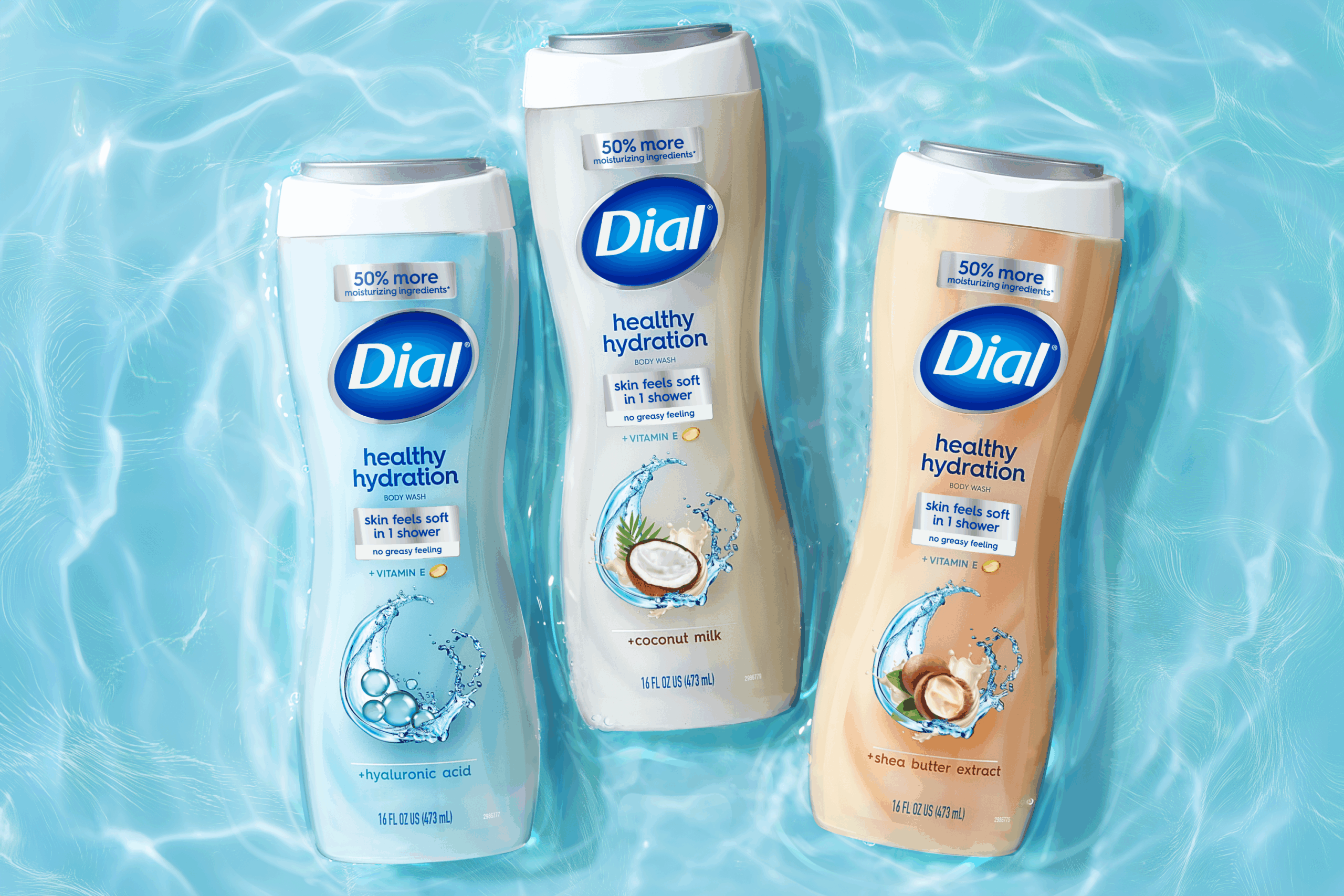
Dial Healthy Hydration was the brand’s innovative new line of body washes that help skin feel refreshed and soft. To convey the benefits of a deep clean that also hydrates, Smith Design extended the Dial brand equities into a new package design for this premium offering that departs from the core line with softer colors and creamy, moisture-inspired visuals while maintaining elements of hydration and core brand equities.
