CHALLENGE
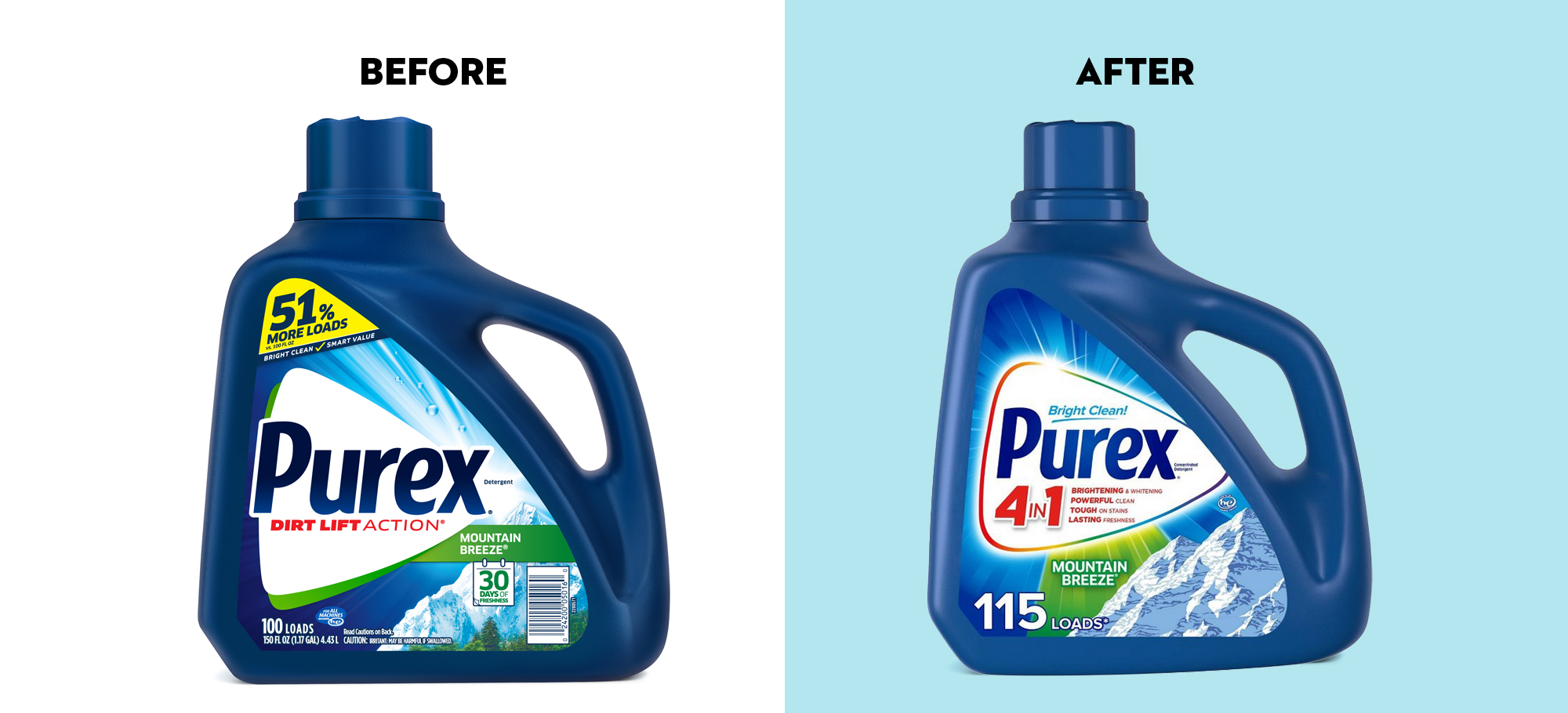
Redesign Purex Laundry Detergent using the new brand positioning. Design must be able to capture/communicate the new positioning & identity of Purex laundry detergent and be supported by the 4-in-1 benefits construct. The packaging must be able to capture a consumer’s attention at-shelf in the first moment of truth and drive consideration amongst of sea of colorful, competitive detergent brands.
SOLUTION
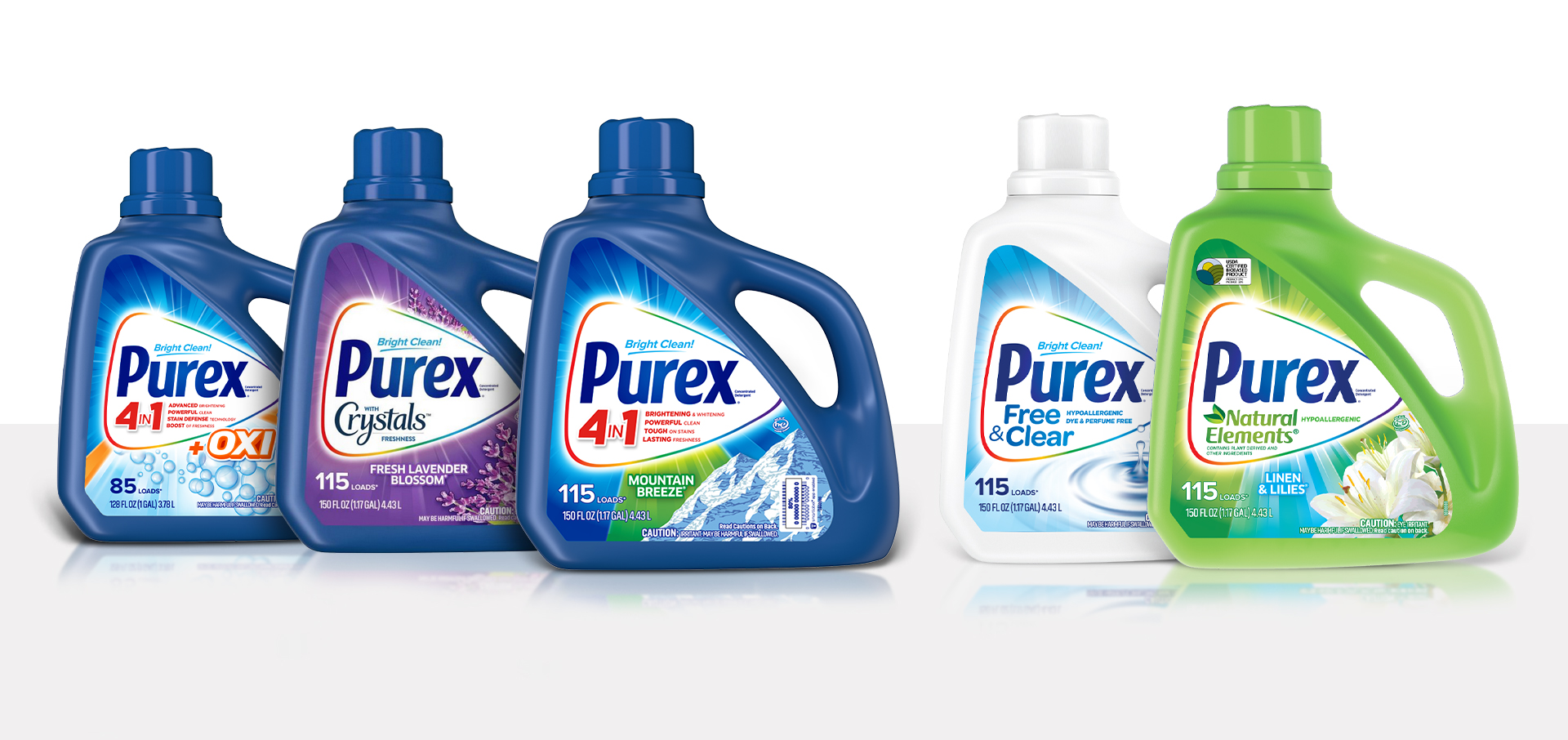
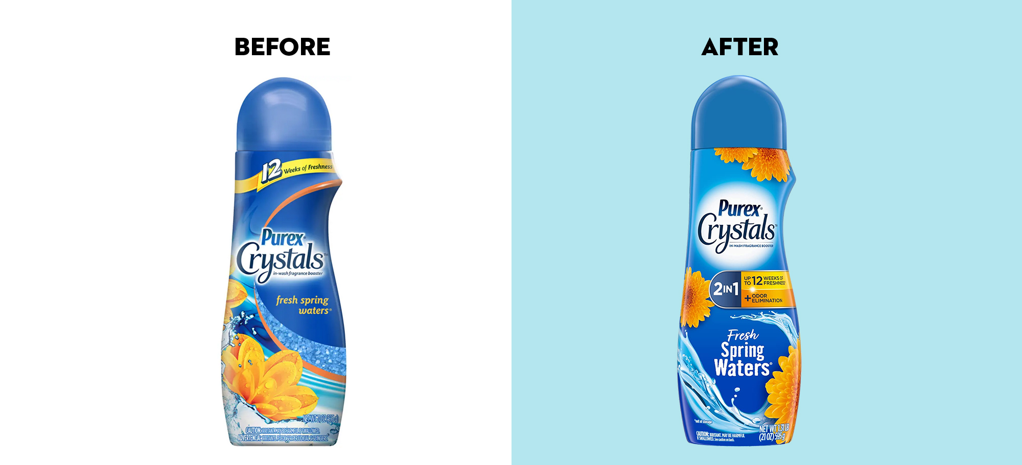
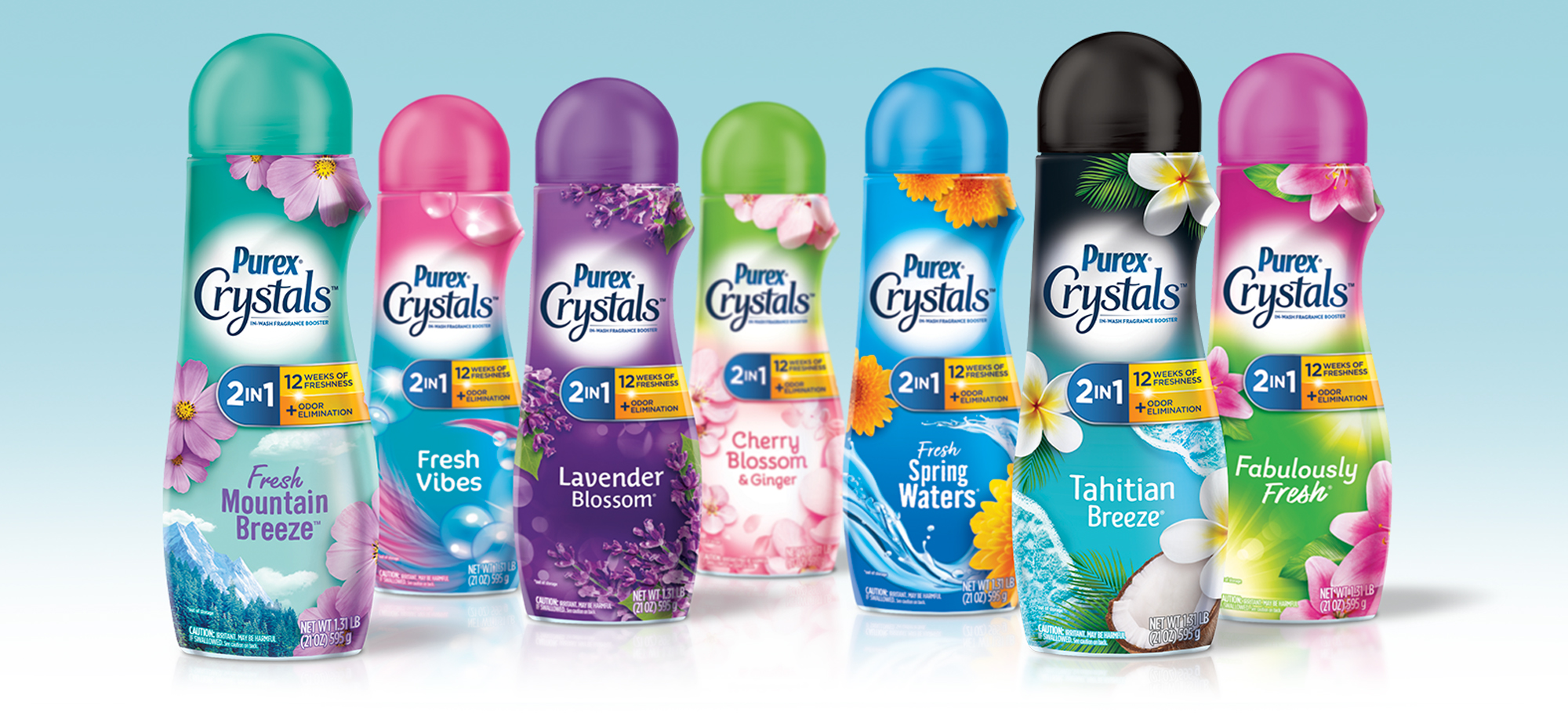
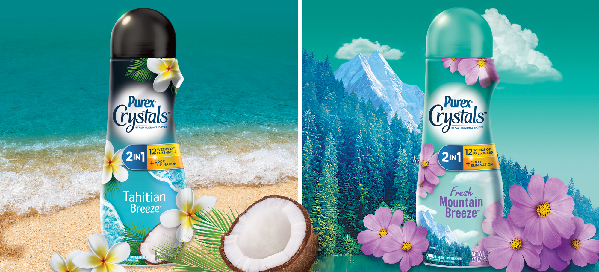
We developed a cohesive brand logo lock up by bringing modernity and simplicity to the Purex logo type and dialing up personality to the traditional holding shape by by adding an optimistic rainbow effect. The 4in1 offering was consistent across all SKUs and allowed space for sub-brands when 4in1 was not applied. All imagery was refreshed but maintained enough current cues for consumer shopability.
Strategy
Brand Identity
Illustration
Packaging Design
Line Extensions

At Smith Design, our culture is rooted in caring. We make a conscious and collective effort to translate our values into actions that benefit our staff, our clients, our community and our environment.


SIGN UP FOR OUR NEWSLETTER
©2022 SmithDesign, ALL RIGHTS RESERVED | Privacy Policy | 8 Budd Street, Morristown NJ 07960 | 973.429.2177