Over the past year, we have seen a wave of brand redesigns, some honoring equities while others completely abandoning them. As a design agency that partners with category-leading heritage brands, our take is simple: treat equities as irreplaceable assets, not creative constraints.
Respecting Memory While Refreshing Meaning
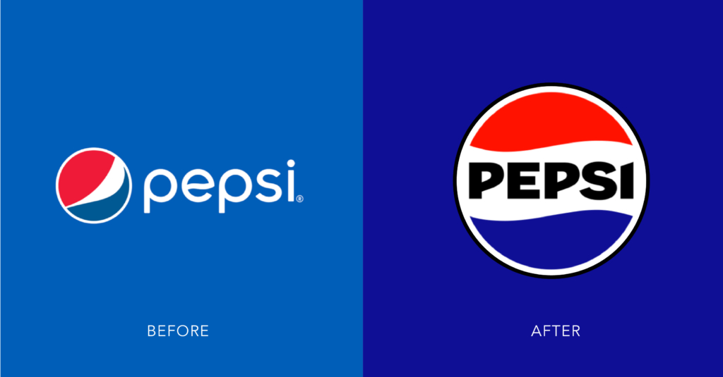
- Pepsi’s identity refresh channeled 1990s visual memory, returning to a bolder wordmark locked inside the globe, with a darker palette and black accents to elevate Zero Sugar. It’s a case study in nostalgia with intent – contemporary, but instantly “Pepsi.”
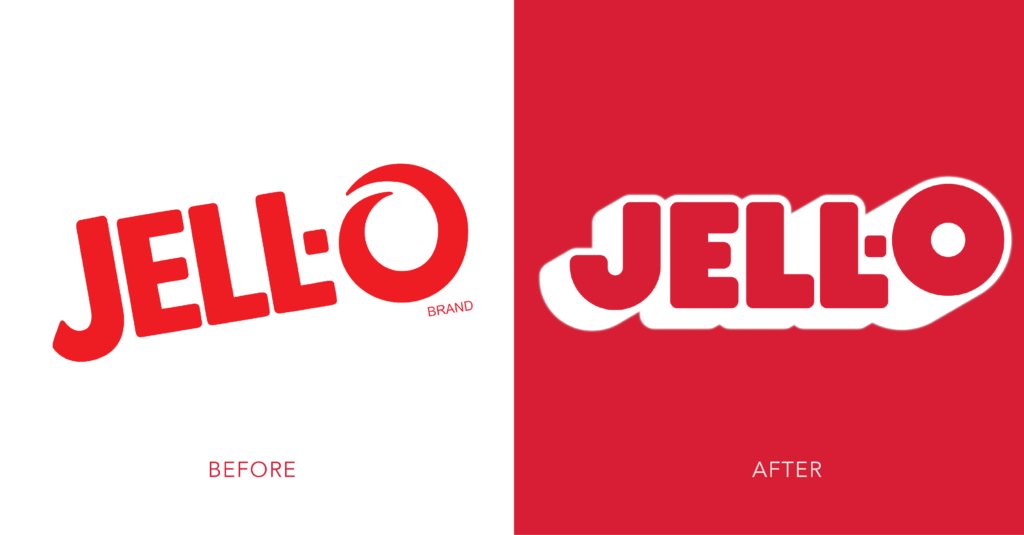
- Jell-O leaned into a retro-playful packaging system and jiggle-forward visuals, trading clinical cues for joyful appetite appeal. Jell-O is an excellent example of a heritage brand made current by amplifying, not erasing.
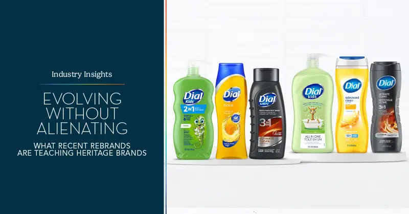
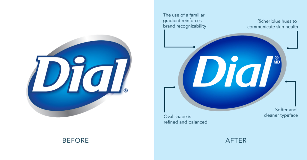
- Dial evolved its identity by honoring core brand equities while expanding beyond cleanliness to build emotional and sensory connections. In collaboration with Smith Design, the brand introduced modernized illustrations, streamlined packaging, and distinct subline expressions that transform its heritage into a foundation for fresh, relevant storytelling.
Why these landed: each began with an audit of non-negotiable equities (shapes, colors, wordmarks, pack architecture) and then used those as springboards. Heritage was a tool to increase recognition and warmth, not the strategy itself.
Breaking the Bond with Loyalists
- Cracker Barrel attempted a modernized logo and store refresh that muted hallmark cues (the “old country store” feel). Customer backlash resulted in a swift halt of the rollout and reinstating the original logo, a lesson in how deeply an experience and brand mark are intertwined for legacy brands.
- Jaguar in a bold push toward electrification, rolled out a campaign centered on the tagline “Copy Nothing”, featuring a new minimalist logotype and sleek visuals. Fans and critics accused Jaguar of abandoning its storied heritage, claiming the company “killed a British icon.”
What went wrong: backlash isn’t just about logos; it’s about signals towards a bigger change that will affect the core of what consumers know and love about a brand. When the new expression seems to disinvite your base, consumers start to recognize what may be changing at a deeper level, leaving the new visual strategy to take the brunt of the negativity for the bigger organizational change.
Our Philosophy for Heritage Leaders
We design with two truths in mind:
- Equities are capital. You don’t delete assets that took decades to accrue; you reinvest in them.
- Growth requires stretch. New, younger audiences need fresher codes to see themselves in the brand. The backlash received by some brands should not deter heritage brands from making necessary updates; mindful reimagination will make sure you are evolving to meet those new consumer needs.
The job is to hold the line on what must endure and evolve what can invite.
How We Do It (and what you can expect)
- Equity Map & Hierarchy. We inventory distinctive assets (color, iconography, pack silhouettes, taglines). Then we tier them: Keep / Evolve / Explore.
- We purposely use dual-audience testing. We test current users and next-gen prospects separately first and then together, so we can see where preferences diverge rather than averaging them into something not rooted in strong support.
- Scenario design, not one-offs. We prototype territories:
- Conserve: tight evolution, maximum continuity.
- Bridge: bolder motion with protected core equities.
- Breakthrough: novelty option pressure-tested for stretch.
- Decision by “Equity + Effect.” We combine recognition/fit metrics with persuasion and “would try/buy” lift. The winning route protects recognition and grows relevance.
When current vs. new consumers don’t agree…this is the hard part, and it happens. How do we continue forward without abandonment?
- Find the overlap first. Identify assets both groups rate as “makes it feel like the brand.” Those become untouchables.
- Localize the novelty. Concentrate change where your base is least sensitive and keep primary marks, core colors, and hero pack elements consistent.
- Stagger the leap. If the breakthrough route wins with prospects but alarms loyalists, roadmap it: launch the Bridge system now, pre-wire the “why,” and schedule feature releases toward the bolder behaviors once familiarity builds.
- Narrate the change. Use brand storytelling to frame evolution as a return to purpose, not a departure. Communicate how the launch narrative connects the past to the future in human terms.
Great redesigns don’t choose between heritage and modernity; they translate heritage into modernity. When you honor what people already love, you earn the right to show them what they’ll love next.
References
Pepsi Logo: https://www.printmag.com/branding-identity-design/the-new-pepsi-logo-proves-the-mass-appeal-of-nostalgic-rebrands/
Jello Logo: https://logos-world.net/bright-rebranding-of-the-jell-o-logo/